Colour Contrast Accessibility: Designing for WCAG Compliance
If your website’s text is illegible to the 2.2 billion people globally with vision impairments, you are not just being inconsiderate; you are actively blocking revenue.
In the UK alone, the “Purple Pound” – the spending power of households with disabled members – is estimated at £274 billion per year. If your checkout button gets lost in a trendy pastel background, that money goes to your competitor.
Beyond the lost sales, there is the legal reality.
Since the landmark Domino’s Pizza v. Guillermo Robles case in the US, where the Supreme Court effectively upheld that digital spaces must be accessible under the ADA, the floodgates have opened. In the UK, the Equality Act 2010 demands “reasonable adjustments” for disabled users.
Colour contrast accessibility is not about stifling creativity. It is about ensuring your message is actually readable. Here is how to fix it before it becomes a problem.
- Ensure text and UI elements meet WCAG AA contrast ratios: 4.5:1 for normal text, 3:1 for large text and UI components.
- Calculate contrast using the luminance ratio formula (L1+0.05)/(L2+0.05); aim for 21:1–1:1 scale compliance.
- Test palettes with tools (Stark, WebAIM, Chrome DevTools) and include colour-blindness simulators in audits.
- Don’t rely on aesthetics: avoid low-contrast pastels; darken subtle greys to meet AA without harming brand feel.
- Remember non-text contrast and dark mode: buttons, borders, focus indicators, and themes need separate accessible palettes.
What is Colour Contrast Accessibility?
Colour contrast accessibility refers to the visual difference in luminance (brightness) between foreground elements (usually text or icons) and their background. It ensures that content is legible for all users, including those with low vision, colour blindness, or age-related visual degeneration.

The Three Core Components:
- Luminance: The relative brightness of any point in a colour space, normalised to 0 for darkest black and 1 for lightest white.
- The Ratio: A mathematical calculation comparing the luminance of two colours.
- Distinction: The ability of the human eye to perceive edges and shapes based on the luminance difference.
The Mathematics of Legibility: Understanding WCAG Standards
The Web Content Accessibility Guidelines (WCAG) are the global gold standard. Maintained by the W3C, these guidelines determine whether your site is legally compliant. They do not care about your “aesthetic preferences.” They deal in hard math.
The Contrast Ratio Formula
To understand why your grey-on-white text is failing, you need to understand how the ratio is calculated.
The formula for the contrast ratio (CR) is:
(L1 + 0.05) / (L2 + 0.05)
Where:
- L1 is the relative luminance of the lighter of the colours.
- L2 is the relative luminance of the darker of the colours.
The result is a ratio ranging from 1:1 (white text on white background) to 21:1 (black text on white background).
The Success Criteria (WCAG 2.1)
The W3C defines three levels of conformance: A (lowest), AA (mid-range), and AAA (highest). For most businesses, Level AA is the legal and practical target.

Level AA Requirements:
- Normal Text (Under 18pt or 14pt bold): Must have a contrast ratio of at least 4.5:1.
- Large Text (Over 18pt or 14pt bold): Must have a contrast ratio of at least 3:1.
- Graphical Objects & UI Components: Must have a contrast ratio of at least 3:1 against adjacent colours.
Level AAA Requirements:
- Normal Text: Requires 7:1.
- Large Text: Requires 4.5:1.
Note: Level AAA is the holy grail, but it can often be restrictive for branding purposes. We recommend aiming for AA as a baseline and hitting AAA for critical body text where possible.
The “Brand Police” vs. Accessibility: A False Conflict
I often hear clients complain: “But Stuart, these accessible colours look harsh. They ruin the vibe.”
If your “vibe” relies on illegible text, your design is fundamentally broken. Design is communication. If the receiver cannot read the message, the transmission has failed.
The Pastel Problem
Startup branding in the 2020s has been plagued by low-contrast pastels. Light grey text on a white background might look “clean” on a designer’s calibrated 5K Retina display in a dark room. But on a cheap Android phone, under direct sunlight, with the screen brightness turned down to save battery? It is invisible.
Case Study: The “Grey Text” Epidemic
The Nielsen Norman Group (NN/g) has repeatedly flagged low-contrast text as a top usability mistake. Users interpret grey text as “disabled” or “inactive.” If your body copy appears grey, making it look “soft,” users might subconsciously skip it, assuming it is irrelevant metadata.
Real-World Example:
Consider the sheer volume of e-commerce sites using light grey (#999999) on white (#FFFFFF). The ratio is 2.8:1. This fails WCAG AA. It fails the law. It fails the user. Darkening that grey to #757575 bumps the ratio to 4.6:1, passing AA. The visual difference is subtle; the usability difference is massive.
See more on how we balance Colour Psychology in Branding
Beyond Text: Non-Text Contrast (The Forgotten Rule)
WCAG 2.1 introduced a critical update that many developers miss: Non-Text Contrast.
It is not just about words. It is about understanding the interface. Buttons, input borders, focus indicators, and icons must also meet the 3:1 ratio requirement.
1. Form Input Borders
If your text input field has a faint border (or no border, relying on a background fill), users with low vision may struggle to determine where to click. The boundary of the input must contrast at a ratio of 3:1 against the page background.
2. Focus Indicators
When a keyboard user tabs through your site, a ring usually appears around the active element. Browsers have default blue rings, but designers often remove them with outline: none, because “it looks ugly.”
Never do this. If you remove the default, you must replace it with a custom focus state that has a 3:1 contrast ratio against the button and the background.
3. Data Visualisation
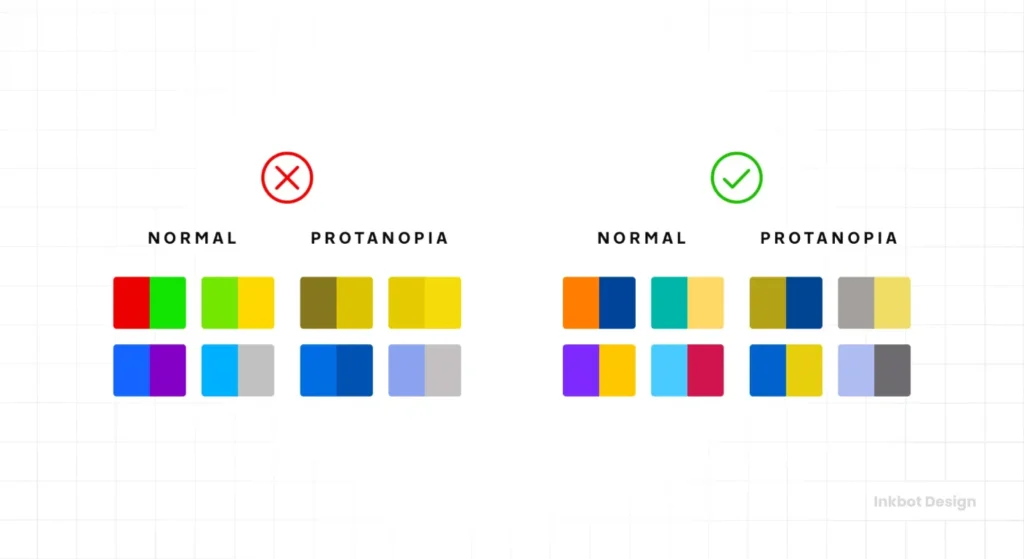
Charts and graphs are notorious offenders. If you use red and green to denote “loss” and “profit” in a pie chart, you are alienating 8% of men with Deuteranopia (red-green colour blindness).
- The Fix: Use patterns (hatched lines vs. solids) alongside colours, or ensure the luminance difference between the red and green segments is high enough to be distinguished in grayscale.
Technical Auditing: How to Test Your Palette
Do not guess. Use tools. The human eye is subjective and easily tricked by optical illusions (like simultaneous contrast).
The Wrong Way vs. The Right Way
| Feature | The Wrong Way (Amateur) | The Right Way (Pro) |
| Testing Method | “It looks okay on my MacBook.” | Automated CI/CD pipeline tests + Manual Audits. |
| Tools | Eyeballing it. | Stark, Contrast (macOS), Chrome DevTools. |
| Text over Images | Placing white text directly on a photo. | Using a CSS overlay (e.g., rgba(0,0,0,0.6)) or text-shadows. |
| Colour Blindness | Ignored. | Tested via simulators (Protanopia, Deuteranopia, Tritanopia). |
| State Changes | Checking default state only. | Checking hover, focus, and active states. |
Recommended Tool Stack
- Stark: A plugin for Figma, Sketch, and Adobe XD that allows designers to check contrast and simulate colour blindness in real-time.
- WebAIM Contrast Checker: The industry standard for quick hex code checks.
- Chrome DevTools: Open the “CSS Overview” or simply inspect an element. Chrome now provides a pass/fail grade for contrast directly in the Styles pane.
The Future: APCA and WCAG 3.0
While WCAG 2.x is the current law, the future lies in the Advanced Perceptual Contrast Algorithm (APCA).
The current contrast ratio math (L1/L2) is flawed. It treats all colours equally, but the human eye does not. We perceive blue as darker than yellow at the same mathematical luminance. We also perceive contrast differently depending on font weight and size.
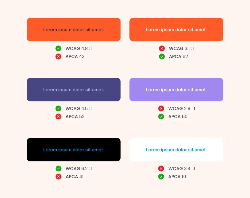
APCA fixes this by:
- Context Sensitivity: It considers the spatial frequency (font weight/size) as part of the contrast score.
- Polarity: It acknowledges that white text on a black background reads differently than black text on a white background (due to light bleed).
The State of Colour Contrast Accessibility in 2026
As we look toward 2026, expect APCA to become the default calculation method in design tools. The W3C is currently drafting WCAG 3.0 (Project Silver), which will likely incorporate APCA.
Strategic Move: Begin auditing your sites with APCA calculators now (such as the one at Myndex). If you pass APCA, you generally also pass WCAG 2.1, and you ensure a much higher quality of perceived readability.
Consultant’s Reality Check: The “Dark Mode” Trap
I once audited a SaaS platform that took pride in its “AAA Compliant” light mode. They had spent thousands on a consultant to perfect their white-and-blue theme.
Then they launched Dark Mode.

They simply inverted the colours. The result? Pure black text on a dark grey background. Or worse, vibrant “brand blue” text on a black background, which causes halation (a vibration effect that hurts the eyes).
The lesson: You cannot just flip a switch. Dark mode requires a separate, dedicated colour palette. You often need to desaturate your primary brand colours to maintain legibility on dark surfaces. Material Design guidelines recommend avoiding fully saturated colours in dark themes for this exact reason.
If you are building a web application in 2025/2026, you are likely using CSS Custom Properties (Variables). Structure your variables so that semantic colours (e.g., –text-primary, –bg-surface) map to different hex codes depending on the prefers-color-scheme media query.
The Verdict
Colour contrast accessibility is not a constraint; it is a quality control standard. It ensures your branding survives the transition from your designer’s monitor to the customer’s cheap smartphone screen.
Failing to meet WCAG AA standards is a choice to exclude users and invite legal action. It is sloppy business practice disguised as aesthetic preference.
Actionable Next Step:
Do not try to fix your entire site overnight. Start with your Primary Action Buttons (Add to Cart, Sign Up, Contact Us) and your Navigation Menu. Run them through the WebAIM Contrast Checker. If they fail, adjust the lightness value until they pass.
If you need a professional audit to ensure your brand is both beautiful and legally compliant, request a quote from Inkbot Design today.
Frequently Asked Questions (FAQ)
What is the minimum contrast ratio for WCAG AA compliance?
For normal text, the ratio must be at least 4.5:1. For large text (bold 14pt+ or regular 18pt+), the ratio must be 3:1. Graphical user interface components (like input borders) also require 3:1.
Does accessibility apply to my logo?
Strictly speaking, WCAG 2.1 exempts logos and brand names from contrast requirements. However, if your logo contains text that is essential for understanding your brand, we strongly recommend ensuring it is legible and clear.
Why do my brand colours fail accessibility checks?
Many brand palettes are chosen for print, where ink on paper behaves differently from light emitted from a screen. Digital colours often need to be tweaked (usually darkened) to maintain the same visual impact while meeting contrast ratios.
What is the difference between WCAG AA and AAA?
AA is the standard legal target for most commercial websites. AAA is the highest level, requiring a 7:1 contrast ratio. AAA is reserved for specialised sites (e.g., government or disability services) as it significantly limits design choices.
Can I use white text on a coloured background?
Yes, provided the background colour is dark enough. For example, white text on a standard red (#FF0000) often fails (3.9:1). You would need a darker red (#D00000) to pass AA (5.0:1).
How does colour blindness affect contrast?
Contrast is about luminance (light/dark), not hue (colour). If two colours have high contrast (e.g., black and white), colour blind users can read them fine. Issues arise when you rely solely on hue (e.g., red vs. green) with similar luminance values.
Is dark mode better for accessibility?
Not necessarily. While it helps users with photophobia (light sensitivity), it can be more challenging for users with astigmatism, as white text on a black background can cause “halation” (blurring). A good site offers both light and dark modes.
Do text shadows help with contrast?
Yes. If you have text over a variable background (such as an image), adding a text shadow or a semi-transparent background overlay (scrim) is a valid technique to increase the effective contrast ratio and meet WCAG requirements.
What is APCA?
APCA (Advanced Perceptual Contrast Algorithm) is a new method for calculating contrast, which is likely to be included in WCAG 3.0. It accounts for how the human eye actually perceives lightness based on context, font weight, and spatial frequency.
Can I get sued for bad colour contrast?
Yes. In many jurisdictions (US, UK, EU), websites are considered public accommodations or services. If your site is unusable for a person with a disability due to poor contrast, you may be liable under laws such as the ADA or the Equality Act 2010.
How do I fix low contrast buttons without changing my brand colour?
If your brand colour is too light for white text, try using dark text (black or dark blue) on the button instead. Alternatively, use your brand colour for the button border and make the background white (ghost button), ensuring the text is dark enough.
Does font weight affect contrast requirements?
Yes. Thinner fonts are harder to read. WCAG accounts for this by allowing lower contrast ratios (3:1) for “large” text, which includes bold text at 14pt (approx 18.66px) or larger.