35 Memorable App Logos & What You Can Learn From Them
Go on, unlock your phone.
Have a good, long look at the grid of icons staring back at you.
How many of them can you identify instantly? How many are just a blur of colour and vague shapes? Most, I’d wager, fall into the second category. They are digital noise.
This isn’t just an observation about aesthetics. For entrepreneurs and business owners, this is a matter of survival. Your app logo isn’t a decorative flourish; it’s a tiny, pixelated billboard fighting for relevance in the most competitive real estate on earth.
Most businesses get it wrong. They treat their app logo as an afterthought, a shrunken version of their primary logo, or worse, a committee-led compromise that tries to say everything and ends up saying nothing.
Let’s cut through the fluff. Here are 35 examples of app logos that work, and the brutally honest lessons they teach.
- Simplicity is essential; intricate logos become unrecognisable at small sizes.
- Your app logo must be scalable, clearly identifiable even as a tiny icon.
- Successful logos typically avoid words, relying on strong symbols for recognition.
- Timeless designs are more effective than those chasing fleeting trends.
The Unspoken Rules of App Icon Design (That Most People Ignore)
Before looking at the shiny examples, we must agree on the ground rules. These aren’t suggestions. In the world of mobile icons, there are laws.
Simplicity Isn’t a “Style”—It’s a Requirement
Your logo will be viewed at roughly the size of your thumbnail. Sometimes smaller. It will fail if it relies on intricate detail, subtle gradients, or complex lines. It will become an unrecognisable smudge. Simplicity isn’t a minimalist trend; it’s a functional necessity. It’s a sign of confidence. You don’t need to shout when you know what you stand for.
Scalability: The Journey from App Store to Notification Badge
That icon must look sharp in the App Store, clear on a high-resolution home screen, and still be identifiable as a tiny circle in a notification banner.
If your design can’t survive being shrunk down to 16×16 pixels, it’s not a viable app icon. Full stop.
Ditch the Words (Most of the Time)
Look at the most successful app icons. Notice a pattern? They rarely include the complete company name. The icon is the name.
Your app’s name will appear below the icon on the home screen anyway. Using that precious space for text is redundant and clutters the design. A powerful symbol beats a tiny, unreadable word every single time.
The Grave Danger of Chasing Trends
Remember when every icon had a long shadow? Or a glossy, “Web 2.0” bubble effect?
Chasing design trends is a fool’s game. It dates your brand instantly. A strong identity is timeless. It might be updated over time, but its core concept shouldn’t be tied to a fleeting aesthetic that will look ridiculous in three years. Your logo should be built to last, not to look “current” for a season.
Group 1: The Titans of Simplicity (Logos as Pure Symbol)
These logos are masters of reduction. They’ve boiled their identity down to a single, unmistakable shape. There’s no ambiguity, and no explanation is needed.
1. Target
A bullseye. It’s the name of the company, visualised. You can’t get more direct or effective. It hits the mark every time.
2. X (formerly Twitter)
The bird was iconic. The ‘X’ is stark, brutalist, and polarising—but undeniably simple. It demands attention through its sheer austerity.
3. Instagram (Original)
The retro Polaroid shape was a perfect metaphor for the app’s function: instant, filtered photos. It told a story without a single word.
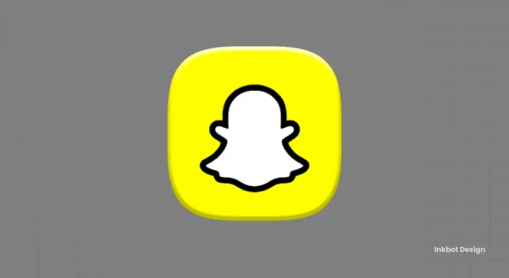
4. Snapchat
A ghost. Why? Because the messages disappear. It’s a simple, quirky visual metaphor perfectly capturing the brand’s core feature.
5. Apple
It’s an apple with a bite taken out of it. It’s so famous we forget how bold it is. It’s not a computer or a phone. It’s a symbol of knowledge, temptation, and thinking differently.
6. Medium
The bold, serif ‘M’. It feels literary, serious. It’s a mark for writers, not just social media posters. The form implies a specific gravity.
Group 2: Letterforms as Identity (When a Single Character is Enough)
Sometimes, the strongest mark you can make is with the first letter of your name. This isn’t just about picking a font; it’s about turning a character into a brand property.
7. Netflix
That single, red ‘N’ unfolding like a red carpet is instantly recognisable on any screen. It’s become a synonym for streaming.
8. Facebook
The simple, white ‘f’ in a blue square is a globally recognised symbol. It’s boring, yes. But it’s also convenient. Its mundanity is its strength.
9. Pinterest
A stylised ‘P’ that also mimics a pin. It’s clever, but not so clever that it becomes confusing. The form subtly hints at the function.
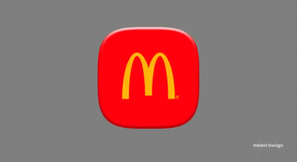
10. McDonald’s
The Golden Arches. It’s just an ‘M’, but its form, colour, and scale have made it a global beacon for fast food. A case study in consistency.
11. Uber
The simple, bold ‘U’ (and later, just the wordmark) is clean and corporate. It conveys efficiency and modernity without any fuss.
12. Google
The capital ‘G’ is composed of Google’s four core colours. It’s a container for their entire ecosystem, a simple letter with immense brand equity.
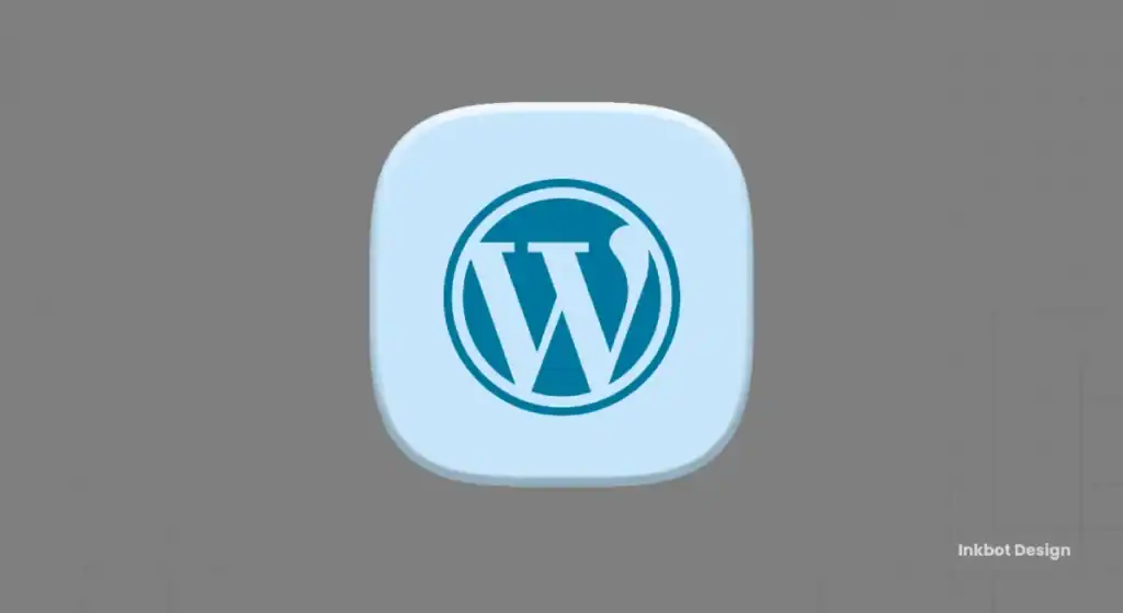
13. WordPress
The ‘W’ in a circle. It’s the symbol of web self-publishing. It is not flashy but a workhorse, just like the platform itself.
Group 3: The Mascot & The Metaphor (Giving Your Brand a Face)
Introducing a character or mascot is a high-risk, high-reward strategy. Get it right, and you create a powerful emotional connection. Get it wrong, and you look childish.
14. Duolingo
Duo, the green owl. He’s friendly, slightly passive-aggressive when you miss a lesson, and utterly unforgettable. He is the brand.
15. Slack
The original hashtag logo was a colourful mess. The new one—a collection of speech bubbles forming a pinwheel—is a cohesive symbol for communication and collaboration.
16. Evernote
An elephant. Why? Because elephants never forget. It’s a brilliant, simple mnemonic device communicating the app’s core benefits: memory and note-taking.
17. Firefox
A fox embracing the globe. It signifies speed, global reach, and a clever alternative to the status quo. It’s a visual story in one icon.
18. Mailchimp
Freddie the chimp. He’s friendly, approachable, and takes the fear out of email marketing. He gave a B2B service a B2C personality.
19. Reddit
The “Snoo” alien. It’s a simple, customisable character representing the user—a blank slate for any community or interest.
20. Tripadvisor
The owl has binocular eyes. It’s a clever visual pun: wisdom (‘wise’ owl) and looking ahead (‘binoculars’). It perfectly encapsulates the idea of a smart travel guide.
Group 4: The “Functional” Icon (Logos That Hint at Purpose)
These icons act as a visual shorthand for what the app does. They don’t spell it out literally, but give you a strong clue. This builds an intuitive user experience before the app is even opened.
21. Spotify
Those three curved lines don’t just look like sound waves; they feel like streaming audio. It’s an abstract mark that perfectly represents the service.
22. YouTube
A play button. It’s the universal symbol for “watch video.” There is zero ambiguity. It’s a call to action baked into the logo.
23. WhatsApp
A phone inside a speech bubble. It says “voice calls and messaging.” It’s almost boringly functional, which is why it works so well.
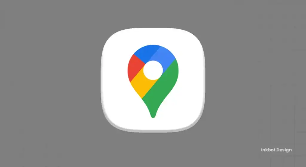
24. Google Maps
A location pin. It’s the universal symbol for “you are here” or “this is the destination.” It’s pure utility.
25. TikTok
A musical note, but distorted and layered with colour to create a sense of movement, vibration, and digital glitchiness. It feels like a modern remix.
26. Apple Clock
The icon is a functioning clock. It’s the ultimate functional design—the icon is the app’s simplest form.
27. Apple Calculator
It’s a picture of a calculator. No branding needed, just pure function. It’s a visual label that needs no translation.
28. Waze
The little ghost-car on wheels. It’s cute, friendly, and represents you, the user, navigating the chaos. It makes traffic feel like a game.
29. Shazam
Is it an ‘S’? A soundwave? A listening ear? It’s all three. A perfect functional metaphor for an app that listens to and identifies music.
Group 5: The Abstract & The Unforgettable
Some logos don’t fit into neat boxes. They are successful because of a unique combination of colour, an unusual shape, or a bold abstract concept that sticks in the mind.
30. Airbnb
The “Bélo.” It’s meant to represent people, places, and love. Pretentious explanation aside, the unique, simple, and friendly shape is compelling.

31. Pepsi
The simple red, white, and blue circle is a masterclass in abstract branding. It doesn’t show a drink; it just is Pepsi.
32. Chase Bank
The simple, blue octagon is a symbol of security and structure. It’s solid, geometric, and trustworthy—everything you want from a bank.
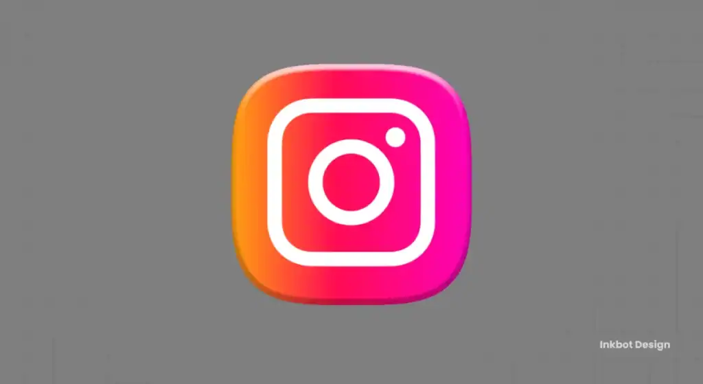
33. Instagram (New)
The controversial “sunset gradient.” People hated it at first. But it’s a vibrant, abstract representation of a camera lens, and it stands out on any screen. A recent study found that colour improves brand recognition by up to 80% [source], and this logo is proof.
34. Microsoft
Four coloured squares. It represents their different product families (Windows, Office, etc.) coming together. It’s a simple, modular “window” into their world.
35. Behance
The stark, blue square with a ‘Be’ ligature. It’s a building block. A portfolio piece. It speaks the language of designers—clean, structured, and confident.
The Redesign Minefield: A Lesson in Evolution
Your logo isn’t set in stone. But changing it is like performing surgery. It requires skill, precision, and a very good reason.
The Instagram Revolution: A Case Study in Boldness
When Instagram ditched its beloved Polaroid icon for the bright gradient, the design world screamed. But it was the right call. The app had evolved beyond a simple photo-filtering tool into a massive video and social platform. The old logo was nostalgic; the new one is vibrant, modern, and purely digital. They traded a specific metaphor for a flexible, abstract mood.
The Client Who Wanted It All
I once had a client developing a local delivery app. For their app icon, they insisted it needed to show a van (for delivery), a box (the product), a smiling person (good service), and a clock (speed).
The result? A tiny, brown-and-grey smudge. On a phone screen, it was completely indecipherable. We fought for a simple, stylised ‘D’ with a motion line. They eventually agreed after seeing mockups of their “everything” logo on a real home screen. It was a stark lesson: a logo is a symbol, not an instruction manual.
When to Evolve vs. When to Stand Firm
Evolve your logo when your business fundamentally changes or when the logo itself actively hinders your brand. Don’t change it just because you’re bored or a new design trend has emerged. Consistency builds equity. Change for the sake of change just confuses your audience.
The Brutal Truth for Your Business
What does this all mean for your startup or small business?
Your Logo Isn’t Your Whole Brand (But It’s the Front Door)
A great logo won’t save a bad product. But a bad logo can cripple a great one. It’s the first point of contact, the symbol of your quality, and the tiny graphic users will tap on daily. It has to earn that tap.
Stop Asking Your Family for Feedback
Your mum, partner, and best mate are not your target audience (unless you’re building an app for them). They will give you polite, subjective, and ultimately useless feedback.
An effective logo is not about whether someone “likes” it. It’s about whether it works. Is it simple? Is it scalable? Is it distinctive? These are not matters of opinion.
Your App Logos Must Be Professional
You wouldn’t ask your cousin who’s “good with computers” to build your app’s back-end architecture. So why would you entrust your entire visual identity—the face of your business—to an amateur?
This isn’t a sales pitch; it’s an observation from seeing hundreds of businesses make the same costly mistake. Investing in professional design isn’t a cost; it’s an investment in the single asset that represents your company everywhere it appears.
Thinking about your logo is one thing. Getting it right is another. A memorable brand identity is born from strategy, not just style. If you need a design that cuts through the noise, you should see what a professional approach looks like. Take a look at our logo design services.
When you’re ready to build a brand mark that works as hard as you do, you know where to find us. Request a quote and let’s talk.
Frequently Asked Questions (FAQs)
What is the most essential element of an app logo?
Simplicity. An app logo must be instantly recognisable at a tiny size. If it’s too complex, it becomes visual clutter and fails its primary job of being a transparent, tappable icon.
Should my app logo include the name of my company?
Generally, no. The app’s name will appear as text below the icon on the user’s home screen. Using the logo space for a potent, simple symbol is far more effective than trying to squeeze in unreadable text.
How much colour should I use in my app icon?
Use colour strategically. A unique colour or a bold gradient can make your icon stand out, like the new Instagram or Firefox logos. However, a limited, distinctive colour palette (like Facebook’s blue or Netflix’s red) is often more powerful and memorable.
How do I know if my logo is “scalable”?
Test it. Shrink it down to the size of a notification icon (around 16×16 or 24×24 pixels) and look at it on a phone screen. Is the core idea still clear? If it becomes a blurry mess, it isn’t scalable.
What is the difference between a logomark and a logotype?
A logomark is a symbol or icon (like the Apple logo). A logotype is a stylised rendering of the company name (like the Google or Coca-Cola wordmarks). For app icons, a strong logomark is almost always the better choice.
Is using a mascot in my app logo a good idea?
It can be very powerful if it fits your brand. Duolingo’s owl is a perfect example of a mascot becoming the brand itself. However, it’s a risk; a poorly designed mascot can make a serious brand feel childish or unprofessional.
How often should I redesign my app logo?
As infrequently as possible. Only consider a redesign if your business has fundamentally changed, your logo looks genuinely dated and unprofessional, or it’s not performing well functionally (e.g., it’s not scalable).
What makes a logo timeless?
Simplicity, distinctiveness, and relevance to the brand’s core idea. Timeless logos avoid fleeting design trends and focus on a clear, powerful concept that doesn’t age.
Can my app icon be different from my primary company logo?
Yes, it can be a simplified version. Many companies use a full logotype for their website or official letterhead, but use a simplified logomark (just the symbol or a single letter) for their app icon. The key is that they must feel like part of the same visual family.
What’s the most prominent mistake startups make with app logos?
Trying to make the logo explain the entire business. A logo is for identification, not explanation. The second biggest mistake is designing by committee, which leads to a weak, compromised design that pleases no one.
Does my app icon need to follow iOS or Android guidelines?
Yes, absolutely. Apple and Google have specific guidelines for icon shapes (e.g., the “squircle” for iOS, adaptive icons for Android), grid systems, and sizing. Ignoring these will make your app look unprofessional and out of place.
What if I have a great product but a bad logo?
A bad logo can limit the potential of a great product by creating a poor first impression. It suggests a lack of attention to detail. Investing in a professional logo redesign can be one of your highest-leverage marketing improvements.


