45 Typographic Logos That Prove Font Choice Is Everything
Most people are utterly lost when it comes to logo design. They’re hunting for some mythical beast—a clever symbol, a hidden arrow, a visual pun that will make a stranger on the internet nod sagely and say, “Ah, very clever.”
This is a complete waste of time.
For most businesses, especially new ones, the relentless pursuit of a pictorial mark distracts you from the single most powerful branding tool you have: your font.
A typographic logo isn’t the “simple” option. It’s the most direct. It’s confident. Its branding is stripped back to its most essential, potent form. It’s the words that say who you are, rendered in a way that says what you are.
Forget the cleverness. Clarity is what builds a business. Here are 45 typographic logos that prove it.
- Font choice is crucial: A typographic logo clearly communicates brand identity, emphasising name recognition and clarity over cleverness.
- Brand personality matters: Your logo's font must reflect a single, strong idea, aligning with your target audience and market positioning.
- Customisation is key: Great logos require refinement beyond standard fonts, ensuring uniqueness and immediate brand recognition.
Let’s Be Honest: Why You’re Probably Overthinking Your Logo

The conversations I have with entrepreneurs are depressingly similar. They’re convinced they need a symbol. An icon. A “brandmark”.
Why? Because Apple has one. Because Nike has one.
You are not Apple. You do not have Nike’s multi-billion-dollar marketing budget. This is the crucial detail everyone seems to forget.
The Myth of the “Clever” Symbol
Everyone brings up the FedEx logo. “But the arrow!” they say, eyes gleaming. “It’s hidden between the E and the x. It’s genius!”
Yes, it is clever. It’s also a happy accident that designer Lindon Leader noticed and refined. It’s the cherry, not the cake. The real power of that logo is the robust, stable, confident letterforms. It communicates reliability before you even spot the arrow.
The Nike swoosh was just a tick mark. A graphic device that cost them $35. It meant nothing. Billions in advertising, athlete endorsements, and world-class products became a symbol of victory.
For a small business, a clever symbol is a liability. Nobody knows who you are. Your primary goal is recognition. Obscuring your name with a meaningless shape is self-sabotage.
Clarity beats cleverness—every single time.
What a Typographic Logo Actually Does
A logotype isn’t just your company name written down. It’s your company’s voice, given a visual form.
Before a customer reads a single word on your website or knows your price point, the font has already spoken to them.
- It screams personality: Is your brand serious and authoritative? Playful and cheap? Elegant and exclusive? The slant of an ‘e’ or the thickness of a ‘t’ says it all.
- It establishes professionalism: A well-crafted wordmark with perfect kerning and balance signals attention to detail. It builds trust. A poorly spaced logo using a free font from a dodgy website signals amateurism.
- It’s a memory hook: Your name is the most critical thing for people to remember. A typographic logo puts it front and centre. It’s the most direct path to brand recognition.
The Masters: Typographic Logos That Set the Standard
Some brands understood this from day one. Others learned it. Designers respect these logos, not for hidden tricks but for their sheer, unapologetic clarity and character.
The Heavyweights of Clarity & Authority
1. FedEx
As we said, the cake is the typography. Based on Futura, the custom font is built to look stable, fast, and utterly dependable.
2. IBM
Paul Rand’s 8-bar slab serif is the visual definition of the computer age. It’s structured, solid, and technological. It feels like an immovable object in the best possible way.
3. NASA
The 1975 “worm” logotype is a masterpiece of modernism. Stripped of all pictorial elements, the fluid, futuristic letterforms spoke of progress and the sleekness of space travel. Its recent revival shows that pure type is timeless.
The Classics of Personality & Heritage
4. Coca-Cola
The Spencerian script is a global icon. It’s not a font; it’s a signature. It feels classic, human, and celebratory. It has flowed unchanged through decades of design trends.
5. Cadbury
Like Coke, that flowing script is unmistakable. The flourish in the lettering communicates a rich, indulgent quality. You can almost taste the chocolate. It’s an experience in a word.
6. Vogue
This is the definition of high fashion in a logo. The custom, high-contrast Didot typeface is elegance personified. The hairline-thin strokes are delicate and precise, just like the world of couture it represents.
The Modern Minimalists
7. Google
It looks so simple. But that’s the point. The custom geometric sans-serif Product Sans is intentionally friendly, clean, and accessible. It feels like “information for everyone,” which is precisely the brand’s mission.
8. Uber
The 2018 rebrand to a simple, clean wordmark was a smart move. It’s direct. No fuss. It communicates utility. It’s about efficiently getting from A to B; the logo reflects that.
9. Intel
The classic “dropped e” logo was an icon of the computer age. The modern version is simpler but still exudes tech confidence.
Deconstructing Why They Work: The Unspoken Rules of Typographic Logos
It’s not random. Great typographic logos follow a set of principles. Calling them “rules” might be strong, but ignore them at your peril.
Rule 1: One Personality Per Brand
Your font choice must project a single, focused idea. You cannot be everything to everyone. Your logo cannot be “both professional and fun.” It cannot be “modern yet traditional.” That’s how you end up with a beige, milquetoast brand that stands for nothing.
Is your brand strong and dependable? A thick, blocky slab serif might work. Is it elegant and refined? A light, high-contrast serif is a better bet. Is it friendly and accessible? A rounded sans-serif could be the answer.
I once had a client who wanted an ” authoritative logo like a bank, but creative like an artist’s studio.” I told them that’s impossible. The result of that path is always a compromise that pleases no one and is remembered by nobody.
Pick one lane.
Rule 2: Legibility is Non-Negotiable
This sounds painfully obvious, but you’d be shocked how many people get it wrong. If a potential customer has to spend more than a fraction of a second deciphering your logo, you have failed.
It must be readable. Instantly.
- On a lorry driving 70mph down the M1.
- On a tiny favicon in a browser tab.
- Embroidered on a shirt.
- It is at the bottom of a blurry Instagram story.
This is where technical skill comes in. Kerning (the space between individual letters), tracking (the overall spacing), and weight are not just jargon. They are the dials a designer turns to ensure a wordmark is perfectly balanced and readable in every situation.
Rule 3: Customisation is King
The world’s best typographic logos are rarely just a font typed out. They are customised. They start with a great typeface, and then they are refined.
This might mean subtly altering a letterform to make it unique. It could involve creating a custom ligature where two letters flow together beautifully. It might be redrawing the curves on a ‘C’ or ‘S’ to make them feel more balanced.
Straight Talk: This is where a professional designer earns their money. It’s not about knowing the name of a cool font. It’s about having the eye to see that the crossbar on a ‘t’ is 5% too heavy or that the ‘a’ and ‘n’ in a name feel disconnected.
This refinement is what elevates a good font into your brand property. It’s the difference between off-the-rack and bespoke tailoring. If you’re serious about your brand, this isn’t negotiable. Explore our logo design services to see what that process involves.
The Rogues’ Gallery: More Typographic Logos to Learn From
To drive the point home, here’s a more rapid-fire look at other logos that do the heavy lifting with type alone.
Bold & Impactful
10. The Guardian
A strong, custom serif that feels both classic and modern. Authoritative.
11. Vice
That bold, condensed graffiti-typeface speaks of raw, unfiltered news. It’s in your face.
12. Braun
Clean, simple, and functional. The typography perfectly mirrors the product design ethos.
13. Panasonic
A simple, corporate sans-serif that exudes reliability and technological confidence.
14. Stripe
Clean, minimalist, and forward-thinking. It feels secure and modern.
15. Vimeo
The slightly rounded blue type is friendly and more creative than its competitors.
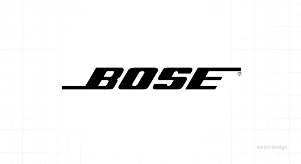
16. Bose
A bold, no-nonsense sans-serif. It feels engineered, high-performance, and confident in its sound quality.
17. Caterpillar
The big, yellow, blocky font is unmistakable and speaks of heavy machinery.
18. 3M
The simple, bold red letters instantly recognise and suggest innovation and strength.
Elegant & Sophisticated
19. Zara
A high-fashion, high-contrast serif. It looks expensive and chic.
20. Giorgio Armani
The epitome of luxury. The fine, geometric lines of the font suggest meticulous craftsmanship.
21. Calvin Klein
The iconic, clean sans-serif (often in all-caps) is minimalist and timelessly cool.
22. Tiffany & Co.
A custom serif that is the very definition of classic luxury and heritage.
23. Prada
It is a modified serif that feels sharp and intellectual, setting it apart from other fashion houses.
24. Tom Ford
A bold, uncompromising slab serif that feels masculine and luxurious.
25. Nespresso
It is a simple, elegant font that feels premium and effortless.
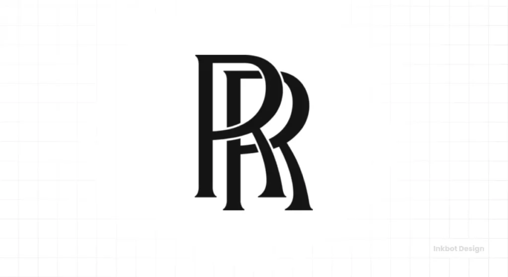
26. Rolls-Royce
The classic overlapping “R’s” monogram is the pinnacle of luxury, but the wordmark itself is a clean, elegant serif.
Quirky & Creative
27. Kellogg’s
The signature-style logo feels like it came from W.K. Kellogg himself. It communicates heritage and trust.
28. Disney
That famous “Waltograph” is pure magic and nostalgia. Instantly recognisable.
29. Fender
That flowing, rock-and-roll script is as iconic as the guitars themselves. It’s pure Americana.
30. Flickr
Simple, clean sans-serif, but using the blue and pink adds a playful, creative touch.
31. Kleenex
A soft, flowing script that perfectly communicates the gentle nature of the product.
32. Kickstarter
The rounded, chunky typeface feels friendly, optimistic, and community-focused.
33. LEGO
The bouncy, rounded font inside the red square is pure fun and playfulness.
Timeless Serifs
34. The New York Times
The custom Fraktur-style lettering is a bastion of journalistic authority and history.
35. Sony
A unique, sharp slab-serif that feels both technical and timeless. Instantly recognisable.
36. Volvo
The simple, clean serif in its iron mark speaks of safety, quality, and engineering.
37. MIT
The strong slab-serif logo designed by Muriel Cooper is a landmark of institutional branding.
38. Honda
A simple, reliable sans-serif that feels trustworthy and engineered.
39. Canon
The custom flared serif font, created in 1935, is unique and timeless. The inward-turning C is a particularly distinctive touch.
40. Gap
The classic, simple slab serif has been a retail icon for decades (despite a disastrous redesign attempt).
Clever Wordmarks
41. London Symphony Orchestra
The “LSO” letters flow together to suggest a conductor’s movement. It’s elegant and intelligent.
42. Gillette
The sharp, diagonal cut in the ‘G’ and ‘i” mimics a razor blade’s clean cut.
43. Tostitos
The two’ t’s in the middle form two people dipping a chip into a bowl of salsa (the dot of the ‘i’). It’s fun, but the base font is solid first.
44. Baskin-Robbins
The ’31’ hidden in the ‘B’ and ‘R’ is a classic, but the bouncy, fun font is what sells the ice cream.
45. Amazon
The smile/arrow from A to Z is famous but built on a solid, friendly font.
The Biggest Mistake Entrepreneurs Make with Typographic Logos
There are two massive, costly errors I see business owners make repeatedly.
Choosing a Font Based on “Liking It”
Your taste is irrelevant.
Let me say that again. It does not matter if you “like” the font.
What matters is strategy. The font you choose must align with your brand’s core message, the expectations of your target audience, and your market position. A law firm using a playful, bubbly script font is a joke. A children’s toy store using a cold, corporate typeface is a failure.
You are not the customer. The font isn’t for you. It’s a tool to communicate a specific message to a particular audience.
The Danger of “Free” Fonts
Everyone loves a freebie. However, using a “free” font for your logo is one of the most expensive mistakes you can make.
First, there’s the legal minefield. Most fonts that are “free” are only free for personal use. Using one for your commercial logo is a breach of the licensing agreement. This can lead to legal demands for thousands of pounds down the line. It happens all the time.
Second, even if it’s legally safe, it’s strategically foolish. The good “free” fonts are wildly overused. Using one guarantees your brand will look generic and amateurish. You’ll look like a hundred other startups that took the same shortcut.
Here’s the rub: Investing in a high-quality font license or, even better, in custom typographic work is not an expense. It’s an investment in the very foundation of your brand. It’s buying originality and security. If that’s a step you’re considering, you can request a quote here to understand the process.
Stop Searching for Magic. The Magic is in the Message.
A great typographic logo isn’t about the font. It’s about what the font says. It’s about having the confidence to state your name clearly and directly.
It’s a declaration. “This is who we are.”
Stop hunting for hidden arrows and clever tricks. Stop asking, “But can we make it ‘pop’ more?” That’s the language of someone who doesn’t know what they want to say.
The real question is this: Is your logo trying to be clever, or is it trying to communicate?
Only one of those builds a brand that lasts.
Frequently Asked Questions (FAQs)
What is a typographic logo?
A typographic logo, also known as a logotype or wordmark, is a logo that consists solely of the company’s name set in a specific, often customised, typeface. Examples include Coca-Cola, Google, and FedEx.
Are typographic logos better than logos with symbols?
Neither is inherently “better,” but they serve different purposes. A typographic logo is often more effective for new and small businesses because it directly builds name recognition. A symbol-based logo (like Apple’s) requires significant marketing spend for people to associate the symbol with the brand.
How do I choose the right font for my logo?
The choice should be strategic, not based on personal taste. Consider your brand’s personality (e.g., trustworthy, playful, luxurious), your target audience, and the industry you’re in. A designer can help you select a typeface that communicates the right message.
What’s the difference between a logotype and a lettermark?
A logotype or wordmark is the company’s full name (e.g., “Google”). A lettermark or monogram is a logo from the company’s initials (e.g., IBM for International Business Machines or HP for Hewlett-Packard).
Can I use a font from my computer for my logo?
You must check the font’s license. Most standard system fonts have commercial use licenses, but it’s crucial to verify. Furthermore, using a standard system font can make your brand look generic.
What is kerning, and why is it essential for a logo?
Kerning is adjusting the space between individual letters to create a visually harmonious and legible result. Poor kerning is a hallmark of amateur design and can make your logo look cheap and unprofessional.
Should my typographic logo be serif or sans-serif?
This depends entirely on the personality you want to convey.
Serif fonts (with small feet on the letters) often feel traditional, classic, authoritative, and trustworthy.
Sans-serif fonts (without the feet) typically feel modern, clean, minimalist, and approachable.
How much does a professional typographic logo cost?
Costs vary widely based on the designer’s experience and the project’s scope. It can range from a few hundred to many thousands of pounds. A key factor is whether you use a licensed font or commission fully custom lettering.
What makes a typographic logo timeless?
Timelessness usually comes from simplicity, excellent craftsmanship, and a resistance to fleeting trends. A logo with a solid, well-crafted structure that prioritises legibility over flashy effects is more likely to endure.
Do I need a custom font for my logo?
You don’t need one, but it’s a significant advantage. A custom-drawn or heavily modified wordmark is unique to your brand and cannot be replicated by competitors. It’s a powerful form of brand ownership.
Is it okay for my logo font to be different from my website font?
Yes, this is very common. Your logo is a distinct graphic element. Your website body font needs to be optimised for readability in long-form text. While they should feel cohesive and part of the same brand family, they do not need to be in the same font.
What are the biggest trends in typographic logos right now?
Current trends include a return to characterful serifs after years of minimalist sans-serifs, custom variable fonts that can change weight and width, and quirky, expressive lettering that injects more personality into brands. However, chasing trends is often a mistake; focus on what’s right for your brand strategy.
If these observations hit home, look through our other articles on branding. If you want direct, no-nonsense input on building a brand identity that works, our logo design services are for that. Let’s create something clear, not just clever.


