20 Punk Logos That Break Every Design Rule (And Why It Works)
Most logos are beige. A sea of polite, sans-serif blandness, focus-grouped into utter pointlessness. They are designed to be inoffensive. And in doing so, they become completely, utterly forgettable.
Then there’s punk.
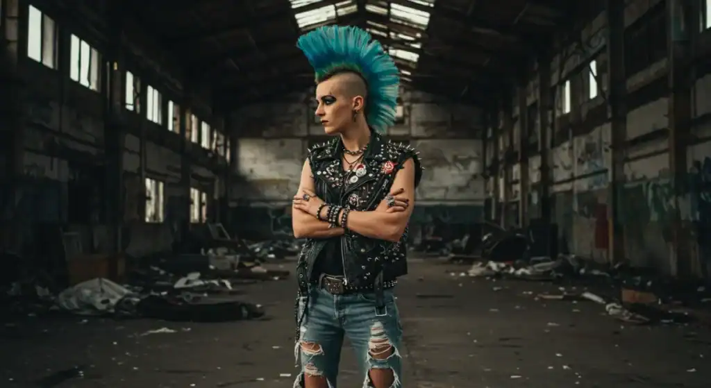
Punk logos weren’t conceived in a boardroom. They were born from necessity, slapped together with glue, markers, and photocopiers in damp basements. They were urgent, cheap, and loud. They weren’t trying to sell you anything—they were a declaration of war on the status quo.
And here’s the rub: these bands created some of the most powerful and enduring historical brand marks in their chaotic, anti-design rebellion. They teach a lesson that most entrepreneurs, obsessed with looking “professional,” are too scared to learn.
Forget the polish. It’s time to talk about impact.
- Punk logos reject corporate blandness, focusing on memorable, impactful designs that capture raw energy and rebellion.
- Clarity and authenticity are crucial; simple logos that resonate with a brand's ethos are more effective.
- Punk design used appropriation, bold typography, and DIY elements, creating a distinct visual language that challenges norms.
- Successful branding can alienate some audiences, allowing businesses to connect strongly with their true tribe.
Punk Design Was an Anti-Brand
You can’t understand the logos without understanding the ethos. This wasn’t a marketing strategy. It was a middle finger.
It Was About a Statement, Not a Sale
The punk movement reacted against the bloated, overproduced rock dinosaurs of the 70s and the slick, soulless disco gloss. It was about raw energy, direct communication, and a DIY (Do-It-Yourself) spirit that said, “We don’t need your record label, producers, or graphic designers.”
The goal wasn’t to build a “brand” in the modern sense. It was to create a symbol for a tribe, a badge of honour for the outcasts. The logo was a flag to rally behind.
The Toolkit of Rebellion: Key Visual Elements
Because it was cheap and fast, a distinct visual language emerged. You know it when you see it.
- Cut-and-Paste / Ransom Note: Taking letters from newspapers and magazines was the quickest way to create a headline. It was anarchic, messy, and perfectly captured the sound.
- Stencils & Spray Paint: You need to get your name on a wall, fast? Or on a t-shirt with no money? A stencil is your best friend. It created a look that was rough, uniform, and instantly reproducible.
- Stark, High-Contrast Black and White: Colour printing was a luxury. Black ink on white paper was the reality. This limitation became a strength, creating bold, aggressive visuals that cut through the noise.
- Appropriated & Twisted Imagery: Taking a familiar image—a presidential seal, a cartoon character, a corporate logo—and defacing it was classic punk. It was a way to subvert the mainstream and make a point without needing advanced illustration skills.
- Brutally Simple Typography: Often, the logo was just the band’s name written in a stark, angular, or aggressive font. No symbol needed. The name was the statement.
20 Punk Logos That Kicked Down the Door
Let’s get to it. No fluff. Here are the logos that mattered, and the unfiltered reason why they work.
1. Black Flag
Designed by artist Raymond Pettibon, brother of founder Greg Ginn, the Black Flag logo is just four black rectangles. It’s not a flag. It’s the idea of a flag. It’s simple, abstract, and deeply unsettling.
It’s genius because it’s so empty that it becomes full of meaning. It’s a waving flag of anarchy. It’s prison bars. It’s a void. It’s so simple you can draw it on a school desk in five seconds, and it’s instantly recognisable. Your meticulously crafted logo can’t achieve that raw, viral reach.
2. Ramones
The band’s artistic director, Arturo Vega, brilliantly parodied the Seal of the President of the United States. He replaced the olive branch with an apple tree branch (a nod to their song “Judy Is a Punk”) and the arrows with a baseball bat. The text banner reads “Hey Ho Let’s Go.”
This is how you do appropriation. It takes the ultimate symbol of the establishment and claims it for the outsiders. It’s clever, subversive, and positions the Ramones as “America’s band” on their terms. It’s a statement of intent.
3. Misfits
The iconic “Crimson Ghost” skull was lifted directly from a 1946 film serial poster. The band just took it, slapped their name, and a legend was born. I remember seeing it on a beaten-up leather jacket the first time. It was genuinely menacing.
Why create when you can steal? Pop culture is a graveyard of brilliant, forgotten imagery. The Misfits saw a perfect symbol of horror and alienation, took it, and owned it so completely that almost no one remembers the original. That’s not theft; it’s a hostile takeover.
4. Dead Kennedys
A sharp, angular monogram. The letters ‘D’ and ‘K’ are fused into a symbol that feels both corporate and corrosive. It looks like it could be the logo for a chemical company that’s poisoning the water supply.
This logo is sharp enough to cut you. Designed by artist Winston Smith, it’s a masterclass in creating a clean, simple mark dripping with menace. It’s easy to stencil and instantly recognisable. It perfectly summarises the band’s political, satirical bite.
5. Crass
A complex, circular symbol that looks like a mix of a Christian cross, a swastika, and the Union Jack, all feeding into a two-headed serpent eating itself (an Ouroboros). It’s a lot.
It looks complicated, but it was designed to be easily spray-painted with stencils. It’s a logo that contains its entire anti-fascist, anti-government, anti-religion ideology in one dense, terrifying package. It’s not just a logo; it’s a political treatise.
6. Sex Pistols
Artist Jamie Reid assembled the definitive “ransom note” logo. There is no other logo in music that so perfectly captures the sound and attitude of the band it represents. It’s chaos, blackmail, and a threat all in one.
It breaks every rule of good design, and that’s why it’s perfect. It’s intentionally ugly, hard to read, and unbalanced. It’s the visual equivalent of Johnny Rotten’s sneer. It proves that your logo doesn’t have to be pleasant; it must be true.
7. The Clash
While they used various logos, their most enduring is the military-style stencil font from their debut album, famously paired with the pink and green colours of an Elvis Presley record.
The font alone is a statement. It screams urgency, conflict, and urban decay. It’s a declaration of war. It shows that sometimes, a powerful font choice is all you need. The appropriation of the Elvis design was the masterstroke, putting them in direct lineage with the original rebel.
8. Bad Religion
The “Crossbuster.” A Christian cross with a red prohibition-style circle and slash through it. Simple. Direct. Unmistakable.
There is zero ambiguity here. You know what this band stands for—or against—in less than a second. It’s confrontational, it’s brave, and it’s a perfect filter. If this logo offends you, you are not the target audience. End of story.
9. Minor Threat
No symbol. Just the band’s name in a bold, capitalised, no-nonsense font. Often stark black on a white or red background.
This is about conviction. The name itself is the message. There’s no need for a clever symbol when your name carries all the weight. It’s a lesson in confidence. Sometimes the strongest brand mark is just your name, which is stated clearly and without apology.
10. Descendents
A nerdy, downtrodden caricature of singer Milo Aukerman. It’s the opposite of most punk bands’ tough, aggressive imagery.
It connected with a different kind of outcast: the nerd, the loser, the kid who wasn’t cool. They created a deeply loved and relatable mascot by embracing vulnerability and self-deprecation. It proves that personality can be more powerful than aggression.
11. Circle Jerks
The “Skanker” is a simple silhouette of a punk dancer created by artist Shawn Kerri. It’s a figure of pure, chaotic energy.
It captures the experience of the music. It’s not about the band; it’s about the audience. It’s a logo that says, “This is you.” They created an incredibly sticky and enduring symbol by putting their fans at the centre of their brand.
12. Buzzcocks
A clean, sharp, lowercase logotype designed by the legendary Malcolm Garrett. It feels more influenced by the Bauhaus than the Sex Pistols, but it has an undeniable energy.
Proof that punk design wasn’t always messy. This is sharp, clever, and timeless. It has the punch of punk but with a designer’s eye. It showed you could be rebellious without being sloppy, influencing decades of design.
13. The Damned
Often using a gothic, horror-film-inspired font, The Damned leaned heavily into a Hammer Horror aesthetic.
Own your niche. The Damned weren’t just a punk band; they were a gothic punk band. Their logo telegraphs that instantly. By embracing a specific genre’s visual language, they carved out a unique and memorable space for themselves.
14. Social Distortion
A skeleton in a fedora, holding a cigarette and a martini glass. “Skelly,” as he’s known, is a legend.
It tells a complete story. It’s about life, death, and having a good time. It’s a character, a mood, and a worldview in a straightforward drawing. A logo that tells a story is one that people connect with on a much deeper level.
15. The Cramps
Another band that let a heavily stylised, B-movie horror font do all the work. The letters are practically dripping with radioactive slime.
Your logo doesn’t need a separate icon if the typography is iconic. The Cramps’ logo is pure atmosphere. You see it and almost hear the reverb-drenched guitar and Lux Interior’s yelp. The font is the brand.
16. Stiff Little Fingers
An aggressive, angular logotype that looks like it was cut from sheet metal with a rusty blade.
Like The Clash and Minor Threat, SLF understood that typography can be a weapon. The logo feels angry and political, perfectly matching the band’s output about The Troubles in Northern Ireland. It’s sharp, dangerous, and effective.
17. X
A simple, bold ‘X’ with a calligraphic serif. That’s it.
The ultimate act of minimalist branding. An ‘X’ is a negation. A target. A signature for those who can’t write their name. A warning. It’s everything and nothing. It’s so brutally simple that it becomes profound. It’s a logo you can carve anywhere.
18. The Germs
A simple, solid light-blue circle. According to the band, it was supposed to be a “burn” mark, like a cigarette burn on film.
This is a lesson in imbuing a meaningless shape with powerful meaning. On its own, it’s nothing. But for fans of The Germs, the “Germs burn” became a secret symbol, a badge of belonging. It shows that community, not design, gives a logo its ultimate power.
19. The Adicts
The Adicts didn’t just have a logo; they had a whole uniform. They fully appropriated the “Droog” look from Stanley Kubrick’s A Clockwork Orange—the white overalls, the black boots, the bowler hats.
Why build a brand from scratch when you can hijack a bigger, more powerful one? They took a well-known, disturbing aesthetic and made it their own. It was a ready-made visual identity instantly recognisable and perfectly suited to their theatrical, chaotic shows.
20. Rancid
A modern classic. Rancid’s dripping, sharp logotype is a throwback to classic horror and punk, yet it has defined them for decades.
It demonstrates that the core principles haven’t changed. A great logotype, infused with the right personality—in this case, street-punk attitude and a hint of ska—is still one of the most effective branding tools you can have. It feels timeless because its roots are authentic.
So, What’s the Point for Your Business?
Right. A fun history lesson. But what does this have to do with your software-as-a-service startup or your artisan coffee shop? Everything.
Stop Chasing “Professionalism” and Start Chasing “Memorable”
The most significant disease in modern branding is the fear of being disliked. Businesses are so terrified of offending a potential customer that they sand down every interesting edge, leaving a smooth, round, useless pebble of a brand.
The goal isn’t to be “professional.” The goal is to be remembered. A polite, generic logo is invisible. A logo with guts, even if some people don’t get it, is the one that sticks.
The Three Brutal Lessons from the Mosh Pit
If you remember nothing else, remember this. The effectiveness of these logos boils down to three truths that most marketing departments have forgotten.
- Clarity Beats Complexity. A simple idea, brutally executed, always wins. The Black Flag bars. The DK symbol. The X. They are memorable because they are simple. Can a customer draw your logo from memory after seeing it once? If the answer is no, it’s too complicated.
- Authenticity is Your Only Weapon. These logos were not fake. They directly reflected the band’s sound, ethos, and soul. Your branding has to be an honest reflection of who you are. Don’t use a gritty, raw logo if you’re a corporate law firm. And don’t use a clean, soulless logo if you’re trying to start a revolution. Your brand’s weirdness is its greatest asset.
- It’s Okay if People Hate It. A great logo is a filter. It signals to the right people, “you belong here.” And it signals to the wrong people, “This is not for you.” Stop trying to please everyone. The Misfits skull wasn’t for soccer mums. It was for the Misfits’ tribe. Define your tribe, and create a symbol for them and them alone.
If you find your brand identity too safe, polite, or forgettable, maybe it’s time to think less like a corporation and more like four teenagers with a photocopier. That’s where the real magic happens. If you need help finding that raw, authentic edge, that’s what our logo design services are for.
Final Thought: Don’t Copy the Style. Steal the Mindset.
A final, crucial warning. Do not slap a ransom-note font on your new accounting app. That’s just being a poser. It’s the kind of inauthentic nonsense that punk was fighting against in the first place.
The lesson here isn’t to copy the aesthetic of punk. It’s to steal the mindset.
Be bold. Be simple. Be relentlessly, unapologetically you.
The question isn’t whether your logo looks like something on this list. The real question is: does it have the guts?
Need a brand with guts? Request a quote and let’s talk.
Frequently Asked Questions (FAQs)
What defines a punk logo?
A punk logo is typically characterised by a DIY (Do-It-Yourself) ethos. Common elements include high-contrast black and white, stencil or ransom-note typography, appropriated imagery, and brutally simple symbols. The focus is on immediate impact and raw energy over polished perfection.
Who designed the iconic Black Flag logo?
The Black Flag logo was created by artist Raymond Pettibon, the brother of the band’s founder, Greg Ginn.
What is the story behind the Ramones’ logo?
The band’s creative director, Arturo Vega, designed it as a parody of the US Presidential Seal. He wanted to portray the Ramones as an all-American band, replacing the seal’s traditional elements with things relevant to the band, like a baseball bat.
Where did the Misfits’ skull logo come from?
The “Crimson Ghost” skull was lifted from the poster of a 1946 horror film serial of the same name. The band appropriated the image, and it became their signature mark.
Why do so many punk logos use stencils or messy fonts?
This aesthetic was born from necessity. Stencils were a cheap and easy way to reproduce a logo on walls, t-shirts, and flyers. The “ransom note” style, using cut-up letters, was a quick way to create text without needing professional typesetting, and it perfectly captured the anarchic feel of the music.
What is the “Crossbuster” logo?
The “Crossbuster” is the logo for the band Bad Religion. It features a black Christian cross with a red universal prohibition sign (a circle with a slash), symbolising their anti-authoritarian and anti-religious stance.
Can a modern business use a punk-inspired logo?
It depends entirely on the brand’s authenticity. It could work if your business embodies a rebellious, unconventional, or DIY ethos. However, a “punk” logo for a conventional business like a bank would feel inauthentic and likely backfire. The key is to adopt the mindset (boldness, simplicity, authenticity), not just the style.
What’s the simplest punk logo?
The logos for X (a calligraphic X) and The Germs (a blue circle) are arguably the simplest. Their power comes from the meaning invested in them by the band and their community, not from complex design.
Who was Jamie Reid?
Jamie Reid was a British artist famous for his work with the Sex Pistols. He created their iconic ransom-note logotype and the “God Save the Queen” artwork, which defined the visual style of British punk.
What can small businesses learn from punk branding?
The biggest lessons are: 1) Be memorable, not just professional. 2) Simplicity is more straightforward to recall. 3) Authenticity connects with an audience more than polish. 4) Don’t be afraid to alienate some people to create a passionate tribe of followers.
Is the punk aesthetic still relevant in 2025?
The raw punk aesthetic cycles in and out of fashion, but its core principles—authenticity, simplicity, and a strong point of view—are more relevant than ever in a crowded, noisy marketplace.
Didn’t you forget [My Favourite Punk Band]?
Almost certainly. A list of 20 is bound to miss some classics. The logos chosen represent key lessons in branding and a wide range of styles within the punk ethos. Think of it as a starting point, not a definitive encyclopedia.


