How to Create a Killer Brand Guide (With Examples)
You’re scrolling through your feed, and BAM! You instantly know it’s an Apple ad without even seeing the logo. That’s the power of a rock-solid brand guide in action.
It’s not magic. It’s not luck. It’s deliberate, strategic branding.
However, most businesses are messing it up royally.
They’re out there, flailing around with inconsistent messaging, flip-flopping brand colours, and a personality that changes more often than a teenager’s Instagram bio.
Result? They blend into the background noise, forgotten just as quickly as last week’s memes.
But not you. Not after today.
In this post, we will create a brand guide to help your business stick in people’s minds, much like that annoyingly catchy pop song you can’t shake off.
These are just actionable steps to craft a brand identity that’ll have your competitors furiously taking notes.
Ready to stand out like a peacock in a chicken coop? Let’s dive in.
- A brand guide is essential for maintaining consistency, which builds trust and fosters loyalty among customers.
- It defines your brand's identity through vital elements like logo usage, colour palette, and brand voice.
- Effective guidelines help align all team members, ensuring that everyone communicates and represents the brand consistently.
- Regularly update your brand guide to reflect brand evolution and maintain relevance in a fast-moving market.
What is a Brand Guide Anyway?
A brand guide is your business’s bible.
The rulebook defines how your brand looks, speaks and behaves across all touchpoints.
Think of it as your brand’s personality on paper.
It covers everything from your logo usage to your brand voice, ensuring consistency, whether slapping your brand on a billboard or firing off a cheeky social post.
Why should you give a toss?
Simple:
- Consistency builds trust
- Trust builds loyalty
- Loyalty builds profit
A solid brand guide keeps everyone on the same page, from your intern to your CEO. No more rogue designers going off-piste with your logo or copywriters butchering your brand voice.
The Core Elements of a Fantastic Brand Guide
Right, let’s break this down into bite-sized chunks. Here’s what we’re covering:
- Brand Story & Values
- Target Audience
- Brand Personality
- Logo Usage
- Colour Palette
- Typography
- Imagery Style
- Accessibility: Don’t Shut People Out
- Brand Voice & Tone
- Social Media Guidelines
Strap in. We’re about to turn your brand from forgettable to unforgettable.
1. Brand Story & Values: The Heart of Your Identity

Your brand story isn’t some “once upon a time” fairy tale.
It’s the reason you exist.
The problem you solve.
The change you want to make in the world.
Here’s how to nail it:
- Start with your ‘why’. What drove you to start this business?
- Identify the problem you’re solving. What keeps your customers up at night?
- Articulate your solution. How do you make their lives better?
- Define your values. What principles guide your decisions?
Example:
“At GreenGrow, everyone deserves access to fresh, organic produce. Born from our founder’s struggle to find affordable, healthy food, we aim to make organic farming accessible to urban communities. Our sustainability, community, and education values drive everything we do.”
Pro Tip: Keep it accurate. Customers can smell BS from a mile away. If your story doesn’t feel authentic, bin it and start again.
2. Target Audience: Know Your People
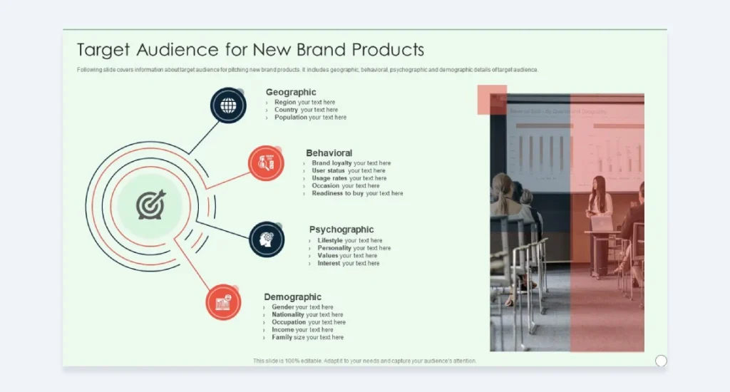
You can’t be everything to everyone.
Trying to please everyone is a surefire way to please no one.
Define your ideal customer with laser precision:
- Demographics: Age, gender, location, income
- Psychographics: Values, interests, lifestyle
- Pain points: What problems do they face?
- Goals: What are they trying to achieve?
Create buyer personas. Give them names, backstories, hopes, and fears.
Example:
“Meet Eco-Emma: A 28-year-old urban professional who’s health-conscious and environmentally aware. She’s time-poor but wants to make sustainable choices. Her biggest challenge is finding affordable organic produce that doesn’t require a trip to a specialist store.”
Remember: Your brand should speak directly to these personas. Every decision you make should be filtered through the lens of “Would this resonate with Eco-Emma?”
3. Brand Personality: Give Your Brand Some Character

If your brand were a person, who would it be?
Are you the wise mentor? The cheeky upstart? The no-nonsense straight shooter?
Defining your brand personality enables you to connect with your audience on a more personal level.
Choose 3-5 personality traits that define your brand. Then, for each trait, explain what it means for your brand and what it doesn’t mean.
Example:
Innovative:
- We are: Forward-thinking, creative, constantly pushing boundaries
- We’re not: Reckless; change for the sake of change
Approachable:
- We are: Friendly, down-to-earth, easy to understand
- We’re not: Overly casual, unprofessional
Trustworthy:
- We are: Reliable, transparent, and experts in our field
- We’re not: Stuffy, overly formal, know-it-alls
This framework provides your team with clear guidelines on embodying your brand’s personality in every interaction.
Look, if you want a shortcut, use archetypes.
It’s a total cheat code for personality. Seriously.
Thing is, these aren’t some new-age marketing fad.
They’re classic characters that are deeply ingrained in our brains.
Everyone just gets them instantly.
You’ve got The Hero, The Jester, The Sage… a whole dozen of them.
Picking one gives you an instant, recognisable personality. It’s that simple.
Nike? They’re the Hero, all day long.
It’s about winning, overcoming odds, and pushing limits.
Every single ad screams it.
Innocent Drinks? The Innocent.
Pure, simple, a bit naive, and totally optimistic.
It’s baked into their name, their packaging, everything they do.
And what about Dove? They’re The Caregiver.
Nurturing, supportive, making you feel good about yourself.
You feel it in their campaigns.
See how it works? It gives you a north star.
Pick your archetype.
Define what it means for you.
Then, every ad, every social post, and every email reinforces that same character.
It makes you consistent without even having to think about it.
4. Logo Usage: How to Present Yourself
Your logo is often the first thing people see. It’s your visual handshake, your stamp of quality.
Don’t let people mess it up.
Your brand guide should cover:
- Minimum size requirements
- Clear space rules
- Colour variations (full colour, black, white, etc.)
- Do’s and don’ts (e.g., don’t stretch, don’t change colours)
Example:
“Our logo should always have a minimum clear space equal to the height of the ‘G’ in our wordmark. Never use the logo smaller than 1 inch wide for print or 100 pixels for digital. The logo may be used in primary green or black/white, depending on the background. Never alter the proportions or apply effects like shadows or gradients.”
Pro Tip: Include visual examples of correct and incorrect logo usage—a picture’s worth a thousand words, especially when it comes to design guidelines.
5. Colour Palette: Paint Your Brand’s Personality

Colours evoke emotions.
Choose wisely.
Your brand guide should define the following:
- Primary colours (usually 1-2)
- Secondary colours (2-3)
- Accent colours (1-2)
For each colour, provide:
- Hex codes
- RGB values
- CMYK values
- Pantone numbers (for print)
Example:
Primary Green:
- Hex: #00A86B
- RGB: 0, 168, 107
- CMYK: 100, 0, 36, 34
- Pantone: 3405 C
Secondary Blue:
- Hex: #0077BE
- RGB: 0, 119, 190
- CMYK: 100, 37, 0, 25
- Pantone: 3005 C
Accent Orange:
- Hex: #FFA500
- RGB: 255, 165, 0
- CMYK: 0, 35, 100, 0
- Pantone: 144 C
Include guidelines on colour usage. Which colours should be dominant? Which are for accents only? How should they be paired?
Remember: Consistency is critical. Use your colours consistently across all touchpoints to build brand recognition.
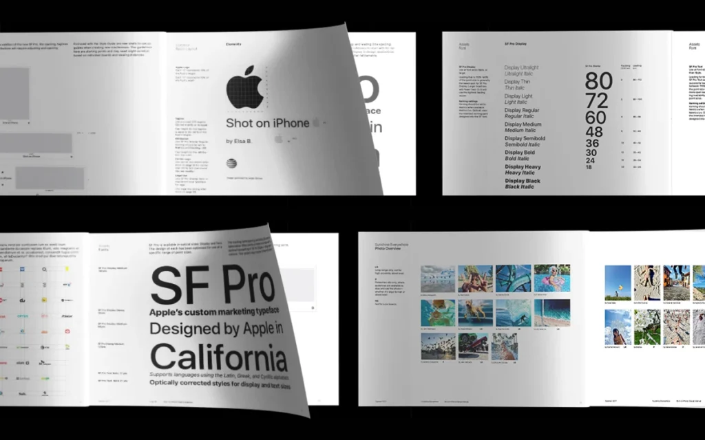
6. Typography: Words Have a Look Too
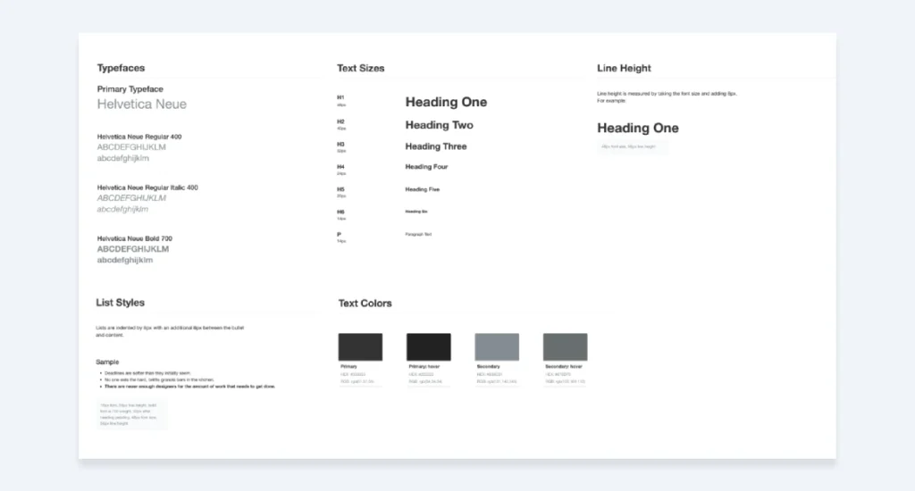
Typography is more than just selecting a visually appealing font.
It’s about readability, hierarchy, and brand personality.
Your brand guide should define the following:
- Primary typeface
- Secondary typeface
- Web-safe alternatives
- Font sizes for different uses (headers, body text, captions)
- Line spacing guidelines
Example:
Primary Typeface: Montserrat
- Use for headlines and subheaders
- Weights: Regular, Semi-Bold, Bold
Secondary Typeface: Open Sans
- Use for body copy and long-form content
- Weights: Light, Regular, Italic
Web-safe Alternative: Arial
Header 1: 36px, Montserrat Bold
Header 2: 24px, Montserrat Semi-Bold
Body Text: 16px, Open Sans Regular
Line Height: 1.5
Pro Tip: Select fonts that are easily readable across various devices and screen sizes. What looks great on your 27-inch monitor might appear as a squinty mess on your mobile device.
7. Imagery Style: A Picture’s Worth a Thousand Words
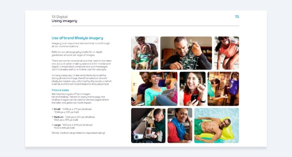
Images speak louder than words.
Make sure yours are on-brand.
Define guidelines for:
- Photography style (e.g., candid vs. posed, bright vs. moody)
- Illustration style
- Iconography
- Image treatments (e.g., filters, overlays)
Example:
“Our imagery should feel natural and authentic. We prefer candid shots of people interacting with our products in real-world settings. Avoid overly staged or studio shots. Our colour palette should be reflected in our imagery, with a preference for shots with natural greenery or urban gardens.
Icons should be simple, line-based designs using our primary green colour. Illustrations should have a hand-drawn feel, using our secondary colour palette.”
Include visual examples of on-brand and off-brand imagery. This gives your team a precise reference point when selecting or creating visuals.
8. Accessibility: Don’t Shut People Out
Right, listen up. This is a significant issue, and most businesses are getting it significantly wrong.
Your brand can look amazing, but if a chunk of your audience can’t read it or use your website, you’ve failed.
Simple as that.
This isn’t about being ‘woke’ or ticking boxes.
It’s about not slamming the door in the faces of potential customers who want to give you their money.
It’s just good business.
Your brand guide needs some dead-simple accessibility rules. Nail these two things down:
1. Colour Contrast
Don’t make people strain their eyes.
Make sure your text is readable against its background.
The official guideline (WCAG AA) is a contrast ratio of at least 4.5:1.
Don’t know what that means? Couldn’t care less.
There are free tools online that check it for you in two seconds.
Just Google ‘colour contrast checker’.
Your guide must show which colour combos are safe to use for text and which are a definite no-go.
Lay it out visually.
Make it impossible to get wrong.
2. Typography That Actually Works
That cool, wispy font might look arty on a designer’s screen, but if your customers have to squint to read it, bin it.
Immediately.
Your guide must specify a minimum font size for body text.
For anything on the web, 16px is a solid baseline.
Anything less is asking for trouble.
Choose fonts for readability first, style second.
This isn’t your personal art project; it’s a business designed to communicate.
Get this stuff documented.
It shows you actually give a damn about your entire audience, not just the ones with 20/20 vision.
9. Brand Voice & Tone: How You Say It Matters

Your brand voice is your personality in words.
It’s about communicating consistently across all channels.
Define:
- Voice characteristics (e.g., friendly, authoritative, playful)
- Tone variations for different situations
- Writing style guidelines
Example:
Voice Characteristics:
- Knowledgeable but not preachy
- Friendly and approachable
- Passionate about sustainability
Tone Variations:
- Social media: Casual and engaging
- Blog posts: Informative and slightly more formal
- Customer service: Empathetic and solution-oriented
Writing Style:
- Use active voice
- Keep sentences short and punchy
- Avoid jargon – explain complex topics in simple terms
- Use “we” to refer to the company, “you” to address the reader
- Grammar and Punctuation: Settle the small stuff that causes big arguments. Do we use the Oxford comma? Are headlines in title case or sentence case? Decide, write it down, and stick to it.
- Brand Terminology: Got your own product names or weird internal words? List them. Make it clear how to write them. Is it ‘GreenGrow’, ‘Greengrow’, or ‘green grow’? Don’t let your team guess.
- Words to Use & Avoid: This is a game-changer. Create two simple columns. For example: Use ‘team’ instead of ’employees’. Use ‘investment’ instead of ‘price’. Avoid tired corporate waffle like ‘synergy’ or ‘blue-sky thinking’. It just makes you sound like everyone else.
Pro Tip: Include examples of your brand voice in action. Show how the same message would be communicated across different channels or to various audiences.
10. Social Media Guidelines: Don’t Let Your Interns Run Wild

Social media is often the front line of your brand.
Don’t mess it up.
Your guide should cover:
- Platform-specific guidelines
- Content types and ratios
- Hashtag usage
- Engagement policies
- Crisis management
Example:
Instagram:
- Post daily, focus on visually striking images of our products in use
- Use a mix of product shots (40%), user-generated content (30%), and educational infographics (30%)
- Always use our branded hashtag #GreenGrowGoodness
- Respond to comments within 2 hours during business hours
X (Twitter):
- Post 3-5 times daily
- Share industry news and quick tips, and engage in relevant conversations
- Use no more than two hashtags per post
- Retweet (or whatever it’s called now) positive customer experiences
Crisis Management:
- Never engage with trolls or respond emotionally to negative comments
- For serious issues, direct users to our customer service email
- Any potential PR crises should be escalated to management immediately.
Remember: Social media moves fast. Your guidelines should be clear enough to inform quick decisions but flexible enough to accommodate timely and relevant content.
Putting It All Together: Your Brand Guide in Action
Right, you’ve got all the pieces.
Now what?
- Compile everything into a single, easily accessible document.
- Make it visual. Use examples, colour swatches, and imagery to illustrate your points.
- Keep it living. Your brand guide should evolve as your business grows.
- Share it widely. Everyone in your organisation should be aware of its existence and know how to access it.
Here’s the kicker: A brand guide is useless if it’s not used.
Make it part of your onboarding process. Reference it in meetings. Use it to justify design and marketing decisions.
Your brand guide isn’t just a document – it’s a tool for building a more substantial, more cohesive business.
The Bottom Line: Your Brand Guide is Your Secret Weapon
Creating a killer brand guide isn’t just some fancy exercise for big corporations with bloated marketing budgets.
It’s your secret weapon for standing out in a crowded market.
It’s how you turn casual browsers into raving fans.
It’s about building a business that’s more than just a logo slapped on a product.
So don’t half-ass it.
Put in the work to define your brand correctly.
Document it.
And seriously, use it consistently.
Your future self (and your bank account) will thank you.
Now, go forth and build a brand that makes your competitors weep.
FAQs: Your Burning Brand Guide Questions Answered
How long should my brand guide be?
There’s no one-size-fits-all answer, but aim for a comprehensive yet concise approach. Most effective brand guides are between 20-50 pages.
Do I need a brand guide if I’m just starting?
Absolutely. It’s never too early to define your brand. Start with the basics and expand as you grow.
How often should I update my brand guide?
Review it annually at a minimum. Update it whenever significant changes to your brand strategy or visual identity exist.
Who should be involved in creating the brand guide?
Ideally, it’s a collaborative effort involving leadership, marketing, design, and customer-facing teams.
Can I create a brand guide myself, or should I hire a professional?
While professionals can bring expertise, you can create a solid initial guide on your own. Just be prepared to invest time in research and refinement.
How do I ensure my team uses the brand guide?
Make it easily accessible, reference it regularly, and consider creating a quick-reference version for day-to-day use.
What if my brand evolves? Do I need to start from scratch?
Not at all. Your brand guide should be a living document. Update relevant sections as your brand evolves.
Is a brand guide the same as a style guide?
Not quite. A brand guide is more comprehensive, covering brand strategy and personality. A style guide typically focuses on visual and writing styles.
How detailed should my colour palette be?
Include all necessary colour codes (HEX, RGB, CMYK, Pantone) for each colour in your palette. Also, guide colour usage and combinations.
Should I include examples of competitor branding in my guide?
It can be helpful to include examples of what your brand is not. Just be careful not to infringe on any copyrights.
How do I distribute my brand guide to my team?
Consider using a cloud-based platform for easy access and updates. Ensure everyone knows where to find it and how to use it.
What’s the most significant mistake people make with brand guides?
Creating them and then letting them gather dust. Your brand guide should be a living, breathing document that is regularly referenced and updated.


