How to Create a Brand Style Guide Without Spending a Fortune
Have you ever walked into a party and instantly knew who the host was?
They weren’t wearing a name tag. They didn’t have a flashing sign above their head.
But something about their energy, style, and how they moved through the room just screamed, “I’m in charge here”.
That’s what a strong brand does for your business.
And a brand style guide? It’s the secret sauce that makes sure your brand shows up to every party (or, you know, marketing channel) looking and feeling exactly like the boss it is.
I learned this the hard way.
When I started my first business, I thought branding was just for the big boys—the Coca-Colas and Nikes of the world.
Boy, was I wrong?
We were all over the place. One day, our social media was cracking jokes; the next, we sounded like a stuffy corporate memo. Our logo changed more often than I change my socks (and trust me, that’s saying something).
It was a mess.
And our customers? They were confused.
Confused customers don’t buy.
That’s when I realised we needed a brand style guide—a rulebook for our brand’s personality.
Now, I’m not going to lie to you. Creating a brand style guide isn’t a walk in the park. But it’s not rocket science, either.
And the payoff? Massive.
In this post, I will walk you through creating a killer brand style guide, even if you’re on a shoestring budget. Even if the closest you’ve come to design is picking out your outfit in the morning.
Ready to give your brand the clarity and consistency it deserves? Let’s get stuck in.
🔰 TL;DR: A brand style guide is your secret weapon for consistent, powerful branding. This post walks you through creating one step-by-step, from defining your brand’s personality to choosing colours and fonts. You’ll learn how to craft a guide that keeps your brand on point across all channels without breaking the bank or needing a design degree. Let’s dive in and give your brand the clarity it deserves.
- A brand style guide ensures consistency in your brand's look, sound, and feel across all platforms.
- It saves time by avoiding discrepancies in branding efforts and empowers teams to create on-brand materials.
- Establishing brand personality is crucial; define your 'why', core values, target audience, and brand voice.
- Your visual identity must be clear, including logo, colour palette, typography, and imagery styles for recognition.
- Regularly review and update the style guide to ensure it evolves alongside your brand's needs.
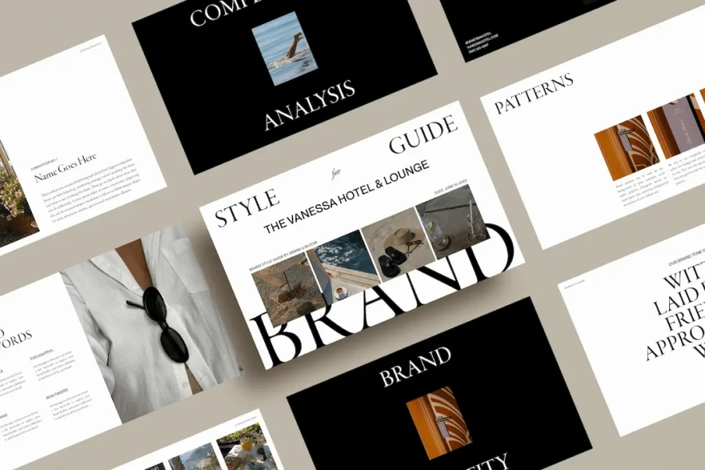
What is a Brand Style Guide Anyway?
Before diving into the nitty-gritty, let’s clarify what we discuss here.
A brand style guide is like your brand’s Bible. Its constitution. Its ‘rules of the game’.
It’s a document that outlines exactly how your brand should look, sound, and feel across all touchpoints.
Think of it as a manual for your brand’s personality.
It covers things like:
- Your brand’s mission and values
- Your visual identity (logo, colours, fonts)
- Your brand voice and tone
- How to use your brand elements
You might be thinking, “That sounds like a lot of faff. Do I need all that?”
Short answer? Yes. Yes, you do.
Here’s why:
- Consistency is key: A style guide ensures your brand looks and sounds the same everywhere. This builds trust and recognition.
- It saves time: No more debates about which shade of blue to use or whether that social post sounds “on-brand”.
- It empowers your team: Everyone can confidently create on-brand materials without constant hand-holding.
- It impresses clients and partners: A solid style guide shows you’re professional and have your sh*t together.
- It makes scaling easier: As you grow, your style guide keeps your brand intact, even with new team members.
Still not convinced? Let me throw some numbers at you:
According to a 2023 study by Lucidpress, consistent brand presentation across all platforms can increase revenue by up to 33%.
Another study found that 94% of consumers will likely be loyal to a brand that offers complete transparency.
Your brand style guide? It’s your ticket to that consistency and transparency.
So, now that we’re on the same page about why you need a brand style guide let’s talk about how to create one that doesn’t suck.
Step 1: Define Your Brand’s Personality

First things first, we need to figure out who your brand is.
I’m not talking about your products or services here. I’m talking about your brand’s personality.
If your brand was a person, who would they be?
- Are they the life of the party or more of a quiet intellectual?
- Do they speak in snappy one-liners or thoughtful paragraphs?
- Are they a rebel or a peacemaker?
This isn’t just fluffy marketing speak. It’s crucial stuff.
Your brand personality will guide everything else in your style guide.
Here’s how to nail it down:
1. Start with Your ‘Why’
Simon Sinek bangs on about this for a reason. Your ‘why’ is the foundation of your brand.
- Why does your business exist?
- What problem are you solving?
- What gets you out of bed in the morning?
Write it down. Make it concise. This is your brand’s North Star.
2. Define Your Core Values
What principles guide your business decisions?
Are you all about innovation? Sustainability? Luxury?
Pick 3-5 core values that truly represent what you stand for.
3. Identify Your Target Audience
Who are you talking to?
Get specific here. “Everyone” is not a target audience.
- How old are they?
- What do they care about?
- What problems do they have that you can solve?
4. Craft Your Brand Voice
How should your brand sound based on your “why,” values, and audience?
Are you:
- Formal or casual?
- Serious or playful?
- Technical or simple?
Create a list of words that describe your brand voice. And a list of words you’d never use.
5. Create a Brand Persona
Now, bring it all together into a brand persona.
Give your brand a name, an age, a backstory.
What would they wear? What music do they listen to?
This may feel silly, but trust me, it works. It makes it much easier for everyone to understand and embody your brand personality.
Remember, your brand personality should be:
- Authentic: Don’t try to be something you’re not.
- Consistent: Your personality should shine through in everything you do.
- Distinctive: In a sea of sameness, what makes you stand out?
Get this right, and the rest of your style guide will flow much more quickly.
Step 2: Nail Your Visual Identity
Right now, we’re getting to the fun part. (Well, I think it’s fun. But I’m a branding nerd.)
Your visual identity is what people see when they interact with your brand. It’s your brand’s face if you will.
Get this wrong, and you’ll look like a dog’s dinner. Get it right, and you’ll be more recognisable than the Golden Arches.
Here’s what you need to sort out:
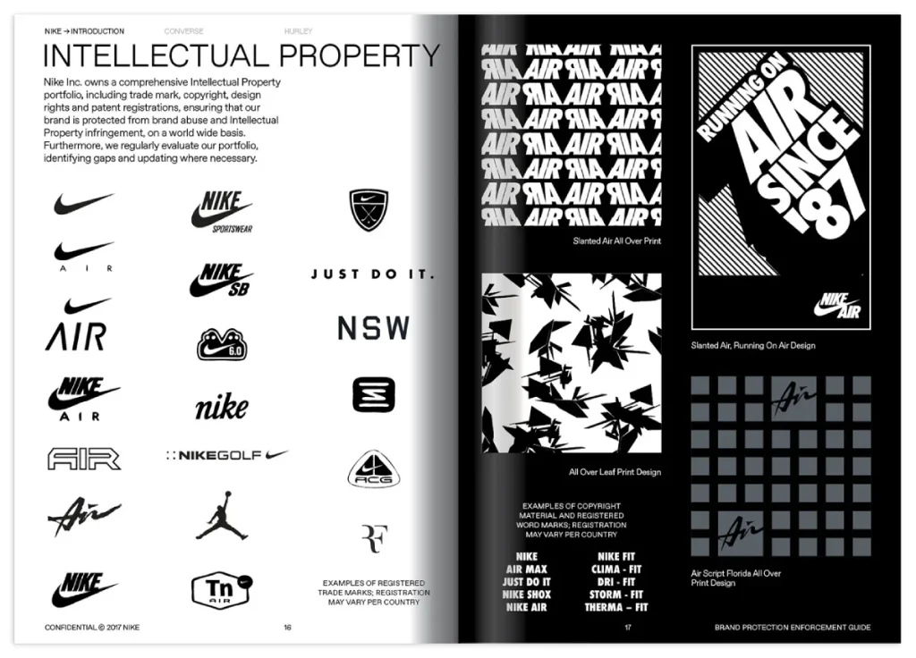
1. Your Logo
Your logo is the face of your brand. It’s what people will remember when they think of you.
I’m not saying you need to spend thousands on a fancy design agency. But please, for the love of all that is holy, don’t use ClipArt.
Here are a few tips:
- Keep it simple. The best logos are often the simplest.
- Make sure it works in black and white.
- Create variations (full colour, black, white, icon only).
- Define clear space around your logo.
📌 Pro Tip: Include examples of how NOT to use your logo. Trust me, someone will try to stretch it, recolour it, or slap it on a busy background if you don’t explicitly tell them not to.
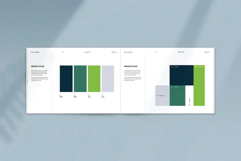
2. Your Colour Palette
Colours evoke emotions. Choose wisely.
- Pick a primary colour that represents your brand’s personality.
- Choose 2-3 complementary colours.
- Include neutral colours for backgrounds and text.
For each colour, define:
- The hex code
- RGB values
- CMYK values (for print)
And please, for the love of all that is good and pure in this world, use colour psychology.
Don’t just pick colours because they look pretty. Choose colours that mean something to your brand and your audience.
3. Your Typography
Fonts matter. A lot.
Choose:
- A primary font for headings
- A secondary font for body text
- A tertiary font for accents (if needed)
Define:
- Font sizes for different heading levels
- Line spacing
- Letter spacing
And remember: legibility trumps everything. That funky handwritten font might look cool, but what’s the point if no one can read it?
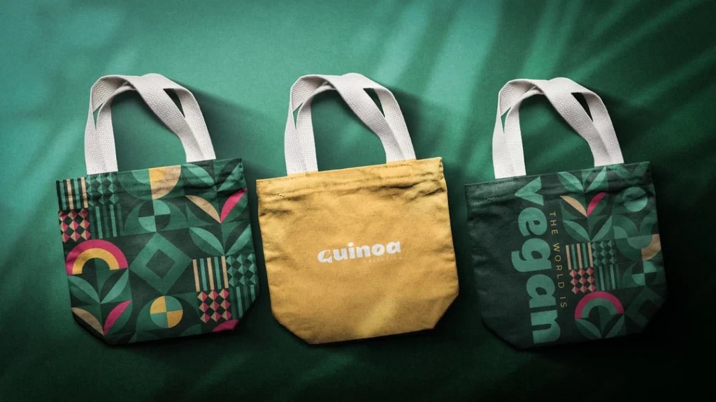
4. Your Imagery Style
What kind of images represent your brand?
- Photographs or illustrations?
- Bright and colourful or muted and subtle?
- People-focused or product-focused?
Define guidelines for:
- Image selection
- Filters or editing styles
- Image placement
5. Your Iconography
If you use icons, keep them consistent.
- Choose a style (filled, outlined, flat, 3D)
- Define sizes and colours
- Create guidelines for when and how to use them
Remember, your visual identity should:
- Reflect your brand personality: Don’t use stuffy corporate blues and greys if you’re a fun, quirky brand.
- Be versatile: It should work across all mediums, from business cards to billboards.
- Be timeless: Trends come and go. Your brand should stand the test of time.
Get your visual identity right, and you’ll be halfway to a killer brand style guide.
Step 3: Find Your Voice
Right, we’ve sorted out how your brand looks. Now, let’s talk about how it sounds.
Your brand voice is crucial. It’s what makes you sound like you and not some faceless corporation.
Get this wrong, and you’ll sound about as authentic as a politician’s promise.
Get it right, and your audience will feel like chatting with an old friend.
Here’s how to nail your brand voice:
1. Define Your Tone
Your tone is the attitude behind your words. It’s not what you say but how you say it.
Are you:
- Friendly and casual?
- Professional and authoritative?
- Witty and irreverent?
Choose 3-5 words that describe your tone. And 3-5 words that definitely don’t describe it.
2. Create a Voice Chart
A voice chart helps you understand how your brand sounds in different situations.
For example:
| We are | We are not |
| Confident | Arrogant |
| Helpful | Pushy |
| Innovative | Reckless |
This gives your team a quick reference for how to communicate.
3. Develop Writing Guidelines
Now, get specific about how your brand writes:
- Sentence structure: Short and punchy or long and detailed?
- Vocabulary: Simple or technical? Any words to avoid?
- Punctuation: Do you use exclamation marks? Ellipses?
- Emojis and slang: Yes or no? If yes, which ones?
4. Create Brand-Specific Terms
Do you have any unique terms or phrases associated with your brand?
List them out, along with their definitions and how to use them.
5. Provide Examples
Show, don’t just tell.
Give examples of your brand voice in action:
- Social media posts
- Email subject lines
- Product descriptions
- Customer service responses
And provide examples of what not to do, too.
Remember, your brand voice should be:
- Consistent: Regardless of the channel, it should sound like the same person is talking.
- Authentic: It should reflect your brand’s true personality, not what you think people want to hear.
- Adaptable: It should be able to flex slightly for different audiences or situations without losing its core identity.
Get your brand voice right, and your audience will feel like they know you. And people buy from brands they know and trust.
Step 4: Put It All Together
Right, we’ve got all the pieces. Now, it’s time to assemble them into a proper style guide.
This is where the magic happens. All your hard work comes together into a document that’ll keep your brand on track for years.
Here’s how to structure your style guide:
1. Introduction
Start with a brief overview of the style guide and why it’s essential.
Include:
- Your brand’s mission statement
- Your core values
- A summary of your brand personality
2. Logo Guidelines
Provide details on how to use (and not use) your logo.
Include:
- All variations of your logo
- Minimum size requirements
- Clear space rules
- Do’s and don’ts of logo usage
3. Colour Palette
List all your brand colours and their values.
For each colour, provide:
- Hex code
- RGB values
- CMYK values
- Pantone number (if applicable)
Include examples of colour combinations and usage guidelines.
4. Typography
Detail your font choices and how to use them.
Include:
- Primary and secondary fonts
- Font sizes for different purposes
- Line spacing and kerning guidelines
- Examples of typographic hierarchy
5. Imagery
Provide guidelines for selecting and using images.
Include:
- Preferred style of photography or illustration
- Image treatment guidelines (filters, cropping, etc.)
- Examples of on-brand and off-brand imagery
6. Brand Voice
Detail how your brand communicates.
Include:
- The tone of voice guidelines
- Writing style tips
- Brand-specific terminology
- Examples of on-brand copy for different channels
7. Applications
Show how all these elements come together in real-world applications.
Include examples of:
- Business cards
- Letterheads
- Social media posts
- Website design
- Product packaging
8. Do’s and Don’ts
Summarise key points with clear examples of what to do and what not to do.
This section is crucial. It’s where you prevent those “What were they thinking?” moments.
Remember, your style guide should be:
- Clear: Anyone should be able to understand and apply it.
- Comprehensive: It should cover all aspects of your brand.
- Flexible: It should allow for creativity within set boundaries.
- Accessible: Make sure everyone who needs it can easily access it.
And here’s a pro tip: Make it digital.
A PDF is fine, but a web-based style guide is even better. It’s easier to update and ensures everyone always has the latest version.
Step 5: Implement and Evolve
Congratulations! You’ve created your brand style guide.
Pop the champagne! Break out the party hats! Do a little dance!
… all right, celebration over. Now, the real work begins.
Creating your style guide is only half the battle. The other half? Getting people to use it.
Here’s how to make sure your shiny new style guide doesn’t just gather digital dust:
1. Train Your Team
Don’t just email out the style guide; hope for the best.
Hold a training session. Walk through the guide. Explain the reasoning behind your choices.
Make it fun. Maybe even turn it into a game. “Spot the Brand Fail”, anyone?
2. Make It Easily Accessible
Your style guide should be easier to find than a cat video online.
Put it somewhere prominent. Like, it’s really obvious.
And make sure it’s in a format everyone can access. No fancy software is required.
3. Lead by Example
Use the style guide yourself. Religiously.
If the boss doesn’t care about brand consistency, why should anyone else?
4. Create Templates
Make it easy for people to stay on brand.
Create templates for standard documents:
- Presentations
- Reports
- Social media posts
- Email signatures
The easier you make it to stay on brand, the more likely people will do it.
5. Review and Update Regularly
Your brand will evolve. Your style guide should, too.
Set a regular review date once a year is a good start.
But be open to making more minor updates as needed.
6. Celebrate Success
Shout it from the rooftops when someone nails it with the brand guidelines.
Share great examples. Give out silly awards. Staying on brand is something people want to do.
Remember, implementing your style guide is about changing behaviour.
Changing behaviour is complex. It takes time. It takes persistence.
But stick with it; your brand will be more consistent than a Swiss train timetable before you know it.
FAQs
Do I need a brand style guide if I’m starting?
Abso-blooming-lutely. It’s never too early to start thinking about your brand identity. Even if it’s just a simple one-pager, having guidelines will help you stay consistent as you grow. Plus, it’ll save you from the “what were we thinking?” moments. Trust me, in the future, you will thank me for sorting this out early.
How long should my brand style guide be?
How long is a piece of string? It depends on your brand’s complexity. For some, a couple of pages will do. For others, it might be a novel-length tome. The key is to make it comprehensive enough to be helpful but not so long that no one bothers to read it. Aim for the Goldilocks zone – not short or long, but just right.
Can I create a brand style guide myself, or do I need to hire a professional?
You absolutely can DIY it. I’d argue that no one knows your brand better than you do. Bringing in a pro for the visual elements isn’t a bad shout if you’re about as artistic as a brick. But your brand’s core – your values, voice, personality – should come from you.
How often should I update my brand style guide?
More often than you change your passwords (which should be pretty usually). But seriously, aim for a yearly review at minimum. However, don’t wait for the annual review if something’s not working. Your brand style guide should be a living document, not a fossil.
What if my team ignores the brand style guide?
Ah, the age-old problem of getting people to use the thing you spent ages creating. First, make sure it’s easily accessible. Second, make it part of your onboarding process. Third, lead by example. And if all else fails? A Nerf gun can be surprisingly effective at enforcing brand consistency. (Just kidding… mostly.)
Is it okay to have different brand voices for other platforms?
It’s okay to adjust your tone slightly for different platforms – you might be more formal on LinkedIn than on TikTok, for example. However, your core brand personality should shine regardless of the platform. Think of it like this: you might speak differently to your gran than your mates, but you’re still fundamentally you.
What’s the most essential element of a brand style guide?
That’s like asking which of your children is your favourite. (We all know you have one, but you’re not supposed to say it out loud.) In all seriousness, consistency is critical. Whether it’s your logo usage, colour palette, or brand voice, the most important thing is that it’s applied consistently across all touchpoints.
How do I choose the right colours for my brand?
First, put down that colour wheel and step away from the paint samples. Choosing brand colours isn’t just about what looks pretty. It’s about psychology, industry, audience, and brand personality. Do some research into colour theory. And for the love of all that is holy, make sure your colours work well together and are accessible to those with colour blindness.
What if I hate my logo, but it’s already well-known?
Ah, the classic “I’ve made my bed, and now I have to lie in it” dilemma. If your logo is genuinely well-known, changing it ultimately could be brand suicide. But that doesn’t mean you’re stuck with it forever. Consider a gentle evolution rather than a complete overhaul. Think Starbucks or Mastercard – their logos have changed but are still recognisable.
How detailed should I be about things like image style in my guide?
It is detailed enough that if your brand was a dish, another chef could recreate it. But it’s not so detailed that you’re specifying the exact angle of every shadow. Give clear guidelines on colour treatment, subject matter, and overall style. But leave some room for creativity. After all, you want your brand to be consistent, not dull.


