FIFA Logo History: A Guide to Sports Branding Evolution
Nobody watches the World Cup for the “Fédération Internationale de Football Association.”
We watch it for the drama, the penalties, and the sheer spectacle.
Yet, the FIFA logo is plastered on everything from the ball being kicked by a £100 million striker to the blurry hoarding in the background of a PlayStation game.
It is ubiquitous. But is it good design?
As a Creative Director, I examine the history of the FIFA logo, and I don’t just see a timeline of fonts. I see a masterclass in how a stuffy, bureaucratic Swiss organisation morphed into a ruthless commercial machine.
The evolution of this symbol isn’t about “aesthetic trends”; it is about legibility, licensing, and ensuring the brand is recognisable whether it is stitched onto a polyester shirt or projected onto the side of a skyscraper in Doha.
If you are a business owner, pay attention. The way FIFA managed their visual identity—even through massive corruption scandals—proves that a strong, consistent brand architecture can survive almost anything.
- FIFA’s logo evolved from an illegible 1904 bureaucratic seal to a scalable, commercial wordmark optimised for modern media.
- The 1977 “Two Globes” introduced global unity symbolism, but was visually cluttered and problematic for embroidery.
- The 1998 shift to a bold custom sans-serif wordmark prioritised legibility, scalability and merchandise monetisation.
- Consistent masterbrand (corporate) vs flexible event marks preserved brand equity despite scandals and enabled product experimentation.
What is the FIFA Logo?
The FIFA logo is the official corporate wordmark and emblem representing the global governing body of association football.
Unlike the tournament-specific logos (which change every four years), the corporate logo serves as the “Masterbrand” anchor, signifying authority, governance, and commercial ownership.
- The Acronym: “FIFA” (Fédération Internationale de Football Association).
- The Globes: The visual representation of the eastern and western hemispheres, symbolising global unity.
- The Wordmark: A custom, bold sans-serif typography designed for maximum legibility at small scales.
The “Bureaucratic Stamp” Era (1904 – 1950s)
When FIFA was founded in Paris in 1904, branding wasn’t a concept anyone cared about. Organisations didn’t have “brands”; they had “seals.”
The original mark was a disaster by modern standards. It wasn’t designed to be sold; it was designed to be stamped on a piece of paper approving a match between Belgium and France. It featured a complex, interwoven script that was barely legible. It looked more like a coat of arms for a defunct bank than a sports logo.
Why it worked then:
It conveyed authority. In the early 20th century, complexity equalled officialdom. If you could replicate a complex seal, you were legitimate.
Why it failed later:
Try printing that 1904 crest on a grainy 1950s television screen. It turns into a smudge. This is a classic error I see with startups today: they design for a high-resolution monitor but forget their logo needs to work on a social media avatar or a monochrome invoice.
If you are interested in how other organisations navigated this transition from “Seal” to “Brand,” take a look at our breakdown of famous logos. You will notice a pattern: successful brands tend to simplify over time.
The Modernist Shift: Two Globes and a Ball (1977 – 1998)
This is where things get interesting. By the 1970s, football was no longer just a game; it was a television product. The 1970 World Cup in Mexico was the first to be broadcast in colour to a global audience. The old, stuffy seals had to go.
FIFA introduced the “Two Globes” motif. This was the first time the organisation visually communicated its core value proposition: Global Unity through Football.
The Design Mechanics
- Symbolism: Two terrestrial globes (representing the continents) merged to form the shape of a football.
- Colour: The introduction of a distinct blue and yellow palette.
- Simplicity: The lines were cleaner, but still arguably too complex for embroidery.
The Consultant’s View:
This was a decent attempt, but it suffered from “element overcrowding.” It was trying to say too much: “We are the world, we are football, we are official.” When you try to say everything, you usually end up saying nothing at all. However, it established the visual language (globes + football) that would define the brand for decades.
Note: This era coincided with the rise of commercial sponsorship (Coca-Cola, Adidas). The logo had to sit next to their logos, which forced FIFA to professionalise their visual output.
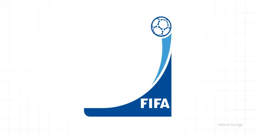
The Commercial Powerhouse: The 1998 Redesign
In 1998, specifically for the World Cup in France, the brand experienced significant growth. The organisation realised that the “FIFA” acronym was stronger than any pictorial symbol.
They shifted to a Wordmark-led identity. The “FIFA” text became the hero, with the globe element reduced to a supporting role above the text.
The Typographic Revolution
The font used here (and refined in later versions) is a robust, custom sans-serif. Why sans-serif?
- Scalability: Serifs (the small feet on letters) break down at small sizes or when printed on textured surfaces, such as those found on football jerseys.
- Modernity: San-serif fonts imply progress, efficiency, and accessibility.
- Authority: The thick strokes of the letters suggest stability.
This is the version that truly monetised the organisation. It was a logo built for merchandise. It was compact, rectangular, and fit perfectly in the corner of a TV screen (the “bug”).
If you are running a business, ask yourself: Does my logo fit in a square? Does it fit in a rectangle? If it only works in one format, you will struggle with modern digital applications. If you need help with this, consider our logo design services. We fix “un-scalable” logos every day.
The 2010 Refinement and the “FIFA Blue”
In preparation for the 2010 World Cup in South Africa, the logo underwent a subtle but critical update. The “FIFA” wordmark was coloured blue (FIFA Blue), and the “swoosh” or globe element was integrated more tightly.
Why Blue?
According to general colour psychology principles, blue represents trust, intelligence, and authority. It is the most common colour in corporate branding (think IBM, Facebook, Ford). For an organisation that acts as a regulator, blue is the safe, conservative choice. It attempts to say, “We are in charge, and we are stable.”
This became ironic in 2015 when the corruption scandal hit. The brand’s “Trust Blue” was featured prominently in news reports regarding wire fraud and racketeering.
The Brand Teflon Effect:
Here is the unique attribute of the FIFA logo. Despite the executives’ reputation, the logo itself retained its value. Why? Because it had been successfully decoupled from the people. The logo represented “The World Cup,” not “Sepp Blatter.” This is the power of a Masterbrand architecture. Consumers loved the product (football) so much that they ignored the management.
Brand Architecture: Corporate vs. Event
One of the smartest things FIFA does—and something most SMBs fail to do—is distinguishing between the Holding Company and the Product.

The Corporate Mark
This is the standard FIFA logo we have discussed. It is consistent, boring, and authoritative. It appears on letterheads, legal documents, and referee shirts.
The Event Mark (The Product)
Every four years, FIFA releases a distinct logo for the World Cup (e.g., Qatar 2022, Russia 2018, United 2026).
- Purpose: To capture local culture and generate short-term hype.
- Lifespan: 4 years.
- Design Rules: Flexible, colourful, often artistic or abstract.
The Strategic Lesson:
Don’t change your main company logo every time you launch a new product or service. Keep your core brand stable (like the FIFA wordmark) and let your product branding be the place where you experiment with trends. If the product brand fails (as with the widely mocked 2002 Korea/Japan logo), your core corporate brand remains intact.
Comparison: The Wrong Way vs. The Right Way
I often see businesses trying to mimic sports branding without understanding the mechanics. Here is how FIFA gets the technical details right where amateurs fail.
| Feature | The Amateur Approach (Wrong) | The FIFA/Pro Approach (Right) |
| Complexity | Detailed illustrations (e.g., a realistic football with stitching). | Abstract geometric shapes. The brain fills in the gaps. |
| Typography | Generic free fonts (Arial, Times New Roman). | Custom or licensed typography with unique kerning and weight. |
| Scalability | Illegible when resized to 16×16 pixels (favicon). | Recognisable shape and colour even at 10mm width. |
| Colour | Using 5-6 colours without a hierarchy. | Strictly defined primary palette (Blue) with secondary accent colours. |
| Application | “Sticking” the logo on top of photos indiscriminately. | Creating single-colour (monochrome) white versions for busy backgrounds. |
A Reality Check
I once audited a client in the logistics sector. They had a logo that included a globe, a truck, a road, and the sun. They insisted every element was “vital to their story.”
It looked like a child’s drawing.
When we attempted to embroider it on their staff uniforms, the stitching appeared as a tangled mess. We had to strip it back, much like FIFA did in 1998. We removed the truck and the road, kept a stylised globe, and focused on a strong wordmark.
The result? Their brand recall increased because people could actually read the company’s name on the side of the van.
FIFA’s logo history teaches us that subtraction can lead to growth. You don’t add value by adding pixels; you add value by removing noise.
If you are struggling to simplify your brand or worried that your current logo is costing you credibility, stop guessing. Request a quote and let’s get it sorted properly.
The Verdict
The FIFA logo is not a piece of art. It is a piece of commercial infrastructure.
From the illegible crest of 1904 to the sleek, vector-optimised wordmark of today, the evolution was never about vanity. It was about adapting to the medium—from paper to TV to smartphone screens.
The lesson for your business is clear: Your logo must be a vessel for your reputation. It needs to be simple enough to be remembered, robust enough to be scaled, and distinct enough to survive a crisis. If FIFA can maintain brand equity despite being one of the most controversial organisations on the planet, you have no excuse for a weak brand identity.
Don’t let nostalgia hold your branding hostage. If it doesn’t work on a mobile screen, it doesn’t work. Period.
Frequently Asked Questions
When was the first FIFA logo created?
The first FIFA logo was created in 1904 upon the organisation’s foundation in Paris. It was a complex, seal-style badge that did not feature a football, reflecting the bureaucratic nature of the era rather than the sport itself.
What font is used in the FIFA logo?
The current FIFA logo uses a proprietary typeface known as “FIFA Official Font.” It is a custom-designed sans-serif typeface created to ensure maximum legibility across diverse media, from stadium hoardings to mobile devices.
Why did FIFA change their logo in 1998?
The 1998 redesign was driven by the need for commercial scalability. The previous “Two Globes” design was difficult to reproduce on merchandise and digital screens. The 1998 update prioritised the “FIFA” wordmark for better brand recognition.
What does the FIFA logo symbolise?
The logo symbolises global unity through football. The two hemispheres (globes) represent the international reach of the sport, while the blue colour signifies reliability, authority, and the corporate governance of the association.
Is the FIFA World Cup logo the same as the FIFA corporate logo?
No. The FIFA corporate logo is the permanent mark of the governing body. The World Cup logo changes every four years to reflect the culture and host nation of the specific tournament (e.g., Qatar 2022, United 2026).
Why is the FIFA logo blue?
Blue (specifically #00529F) is used because it projects stability, trust, and professionalism. In corporate colour psychology, blue is the standard for governing bodies and banks, distinguishing the “business” of football from the excitement of the game.
Who designed the FIFA logo?
While the original 1904 crest has no recorded single author, the modern iterations have been handled by major branding agencies. The significant 1998 and subsequent refreshes involved agencies like Wolff Olins and internal FIFA creative teams to ensure consistency.
What was the controversy with the FIFA 26 logo?
The logo for the 2026 World Cup faced criticism for its extreme minimalism. By placing the trophy over a simple “26” typography, fans felt it lacked the cultural distinctiveness and artistic flair of previous tournament emblems.
How much is the FIFA brand worth?
While the logo itself doesn’t have a standalone price tag, it is the linchpin of FIFA’s revenue cycle. For the 2019-2022 cycle, FIFA generated record revenues of USD 7.6 billion, largely driven by licensing rights where the logo is the primary asset.
Can I use the FIFA logo on my website?
Generally, no. The FIFA logo and World Cup emblems are strictly protected intellectual property. Unless you are an official sponsor or partner, using the logo for commercial purposes or to imply affiliation can lead to legal action.


