Saul Bass: The Brutal Art of Visual Shorthand in Branding
There’s a problem with modern design: people think “more” equals “better”.
Saul Bass would have hated it.
If you are an entrepreneur or an SMB owner, you are likely overspending on design that doesn’t work. You are paying for “art” when you should be paying for “shorthand”.
Saul Bass didn’t make things look “nice”. He made things look inevitable.
He understood that in a crowded market, the fastest brand to be recognised is the one that wins. If your audience has to squint or think to understand what you do, you’ve already lost the sale.
- Strip every non-essential element until a single, memorable visual truth remains.
- Design marks as bold, high-contrast silhouettes that work instantly at any scale.
- Prioritise distinctive shorthand over literal description to occupy mental real estate quickly.
Who is Saul Bass?

Saul Bass (1920–1996) was an American graphic designer and Oscar-winning filmmaker who defined the visual language of 20th-century corporate America and cinema. He moved design from decorative illustration to a functional, symbolic system that prioritised “summarising” a complex narrative into a single, potent image.
“Design is thinking made visual.”
The three core elements of the Saul Bass philosophy are:
- Reductionism: Stripping away every non-essential line until only the core message remains.
- Symbolic Synthesis: Using a single metaphor to represent an entire plot or corporate ethos.
- Kinetic Synergy: Ensuring that a visual identity works just as well in motion (film) as it does in static print.
The “Symbolise and Summarise” Framework
Most famous graphic designers try to tell a story. Bass tried to tell a point. There is a difference. A story meanders; a point hits.
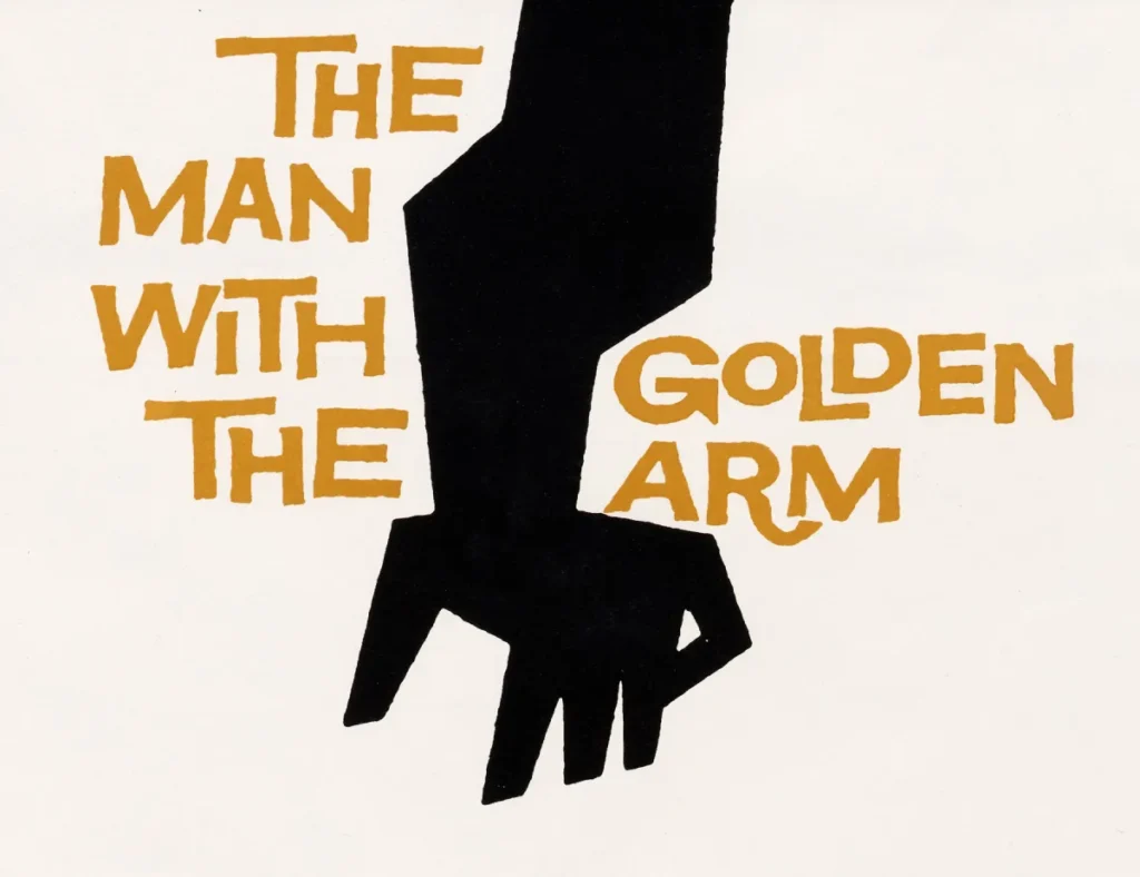
When Bass sat down to design the title sequence for The Man with the Golden Arm (1955), he didn’t draw a scene from the movie. He drew a jagged, distorted arm. It was a visual metaphor for the protagonist’s addiction. It was brutal, simple, and unforgettable.
Why This Matters for Your Business
Small businesses often fall into the trap of trying to include everything they do in their logo. If you’re a plumber who also does electrics, you want a wrench and a spark. Stop it.
Data from the Ehrenberg-Bass Institute suggests that “distinctive brand assets” are more valuable than “descriptive” ones. Your logo doesn’t need to explain what you do; it needs to be a “memory hook”.
Case Study: The AT&T “Globe” (1983)
Before Bass, AT&T used a literal bell (a nod to Alexander Graham Bell). It was traditional, static, and parochial. As the company moved into global telecommunications, Bass replaced the bell with the “Globe”—a series of lines of varying thicknesses that suggested a spinning, interconnected world.
He didn’t “draw a world.” He suggested the idea of a world. That logo lasted for decades because it wasn’t tied to a specific technology; it was tied to a concept. According to a McKinsey & Company report on design, companies that excel in “design leadership” (like the consistency Bass provided for AT&T) see 32% higher revenue growth than their peers.
The Myth of the “Complex” Premium
There is a persistent, damaging myth among SMB owners: “If I’m paying £5,000 for a logo, it should look like it took a long time to draw.”
This is nonsense. You aren’t paying for the hours spent drawing; you are paying for the years spent learning what to remove.
| Feature | The Amateur Way (The “Tapestry” Approach) | The Saul Bass Way (The “Shorthand” Approach) |
| Concept | Try to represent all the services the company offers. | Find one singular, abstract truth. |
| Colour | 4-6 colours with gradients and shadows. | 2-3 flat, high-contrast colours. |
| Scalability | Becomes a blurry “blob” on a favicon or business card. | Retains total integrity at 16px and 16ft. |
| Typography | Trendy, “expressive” fonts that date in 18 months. | Custom, geometric, or classic sans serifs. |
| Cognitive Load | Requires 3-5 seconds to decode the image. | Instant recognition (< 100ms). |
The Data on Cognitive Load
Research by the Nielsen Norman Group confirms that users prefer “low visual complexity.” When a logo is too complex, the brain has to work harder to process it. In a world of communication in marketing, friction is the enemy of conversion. Bass’s work succeeded because it functioned at the speed of thought.
Film Titles: The First “Loading Screens”
Before Saul Bass, film credits were a legal necessity. They were static cards that the audience ignored while they bought popcorn. Bass turned them into an “appetiser.”
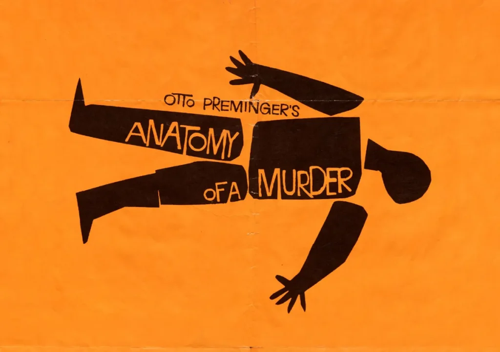
In Anatomy of a Murder, he used disjointed pieces of a paper-cut corpse. As the credits rolled, the pieces shifted. He was teaching the audience how to feel before the first line of dialogue was even spoken.

The UX Connection
Think of your website’s landing page or your social media headers as your “title sequence.” Are they engaging the user, or are they a hurdle to get over? Bass’s approach to visual storytelling was essentially an early form of UX design. He was managing the user’s emotional state through motion and minimalist geometry.
In our fieldwork, we often see businesses that treat their logo design and branding as a final step—a “sticker” to slap on a product. Bass proves that branding is the environment in which the product lives.
The 2026 Shift: Neo-Bassism and AI
We are entering a period I call “The Great Clutter.” AI-generated imagery is flooding the internet with hyper-detailed, overly-rendered “art.” It all looks the same.
In 2026, we are seeing a massive pivot back to “Neo-Bassism.” Brands are stripping back the AI-generated fluff in favour of bold, human-made, flat marks. Why? Because in a sea of complexity, the simple stands out.
Emotional branding in 2026 isn’t about how many pixels you can cram into a screen; it’s about how much “mental real estate” you can occupy with a single shape.
Why Your Logo Must Be “Stupid Simple”
If you look at the 100 famous logos, the ones that have survived the longest—Nike, Apple, the FedEx arrow—all follow the Bass principle.
- Nike: A single stroke.
- Apple: A silhouette with a bite taken out.
- Bass’s United Airlines (The Tulip): A geometric “U” that looked like a tail fin and a flower.
These marks don’t require an explanation. They are “Pre-Attentive Attributes.” Your brain processes their shape before your conscious mind even realises it’s looking at a brand.
I audited a £10m Tech Firm
I once audited a tech firm that had spent £50,000 on a rebrand. The new logo was a complex 3D “knot” intended to represent “connectivity and synergy.”
It looked like a ball of yarn.
When printed on their employee lanyards, it looked like a stain. When put on their website, it slowed down the mobile load time because the SVG was unnecessarily heavy. They had ignored the “Bass Rule”: If it doesn’t work in black and white, and if it doesn’t work at the size of a postage stamp, it isn’t a logo.
We scrapped it. We went back to basics. We created a mark that used two shapes and one colour. Their brand recognition scores increased by 22% within six months.
Stop buying “tapestries.” Buy “shorthand.”
The Anatomy of a Saul Bass Masterpiece
To understand why his work is the gold standard, we must examine his process. Bass didn’t start with a computer (obviously) or even a pen. He started with paper and scissors.
1. The Paper-Cut Method
By cutting shapes out of paper, Bass was physically unable to add “fine detail.” This forced him to focus on the silhouette.
2. The “Irregular” Line
Bass’s work never looked “corporate” in the cold, sterile sense. His lines were often shaky or hand-drawn. This added a “human thumbprint” to the work. It created a sense of emotional branding that felt approachable yet authoritative.
3. High-Contrast Palettes
He almost never used gradients. He used solid blocks of red, black, yellow, or blue. This wasn’t just an aesthetic choice; it was a technical one. High-contrast imagery is easier for the human eye to track in motion.
Applying the “Bass Method” to Your SMB
If you want to apply this to your own business, you don’t need to be an artist. You need to be a critic.
- Print your logo. Now, shrink it to 1cm wide. Can you still tell what it is? If not, fire your designer.
- Look at your brand colours. If you have more than three, you are confusing your customers.
- Check your “Visual Metaphor.” If you are a consultant, does your logo feature a “lightbulb”? That’s not a metaphor; that’s a cliché. Bass would have found a more “Rare Attribute” to represent “enlightenment.”
- Audit your services. Are you trying to say too much? Simplify your message until it fits on a single Post-it note.
The Verdict
Saul Bass was a “Forensic Designer.” He cut through the noise of 1950s illustration to create a visual language that still works in the digital age. He understood that clarity is the ultimate sophistication.
For the modern entrepreneur, the lesson is clear: Stop trying to be “creative” and start trying to be “clear”. Complexity is a mask for a lack of a core idea. If you can’t summarise your business in a single, simple mark, you don’t understand your business well enough yet.
If you’re tired of “fluff” and want a visual identity that actually drives business results, you need to stop thinking like an artist and start thinking like a strategist.
Ready to stop blending in?
Request a quote to see how we can apply “Bass-level” clarity to your brand, or contact us to discuss your next project. You can also explore more about Inkbot Design and our approach to no-nonsense branding.
FAQ: Saul Bass and Modern Branding
Why is Saul Bass considered the most influential graphic designer?
He transformed film titles from boring credits into an art form and created some of the most enduring corporate logos in history, including those of AT&T and United Airlines. His ability to reduce complex ideas into simple, “symbolic shorthand” set the standard for modern minimalism.
What is the “Symbolise and Summarise” philosophy?
It is the practice of identifying the single most important “truth” or “emotion” of a brand or story and representing it with a minimalist visual metaphor, rather than trying to illustrate the entire narrative.
Did Saul Bass design the AT&T logo?
Yes, in 1983, Saul Bass designed the “Globe” logo for AT&T, replacing the old “Bell” logo of the old Bell System. It was one of the most recognised logos in the world and represented the company’s shift toward global telecommunications.
How did Saul Bass change movie posters?
Before Bass, movie posters usually featured literal illustrations of the actors. Bass introduced a more “metaphorical” approach, using bold shapes and typography to convey the theme of the movie (e.g., the “spiral” for Vertigo).
What are the key characteristics of a Saul Bass logo?
Key traits include hand-drawn or “paper-cut” geometric shapes, a limited colour palette (often high-contrast), and a focus on silhouette and negative space rather than fine detail.
Can a small business use Saul Bass’s principles?
Absolutely. In fact, SMBs should use them. Minimalism is cheaper to produce, easier to reproduce across different media (such as embroidery, social media, and print), and much faster for customers to recognise and remember.
Why did Saul Bass use “shaky” or hand-drawn lines?
To add a “human” element to corporate identity. He believed that even the largest corporations should feel accessible and human-centric, rather than cold and mechanical.
What is “Kinetic Typography”, and did Saul Bass invent it?
While he didn’t “invent” it, he was a pioneer. He was one of the first to make text move on screen in a way that conveyed meaning and emotion, a precursor to modern motion graphics and UI animations.
How long do Saul Bass logos typically last?
His logos are famous for their longevity. His United Airlines “Tulip” lasted 36 years, and his Girl Scouts logo remained largely unchanged for decades. This is a testament to the “timelessness” of simple design.
What is the difference between a “descriptive” and “distinctive” logo?
A descriptive logo tries to show what you do (e.g., a tooth for a dentist). A distinctive logo, like those by Bass, uses a unique mark to create a “memory hook” that doesn’t rely on literal interpretation.
Why is visual shorthand better for mobile users?
Mobile screens are small. Complex logos become “visual noise” at small scales. A Saul Bass-style mark remains legible and impactful even on a small smartphone screen.
How do I know if my logo is too complex?
The “Postage Stamp Test”: Shrink your logo down to the size of a postage stamp. If you can’t clearly distinguish the shapes or read the text, it’s too complex for modern brand standards.


