PDFs for Branding: How to Design and Package Like a Pro
PDFs are considered one of the most reliable methods for preserving your design intent across various screens.
You can use them to ship brand-safe, easy-to-share assets that always look polished, from client pitches and sales one-pagers to trade-show handouts.
Below, you’ll learn exactly why PDFs for branding are so important, brand materials to create as PDFs, the design moves that make them stand out, how to distribute your PDFs, and more.
- PDFs preserve pixel‑perfect consistency across devices, embedding fonts and locking layouts for reliable brand presentation.
- Create core brand PDFs: living style guide, press kit, product one‑pagers, case studies, and lookbooks for organised portability.
- Design like an agency: clear typographic hierarchy, strict grids, generous whitespace, and disciplined 60‑30‑10 colour usage.
- Make PDFs accessible: use real, tagged text, alt text, logical reading order and sufficient colour contrast.
- Distribute with control: host canonical files, add UTMs/QRs, version dates, localisation and analytics for traceable, current assets.
Why PDFs for Branding Still Matter
When brand assets are moved between teams, devices, and print vendors, minor inconsistencies start to appear. For example, you may notice some elements start to break, such as fonts reflowing, colours shifting, and layouts becoming distorted.
PDFs solve that distribution problem and play a crucial role in branding and for plenty of different uses, as PDFinity helps demonstrate below:
As for why PDF files matter for branding specifically, these reasons include:
- Pixel-perfect consistency: Fonts embed and layouts don’t reflow, so grids, captions, and charts remain locked as designed.
- Cross-platform trust: PDFs open without issues on Windows, macOS, iOS/Android, and in modern browsers.
- Security & Control: Prevent file theft by adding passwords and watermarking sensitive materials.
- Longevity & compliance: PDF/A file formats preserve brand guidelines and historical logos for long-term access and audits.
Core Branding Assets to Build as PDFs
Your brand or a brand you work for will be easier to manage when the important details live in clean, portable PDFs:
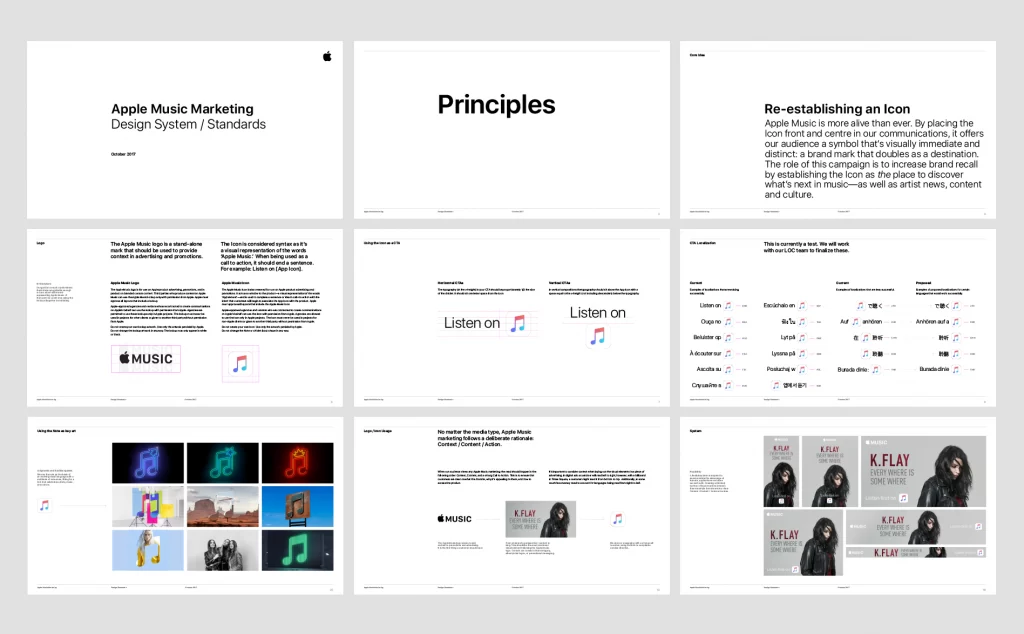
- Brand style guide (living PDF): Include logo versions and clear-space rules, exact colour values (CMYK/RGB/HEX), type scales, imagery rules, and tone of voice.
- Press/Media Kit: You can include a brand story, founder bios, product shots, approved quotes, and press contact information.
- Product one-pagers: Feature callouts, dimensions, certifications, and compatibility tables for quick buyer validation.
- Case studies: Use them for the process of finding the problem → approach → results, with charts and before/after visuals.
- Lookbooks/portfolios: Create spreads for fashion, architecture, or creative services; keep grids tight and imagery consistent.
A good idea is to pair a concise, quick-view one-pager with a deeper, complete kit and link between them. This creates a smooth content journey without inflating file size or overwhelming the reader.
Design Principles for Strong, On-Brand PDFs
Creating a professional PDF requires more than simply adding a logo to the header of a Word document. To make your assets appear as if they came from a top-tier agency, you need to treat the PDF as a standalone design product.
1. Master Your Typography Hierarchy. Digital PDFs are often read on phones and tablets, not just printed on A4 paper.
- Stop using 10pt text. It’s too small for mobile screens. Bump your body copy to at least 11pt or 12pt for comfortable reading.
- Lock in your line heights. A good rule of thumb is to set your leading (line height) to 1.4x or 1.5x your font size, allowing the text to breathe.
- Contrast is key. Ensure your headers (H1, H2) are distinct from your body text through weight and size, not just colour.
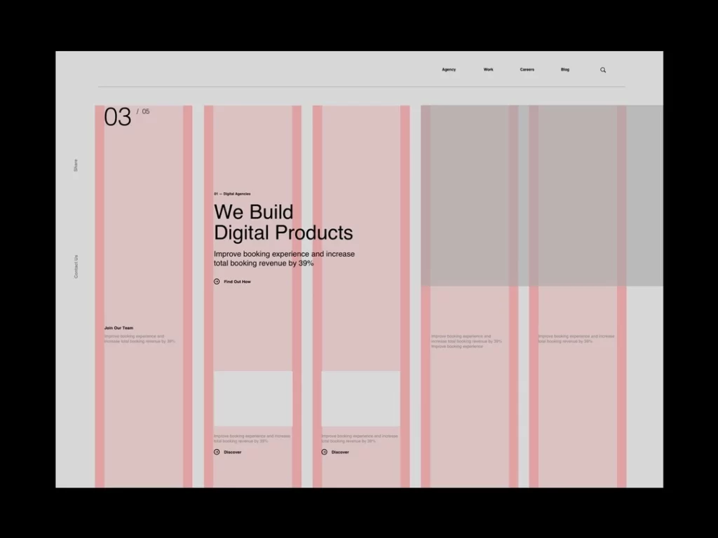
2. The Grid is Your Best Friend. If your PDF looks “messy” but you can’t figure out why, it’s usually a grid issue.
- Use a baseline grid. Align every text box and image to a consistent vertical rhythm. This invisible structure makes the document feel cohesive and premium.
- Respect the margins. Don’t crowd the edges. Generous whitespace (padding) around the content creates a sense of luxury and confidence.
3. Colour Discipline Just because you can use every colour in your brand palette doesn’t mean you should.
- The 60-30-10 Rule: Use your neutral background colour for 60% of the design, your primary brand colour for 30% (headers and sidebars), and a punchy accent colour for the final 10% (CTAs and key data points).
- Check your mode. If this PDF is intended for screens (such as a pitch deck), design it in RGB for optimal vibrancy. If it might be printed (like a brochure), design in CMYK to avoid muddy colour shifts when the client hits “Print.”
4. Make It Accessible (Non-Negotiable) Accessibility isn’t a “nice to have”—it’s a requirement for modern brands.
- Real text only: Never flatten your text into images (JPEGs). Screen readers can’t read images, and pixelated text looks unprofessional.
- Tag your structure: When exporting from InDesign or Word, ensure the “Create Tagged PDF” option is checked. This ensures reading software knows the difference between a Header and a Paragraph.
Smart Distribution & Version Control
When it comes to control and distribution, treat your PDFs like products with a single “home” and a clear release cycle.
Host core assets on a brand or press page, then share the canonical URL across email, social, and sales channels so partners never have to pass around stale attachments.
It’s also critical to add basic analytics so you can see what actually performs. In practice, that means adding:
- Trackability: Use UTMs (or channel-specific filenames) to attribute downloads of media kits and sales sheets.
- Offline → online: Print QR codes on packaging, booth signage, or mailers that jump to your downloadable kit or lookbook.
- Lead capture: Gate premium PDFs (whitepapers, lookbooks) and follow up with a tailored deck based on segment or interest.
- Version hygiene: Include a version/date in the footer, maintain a “current” folder, and archive older files.
- Localisation: Publish region-specific PDFs (currency, spelling, legal lines) to prevent off-brand edits.
- Mini-example: A DTC brand mails a postcard with a QR code to an interactive Holiday Gift Guide PDF; UTMs reveal which bundles convert, shaping the next week’s paid and email creative.
PDFs aren’t old school; they’re the most dependable container for your brand. Start by exporting a crisp style guide and press kit, then extend to sales sheets and case studies. By using PDFs for branding correctly, your brand will flourish.
Frequently Asked Questions
When should I export Standard vs. PDF/X vs. PDF/A?
Use the Standard PDF for everyday use, such as when sharing media kits or one-pagers. Choose PDF/X for any document that must print exactly as designed (such as brochures and posters), as it enforces print standards and embeds essential information.
Select PDF/A for files that require long-term storage. It’s optimised for archival stability, so files remain accessible years later without missing fonts or broken links.
What makes a branded PDF accessible?
Tag the PDF with a logical reading order, add alt text to meaningful images, and ensure sufficient colour contrast for text and charts.
Use real text and descriptive link labels. Provide visible focus indicators for interactive elements. Include document language, structured headings, and table headers.
Should I use an interactive PDF or a web page?
Use an interactive PDF when you need a controlled, portable artefact with links, anchors, and fillable forms, which are great for onboarding checklists or sales kits sent via email.
Select a web page that features dynamic content, changes frequently, requires in-depth analytics, or benefits from responsive layouts and SEO.


