The Volvo Logo: Iron Mark History and Design Evolution
The automotive industry is notoriously conservative until it isn’t. For nearly a century, the Volvo logo—or the “Iron Mark”—has remained one of the most steadfast symbols in commercial history.
While other brands panic-rebrand every decade to chase the zeitgeist, Volvo has mostly tweaked the edges, focusing on a single, monolithic brand promise: Safety.
However, if you spend five minutes on Twitter (or X), you’ll see a different conversation. You’ll see people claiming the Volvo logo is an antiquated symbol of toxic masculinity. This is a prime example of why context in design is non-negotiable.
As a designer, I look at the Volvo mark and I don’t see gender politics. I see a masterclass in industrial typography, functional evolution, and the sheer stubbornness required to build a legacy brand.
If you are an entrepreneur building a business, you need to understand logo design and branding not as a decoration, but as a tool for survival. Let’s tear down the history of the Volvo logo, debunk the myths, and see what your business can learn from the Swedes.
- Volvo's Iron Mark originates from the ancient alchemical symbol for iron, symbolising Swedish steel and strength, not gender.
- The diagonal bar began as a functional bracket and became a distinctive, recognisable brand element.
- Volvo's identity pivoted from iron/steel to safety after inventing and freely sharing the three‑point seatbelt in 1959.
- The logo evolved from 3D chrome to a flat, monochrome design in 2021 for digital clarity and scalability.
- Brand lessons: own a clear promise, celebrate functional details, remain consistent, adapt to medium, and manage context.
The Elephant in the Room: Is it the “Male Symbol”?
Let’s address this immediately so we can proceed with the actual design work.
No, the Volvo logo is not a statement on gender.
It is a statement on chemistry and heritage.
When Volvo was founded in 1927, the founders utilised the ancient chemical symbol for Iron. In medieval alchemy, iron was represented by a circle with an arrow pointing diagonally upwards to the right. This symbol is associated with the planet Mars (the Roman god of war), which is where the confusion stems from.
Because early Western biology adopted the Mars symbol to represent the male sex (and the Venus symbol for female), modern audiences often conflate the two.
Why Iron?
Sweden is historically famous for its superior steel and iron industry. During the First World War and the subsequent industrial boom, Swedish steel was renowned for its exceptional quality, strength, and durability.
Volvo wanted their cars to be perceived as:
- Strong
- Safe
- Swedish
Using the Iron Mark was a logical, industrial branding decision. It was a shorthand for “Made of Swedish Steel.” It had absolutely nothing to do with masculinity.
Design Note: When designing a logo today, it is essential to vet your symbols against modern cultural interpretations. Volvo gets a pass due to its 100 years of equity. You, launching a startup in 2025, might not be so lucky if you accidentally use a symbol with double meanings.
The Visual Timeline: Evolution of the Iron Mark
The evolution of the Volvo logo is less about “change” and more about “refinement.” They found a formula that worked and polished it for ninety years.
1. 1927: The Debut and the Diagonal Bar
The very first Volvo (“Jakob”) rolled out with a logo that was born of necessity.
To attach the chrome badge to the radiator grille, they needed a physical bracket. The designers created a diagonal metal strip running from bottom-left to top-right to hold the circle in place.
This is a perfect example of form being dictated by function.
Eventually, the diagonal bar became as iconic as the circle itself. Even when they didn’t need the bar to hold the badge on modern plastic grilles, they kept it. It broke up the horizontal lines of the front fascia and made the car instantly recognisable from a distance.
2. 1930s – 1950s: Typography and Hierarchy
During this era, Volvo experimented with the “Volvo” wordmark. They utilised a bespoke slab-serif typeface (Egyptienne).
- The Vibe: Industrial, heavy, unmovable.
- The Strategy: In the mid-20th century, trust was built on solidity. Thin, elegant fonts were for fashion. Heavy slab serifs were for machinery.
3. 1959: The Safety Revolution
This isn’t a logo change, but it defined the brand’s visual identity forever. Volvo engineer Nils Bohlin invented the three-point seatbelt.
Crucially, Volvo waived its patent rights, allowing every car manufacturer to use it. This decision cemented the “Iron Mark” as the global symbol for automotive safety. From a branding perspective, this is where the logo stopped representing “Iron” and started representing “Protection.”
4. 2000s: The 3D “Chrome” Era
If you were alive in the early 2000s, you likely remember the design trend known as Skeuomorphism.
Every car brand (Ford, BMW, Nissan, Volvo) turned its flat logos into shiny, 3D-rendered, chrome-effect badges. They wanted the logo on the website to look like the physical badge on the bonnet.
- The Look: Gradients, drop shadows, bevels, and high-gloss finishes.
- The Problem: These logos look terrible on mobile screens. They don’t scale well, and they look dated very quickly.
5. 2021 – Present: The “Flat” Revolution
In 2021, Volvo joined the ranks of Volkswagen, BMW, and Nissan by abandoning the 3D chrome and adopting a flat, minimalist design.
The New Look:
- Monochrome: Just black and white.
- Simplified: No bevels, no shadows.
- Space: The arrow is slightly separated from the circle in some iterations to ensure clarity at small sizes (like a favicon or an Apple Watch face).
This wasn’t just an aesthetic choice; it was a functional one for the digital age. A flat logo loads faster, scales infinitely, and looks crisp on a Retina display.
Anatomy of the Design: Why It Works
As a professional design agency, when we provide logo design services, we look at the “bones” of a mark. Volvo has excellent bones.
1. The Typography (The Wordmark)
The font used in the Volvo logo is a variation of Clarendon or Egyptienne. It is a slab-serif font.
- Serifs: The little “feet” on the letters imply tradition and stability.
- Slab: The thickness of the serifs implies heavy industry and engineering.
Compare this to a tech company like Tesla or Uber, which uses sans-serif fonts (no feet) to imply speed and futurism. Volvo isn’t trying to look fast; they are trying to look unbreakable.
2. The Colour Palette
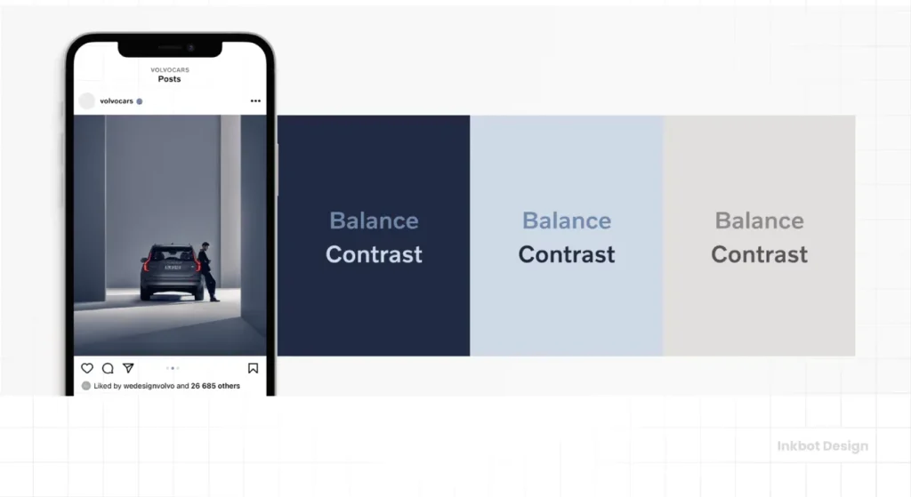
- Silver/Chrome: Represents the steel heritage and high-tech engineering.
- Blue: Represents reliability, trust, and the Swedish flag.
- White: Clarity and transparency.
In the modern “flat” iteration, they rely strictly on Black (authority) and White (cleanliness), allowing the context (such as the car paint or website background) to do the heavy lifting.
3. The Circle and Arrow (The Gestalt)
The circle represents unity and wholeness. The arrow provides dynamic movement.
However, the genius is in the Diagonal Bar.
Most car grilles have horizontal slots. By slashing a diagonal line across the car’s face, Volvo creates a visual disruption. The human eye is drawn to contrast. That diagonal line ensures you can spot a Volvo in your rear-view mirror from 100 metres away without reading the text.
Comparison: Iron Mark vs. Mars/Male Symbol
To settle the debate for your dinner party trivia, here is the breakdown of the semiotics.
| Feature | The Volvo “Iron Mark” | The Mars / Male Symbol |
| Origin | Ancient chemical symbol for Iron (Ferrum). | Astrological symbol for the Planet Mars. |
| Brand Meaning | Strength, Durability, Swedish Steel, Safety. | War, Masculinity, Biology. |
| Visual Construction | Often features a “break” or spacing for the text “VOLVO”. | Usually a solid circle with a connected arrow. |
| Orientation | Arrow points diagonally top-right (NE). | Arrow points diagonally top-right (NE). |
| Primary Association | Automotive Engineering. | Gender Identity / Astronomy. |
The Takeaway: Symbols are not owned by a single meaning. They are contextual.
5 Branding Lessons for Entrepreneurs
You don’t need to sell cars to learn from Volvo. Whether you run a coffee shop, a SaaS platform, or a construction firm, these principles apply.

1. Own Your Niche (The “Safety” Monolith)
Volvo is not the fastest car. It is not the most luxurious car. It is the safest car.
Every piece of their branding, from the sturdy logo font to the crash-test dummy advertisements, reinforces this single truth.
Advice: Don’t try to be everything. Pick one adjective (Fast, Cheap, Premium, Reliable) and design your entire identity around it.
2. Function Can Be Aesthetic
The diagonal bar on the Volvo grille originally served as a bracket to hold the badge in place. It was ugly, functional plumbing. Instead of hiding it, they celebrated it and turned it into a brand asset.
Advice: If your product has a unique quirk or a “boring” functional element, see if you can highlight it rather than hide it. Authentic utility sells.
3. Consistency Builds Equity
Volvo has used the Iron Mark since 1927.
If they had changed their logo to a “V” in the 80s, a “Globe” in the 90s, and a “Shield” in the 2000s, they would have zero brand recognition today.
Advice: Don’t change your logo just because you are bored with it. Your customers are just starting to notice it. Stick with it.
4. Adapt to the Medium (The Flat Redesign)
Volvo moved to a flat logo because the old 3D one looked fuzzy on iPhones. They sacrificed the “cool” chrome look for digital clarity.
Advice: Audit your logo. Does it look good on a business card? What about as a tiny Instagram profile picture? If it’s messy at small sizes, simplify it.
5. Context Matters More Than Intent
Volvo didn’t intend to appear “masculine,” but they have to contend with the public’s perception of the symbol. They achieve this by surrounding the logo with imagery of families, nature, and safety, thereby softening the “hard” industrial edge of the mark.
Advice: Be aware of how your branding is perceived culturally. You cannot control what people think, but you can guide the narrative through your marketing.
The Future of the Volvo Brand
With the automotive industry pivoting rapidly toward electric vehicles (EVs), Volvo is undergoing its biggest shift in history.
The move to the “Flat” logo coincides with their commitment to go fully electric by 2030. The heavy, industrial “Iron” symbolism is being subtly repurposed.
- Old Meaning: Heavy Steel (Protection via mass).
- New Meaning: Sustainable Strength (Protection via technology).
The logo remains, but the story shifts. This is the hallmark of a flexible brand identity.
A Note on “Blanding”
There is a critique in the design world called “Blanding”,—where every tech and car company moves to the exact same sans-serif, black-and-white aesthetic.
Did Volvo fall victim to this?
Partially. The new logo is significantly more generic than the metallic badges of the past. However, by retaining the arrow and the slab-serif font, they managed to keep their personality while modernising. They didn’t go full “Helvetica,” and that saved them.
Conclusion: Strength in Identity
The Volvo logo is a triumph of endurance. It survived world wars, ownership changes (from Ford to Geely), and the transition from internal combustion to electric power.
It succeeds because it is honest. It tells you exactly what you are buying: A strong piece of Swedish engineering.
For the small business owner, the lesson is clear:
- Anchor your brand in a real value (like Safety).
- Design for clarity, not trends.
- Don’t apologise for your history.
If your current logo appears to have been designed in a rush, or if it doesn’t scale well to the digital screens of 2026, it may be time for a rethink. Not a revolution, but a strategic evolution.
Would you like me to review your current logo and advise you on whether it will remain relevant over the next decade?
Request a Brand Audit Quote Here
Frequently Asked Questions (FAQs)
What does the circle and arrow in the Volvo logo mean?
It is the ancient chemical symbol for Iron. It represents strength, durability, and the Swedish heritage of high-quality steel manufacturing.
Is the Volvo logo a male symbol?
No. While it shares the same symbol (the Shield and Spear of Mars) used in biology for the male sex, Volvo uses it in the context of alchemy and iron.
Why did Volvo change its logo in 2021?
They moved to a “flat” design (2D) to ensure the logo looks crisp and clear on digital screens, mobile apps, and electric vehicle interfaces.
What font is used in the Volvo logo?
Volvo uses a bespoke typeface known as “Volvo Broad,” which is based on the Egyptienne and Clarendon slab-serif font families.
Why is there a diagonal line on the front of Volvos?
Originally, it was a metal bar used to physically hold the logo in place on the radiator grille. It became a key design identifier and was kept for brand recognition.
Who owns Volvo now?
Volvo Cars is owned by the Zhejiang Geely Holding Group (Geely), a Chinese automotive company. However, the headquarters and design teams remain largely in Gothenburg, Sweden.
Has the Volvo logo always been the same?
The core elements (Iron Mark and diagonal bar) have remained unchanged since 1927, but the rendering has evolved from a simple metal to 3D chrome, and then back to flat black and white.
What is the “Iron Mark”?
“Iron Mark” is the official internal name Volvo uses for their logo symbol.
Why are car logos becoming flat?
“Flat design” loads faster on websites, scales better on small screens, and conveys a modern, tech-focused aesthetic suitable for the electric vehicle era.
How much does a logo redesign like Volvo’s cost?
Enterprise-level rebrands often cost hundreds of thousands (sometimes millions) of dollars, not just for the design, but for the implementation across thousands of dealerships and digital assets.
Can I use the iron symbol for my business?
Technically, you can use the alchemical symbol for iron, as it is in the public domain. However, if you style it to look exactly like Volvo’s (with the text inside), you will face trademark infringement.
What is the main colour of the Volvo brand?
Historically, “Volvo Blue” and Silver. Currently, they prioritise Black and White for a premium, minimalist aesthetic.
Need a logo that stands the test of time like the Iron Mark? Explore our Logo Design Services or check out more insights on Inkbot Design.


