25 Best Candy Logos: Famous Brands, Hidden Meanings & Design Secrets
The best candy logos are strategic assets that transcend simple shelf appeal, using distinctive typography, colour, and symbolism to build lasting brand recognition.
This includes the elegant script of Cadbury, the bold simplicity of the Hershey’s wordmark, the playful personality of the M&M’s characters, and the clever hidden bear in the Toblerone mountain.
Each of these iconic marks is meticulously designed to communicate a core brand promise—from heritage and quality to fun and adventure—in a single glance.
- The best candy logos use distinct typography and colour for lasting brand recognition.
- Icons like Cadbury and M&M's communicate heritage and personality effectively.
- Memorability is key; simple, unique logos outperform complex designs.
- Colour ownership (e.g. Cadbury's purple) serves as a powerful brand asset.
- Custom typography creates defensible brands that stand out in a crowded market.
The 25 Best Candy Logos, Ranked & Analysed
Here they are. The logos that get it right, and the core lesson you can learn from each.
1. Cadbury: The Best Purple Branding
The Design: The flowing, elegant script of William Cadbury’s signature, set against a sea of iconic purple (Pantone 2685C). It’s simple, confident, and timeless.
Why It Works: It doesn’t scream “candy.” It communicates heritage, quality, and a touch of everyday luxury. That signature feels like a personal guarantee of quality. At the same time, the purple is so distinctive that Cadbury has fought legal battles for decades to protect its use. It’s a masterclass in owning a colour.
The Takeaway: Find a unique colour and own it completely. Make it synonymous with your brand.
2. Chupa Chups: The Famous Logo by Salvador Dalí
The Design: A bold, slightly goofy wordmark in a simple daisy shape. The colours are bright and playful.
Why It Works: This logo was designed by the surrealist artist Salvador Dalí in 1969. His critical insight was to place the logo on the top of the lollipop wrapper, not the side. This ensures it’s always visible and perfectly presented. It was designed for its specific application, making it a functional piece of genius.
The Takeaway: Design your logo with its primary context in mind. How and where will people see it?
3. M&M’s: Characters as the Brand
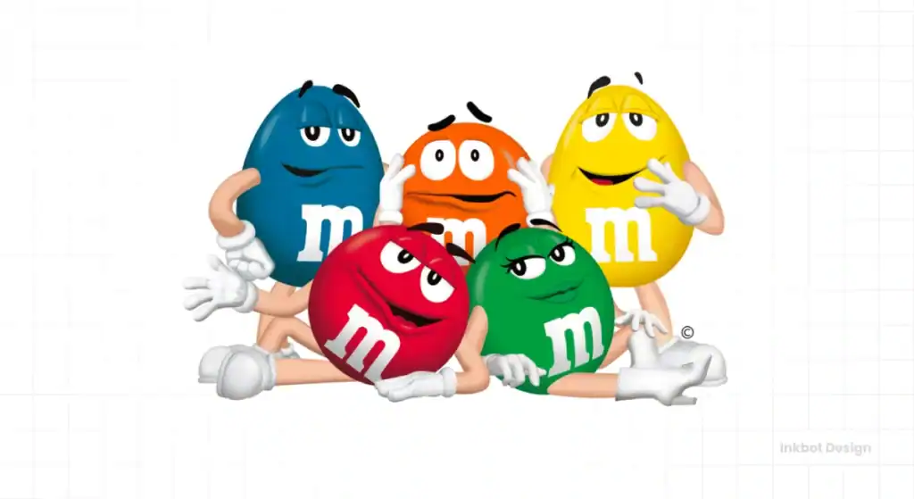
The Design: The technical logo is a simple, lowercase brown wordmark with angled letters. However, the real logo is the cast of anthropomorphic M&M’s characters.
Why It Works: Mars personified its product, turning a simple candy into a brand with a personality, voice, and story. The characters—Red, Yellow, and the gang—do more marketing heavy-lifting than any static logo ever could. They allow for infinite storytelling.
The Takeaway: A mascot can be your brand if it has personality and purpose.
4. Toblerone: The Logo with a Hidden Bear
The Design: The Matterhorn is a powerful, bold, red wordmark with a stylised gold mountain peak.
Why It Works: It’s a tribute to its Swiss origins that feels both premium and strong. The real genius, however, is the hidden bear (the symbol of its home city, Bern) within the mountain’s negative space. It’s a clever detail that rewards observant customers and adds depth to the experience. The triangular packaging is inseparable from the logo itself.
The Takeaway: Integrate a piece of your brand’s origin story directly into the visual mark.
5. Hershey’s: The American Classic
The Design: A bold, blocky, sans-serif wordmark. It’s brown, straightforward, and has remained unchanged for over a century.
Why It Works: Its power lies in its simplicity and heritage. The “The Great American Chocolate Bar” logo isn’t fussy or elegant. It’s solid, dependable, and instantly recognisable. It feels like an institution because it has never chased trends.
The Takeaway: If you have heritage, lean into it. Consistency builds trust and iconic status.
6. Snickers: Bold, Aggressive, and Confident
The Design: A thick, heavy, sans-serif logotype, usually blue, outlined in red. It’s angled aggressively, as if bursting out of the wrapper.
Why It Works: The logo perfectly aligns with the brand’s positioning: a substantial, satisfying snack that effectively tackles hunger. It’s not delicate. The typography is muscular and confident, mirroring the “You’re not you when you’re hungry” campaign.
The Takeaway: Your logo’s typography should match your brand’s personality. If you’re bold, use a bold font.
7. Kit Kat: The Unbreakable Wordmark
The Design: A simple, impactful red oval containing a strong, white sans-serif wordmark. Since 1947, the core elements have been consistent.
Why It Works: It’s a perfect example of a logo “lockup.” The red and white colours are high-contrast and stand out. The oval is a containing shape, making the logo a self-contained badge that works anywhere. It’s simple, effective, and has undergone minimal changes in over 75 years.
The Takeaway: Create a self-contained logo lockup that is easily applied and instantly recognisable.
8. Ferrero Rocher: Unapologetic Luxury
The Design: An elegant, gold, script-like wordmark. The name itself, combined with the gold foil packaging, conveys a sense of premium quality.
Why It Works: This logo doesn’t try to be fun or playful. It’s all about indulgence and sophistication. The gold colour and classic typography make it an affordable luxury item, a perfect gift. It looks and feels expensive.
The Takeaway: Use colour and typography to signal your market position. If you’re premium, look premium.
9. Skittles: Taste the Rainbow
The Design: The word “Skittles” in a playful, bouncy font, often sitting on a literal rainbow. The “S” is a signature element.
Why It Works: The logo is a direct visual representation of the product’s famous tagline. The rainbow isn’t just a decoration; it is a promise of the product. The slightly irregular typography gives it a fun, energetic feel that appeals to its younger target audience.
The Takeaway: If you have a strong tagline, find a way to visualise it in your logo.
10. Haribo: The Cheerful Goldbear
The Design: A friendly, bold, red sans-serif wordmark with the iconic yellow Goldbear mascot.
Why It Works: Like M&M’s, Haribo puts its mascot front and centre. The Goldbear is more than a logo element; it’s a beloved character. The simple, cheerful wordmark is the foundation. Still, the bear provides the personality and emotional connection that has made the brand a global giant.
The Takeaway: A simple, friendly mascot can cross cultural and language barriers.
11. PEZ: The Mechanical Candy
The Design: A logotype constructed from 44 individual, brick-like rectangles. The colours are typically blue and red.
Why It Works: It’s brilliant. The logo itself looks like the candy bricks it represents. It’s a unique, self-referential design that can’t be mistaken for anything else. It visually connects the brand name to the physical product.
The Takeaway: Let the physical form of your product inspire the form of your logo.
12. Tootsie Roll: A Classic Vintage Candy Logo
The Design: A quirky, hand-drawn logotype with a charmingly imperfect, oblong shape.
Why It Works: It evokes a sense of nostalgia and timeless appeal. The off-kilter lettering and container shape give it a wholesome, almost vintage feel that stands out from a world of slick, corporate logos. It has remained largely untouched for decades, making it a powerful symbol of childhood for generations.
The Takeaway: Don’t be afraid of a logo with hand-crafted character. Perfection can be boring.
13. Lindt: Swiss Precision and Elegance
The Design: A classic, cursive script in gold, often accompanied by a dragon symbol. It’s rooted in the formal calligraphy of the 19th century.
Why It Works: The logo communicates mastery and heritage. The flowing script feels like the signature of a master chocolatier. It promises a smooth, high-quality product. This logo for adults positions Lindt as a serious, premium chocolate brand.
The Takeaway: A script font can convey elegance and personal craftsmanship.
14. Twix: Interlocking Flavours
The Design: A powerful, sans-serif wordmark, often in gold or red, with the letters “T” and “X” creating strong vertical bookends. Recent versions have a pause symbol in the “i,” cleverly referencing the “Need a Moment” campaign.
Why It Works: The letters are tightly kerned, almost interlocking, which subtly hints at the dual-bar nature of the product. It’s a bold, confident logo that, like Snickers, communicates substance.
The Takeaway: Pay attention to the spacing and interaction between letters. You can tell a story with kerning alone.
15. Godiva: The Mark of Nobility
The Design: An elegant, refined serif typeface paired with an icon of Lady Godiva on horseback.
Why It Works: The logo directly references its namesake, a figure from late Anglo-Saxon England, instantly lending the brand an air of European heritage and nobility. This isn’t a candy; it’s a chocolatier. The logo sets a high expectation of quality and price before you even taste the product.
The Takeaway: A well-chosen historical or mythological symbol can instantly elevate your brand’s perceived value.
16. Ritter Sport: Form Follows Function
The Design: A clean, modern, sans-serif font, typically in blue. The logo is almost always presented on the brand’s signature square packaging.
Why It Works: The brand promise is “Quality. Chocolate. Squared.” The logo is simple and efficient, mirroring the practical, functional design of the square bar. The packaging is the brand, just as the logo is. The two are inseparable and create a powerful, consistent identity.
The Takeaway: Your packaging and logo should work as a unified system.
17. Jelly Belly: A Carnival of Flavour
The Design: A fun, bouncy wordmark in red, with a friendly, cartoonish feel. The letters resemble jelly beans almost exactly.
Why It Works: It perfectly captures the brand’s spirit: fun, variety, and a touch of silliness. The logo is approachable and doesn’t take itself too seriously. It is right for a company that makes flavours from buttered popcorn to boogers.
The Takeaway: Your logo should reflect the customer’s experience with your product.
18. Ghirardelli: San Francisco Heritage
The Design: A sophisticated, elegant serif wordmark, often in gold, accompanied by the Ghirardelli eagle and cable car illustrations.
Why It Works: It’s steeped in place and history. The logo leverages its San Francisco origins to communicate a long-standing tradition of American craftsmanship. The elegant typography and classic illustrations make it a premium, domestic alternative to European chocolatiers.
The Takeaway: If your business has a strong geographical identity, make it part of your brand.
19. Oreo: The Unmistakable Stamp
The Design: A custom, decorative sans-serif font enclosed in a blue oval. More importantly, the intricate, embossed pattern on the cookie is a key part of the brand’s visual identity.
Why It Works: The wordmark is iconic, but the true genius lies in transforming the product into a logo. The detailed pattern on an Oreo cookie is as recognisable as the Nike swoosh. It’s a tactile logo you can see and feel.
The Takeaway: Don’t forget the product itself. Can you emboss, stamp, or shape it into your brand identity?
20. Butterfinger: Sharp and Edgy
The Design: A jagged, sharp, and chaotic bright yellow and blue wordmark. The letters appear to be breaking apart.
Why It Works: A crispy, crunchy, flaky candy bar is a perfect visual metaphor for the product. The design isn’t smooth or elegant; it’s edgy and loud. It communicates the unique texture of the candy before you even open the wrapper.
The Takeaway: Use your product’s texture to inspire your logo’s visual style.
21. Sour Patch Kids: The Ultimate Sour Candy Brand
The Design: A playful, multi-coloured logotype where the letters look like the candy itself. The font is soft and rounded, but the “Sour” and “Sweet” messaging creates tension.
Why It Works: The logo captures the dual nature of the product. The friendly font and bright colours draw you in, while the brand name promises a sharp, sour kick. It sets an expectation for the flavour experience.
The Takeaway: If your product has a unique process or experience (e.g., sour then sweet), reflect that duality in your branding.
22. Cracker Jack: A Prize Inside Every Box
The Design: A classic, almost circus-like red wordmark, featuring the iconic “Sailor Jack” and his dog, Bingo.
Why It Works: It’s pure, unadulterated nostalgia. The logo hasn’t changed significantly in over a century, and it instantly transports people back to their childhood and memories of baseball games. Sailor Jack isn’t just a mascot; he’s a symbol of a timeless American experience.
The Takeaway: Never underestimate the power of nostalgia. A classic logo can become a cherished cultural icon.
23. Bazooka: The Retro Bubble Gum Brand
The Design: A bold, blue, and red logotype with a strong, patriotic feel. It’s often paired with the Bazooka Joe comic strip character.
Why It Works: It’s simple, powerful, and has a mid-century Americana vibe. The logo’s chevron shape gives it a sense of motion and impact, fitting for a bubble gum named after a weapon. It’s another example of a brand where the extended universe (the comics) is as important as the logo.
The Takeaway: Build a world around your logo. Supporting elements, such as comics or characters, can create a much richer brand experience.
24. Wonka: A World of Imagination
The Design: A whimsical, quirky wordmark with a distinctive top-hat “W.” The font has a magical and slightly eccentric feel.
Why It Works: It perfectly captures the spirit of its fictional founder, Willy Wonka. The logo isn’t just selling candy; it’s selling a story of magic, invention, and imagination. It promises a product that is more than just sugar—an adventure.
The Takeaway: Use your logo to sell a story or a feeling, not just a product.
25. Reese’s: Perfect Combination
The Design: A bold, friendly, rounded wordmark in bright yellow, set against a vibrant orange background.
Why It Works: The colour combination is king. The orange and yellow are warm, inviting, and absolutely ownable. You can spot a Reese’s product from 50 feet away based on colour alone. The typography feels satisfying and substantial, just like the product. It’s a masterclass in using colour to win on the shelf.
The Takeaway: Your colour palette is your uniform. Make it unique, and wear it consistently across everything you do.
What Separates a Great Candy Logo from a Pile of Sugar?
Before we dive into the list, it’s essential to understand the distinction between amateur hour and professional branding. It comes down to three core principles that the best logos master and the worst ignore.
It’s Not About Being “Fun”—It’s About Being Memorable
Anyone can make a logo “fun” using a wacky font and a splash of colour. That’s easy. The hard part is making it memorable. A memorable logo is simple, unique, and instantly recognisable. It sticks in your brain long after you’ve seen it. The best brands prioritise recognition over fleeting novelty every single time.
Colour with a Purpose, Not a Paintball Gun
My biggest pet peeve is colour chaos. Amateurs think more colours equal more excitement. Professionals know that owning a single colour is a superpower. Think of Cadbury’s purple or Reese’s orange. These colours aren’t chosen at random; they are legally protected, billion-dollar brand assets that trigger an immediate product association.
Typography That Sells, Not Just Shouts
The font you choose says everything. Many candy brands default to generic, bubbly “kiddie” fonts that appear cheap and unprofessional. The iconic brands use custom typography that communicates a story. Whether it’s the heritage of Hershey’s or the bold confidence of Snickers, the lettering is doing serious strategic work.
4 Unbreakable Rules from the Best Candy Logos
Upon examining these 25 examples, four distinct patterns emerge. If you want to build an iconic brand, these are not suggestions but rules.
Rule 1: Custom Typography is Your Greatest Weapon
Almost none of these logos use a standard, off-the-shelf font. Cadbury, Hershey’s, Tootsie Roll, Wonka—they all use custom lettering that is uniquely theirs. A custom wordmark is a defensible asset that no competitor can copy.
Rule 2: Simplicity Wins in a Crowded Aisle
The most chaotic, visually noisy logos are often the least effective. The enduring icons—Kit Kat, Hershey’s, Toblerone—are fundamentally simple. They can be recognised quickly when you grab a customer’s attention.
Rule 3: Your Container Can Be Your Canvas
Brands like Toblerone, PEZ, and Ritter Sport demonstrate that the shape of your product or packaging is a valuable branding opportunity. A unique physical form is more complex to copy than a logo, creating a powerful multi-sensory brand experience.
Rule 4: Nostalgia is a Hell of a Drug
Brands like Cracker Jack and Tootsie Roll thrive because their logos have remained unchanged. They are visual triggers for cherished memories. While new brands can’t invent nostalgia, they can aim for a timeless design that will become nostalgic in the future by resisting the urge to rebrand constantly.
Is Your Logo Empty Calories?
A logo is not a decoration. It’s the face of your business, your silent salesman, and the vessel for your brand’s reputation.
The difference between a forgettable candy logo and an iconic one is strategy. It’s the choice to be memorable over “fun,” to own a colour palette instead of borrowing a rainbow, and to invest in custom typography that tells a story.
Creating a logo with this level of strategic thought isn’t accidental. It’s the result of a rigorous logo design process that treats your brand as the serious business asset it deserves to be.
Frequently Asked Questions About Candy Logos
What is the oldest candy logo?
Brands like Hershey’s and Tootsie Roll have maintained their vintage logos for over a century, leveraging nostalgia to build brand recognition.
Which candy logo has a hidden meaning?
The Toblerone logo hides a bear in the mountain, and Twix uses a pause button in the ‘i’.
Why are candy logos red and yellow?
Colours like red (stimulation) and yellow (happiness) are used by brands like Reese’s and McDonald’s to trigger appetite and impulse buys.
How often should a candy brand update its logo?
Very rarely. The most powerful candy brands build equity through consistency. Minor refinements every 10-20 years can keep a logo fresh, but a complete overhaul risks throwing away decades of brand recognition.
What makes a candy logo look “premium”?
Premium candy logos often use elegant script or serif fonts, darker colour palettes (like gold, black, or deep purple), and minimalist design. They signal craftsmanship and quality over playful energy. Examples include Lindt, Godiva, and Ferrero Rocher.
Can a simple wordmark be effective for a candy brand?
Absolutely. Hershey’s, Snickers, and Twix are powerful brands built on strong, simple wordmarks. The key is that the typography must have personality and be executed flawlessly.
How important is the logo’s colour?
Critically important. Colour is the first thing a consumer’s brain processes. Owning a specific colour, like Cadbury’s purple, is one of the most powerful branding moves a company can make.
What is the biggest mistake in candy logo design?
Trying to communicate everything at once. The worst logos are cluttered with multiple fonts, colours, and symbols. The best logos focus on communicating one single, clear idea exceptionally well.
Does a candy logo need to show the actual product?
No, it’s not necessary. The Hershey’s logo doesn’t show a chocolate bar, and the Skittles logo doesn’t show the candy. The branding should evoke the feeling and promise of the product, which is a more sophisticated approach.
How can a new candy brand stand out?
By avoiding clichés. Don’t use a generic swirl icon or a bubbly font. Instead, focus on what makes your product unique. Is it the texture? The origin story? The flavour combination? Build your visual identity around that unique truth.
Ready to create a brand that gets noticed?
A powerful logo isn’t born from luck; it’s the product of strategy, insight, and expert design. It might be time for a conversation if you’re tired of blending in and ready for a brand identity that works as hard as you do.
At Inkbot Design, we build logos that are designed to last. Explore our logo design services to see how we work, or request a quote if you’re ready to get started.


