World Wildlife Fund Logo: Lessons from an Iconic Panda
It’s 1961, and a group of passionate conservationists are huddled around a table, probably sipping tea (because, well, it’s Britain).
They’ve just founded the World Wildlife Fund and need a logo that makes people sit up and take notice.
How did they create something so powerful? And, more importantly, how could I learn from their success?
So, grab a snack (bamboo optional) and embark on a journey through the bamboo forests of branding brilliance.
We’ll unpack how a simple panda sketch became a symbol of global conservation and how you can apply these lessons to your logo design—whether you’re saving the planet or selling novelty socks.
- The World Wildlife Fund was founded in 1961 to protect endangered species and habitats.
- Sir Peter Scott's panda sketch became a powerful logo symbolising global conservation.
- Key elements: simplicity, emotional connection, and versatile design ensure logo recognition.
- The “Love It or Lose It” campaign stresses humanity's vital connection to nature.
- Lessons learned: Emphasise meaningful simplicity and test designs across various contexts.
A Brief History: From Sketch to Global Icon 🐼
The founding of the World Wildlife Fund (WWF) was sparked by a series of alarming articles about habitat and wildlife loss in East Africa. These articles, published in a UK newspaper by Sir Julian Huxley, resonated deeply with businessman Victor Stolan. Moved by the situation’s urgency, Stolan initiated contact with others who shared his concern, aiming to establish a group dedicated to conservation.
One key figure who joined this effort was Max Nicholson, then Director General of the Nature Conservancy in Britain. Nicholson embraced the cause wholeheartedly. He developed a foundational plan for the WWF, which gained official backing from the International Union for Conservation of Nature (IUCN) in April 1961. This plan became known as the Morges Manifesto.
Among the endorsers of the Morges Manifesto was Sir Peter Scott, an IUCN executive board member. Alongside Nicholson and other committed individuals, Scott played a crucial role in forming the WWF. Their collective effort led to the organisation’s launch, with Scott eventually serving as its first vice president.
The WWF was established with a clear mission: to secure funding to protect endangered species and habitats threatened by human activities.
The Birth of a Legend
The year was 1961. The World Wildlife Fund (now World Wide Fund for Nature) had just been founded, and they needed a logo that would capture hearts and wallets worldwide.
Enter Sir Peter Scott—naturalist, painter, and apparently, a dab hand at logo design.
Scott’s initial sketch of Chi Chi, a famous panda at the London Zoo, became the foundation for one of the most recognisable logos in history.
Why a Panda?
- Endangered status (tugs at the heartstrings)
- Black and white colouring (cost-effective printing)
- Adorable factor (off the charts)
Fun fact: The original design cost precisely £0 to create. Talk about budget-friendly!
The World Wildlife Fund (WWF) plays a crucial role in global conservation efforts by acting as a guardian of nature and people. Since its inception in 1961, WWF has become one of the foremost organisations dedicated to preserving our planet’s biodiversity. Operating across nearly 100 countries, it mobilises the power of over five million supporters worldwide to tackle pressing environmental challenges.
WWF aims to foster a world where humans and nature can coexist harmoniously. It actively addresses the climate crisis, striving to mitigate its impacts through innovative and sustainable solutions. Additionally, WWF is committed to stopping environmental degradation, working tirelessly to improve ecosystems and protect endangered species.
By collaborating with local communities, governments, and other organisations, WWF implements effective strategies that promote conservation and support environmental stewardship on a global scale.
Anatomy of an Icon: Breaking Down the WWF Logo
The Power of Simplicity
The WWF logo is a masterclass in the “less is more” philosophy. It’s essentially a black blob with some white bits.
Yet, it’s instantly recognisable. Why?
- Unmistakable silhouette: You could shrink this logo to the size of a postage stamp, and it’d still be identifiable.
- Negative space: The white areas aren’t just gaps—they’re crucial to defining the panda’s features.
- No unnecessary details: There’s not a single line or element that doesn’t earn its place.
Emotional Connection
Look into those panda eyes. What do you see?
Sadness? Innocence? A plea for help?
That simple curved line conveys a wealth of emotion, creating an instant connection with viewers.
Versatility
The WWF logo works everywhere:
- Tiny social media icon? ✅
- Massive billboard? ✅
- Embroidered on a t-shirt? ✅
- Carved into a bamboo forest? (Okay, I made that one up, but I bet it’d work)
This versatility is no accident. It’s the result of thoughtful, purposeful design.
The World Wildlife Fund Logo Through the Years
While the core concept has remained unchanged, the WWF logo has undergone subtle refinements over the decades.
1961-1978: The Original
- Slightly rougher edges
- More “hand-drawn” feel
1978-1986: Smoothing Things Out
- Cleaner lines
- More defined shapes
1986-Present: The Modern Classic
- Further refinement
- Subtle adjustments to proportions
Key takeaway: Even iconic designs can benefit from gentle evolution. Feel free to refine and improve over time.
Beyond the Panda: WWF’s Brand in Action

The panda might be the star, but it’s not a solo act. WWF’s broader visual identity is a masterclass in brand cohesion.
Colour Palette
- Black and white (obviously)
- Pops of vibrant green (nature connection)
- Earth tones (think forest floors and savannah grass)
Typography
- Clean, sans-serif fonts
- Emphasis on readability and accessibility
Imagery
- Stunning wildlife photography
- Focus on individual animals (personalising the cause)
Understanding the “Love It or Lose It” Campaign
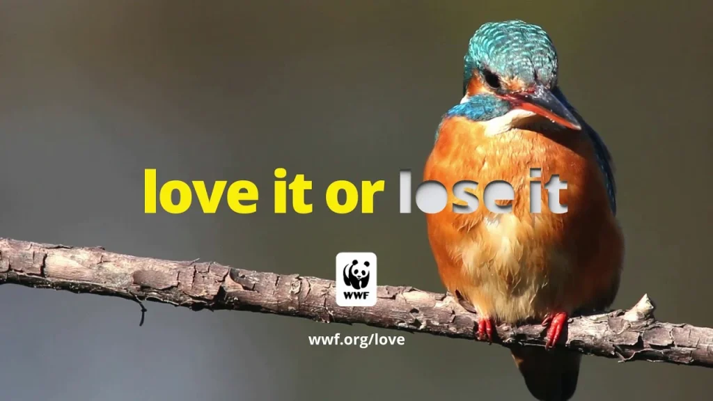
The “Love It or Lose It” campaign launched by the WWF in 2021 emphasises the urgent need for humanity to rekindle its bond with nature. Anchored in the idea of appreciation and preservation, this initiative calls for a collective introspection on what elements of the natural world we cherish—be it serene forest trails, vibrant coral ecosystems, or the indispensable honeybee.
Core Message
The campaign’s message is clear: our connection to nature is integral and urgent. It stresses the point that without an active effort to love and protect these natural treasures, we risk facing their irreversible loss.
Campaign Activities
To bring this message to life, the campaign spans diverse platforms. Throughout 2021, it includes multi-channel public service announcements to raise awareness and foster engagement. Additionally, the campaign features virtual events, enhancing access and participation worldwide.
WWF leverages cultural touchstones to drive the message home—such as releasing a new version of “Love Me Tender,” performed by country star K.C. Rhodes. This creative approach appeals to a broad audience and reinforces the message that love, a universal language, is the key to conservation.
Expert Insight
Terry Macko, the U.S.’s Chief Marketing Officer of WWF, highlights a profound truth: love is our most valuable resource. Love provides the strength and unity needed to face environmental challenges in a daunting and overwhelming world. By nurturing a deep appreciation for nature, we all contribute to its survival, which is intrinsically linked to our well-being.
In summary, “Love It or Lose It” is more than a campaign; it is a call to action, urging everyone to embrace and protect the natural world with love.
Lessons from the Bamboo Forest: Applying WWF’s Design Wisdom
1. Simplicity Reigns Supreme
🚫 Don’t: Create a logo resembling a Rorschach test on steroids.
✅ Do: Distil your concept to its absolute essence. If you can’t sketch it in 5 seconds, it’s probably too complex.
2. Emotion Trumps Detail
🚫 Don’t: Obsess over every whisker and fur tuft.
✅ Do: Focus on creating an emotional connection. What’s the feeling you want to convey?
3. Think Beyond the Logo
🚫 Don’t Treat your logo as an isolated element.
✅ Do: Consider how it fits into your broader visual identity. Colours, fonts, imagery—they all need to play nicely together.
4. Embrace Constraints
🚫 Don’t: Assume you need a massive budget or professional design team.
✅ Do: Let limitations fuel your creativity. Remember, the original WWF logo cost nothing to create!
5. Test, Test, Test
🚫 Don’t Fall in love with your first draft.
✅ Do: Try your logo in different contexts. Shrink it, enlarge it, and put it on different backgrounds. If it doesn’t work everywhere, keep refining.
From Pandas to Profits: Applying WWF’s Logo Lessons to Your Business
Now, I know what you’re thinking. “That’s all good for a global conservation organisation, but how does this apply to my widget-making business?”
Fair question. Let’s break it down.
Find Your “Panda”
What’s the essence of your business? What emotion do you want to evoke?
Maybe it’s:
- The reliability of a sturdy oak tree
- The speed of a cheetah
- The precision of a Swiss watch
Identify that central concept, then ruthlessly simplify it.
Embrace Limitations
Are you working with a tight budget? Good! Constraints breed creativity.
- Stick to one or two colours
- Focus on a solid silhouette
- Avoid complex gradients or effects
Remember: A well-designed logo in black and white will always trump a poorly executed full-colour monstrosity.
Think Long-Term
The WWF logo has stood the test of time because it’s not tied to passing trends.
- Avoid trendy fonts or design elements
- Think about how your logo might evolve over decades
- Consider cultural implications if you’re going global
Make It Memorable
The average person is bombarded with thousands of brand messages daily. How will yours cut through the noise?
- Use unexpected juxtapositions (like a panda for conservation)
- Create visual puzzles or optical illusions
- Tell a story with your design
Case Study: The “Panda-fication” of Bob’s Plumbing
Let’s put these principles into action with a hypothetical example.
Bob’s Plumbing is a small, local business looking to rebrand. Their current logo is a clip-art wrench that screams, “I made this in Microsoft Word circa 1998”.
Step 1: Find the Core Concept
After some brainstorming, we identify Bob’s key strengths:
- Reliability
- Problem-solving
- “We’ll stick with it until the job’s done.”
Step 2: Visual Metaphor
We decide on a beaver as our “panda”. Why?
- Known for building dams (water connection)
- Industrious and hardworking
- Cute factor (never hurts)
Step 3: Simplify
We sketch a minimalist beaver silhouette, focusing on:
- The distinctive flat tail
- Buck teeth (for a touch of humour)
- A water droplet incorporated into the design
Step 4: Refine and Test
After several iterations, we settle on a design that:
- Works in one colour
- It is recognisable in small sizes
- It looks good on vans, business cards, and work uniforms
The Result
Bob’s new logo is simple, memorable, and tells a story. It stands out in a sea of generic plumbing logos and gives the business a friendly, approachable personality.
Bonus: The beaver mascot (affectionately named “Bob Jr.”) becomes a local hit, appearing in ads and even as a plush toy given to customers after big jobs.
FAQs: Demystifying Logo Design
Do I need to hire a professional designer?
Not necessarily. While a pro can be invaluable, many successful logos were created in-house. Focus on simplicity and meaning over technical perfection.
How many colours should I use in my logo?
Less is often more. One or two colours are plenty for most logos. Remember, it should work in black and white, too.
Should my logo include my company name?
It depends on your brand recognition. Nike can get away with just the swoosh, but newer companies often benefit from including their name.
How often should I update my logo?
Major overhauls should be rare. Minor refinements every 5-10 years can keep things fresh without losing recognition.
Can I use clipart or stock images in my logo?
Absolutely not. Your logo should be original and uniquely yours.
What file formats do I need for my logo?
At a minimum, you’ll want a vector file (AI or EPS) for print and high-resolution PNGs for digital use.
How do I know if my logo is “good enough”?
Show it to people outside your business. You’re on the right track if they can describe what you do and the feeling you’re going for after a glance.
Can a logo be too simple?
It’s rare but possible. The key is meaningful simplicity, not emptiness.
Should I follow logo design trends?
Be aware of trends, but don’t slavishly follow them. A good logo should transcend fads.
How important is colour psychology in logo design?
It can play a role, but don’t obsess over it. Cultural associations with colours vary widely, and the overall design is more critical than specific hues.
The Last Bite of Bamboo: Wrapping It Up
We’ve journeyed from China’s mist-shrouded bamboo forests to modern branding’s digital landscapes. We’ve dissected a global icon and applied its lessons to humble local businesses.
The WWF panda logo isn’t just a pretty face (though it certainly is that). It’s a masterclass in communication, distilling complex ideas into a simple, powerful symbol.
As you embark on your logo design journey, remember:
- Simplicity is your friend
- Emotion trumps complexity
- Think beyond the immediate future
- Embrace your constraints
- Test, refine, and test again
Whether you’re saving pandas or unclogging pipes, your logo has the power to tell your story at a glance. Use it wisely.
Now, if you’ll excuse me, I’ve got a sudden craving for some bamboo shoots. Funny how that works, isn’t it?
Your Mission (Should You Choose to Accept It): Look hard at your current logo (or lack thereof). How does it measure up to the lessons we’ve learned? Spend 15 minutes sketching new ideas, focusing on simplicity and emotional impact.
Remember, the next iconic logo is just a doodle away. Who knows? Maybe your sketch will be the next panda.
🐼 Design on, my friends. Design on. 🐼


