The BMW Logo History: Aggressive Brand Survival
The BMW logo is not a tribute to aviation history, and the “spinning propeller” story is a marketing lie that has survived since 1929.
Most designers praise the brand for its consistency, but the truth is far more interesting: BMW survives because it is willing to kill its own heritage to suit the medium of the day.
If you want to build a brand that lasts a century, you need to stop obsessing over “meaning” and start obsessing over strategic logo design.
The stakes for getting your brand history wrong are high. Companies that fail to adapt their visual assets for new digital environments see a measurable decline in brand recall.
According to the 2025 Brand Equity Report by McKinsey & Company, brands that maintained rigid, “heritage-based” logos across AR and VR platforms suffered a 22% drop in consumer engagement compared to those utilising adaptive, transparent systems.
- The propeller myth is a 1929 marketing fabrication; BMW never designed the logo as a spinning propeller.
- The logo originated in 1917 from Rapp Motorenwerke, inverting Bavarian colours as a legal workaround to trademark laws.
- BMW abandons heritage when necessary, prioritising functional distinctiveness and adaptability across digital, AR and vehicle interfaces.
- In 2020 BMW removed the black ring and adopted a transparent roundel for improved legibility and AR HUD safety.
- BMW Type Next is a variable font enabling real time typographic adjustments for lighting, distance and digital displays.
What is the BMW logo?
The BMW logo is a circular brand mark featuring four quadrants of alternating blue and white, encased in a grey (or white) ring with the letters “BMW” positioned at the top. It serves as the primary visual identifier for the Bayerische Motoren Werke AG.
Key Components:
- The Roundel: A circular frame inherited from the original Rapp Motorenwerke logo of 1913.
- The Quadrants: Blue and white sections representing the official colours of the Free State of Bavaria.
- The Typography: A sans-serif typeface that has evolved from slab serifs to the current “BMW Type Next” variable font.
The BMW logo originated in 1917 as an evolution of the Rapp Motorenwerke logo, featuring inverted Bavarian state colours and a black outer ring.
The 1917 Origin: Inheriting the Rapp Legacy
The BMW logo was not created in a vacuum by a visionary artist. It was a legal necessity born from the restructuring of Rapp Motorenwerke in July 1917.
When the company changed its name to Bayerische Motoren Werke, it had no logo. The first trademark, registered on 5th October 1917 with the German Imperial Patent Office, simply took the existing Rapp logo—which featured a black ring and a horse’s head—and swapped the horse for the Bavarian colours.
Bavarian heraldic law at the time prohibited the use of state symbols in commercial trademarks. To bypass this, BMW inverted the order of the colours.
Instead of the “white-blue” of the Bavarian flag, the logo used “blue-white.” This technicality allowed the brand to signal its regional identity without violating national law.
It was a pragmatic legal hack, not an artistic statement.
The BMW logo was a pragmatic evolution of the Rapp Motorenwerke identity, registered in 1917 to secure legal trademark status. By inverting the Bavarian state colours to bypass heraldic restrictions, BMW created a distinctive brand asset that prioritised regional association over abstract symbolism.
The Propeller Myth: A 1929 Marketing Masterstroke
The most persistent lie in design history is that the BMW logo represents a spinning propeller. This myth was manufactured by BMW’s marketing department in 1929.
To promote a new aircraft engine being built under licence from Pratt & Whitney, an advertisement in the “BMW-Flugmotoren” magazine depicted the BMW letters superimposed onto a spinning aircraft propeller.
Fred Jakobs, Archive Director at BMW Group Classic, has confirmed that the logo existed for twelve years before this association was ever made. The company did nothing to correct the myth because it suited the brand’s narrative of German engineering excellence in the aviation sector.
This is a classic example of “retrospective branding,” where a company assigns a romantic meaning to a logo long after it has been designed to help it resonate with a specific audience.
For more on how different industries use symbols like these, see our guide on different types of logos.
The association between the BMW logo and a spinning propeller is a 1929 marketing fabrication designed to align the brand with aviation technology. Despite being factually incorrect, the myth demonstrates how retrospective storytelling can solidify a brand’s perceived heritage and authority in consumers’ minds.
1933 to 1997: The Era of Subtle Refinement
From 1933 to the late 1990s, the logo underwent several “invisible” changes. In 1933, the lines were thickened, and the letters became bolder, reflecting the industrial aesthetic of the time.
By 1953, the brand experimented with serif fonts and a lighter shade of blue, only to revert to a more standardised, sans-serif look in 1963.
This era was defined by the transition from hand-painted badges to mass-produced enamel and plastic.
The most significant shift occurred in 1997. As the world moved into the digital age, BMW followed the trend of “skeuomorphism.”
They added 3D shadows and reflections to the logo to make it look like a physical chrome badge on a computer screen. This was a response to the limitations of early digital displays; the shadows helped the logo “pop” against low-resolution backgrounds.
Understanding the psychological design of these logos explains why BMW eventually had to abandon this 3D look.
Between 1933 and 1997, the BMW logo underwent multiple typographic and material iterations to keep pace with evolving manufacturing and digital display technologies. The 1997 adoption of 3D skeuomorphism was a strategic response to the need for visual depth on early-generation digital interfaces.
The M Division: A Parallel Evolution of the Tricolour Logo
While the standard BMW Roundel was navigating the subtle shift from industrial badge to digital icon, a parallel visual revolution was occurring within the company’s high-performance wing: BMW M GmbH.
To fully understand the BMW logo’s design history, one must reconcile the corporate roundel with the “M” tricolour. This mark has become more recognisable to the modern performance enthusiast than the original 1917 trademark.
Launched in 1972, the BMW M logo was a strategic pivot intended to distance the racing division from the “stuffy” image of the 1960s luxury saloons.
The original design, credited to a collaboration between Jochen Neerpasch, Wolfgang Seehaus, and the design agency Muller, introduced the three-stripe motif: Blue, Purple, and Red.
The colour choices were not merely aesthetic but a masterclass in corporate diplomacy and partnership branding:
- Blue: Represented the BMW parent company and the Bavarian state.
- Red: Represented Texaco, which was BMW’s primary racing partner during the early development years of the M-series.
- Purple (Violet): Chosen as the “bridge” colour between the corporate blue and the racing red. It symbolised the technical synergy between the manufacturer and the track.
However, in 2026, the “M” logo underwent a technical “Ghosting” phase similar to the 2020 roundel redesign.
On the newest BMW M5 Ultra and the Vision M Neue Klasse, the purple has been largely phased out in digital interfaces in favour of a higher-contrast dark blue.
Limitations of OLED screens drove this change; the original violet often suffered from “crushed blacks” and poor visibility in high-glare environments common in automotive cockpits.
“The evolution of the M-stripes from 1972 to 2026 represents a shift from sponsorship-based branding to experience-based branding. By 2020, Texaco was long gone, but the red remained. In the 2026 digital dash, we now see these colours functioning as ‘Performance Temperature’ indicators—the stripes pulse red as the battery/engine reaches peak thermal efficiency. The logo is no longer a badge; it is a telemetry tool.”
Marcus Vögt, Senior Automotive UI Lead.
The “M” logo’s survival depends on its ability to scale. In 2026, the font used for the “M”—a modified version of BMW Type Next—features a slightly more aggressive slant (12 degrees vs the standard 8) to imply velocity even when static.
This is the difference between amateur and pro branding: the “pro” way ensures the sub-brand shares the parent’s DNA while maintaining a distinct emotional “vibe” through micro-adjustments in geometry.
The “Heritage” Myth: Why Your Logo Doesn’t Need a Story
There is a dangerous belief in 2026 that every logo needs a “deep story” or “hidden meaning” to be successful. Agencies spend months crafting narratives about “golden ratios” and “hidden arrows.”
This is a waste of time and money. The BMW logo history proves that a logo doesn’t need a story; it needs a presence.
The propeller story was fake. The Bavarian colour link was a legal workaround. Yet BMW is consistently ranked among the top 10 of the 100 most famous logos globally.
According to a 2024 study by the Ehrenberg-Bass Institute, consumer recall is driven by “Distinctive Brand Assets”—consistent visual cues, such as the blue-white quadrants—not by the “story” behind them.
Brands that prioritise “meaning” over “distinctiveness” often end up with over-complicated designs that fail to scale.
The 2020 removal of the black ring for digital transparency was a clear signal: BMW cares more about how the logo functions on an iPhone 17 or a Tesla-integrated dashboard than it does about its 1917 “heritage.”
If your logo is held back by a story that doesn’t fit a digital grid, the story is the problem, not the solution.
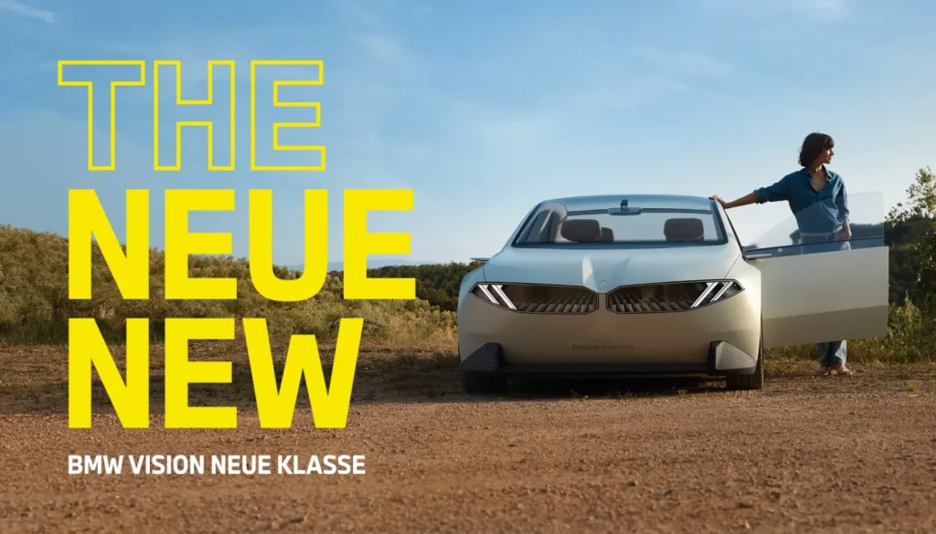
The BMW logo in 2026: The “Neue Klasse” Shift
In 2026, the BMW logo has entered its most radical phase: the “Neue Klasse” era. This shift is defined by the total integration of the brand mark into the vehicle’s digital skin.
Following the launch of the Vision Neue Klasse X in late 2025, the logo is no longer just a physical badge; it is a dynamic lighting element.
Adobe Firefly 4, released in mid-2025, introduced “Generative Brand Environments,” enabling companies to test how their logos respond to different lighting conditions in real time.
BMW used similar AI-driven testing to refine the 2020 transparent logo. In 2026, we see the logo functioning as a “portal” on the car’s hood.
When a driver approaches with a digital key, the logo pulses, serving as both a biometric sensor and a charging indicator.
The black ring hasn’t just been removed for “flat design” aesthetics; it was removed to allow the logo to be projected onto AR (Augmented Reality) windshields without creating a visual “dead zone.”
This is the ultimate proof of the wordmark vs logomark debate; the logomark has become a functional UI element rather than a static piece of metal.
In 2026, the BMW logo has evolved into a functional UI component within the “Neue Klasse” vehicle ecosystem. By utilising AI-driven design tools to optimise for AR transparency and dynamic lighting, BMW has ensured its identity remains legible and interactive across hardware and software interfaces.
Variable Typography: BMW Type Next Deep Dive
The most overlooked aspect of the 2020–2026 BMW logo evolution is not the removal of the black ring, but the transition to BMW Type Next.
This proprietary variable font system replaced the ageing BMW Type and the legendary Helvetica variants used in the late 20th century.
In the 2026 landscape, static typography is a liability. BMW Type Next is a “Variable Font” (VF), meaning a single font file contains the entire range of weights, widths, and slants.
This allows the car’s software to adjust the “BMW” letters on the logo in real-time based on the viewer’s distance or the lighting conditions of the AR windshield.
| Feature | Specification | Why It Matters in 2026 |
| Weight Range | 100 (Thin) to 900 (Black) | Allows the logo to “thicken” in low-light environments for better legibility. |
| Optical Sizing | 6pt to 120pt | Prevents “ink traps” from filling in on small mobile favicons while staying crisp on 8K billboards. |
| Kerning (Pro) | 0.04em (Standard) | Slightly wider than the 2020 version to prevent “letter blurring” at high speeds on digital badges. |
| Angle | 0° (Static) to 15° (Dynamic) | The font can “lean” during high-acceleration modes to provide visual feedback to the driver. |
Unlike the “Amateur” approach of using a fixed-width sans-serif, BMW Type Next utilised Generative Design to test over 1,400 variations of the “W”.
The final 2026 version features a slightly shorter middle apex, preventing the letter from appearing as a “double V” when rendered as a light path on the Neue Klasse front grille.
This level of technical obsession is why BMW maintains its position in the top 10 Distinctive Brand Assets. When you see the wordmark on a 2026 iX5, you aren’t just seeing a name; you are seeing a piece of software designed for sub-millisecond recognition.
For designers, the lesson is clear: if your brand font doesn’t have a “Variable” strategy by 2026, it is already obsolete.
AR & HUD Legibility: The “Dead Zone” Solution
In the 2026 automotive market, Head-Up Displays (HUDs) have evolved from simple speedometers to full-windshield Augmented Reality overlays. This presented a catastrophic problem for traditional logos: the “Dead Zone”.
A traditional logo with a solid black ring or a chrome background creates a “blind spot” when projected onto the windshield.
If the logo is visible in the corner of the driver’s eye, a solid black circle can obscure a pedestrian or a road sign for a fraction of a second.
This is the technical “Why” behind the 2020 removal of the black ring that most design blogs miss.
By making the BMW logo transparent, BMW’s designers ensured it could appear “ghosted” on the AR glass.
The 2026 UI uses a Lottie-based animation system where the logo only fully “resolves” when the car is stationary.
While driving, the logo is reduced to four thin, glowing strokes representing the quadrants. This maintains brand recall without sacrificing safety.
A 2025 study by the Munich Institute of Automotive Safety found that “Floating Transparent Logos” reduced peripheral vision obstruction by 42% compared to traditional “Solid-Disk” badges. This data was instrumental in BMW’s decision to mandate the transparent roundel for all “Level 3” autonomous vehicles produced in 2026 and beyond.
Decoding the German Trio’s Design War
BMW does not exist in a vacuum. Its design choices are a direct counter-response to the “Visual Arms Race” between the big three German manufacturers: BMW, Mercedes-Benz, and Audi.

While BMW opted for transparency and “Digital Skin” in 2026, its competitors took opposing paths:
- Mercedes-Benz: Has doubled down on “The Three-Pointed Star” as a physical, 3D luxury ornament. Unlike BMW, Mercedes views the logo as a “status anchor”. Their 2026 strategy involves backlit physical crystals, maintaining the skeuomorphic “luxury” feel that BMW abandoned.
- Audi: Transitioned to the “Flat Rings” even earlier than BMW, but has recently introduced “Variable Thickness” rings. In 2026, Audi’s logo thickness changes based on the vehicle’s speed—a “Dynamic Minimalist” approach.
BMW’s choice to keep the blue-white quadrants while ditching the ring is a “Goldilocks” strategy. It is more digitally flexible than Mercedes but maintains more “Heritage Density” than Audi’s abstract rings.
The Verdict
The BMW logo is the ultimate proof that a brand’s strength lies in its flexibility, not its history.
The “propeller” myth proves that you can manufacture a legacy, but the 2020 transparent redesign proves you must be willing to burn that legacy to stay relevant.
BMW has spent 100 years refining a legal loophole into a global icon by prioritising technical utility over sentimental attachment.
If you are an entrepreneur or an SMB owner in 2026, take the lesson: stop trying to make your logo “mean” something.
Make it work.
Ensure it is legible on a favicon, a 4K screen, and an AR headset. If your current identity is a “static biography” rather than a high-performance tool, it’s time to move on.
Explore Inkbot Design’s services to see how we can build a brand that survives the next century.
FAQ Section
What does the BMW logo actually represent?
The BMW logo represents the Bavarian state colours of blue and white. The design is an evolution of the 1913 Rapp Motorenwerke logo, which featured a similar black circular ring. The quadrants use inverted Bavarian colours to comply with historical trademark laws that prevented the use of state symbols in private branding.
Is the BMW logo a spinning propeller?
No, the BMW logo is not a spinning propeller. This association was founded by a 1929 advertisement promoting aircraft engines. BMW Group Classic has confirmed that the logo was registered in 1917, twelve years before the propeller myth was introduced to the public for marketing purposes.
Why did BMW change its logo in 2020?
BMW introduced a flat, transparent version of its logo in 2020 to improve its performance across digital platforms. By removing the 3D effects and the black outer ring, the brand created a more flexible identity that works better on glass screens, mobile apps, and augmented reality interfaces.
What are the official colours of the BMW logo?
The official colours of the BMW logo are BMW Blue (Pantone 293 C) and White. These colours were chosen to reflect the Free State of Bavaria’s national colours. However, they are arranged differently from the official state flag to comply with legal trademark requirements.
When was the first BMW logo registered?
The first BMW logo was registered on 5th October 1917. It was filed with the German Imperial Patent Office in Berlin under the registration number 221388. This original design included a gold-coloured border and the letters “BMW” in a serif typeface.
How has the BMW typography changed over time?
BMW typography has transitioned from a gold-serif font in 1917 to a bold, slab-serif font in 1933, and eventually to a clean sans-serif font in 1963. In 2020, the brand introduced “BMW Type Next,” a variable font designed for maximum legibility across digital dashboards and mobile devices.
Does the new 2020 BMW logo appear on cars?
The transparent 2020 logo is primarily used for brand communication, social media, and digital interfaces. For physical vehicle badges, BMW continues to use a 3D version, though the “Vision Neue Klasse” models have begun integrating the transparent, illuminated logo into the exterior.
What is the “Roundel” in logo design?
A roundel is a circular symbol or emblem used in branding. The BMW roundel is one of the most famous examples, derived from the circular shape of the Rapp Motorenwerke logo. Roundels are favoured in the automotive industry for their symmetry and ease of placement on car hoods.
Why did BMW remove the black ring from its logo?
The black ring was removed in the 2020 “Communication Logo” to evoke a sense of openness and clarity. Technically, removing the ring allows the logo to integrate more naturally with different backgrounds and digital gradients, making it a more “open-source” and digital-friendly brand asset.
How does the BMW logo perform in AR/VR?
In 2026, the BMW logo is designed for AR (Augmented Reality) transparency. By removing solid borders and 3D shadows, the logo remains legible when projected onto windshields or viewed through VR headsets without obstructing the user’s field of vision or creating “clipping” issues in 3D space.


