25 Famous Shoe Brand Logos: Beyond the Swoosh
Stop overthinking your logo.
A logo isn’t a magic trick; it’s an empty vessel that absorbs meaning from your actions over the years.
The most famous shoe brand logos aren’t clever; they’re brutally consistent and straightforward.
This isn’t a gallery of pretty pictures.
It’s a strategic breakdown of 25 logos, focusing on the real lesson: a great logo is the result of a great business strategy, not its cause.
- A great logo reflects the brand's strategy, not a mere clever design.
- Simplicity ensures recognisability, making logos more effective.
- Logos gain meaning from the brand's actions and history.
- Timeless logos avoid trend-chasing for lasting appeal.
- Effective logos are versatile and bold, functioning across formats.
The Titans of Sportswear: When a Simple Shape is Enough
The world’s biggest sportswear brands didn’t achieve their success with complex logos. They got there with straightforward, abstract marks that are easy to recognise at 100 mph. They are defined by motion and energy.
1. Nike: The $35 Swoosh
The Swoosh is one of the most famous logos on the planet. Designed in 1971 by student Carolyn Davidson for a mere $35, it represents the wing of the Greek goddess of victory, Nike. However, let’s be honest, 99.9% of customers are unlikely to know or care about that. They just see speed and quality.
- Entrepreneur’s Takeaway: Don’t get hung up on a deep backstory. A simple, dynamic shape that evokes a feeling is infinitely more powerful. Your logo’s value comes from what you do with it, not the story you invent.
2. Adidas: The Versatile Three Stripes
Initially, the three stripes were a functional element designed to provide stability on the shoe, but they eventually evolved into the logo. From the “Trefoil” to the modern “Globe” and the slanted “Equipment” logo, the three stripes are the constant thread. They own the concept of three parallel lines in the sportswear industry.
- Entrepreneur’s Takeaway: Look for a simple, repeatable graphic element in what you already do. Your most powerful branding tool might be a functional part of your product, not something you invent from scratch.
3. Puma: The Leaping Cat
The Puma Cat is pure motion. It’s an animalistic silhouette that communicates agility, speed, and prowess without a single word. You know precisely what Puma is about just by glancing at it. It has remained essentially unchanged for over 50 years.
- Entrepreneur’s Takeaway: If your brand is centred around a specific action or feeling (like speed), find the simplest possible visual representation of that idea. An abstract symbol often works better than a literal one.
4. New Balance: The Simple “NB”
New Balance keeps it clean and direct. The “NB” monogram is often accompanied by chevrons, suggesting movement and a “track” ahead. It’s less about a mythical story and more about a simple, well-crafted mark that says “we make quality athletic gear.”
- Entrepreneur’s Takeaway: A well-designed monogram (using your business initials) can be a timeless and effective solution. It’s direct, confident, and hard to get wrong.
5. Under Armour: The Interlocking Power
The interlocking U and A is aggressive and technical. It resembles a shield or a futuristic emblem, perfectly aligning with their brand position as a challenger focused on performance technology. It’s symmetrical, scalable, and instantly recognisable.
- Entrepreneur’s Takeaway: Think about the personality of your brand. Under Armour’s logo feels technical and intense because the brand is. Your logo should match the energy you want to project.
6. On Running: The Cloud Switch
The Swiss brand On has a logo with its initials: O-N. The “O” is often styled to look like their unique “CloudTec” shoe soles, while the “N” forms a switch. It connects the brand name directly to the product’s unique selling proposition.
- Entrepreneur’s Takeaway: A logo that visually hints at your product’s key feature can be incredibly effective. Just be careful it doesn’t become too literal or complex.
Lifestyle & Streetwear Legends: Wordmarks with Attitude
These brands prove that you don’t always need a symbol. Sometimes, the right font is all it takes to build a multi-billion-dollar empire. Typography is the brand.
7. Vans: The “Off The Wall” Stamp
The Vans wordmark is thick, sturdy, and grounded. The extended line from the “V” cleverly mimics the brand’s iconic “side stripe” on its shoes. It’s a logo that feels like it belongs on a skateboard, not in a corporate boardroom.
- Entrepreneur’s Takeaway: Your wordmark can do more than just spell your name. Simple letterform modifications can create a unique and ownable visual identity that connects to your product.
8. Converse: The Chuck Taylor Star
The star-in-a-circle mark is pure Americana. It’s been on the ankle of the Chuck Taylor All-Star for over a century. It’s less a logo and more a badge of honour, a piece of cultural history that screams authenticity.
- Entrepreneur’s Takeaway: Consistency is your most powerful branding tool. Converse didn’t change its logo every five years to chase trends. It stuck, and now that logo is the trend.
9. Dr Martens: The Utilitarian Wordmark
Written in a simple, bold, industrial sans-serif font, the Dr Martens logo is no-nonsense. It reflects the brand’s utilitarian, work-boot origins. It’s practical, legible, and unpretentious.
- Entrepreneur’s Takeaway: Don’t be afraid of a simple wordmark. A clean, well-chosen font can effectively communicate your brand’s ethos—utilitarian, premium, or playful—without the need for additional graphics. A solid logo design starts with solid typography.
10. Supreme: The Futura Box Logo
Technically, a streetwear brand, not just shoes, but its influence is undeniable. Using Futura Bold Italic, the red box logo is a direct “appropriation” of artist Barbara Kruger’s work. It’s a testament to the power of bold, unapologetic branding. It’s not just a logo; it’s a statement.
- Entrepreneur’s Takeaway: Context is everything. A simple red box with white text became a cultural icon because of the brand’s attitude, scarcity model, and cultural positioning. The logo didn’t create the hype; it became the symbol of it.
11. Clarks: The Enduring Script
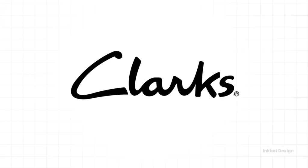
Founded in 1825, the Clarks script logo feels personal and timeless. It suggests heritage, craftsmanship, and a human touch. It’s the opposite of a cold, corporate mark and perfectly suits their reputation for comfort and quality.
- Entrepreneur’s Takeaway: A script or signature-style logo can effectively communicate heritage and a personal touch. Use this if your brand story is built around a founder or a long history of craftsmanship.
The Mark of Luxury: Selling a Signature
In the luxury space, the logo often isn’t a symbol; it’s the founder’s name or a mark of exclusivity. It’s about signalling status, not athletic performance.
12. Christian Louboutin: The Red Sole (The Un-Logo)
The most brilliant logo in luxury footwear isn’t a logo at all. It’s the Pantone 18-1663 TPX red lacquered sole. It’s an uncopyable, instantly recognisable mark of extreme luxury that requires no text or symbol. It’s seen only when the wearer is in motion or at rest.
- Entrepreneur’s Takeaway: Think beyond a graphic on a page. Your “logo” could be a distinctive colour, a material, or a unique product feature. What is your “red sole”?
13. Jimmy Choo: The Elegant Monogram
The interlocking JC monogram is clean, elegant, and perfectly balanced. It works beautifully as a slight metal accent on a shoe or a pattern on a handbag. It exudes a quiet confidence that is synonymous with high fashion.
- Entrepreneur’s Takeaway: For a premium or personal brand, a well-crafted monogram provides a touch of class and works exceptionally well as a repeatable pattern or a subtle hardware detail.
14. Gucci: The Interlocking ‘G’
The interlocking ‘ G’s are a global symbol of Italian luxury, created by Aldo Gucci in 1933 in honour of his father, Guccio Gucci. Like the Jimmy Choo monogram, its power lies in its simplicity and use as a status-defining pattern.
- Entrepreneur’s Takeaway: If your brand carries a family name or strong heritage, a monogram is a direct way to codify that legacy into a visual mark.
15. Manolo Blahnik: The Founder’s Signature
There is no symbol. There is only the name, presented in a refined, serif typeface. The brand is the designer; the designer is the brand. The logo is simply his name, serving as a stamp of approval and a testament to his artistry.
- Entrepreneur’s Takeaway: If you are the face of your brand, sometimes your name is the only logo you need. Investing in custom typography for your name can turn it into a distinctive and ownable asset.
Outdoor & Workwear Icons: Logos That Signal Durability
These brands sell ruggedness, reliability, and a connection to the outdoors. Their logos reflect that with earthy tones and solid, dependable shapes.
16. Timberland: The Tree Combination Mark
The Timberland logo perfectly combines the brand name with a symbol. The sharp, detailed tree inside a circle communicates the outdoors, nature, and durability. It’s a literal representation of the brand’s essence.
- Entrepreneur’s Takeaway: A combination mark (text + symbol) can be highly effective. It allows you to use the emblem alone once brand recognition is established. Just ensure the symbol is simple enough to work on its own.
17. Red Wing Shoes: The Heritage Wordmark
Like Dr Martens, Red Wing relies on a strong, vintage-inspired wordmark. The typography feels as if it were stamped onto a piece of leather a century ago. It powerfully communicates the brand’s 115+ year history of American-made quality.
- Entrepreneur’s Takeaway: Your font choice should align with your brand’s age and positioning. A heritage brand benefits from a font that feels established, not one that appears to have been designed recently.
18. The North Face: The Half Dome
The “Half Dome” peak inspires the logo for The North Face in Yosemite National Park. The lines represent the three main pillars of exploration: hiking, climbing, and skiing. It’s a simple, graphic interpretation of their core mission.
- Entrepreneur’s Takeaway: Look to your brand’s “why” for inspiration. What is the core mission or location that defines you? There might be a simple, symbolic way to represent it.
19. Merrell: The Custom Wordmark
Merrell’s logo is a custom wordmark featuring a unique, slanted “M.” It conveys a friendly, approachable, and slightly rugged aesthetic. It’s less aggressive than other outdoor brands, which aligns with their focus on accessible hiking and trail running for everyone.
- Entrepreneur’s Takeaway: Small customisations to a standard font can make your wordmark unique. Changing one letter can be enough to create a memorable and ownable logo.
The 2026 Digital Evolution: Why Versatility is the New Premium
In 2026, the Visual Identity of a shoe brand must perform in environments Carolyn Davidson never imagined.
With the rise of Generative Engine Optimisation (GEO) and Augmented Reality (AR) commerce, a logo is no longer a static sticker; it is a dynamic asset.
Modern leaders like Allbirds and On Running have pioneered the “Responsive Mark.”
This means the logo adapts its Entity Salience based on the screen size—from a detailed Vector Graphic on a 4K display to a simplified Favicon in a mobile checkout.
Furthermore, Sustainability Branding has forced a shift in colour psychology. We are seeing a move away from high-contrast synthetics toward Earthy Hex Codes that signal Biodegradable Materials and Circular Economy practices.
Comparison: Athletic vs. Luxury Branding Archetypes (2026 Data)
| Brand Category | Primary Logo Style | Key Psychological Trigger | 2026 Trend Signal |
| Performance | Abstract Mark | Speed & Agility | Kinetic/Motion Design |
| Heritage | Wordmark | Trust & Durability | Distressed/Vintage Textures |
| Luxury | Monogram | Exclusivity & Status | Minimalist “Quiet” Branding |
| Eco-Conscious | Organic Symbol | Responsibility | Earth Tones / Bio-mimicry |
2026 Design Insight: If your logo cannot be rendered clearly in a 32×32 pixel SVG or recognized by a Computer Vision algorithm in a crowded social feed, it is failing your Brand Equity.
The Comfort & Casual Crew: Approachable & Friendly Marks
For these brands, it’s about comfort, ease, and accessibility. Their logos are often rounded, soft, and un-intimidating.
20. Crocs: The Jibbitz-Ready Duke
The friendly crocodile silhouette (named Duke) is ideally suited to the brand: playful, a little goofy, and instantly recognisable. The holes in the logo cleverly mirror the iconic holes in the shoes themselves, which hold their “Jibbitz” charms.
- Entrepreneur’s Takeaway: Don’t be afraid to let your brand’s personality show. A playful mascot can be very effective if your product is fun and doesn’t take itself too seriously.
21. Birkenstock: The Seal of Quality
Birkenstock’s logo often appears as a seal, with the name and “Made in Germany” reinforcing its commitment to quality and heritage. The hexagonal shape and clean typography evoke a craftsman’s mark more than a fashion brand’s logo.
- Entrepreneur’s Takeaway: A “seal” or “badge” style logo can communicate quality, tradition, and authenticity. It works well for food products, handcrafted goods, and heritage brands.
22. Skechers: The Dynamic “S”
The Skechers “S” is simple, generic, and highly effective. Its slightly oval shape gives it a sense of movement and speed, helping it compete in the athletic-casual space without being as aggressive as Nike or Under Armour.
- Entrepreneur’s Takeaway: Sometimes, a simple lettermark is all you need. It’s easy to remember, easy to apply, and serves its function as a clean brand identifier.
23. Toms: The Argentinian Flag
The simple blue and white stripes of the Toms logo directly refer to the Argentinian flag, a nod to the country that inspired founder Blake Mycoskie. It connects the brand directly to its social mission and origin story.
- Entrepreneur’s Takeaway: If your brand has a strong social mission or is tied to a specific place, incorporating that into your logo can be a powerful way to communicate your values.
24. Allbirds: The Minimalist Mark
Allbirds uses an ultra-simple, arch-like symbol or a clean, rounded wordmark. This reflects their brand ethos of simplicity and sustainability. There’s no flash, no aggression—just a quiet confidence in the product.
- Entrepreneur’s Takeaway: Minimalism is most effective when it reflects the product itself. If your product is simple, sustainable, and stripped of non-essentials, your logo should be too.
25. ASICS: The Sound Mind, Sound Body Acronym
The name is an acronym for the Latin anima sana in corpore sano (“a sound mind in a sound body”). The logo, a stylised ‘a’, evokes a sense of motion, like a runner on a track. It’s a brand built on a philosophy, and the logo reflects that focus.
- Entrepreneur’s Takeaway: A great name can be the foundation of a great brand. The job of the logo is to give that name a memorable visual form.
4 Uncomfortable Truths All These Logos Prove
Examining these 25 examples reveals four key principles that most new business owners overlook.
Truth 1: Simplicity Isn’t Lazy, It’s Strategic
Not a single one of these iconic logos is complex. The Nike Swoosh, the Adidas stripes, and the Vans wordmark can all be drawn by a child from memory. That’s a feature, not a bug. Simplicity is instantly recognisable.
Truth 2: Your Logo Means Nothing Without Your Brand
The Swoosh was just a checkmark before Nike spent billions on athletes and ads to make it mean “victory.” The Supreme box was just a red rectangle. Your logo doesn’t build your brand; your brand gives your logo meaning. Focus on building a great business first.
Truth 3: Versatility Is More Important Than Cleverness
Every single one of these logos works in one colour. It works when it’s tiny and embroidered on a shoe tag. It works when it’s huge on a billboard. They are practical. That hidden meaning in your logo is worthless if it disappears when shrunk to 16 pixels for a favicon.
Truth 4: A Timeless Logo Ignores Trends
Puma’s cat has been leaping since the 60s. The Converse Star is over a century old. These brands achieved timelessness by finding a simple, authentic mark and sticking with it. Chasing the latest design trend ensures your logo will look dated in 3-5 years.
Your Business Isn’t Nike, and That’s Okay
The temptation is to look at Nike and say, “I need a swoosh.” You don’t. You can’t buy 50 years of cultural equity.
What you can do is learn from the principles. Start with something brutally simple. Choose a clean wordmark or a basic symbol. Pick one or two core colours. Then, stop messing with it.
Focus your energy on making your business great. Apply your simple, consistent branding to everything you do. In a few years, you’ll look back and realise your logo has absorbed all the value you’ve built. It will have earned its meaning.
Looking at these giants is one thing. Creating a hard-working logo for your own business is another challenge entirely. You need a simple, versatile, and professional mark from day one.
Frequently Asked Questions About Shoe Brand Logos
What is the most famous shoe logo?
The Nike Swoosh is almost universally considered the most famous and recognisable shoe brand logo worldwide due to its simplicity and decades of global marketing.
How does AI impact shoe logo design in 2026?
AI tools like Midjourney and Canva Magic Studio allow for rapid prototyping, but the most successful 2026 brands focus on Human-Centric Design to ensure signals that AI cannot replicate.
What are the three types of logos used by shoe brands?
Shoe brands commonly use three main types of logos:
Abstract Marks: Simple, symbolic shapes like the Nike Swoosh or Puma Cat.
Wordmarks: Stylised versions of the company name, like Vans or Dr Martens.
Monograms/Lettermarks: Brand Initials, such as the New Balance “NB” or Gucci “GG”.
What is ‘Quiet Luxury’ in footwear branding?
It’s a move toward the “Un-logo,” pioneered by brands like The Row or Common Projects, where quality and silhouette (the Entity) become the logo itself.
Why are so many athletic logos abstract?
Athletic brands use abstract logos to convey feelings of speed, motion, and energy. A simple shape, such as the Swoosh, can communicate this more effectively and universally than a literal image.
Can a logo simply be the company’s name?
Absolutely. This is referred to as a wordmark or logotype. Brands like Vans, Clarks, and Red Wing Shoes have built iconic identities using only their names in distinctive fonts.
What is the story behind the Adidas logo?
The iconic “three stripes” were originally a functional feature added to the side of Adidas shoes for stability. Founder Adi Dassler turned this functional element into the company’s core branding.
How important is colour in a shoe logo?
Colour is essential for brand recognition (as seen in Christian Louboutin’s red sole), but the strongest logos are designed to work effectively in a single colour, such as black or white.
Should my new shoe brand have a complex logo?
No. Start with simplicity. A complex logo is more challenging to remember and apply across different products and marketing materials. The most successful brands prove that simplicity is the ultimate winner.
What is a combination mark?
A combination mark pairs a wordmark with a symbol (e.g., the Timberland name and tree logo). This versatile approach allows the brand to use the emblem alone once recognition is established.
Why do luxury shoe brands often use the founder’s name?
Using a founder’s name or signature (like Manolo Blahnik) adds a sense of personal craftsmanship, heritage, and exclusivity, key values in the luxury market.
How do I make my logo timeless?
Avoid trendy fonts, colours, and effects to create a timeless logo. Focus on a simple, classic concept that is well-executed. Simplicity, balance, and legibility never go out of style.
Ready to Build a Logo That Lasts?
Analysing the greats is a good start, but applying those principles is where the real work begins. Your logo is the face of your business, and it deserves a professional, strategic design that will serve you for years to come.
We should talk if you’re ready to stop chasing trends and build a brand identity that’s as solid as your business plan. Explore our Logo Design services or request a free quote today. Let’s create something memorable together.
For more insights on branding and design, check out the rest of our articles on the Inkbot Design blog.


