What is the CMYK Colour Model & When to use it in Design
CMYK is not a creative choice; it is an economic and technical constraint that most designers fundamentally misunderstand.
Most branding failures in the physical world happen because designers treat CMYK as a secondary “mode” in Photoshop rather than the physics of light subtraction.
If you believe CMYK is simply “RGB for paper,” you are likely producing muddy, expensive, and inconsistent marketing materials.
The physical reality of your brand depends on how light bounces off a substrate. While digital screens emit light, physical paper absorbs it. This distinction is where profits are lost.
Brands that fail to manage their physical colour assets effectively see an average 23% drop in brand consistency across touchpoints, according to research by Lucidpress.
To avoid this, you must understand the RGB vs CMYK vs Pantone distinction before you ever touch a stylus.
- CMYK is a subtractive, print-first colour model; treat it as physics, not just a Photoshop mode.
- Manage black with K and use GCR/UCR to reduce ink, improve stability, and cut costs.
- Substrate matters: coated vs uncoated and recycled stock dramatically change final colour and dot gain.
- Respect TAC limits and use proper profiles (FOGRA51/52); convert with colour-managed workflows, not naive RGB exports.
What Are CMYK Colours?
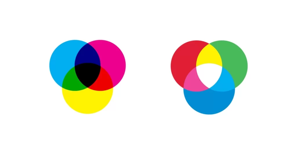
CMYK is the standard colour model used in the printing industry to produce a full spectrum of hues by overlapping four specific ink pigments.
It operates on a subtractive logic: the presence of all colours results in black (in theory), and the absence of all colours results in the paper’s white.
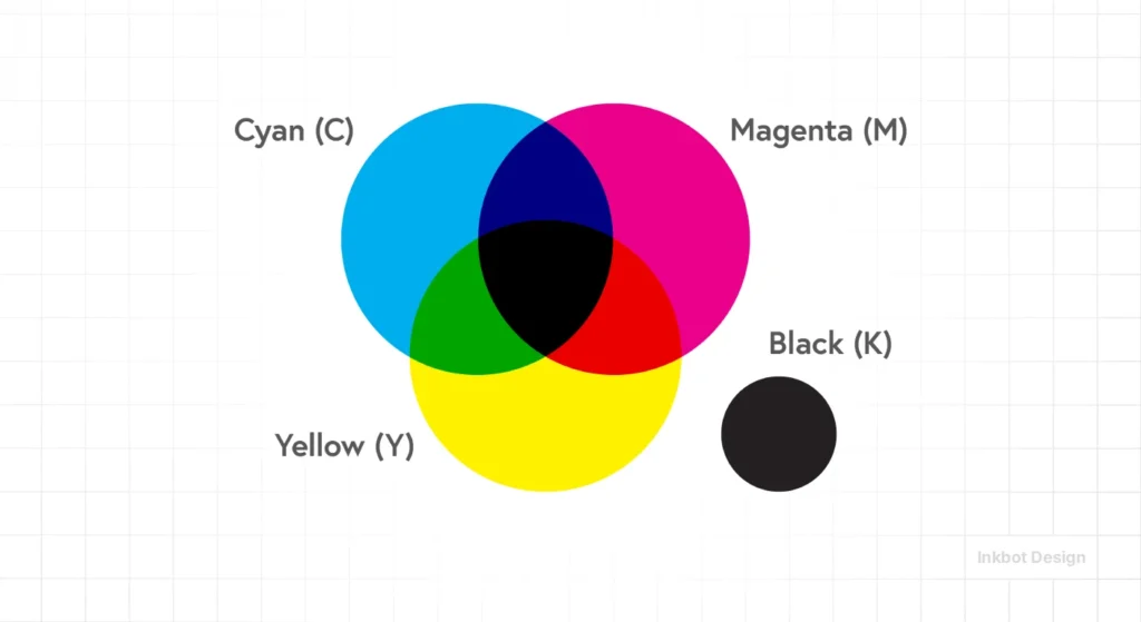
Key Components:
- Cyan: A bright blue-green pigment that absorbs red light.
- Magenta: A purplish-red pigment that absorbs green light.
- Yellow: A bright yellow pigment that absorbs blue light.
- Key (Black): The “Key” plate adds depth, contrast, and true neutral blacks that the other three colours cannot achieve on their own.
CMYK is a subtractive colour model using Cyan, Magenta, Yellow, and Key (Black) inks to produce images on physical substrates by absorbing light.
The Physics of Subtraction: Why CMYK Isn’t “Screen Colour”
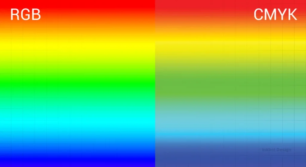
Understanding Light Absorption vs Emission
CMYK works by subtracting light. When you look at a printed red apple, the inks are absorbing (subtracting) the blue and green wavelengths of light and reflecting only the red back to your eyes.
This is the inverse of your smartphone screen, which is actively “spitting” red, green, and blue light at you.
The Nielsen Norman Group (NN/g), the UX research consultancy, has noted that the cognitive load of processing reflected light (print) differs from emitted light (screens), which is why consumers often perceive a brand as “higher quality” when the CMYK reproduction is flawless.
If your magenta is 5% too heavy, the apple looks rotten. On a screen, the brain forgives a lot; on paper, it forgives nothing.
Why the ‘K’ Matters More Than the ‘C, M, and Y’
The ‘K’ in CMYK stands for “Key,” referring to the key plate that holds the image detail.
In the 1800s, this was almost always black ink. Theoretically, 100% Cyan, 100% Magenta, and 100% Yellow should create black.
In reality, chemical impurities in the ink produce a muddy, dark brown.
Adding the ‘K’ plate serves two purposes: it saves money (black ink is cheaper than a three-colour mix) and it prevents the paper from becoming oversaturated with wet ink.
If you ignore your ‘K’ values, you risk “dot gain”—a phenomenon where ink spreads into the paper fibres, blurring your crisp design into a messy smudge.
“In professional print production, the Key plate is the structural anchor of the image. Relying on a C+M+Y mix for blacks results in poor registration and excessive ink weight, which causes drying issues and paper warping. True CMYK mastery is the art of using the least amount of ink to achieve the highest visual impact.”
Advanced Ink Management: GCR, UCR, and the Economics of CMYK
Modern CMYK is as much about what you don’t print as what you do.
For high-volume projects, the difference between a standard CMYK build and an optimised one can be the difference between a profitable campaign and a £20,000 loss in ink waste and drying delays.
This is where Grey Component Replacement (GCR) and Under Colour Removal (UCR) come into play.
Grey Component Replacement (GCR)
GCR is based on a simple colour theory principle: any neutral grey or desaturated colour is composed of specific amounts of Cyan, Magenta, and Yellow.
If you have a dark brown made of 60C, 50M, 50Y, and 20K, you can “replace” the overlapping CMY components with more Black (K) ink.
In a “Heavy GCR” workflow, that same brown might be rendered as 20C, 10M, 10Y, and 60K. Visually, the colour remains identical to the human eye, but the technical benefits are massive:
- Neutral Stability: Because the “grey” is made mainly of black ink rather than a balance of three colours, it won’t shift toward green or pink if the press’s cyan or magenta levels fluctuate slightly.
- Faster Drying: You are replacing three layers of wet ink with one. This lowers the Total Area Coverage (TAC), allowing the press to run at higher speeds without risk of smearing.
- Cost Reduction: Black ink is significantly cheaper per litre than Cyan, Magenta, or Yellow pigments. On a run of 1 million supermarket circulars, GCR can save upwards of 15% on total ink costs.
Under Colour Removal (UCR)
UCR is a more conservative cousin to GCR. It only targets the neutral components in the Shadow Areas (the darkest parts of an image).
Instead of using 100% of all four inks in the shadows (which results in a muddy 400% TAC), UCR pulls back the CMY in the deepest blacks and lets the ‘K’ plate do the heavy lifting.
Ink Strategy ROI
| Strategy | Implementation | Ideal For | Economic Impact |
| Standard CMYK | Basic Profile Conversion | Short-run digital print | High ink cost; low setup time. |
| UCR | Shadow reduction in RIP | Photography-heavy books | Reduced drying time; better shadow detail. |
| GCR (Medium) | Professional ICC Profile | Catalogues & Magazines | 5–8% ink saving; improved colour stability. |
| GCR (Max) | Custom Separation Math | Newsprint & Packaging | 12–20% ink saving; vital for low-grade paper. |
In the 2026 economy, GCR is the “Invisible Profit” of design. A London-based publishing house recently switched its monthly magazine from a standard FOGRA 39 workflow to a custom GCR profile optimised for its 80 gsm silk stock. They reported a £4,500 monthly saving on ink surcharges and a 20% reduction in paper spoilage due to ink-trapping errors.
Substrate Chemistry: The Hidden Co-Designer
In professional print production, the Substrate is not merely a canvas; it is an active chemical participant in the colour-building process.
When a CMYK ink droplet hits a surface, its behaviour is governed by three factors: porosity, surface energy, and brightness (fluorescence).
Ignoring these factors is why a design that looks vibrant on a screen can appear “flat” or “dead” on a recycled business card.
The Porosity Paradox: Coated vs Uncoated
The most fundamental distinction in CMYK design is between Coated and Uncoated stocks.
On a coated sheet (such as gloss or silk), the ink sits on top of a clay or polymer coating. This prevents the ink from soaking into the paper fibres, allowing for smaller, sharper dots and a higher Total Area Coverage (TAC)—often up to 320%.
On uncoated paper, the ink is absorbed deep into the fibres. This causes significant Dot Gain, where a 50% halftone dot can expand to 65% or more.
This absorption also limits the maximum ink density. If you apply a “Rich Black” designed for coated paper to an uncoated flyer, the paper will become oversaturated, leading to “set-off” (ink transfer between sheets) and a lack of detail in the shadows.
In 2026, professional workflows use the FOGRA52 profile for uncoated stocks specifically to compensate for this absorption math.
Recycled Stock and the “Yellowing” Effect
As the industry moves toward 100% post-consumer waste (PCW) stocks, designers must account for the Substrate’s Base Hue.
Recycled paper rarely has a neutral white point; it often leans toward yellow or grey. Because CMYK is subtractive, the paper’s colour acts as a base “filter.” If you print a delicate cyan sky on yellow-tinted recycled stock, it will turn green.
Mastering CMYK in 2026 requires adjusting your primary builds to counteract the substrate’s inherent bias—a process known as “white point compensation.”
Surface Energy and Synthetic Substrates
With the rise of durable marketing materials, we are seeing more CMYK printing on plastics, foils, and “never-tear” synthetics. These non-porous surfaces require UV-curable inks.
Unlike traditional offset inks that dry through oxidation and absorption, UV inks are “cured” instantly by ultraviolet light.
This allows for a much wider gamut and nearly zero dot gain, but it introduces the risk of “ink chipping” if the TAC is too high.
> Data from the 2025 Print Industry Benchmark indicates that 82% of print-run rejections on sustainable substrates are caused by using standard ISO Coated v2 profiles on high-recycled content papers. To mitigate this, high-end design firms now employ Spectral Mapping, in which the substrate is scanned with a Spectrophotometer before CMYK conversion, ensuring the digital file is tuned to the specific chemical “fingerprint” of the paper batch.
Why “100% Everything” is a Disaster
The Myth of the “Ultimate Black”
A common mistake among amateur designers is the belief that setting Cyan, Magenta, Yellow, and Black to 100% (400% total ink) will create the “blackest” possible black.
This is the 400% Ink Myth, and it is the fastest way to have your project rejected by a professional printer in 2026.
The Reality of Ink Limits
Most commercial printing presses have a Total Area Coverage (TAC) limit between 220% and 320%. If your total ink values exceed this, the paper cannot absorb the liquid.
The result is “setting off”, where the wet ink from one sheet transfers to the back of the next sheet in the stack.
According to Smithers, a leading authority on the packaging and print supply chains, ink-related drying delays account for up to 15% of wasted time in offset litho environments.
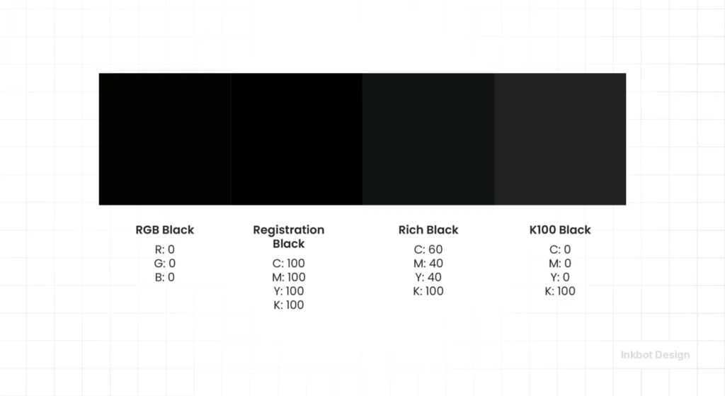
By using a “Rich Black” (e.g., 60C, 40M, 40Y, 100K) instead of a “Global Black” (100C, 100M, 100Y, 100K), you achieve a deeper, more professional finish while staying well under the 300% TAC limit.
This is a fundamental part of colour theory that impacts the bottom line.
“Total Area Coverage (TAC) is the chemical ceiling of design. Exceeding the 300% ink threshold doesn’t make a design darker; it makes it physically impossible to dry. Professional CMYK files are engineered to respect the absorption limits of the substrate, ensuring that brand assets remain crisp rather than bleeding into the stock.”
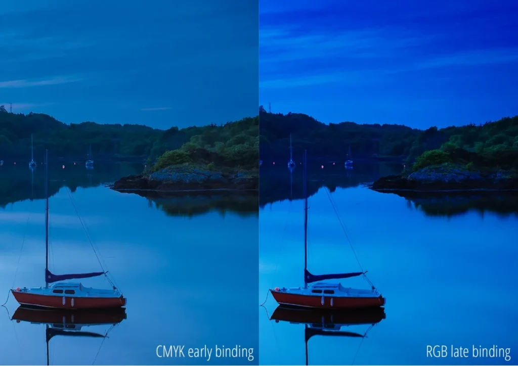
The State of CMYK Colour in 2026: The “Late-Binding” Revolution
In 2026, the traditional workflow of “Design in RGB, then convert to CMYK” is dying. We are now in the era of Late-Binding Colour Management.
AI-Driven RIP Engines
New technology from companies like HP Indigo and Heidelberg now uses AI-driven Raster Image Processors (RIPs) that prefer to receive high-gamut RGB files.
These engines calculate CMYK conversions in real time based on the specific humidity, temperature, and paper stock at that moment.
This shift was accelerated by the Adobe-Pantone split in 2022-2023.
When Pantone removed their colour libraries from the Adobe Creative Cloud, it forced designers to understand the math behind CMYK builds rather than relying on a “magic” spot-colour button.
Sustainable Ink Optimisation
In 2026, “Green Printing” is a requirement, not a feature. Advanced CMYK workflows now use GCR (Grey Component Replacement).
This technique replaces the neutral grey portions of a CMYK mix with more black ink (‘K’) and less of the expensive ‘CMY’ inks.
Not only does this make the print run more stable and less prone to colour shifting, but it also reduces the environmental impact of the ink production process.
The Rise of 7-Colour Process (ECG)
While this guide focuses on CMYK, the industry is moving toward Expanded Colour Gamut (ECG), which adds Orange, Green, and Violet (CMYKOGV) to the mix.
However, the four-colour CMYK model remains the “Greatest Common Denominator.”
If your branding works in CMYK, it will work anywhere. This is why colour psychology in branding must be validated against CMYK’s physical limitations before a brand is launched.
Expanded Colour Gamut (ECG): When Four Colours Aren’t Enough

While CMYK is the foundation of print, it is a mathematically limited model.
In the visible spectrum, there are millions of colours that a 4-ink process simply cannot reach—most notably vibrant oranges, deep greens, and electric violets.
This is known as the Gamut Gap. In 2026, the industry has solved this through Expanded Colour Gamut (ECG), also known as Fixed-Palette Printing.
The CMYKOGV Solution
ECG adds three additional inks to the standard array: Orange, Green, and Violet.
By using a 7-colour process (CMYK + O + G + V), printers can reproduce approximately 90% of the Pantone library, compared to only ~60% with standard CMYK.
For brands, this offers a revolutionary middle ground. Instead of paying for a custom “Spot Colour” (which requires a dedicated press unit and a time-consuming wash-up), they can use a fixed 7-colour setup to achieve near-perfect brand matches across complex, photographic layouts.
The Math of Gamut Expansion
The benefit of ECG is best visualised in the CIE Lab colour space.
If you imagine the visible spectrum as a large horseshoe shape, a standard CMYK gamut is a small, somewhat squashed triangle inside it.
By adding O, G, and V, that triangle expands into a much larger heptagon, reaching out into the saturated corners of the spectrum that were previously “Out of Gamut.”
Why ECG is the 2026 Standard for Packaging
Sustainable packaging thrives on ECG. Because the press doesn’t need to be washed between jobs to change spot colours, there is significantly less chemical waste and faster turnaround times.
Brands like Coca-Cola and Unilever have begun shifting their primary packaging to ECG workflows, enabling them to maintain their iconic reds and blues while still printing high-quality food photography on the same sheet.
The Mathematics of Accuracy: Understanding Delta E
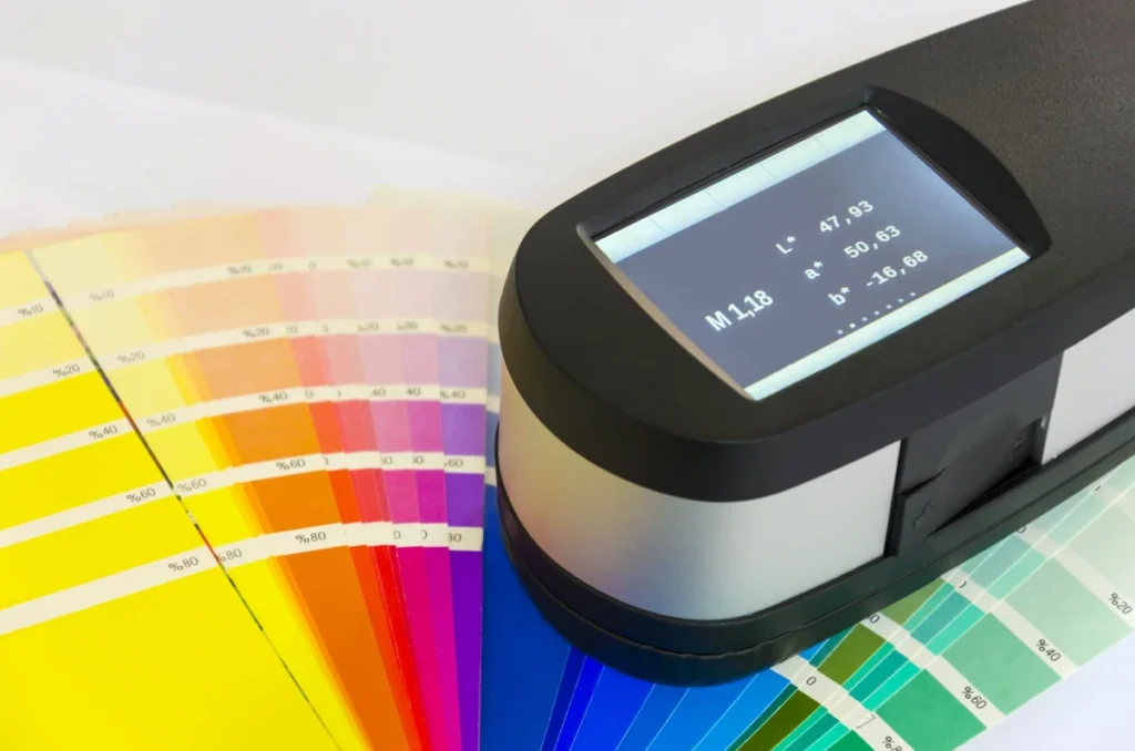
In 2026, telling a printer that a colour “looks wrong” is no longer a professional critique. To manage a brand’s physical identity across global vendors, you must speak the language of Delta E.
Delta E is a mathematical formula that measures the visual distance between a target brand colour and the actual printed output.
The Delta E Formula
The original 1976 formula calculated the Euclidean distance between two points in the CIE Lab colour space:
Delta E ab = √[(L2* – L1*)² + (a2* – a1*)² + (b2* – b1*)²]
What this actually means (in practical design terms)
This formula calculates the perceptual colour difference between two colours in the Lab* colour space.
You are measuring the distance between two points in a 3-dimensional colour space:
- L* = lightness
- a* = green ↔ red axis
- b* = blue ↔ yellow axis
So conceptually, it is simply:
colour difference = straight-line distance between two colours
The CMYK Decision Table
| Technical Aspect | The Wrong Way (Amateur) | The Right Way (Pro) | Why It Matters |
| Black Formula | 100, 100, 100, 100 (Global) | 60, 40, 40, 100 (Rich) | Prevents paper warping and drying smudges. |
| Small Text | Using all 4 colours for 6pt type. | Using 100% ‘K’ only for fine text. | Prevents “ghosting” if the press is slightly out of alignment. |
| Conversion | “Image > Mode > CMYK” in Photoshop. | Using “Convert to Profile” with a specific target (e.g. FOGRA51). | Preserves the visual intent based on the specific paper stock. |
| Total Ink (TAC) | Ignoring it / over 320%. | Capping ink at 240%–280% for uncoated stock. | Stops the ink from bleeding through the paper. |
| Image Resolution | 72dpi “stretched” to fit. | 300dpi at 100% of the final print size. | Avoids the “pixelated” look that screams “cheap brand.” |
When to Use CMYK (and When to Run Away)
Use CMYK When:
- Physicality is the Goal: Business cards, brochures, billboards, packaging, and direct mail.
- Cost is a Factor: CMYK is significantly cheaper than using Pantone spot colours for multi-coloured designs.
- Consistency Across Vendors: Using standard ISO profiles (like Coated GRACoL) ensures your flyer printed in Manchester looks like your flyer printed in Dallas.
Avoid CMYK When:
- Digital-Only Campaigns: Social media, websites, and apps should always stay in RGB. Converting them to CMYK makes them look dull and lifeless on a screen.
- Fluorescent or Metallic Needs: CMYK cannot reproduce “Neon” or “Chrome.” For these, you must use a Pantone spot colour.
- High-End “Power” Branding: If your brand identity relies on a specific, unchanging orange (like Hermes), use a spot colour for the logo and CMYK for the rest. Understanding the colour psychology of your specific hue is vital here.
The Verdict
CMYK is the bridge between the digital dream and the physical reality.
In 2026, successful design requires a “Chemistry-First” approach. You cannot simply “pixel-push” your way to a great print job.
You must respect the Total Area Coverage, manage your rich blacks, and understand that the paper stock is your co-designer.
Ignoring these technical realities doesn’t just result in “bad” design; it results in wasted capital and a diluted brand.
If your current design partner doesn’t know their FOGRA51 from their ISO Coated v2, you are leaving your brand’s physical reputation to chance.
Ready to ensure your brand’s physical identity is as sharp as its digital one?
Explore Inkbot Design’s services to see how we blend technical SEO expertise with world-class print production knowledge.
You can also read more about the 60-30-10 rule to master your colour distribution across all mediums.
FAQ
Is CMYK better than RGB for printing?
CMYK is the only model suitable for traditional commercial printing. While RGB is used for digital screens, printing involves physical ink. If you send an RGB file to a printer, the colours will be automatically converted, often resulting in dull, “clipped” hues that don’t match your original design.
Why does my CMYK blue often look purple on the final print?
This occurs because the human eye is more sensitive to Magenta than Cyan, and many “Blue” CMYK builds contain too much Magenta for the specific substrate. To achieve a “true” blue, the Cyan value should typically be at least 30% higher than the Magenta value (e.g., 100C, 70M). If the gap is smaller, the subtractive mix will lean toward violet, especially on uncoated papers, where the Cyan pigment “sinks” into the fibres more rapidly than the Magenta pigment.
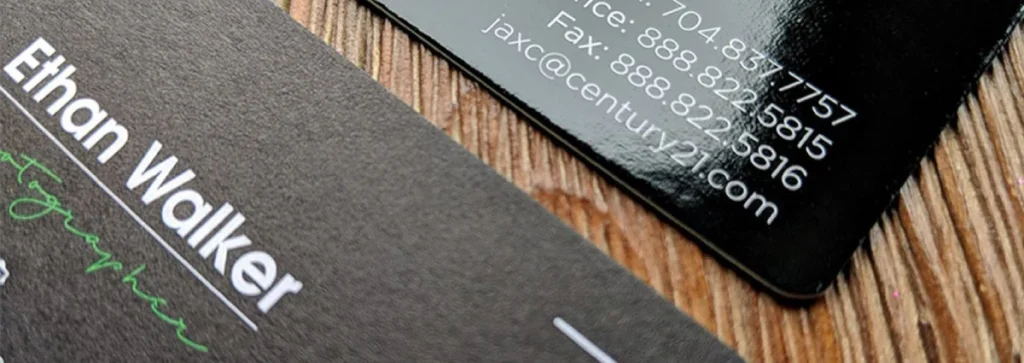
What is a “Rich Black” in CMYK?
A Rich Black is a mixture of Cyan, Magenta, and Yellow added to a base of 100% Black (K). This creates a deeper, more neutral black than using black ink alone. A standard professional formula is 60% Cyan, 40% Magenta, 40% Yellow, and 100% Black.
What does “Total Area Coverage” mean in print?
Total Area Coverage (TAC) is the combined percentage of the four inks (C, M, Y, K) at any given point in a design. Most printers require a TAC of 300% or less to ensure the ink dries properly and doesn’t smudge during printing.
Can I print neon colours using CMYK?
No, neon and fluorescent colours exist outside the CMYK gamut. Because CMYK is a subtractive process, it cannot reflect enough light to appear “neon.” For these colours, you must use a special “Spot Colour” ink, such as a Pantone 800-series.
Why is Black called ‘K’ in CMYK?
‘K’ stands for “Key.” In traditional printing, the black plate was the “Key Plate” because it provided the image’s essential detail and contrast. It also avoids confusion with ‘B’ for Blue, which is part of the RGB model.
When should I use Pantone instead of CMYK?
Use Pantone (Spot Colour) when you need absolute colour precision for a logo or when you require colours that CMYK cannot reach, like metallics or neons. CMYK is better for photographs and multi-coloured layouts where cost-efficiency is a priority.
How do I choose the right CMYK profile?
The profile depends on your geographic location and the paper stock. In Europe, FOGRA51 (for coated) and FOGRA52 (for uncoated) are the 2026 standards. In the US, GRACoL 2013 is the most common professional standard for high-quality offset printing.
What is “Dot Gain”?
Dot Gain is the physical expansion of ink droplets as they hit the paper. If a designer specifies a 50% screen of black, the final print might look like 60% because the ink “grows” in the paper fibres. High-quality, stunning colour palettes account for this shift.
What is the difference between FOGRA51 and FOGRA39?
FOGRA51 is the 2026 industry standard for coated paper, replacing the legacy FOGRA39 profile to better account for Optical Brightening Agents (OBAs) in modern paper. Older profiles (FOGRA39) assumed paper was “neutral” white. Modern papers use OBAs that glow blue under UV light. FOGRA51 accounts for this blue shift in its calculations, ensuring that your CMYK conversion doesn’t result in a yellowish tint when printed on high-brightness office or gloss papers.


