30 Website Design Mistakes Killing Your Conversions
A bad website isn’t just ugly; it’s a leaky bucket that haemorrhages cash and kills customer trust.
I know because my first site was a mess, and my conversion rates were abysmal.
The most common website design mistakes aren’t about aesthetics; they’re fundamental flaws in the user experience and conversion rate optimisation (CRO) systems.
This isn’t a list of pet peeves. It’s a strategic audit of the 30 leaks most likely sinking your business right now.
- Slow loading times can lead to high abandonment rates, with users expecting sites to load within 3 seconds.
- Mobile-friendly designs are essential; over 60% of global web traffic comes from mobile devices.
- Clear navigation and well-placed call-to-action buttons are crucial to improve user experience and conversion rates.
30+ Website Design Mistakes to Avoid
1. Slow Loading Times: The Silent Conversion Killer
You’re at a restaurant, eagerly waiting for your meal. Five minutes pass. Then ten. Fifteen minutes in, and you’re eyeing the exit.
That’s precisely how visitors feel when your website takes ages to load.
According to a 2016 Google study, 53% of mobile users abandon sites that take longer than 3 seconds to load. That’s right, 3 seconds is all it takes to lose half your potential customers.
How to Speed Things Up:
- Optimise images (compress them, you hoarder!)
- Minimise HTTP requests
- Enable browser caching
- Use a Content Delivery Network (CDN)
Core Web Vitals targets:
- Aim for LCP at 2.5s or less.
- Keep INP at 200ms or less.
- Hold CLS at 0.1 or less.
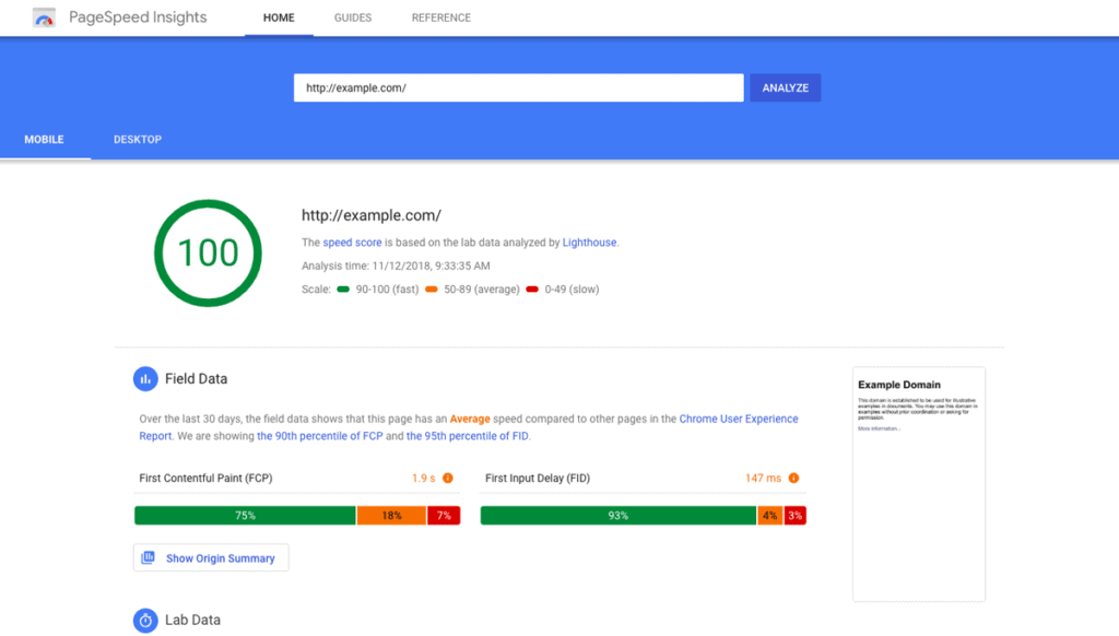
- Audit with PageSpeed Insights and Search Console.
- Serve WebP or AVIF with srcset and sizes.
- Set the image width, height, or aspect ratio to stabilise.
- Defer low‑priority JavaScript and trim third‑party tags.
- Use HTTP/2 or HTTP/3 via host or CDN.
- Inline key CSS and preload key fonts, font-display: swap.
- Source: Google Search Central and Chrome UX Report.
The State of Speed in 2026:
- INP replaced FID as a Core Web Vitals metric in 2024.
- Major CDNs broadly support HTTP/3 in modern browsers.
- Source: Google Chrome team and Cloudflare.
Wrong Way vs Right Way
- Wrong Way, Ship 5MB hero video above the fold.
- Right Way, Poster image, lazy load, and user play.
I once audited a retailer with 0.28 CLS.
Fixing image dimensions cuts bounces within a week.
Remember, every second counts. Don’t let your website be the digital equivalent of a snail race.
2. Mobile Unfriendliness: It’s 2025, Not 1994
If your website isn’t mobile-friendly, you might as well be using a carrier pigeon to deliver your message.
In 2024, mobile devices accounted for 60% of global website traffic. Yet, I still come across sites that look allergic to smartphones.
Mobile-First, Not Mobile-Afterthought:
- Use responsive design
- Prioritise content for mobile users
- Make buttons and links “thumb-friendly.”
- Test on multiple devices (not just your iPhone)
Mobile must-haves:
- Use meta viewport width=device-width, initial-scale=1.
- Provide responsive images to avoid oversized downloads.
- Avoid intrusive interstitials that block content.
- Meet 24×24 CSS px minimum target sizes.
- Test on throttled 3G and low‑end Android devices.
- Source: Google Search Central and WCAG 2.2.
3. Confusing Navigation: Don’t Make Users Play “Where’s Wally?”
Your website navigation should be as straightforward as a mountain stream, not as murky as the Thames.
I once visited a site where the menu was hidden behind an icon resembling a half-eaten sandwich. Seriously, who does that?
Navigate Away from Navigation Nightmares:
- Use clear, descriptive labels
- Limit main menu items (7±2 is the magic number)
- Include a search function
- Use breadcrumbs for deep sites
Remember, if users can’t find it, it might not exist.
4. Lack of Clear Call-to-Action (CTA): Don’t Leave ‘Em Hanging
Imagine going to a party where the host never tells you where the food is. That’s what a website without clear CTAs feels like.
Your visitors shouldn’t have to play detective to determine what you want them to do next.
CTA Clarity:
- Use action-oriented text (“Get Your Free Guide”, not “Click Here”)
- Make CTAs stand out visually
- Place CTAs strategically throughout the page
- A/B test different CTA variations
Don’t be shy. Tell your visitors exactly what you want them to do!
5. Cluttered Design: Less is More (Usually)

Remember my unicorn vomit website? Yeah, don’t do that.
A cluttered website is like a messy room – it’s hard to find what you’re looking for and just plain unpleasant.
Declutter Your Digital Space:
- Embrace white space
- Use a consistent colour scheme
- Limit font styles and sizes
- Group related elements together
Your website should be fresh air, not a punch in the face.
6. Poor Colour Choices: Not Everything Needs to Be Neon
Just because you can use every colour in the rainbow doesn’t mean you should.
I once saw a website with neon-green text on a bright-yellow background. I’m pretty sure I developed a temporary eye twitch after that.
Colour Me Impressed:
- Stick to a cohesive colour palette
- Ensure sufficient contrast for readability
- Consider colour psychology in your choices
- Don’t forget about colour-blind users
Contrast that passes:
- 4.5 to 1 for normal body text.
- 3 to 1 for large text and bold.
- 3 to 1 for UI components and graphics.
- Test with a contrast checker before sign‑off.
- Source: W3C WCAG 2.1 Success Criteria 1.4.11.
Remember, we’re designing websites, not recreating 80s disco posters.
7. Inconsistent Branding: Identity Crisis Much?
Your website should reflect your brand, not a chameleon changing its stripes on every page.
Consistency builds trust. Inconsistency? Well, that just confuses the heck out of people.
Brand It Like You Mean It:
- Use consistent logos, colours, and fonts throughout
- Maintain a consistent tone of voice
- Ensure all visual elements align with your brand guidelines
- Don’t forget about microinteractions and UI elements
Your brand is your promise to your customers. Don’t break it with a schizophrenic website.
8. Autoplay Media: The Auditory Assault
Nothing says “I don’t respect your choices” like autoplaying videos or music.
I once visited a site that auto-plays a full-volume heavy metal song. My neighbours probably thought I was having a midlife crisis.
Silence is Golden:
- Never autoplay videos or music
- If you must use autoplay, start muted with precise controls
- Consider user context (they might be at work or in a quiet environment)
- Provide transcripts for video content
Let your users choose when and if they want to engage with your media. Don’t force-feed it to them.
9. Ignoring Accessibility: Excluding Potential Customers

Accessibility isn’t just a nice-to-have; it’s a must-have.
Did you know that about 15% of the world’s population lives with some form of disability? That’s a huge market you could be alienating with an inaccessible website.
Access Granted:
- Use sufficient colour contrast
- Provide alt text for images
- Ensure keyboard navigation is possible
- Use descriptive link text (no more “click here”)
WCAG 2.2 essentials:
- Focus must not be obscured by sticky UI.
- Focus indicators must be clearly visible.
- Provide alternatives to dragging movements.
- Use 24×24 CSS px minimum target sizes.
- Avoid repeated entry by auto‑filling known data.
- Do not block copy and paste for login.
- Source: W3C WCAG 2.2 Recommendation.
Accessibility isn’t just about being inclusive; it’s about expanding your potential customer base. It’s a win-win!
10. Outdated Content: The Digital Cobwebs
An outdated website is like a mouldy loaf of bread – nobody wants it.
I once came across a site still advertising its “Y2K-ready services”. In 2025. Yep, really.
Keep It Fresh:
- Regularly update your content
- Remove or archive outdated information
- Keep your copyright date current
- Maintain an active blog or news section
Your website is often the first impression you make. Don’t let it be a dusty one.
11. Overly Complex Forms: Don’t Interrogate Your Users
Have you ever tried to sign up for something and felt like you were filling out a mortgage application? Yeah, don’t do that to your users.
Long, complicated forms are the quickest way to lose potential leads.
Form Follows Function:
- Only ask for essential information
- Use field validation to prevent errors
- Break long forms into steps
- Provide clear error messages
Faster, kinder forms:
- Use semantic inputs like email, tel, and date.
- Add inputmode for better mobile keyboards.
- Apply autocomplete for names and addresses.
- Link labels and errors with aria‑describedby.
- Set min, max, and pattern with clear hints.
- Allow paste into password fields and logins.
- Source: Baymard Institute and WCAG 2.2 Accessible Authentication.
I once saw 30 per cent fewer errors after autocomplete.
Remember, every field you add is another chance for the user to abandon the ship.
12. Lack of Social Proof: Trust Me, You Need This
In the digital world, social proof is currency. Without it, you’re just another faceless entity making claims on the internet.
Prove Your Worth:
- Display customer testimonials prominently
- Showcase awards and certifications
- Use trust badges (especially for e-commerce)
- Highlight media mentions or case studies
Don’t just tell people you’re awesome. Show them that others think you’re fantastic, too.
13. Poor Typography: Comic Sans is Not Your Friend
Typography can make or break your design. Choose poorly, and you might as well be writing in hieroglyphics.
Type Cast Your Site:
- Stick to 2-3 font families max
- Ensure readability across devices
- Pay attention to line height and spacing
- Use font sizing hierarchy for a clear structure
Remember, typography is not just about looking pretty; it’s about communicating effectively.
14. Ignoring Analytics: Flying Blind is for Birds, Not Businesses
If you’re not using analytics, you’re throwing spaghetti at the wall and hoping something sticks.
Data-Driven Design:
- Install and configure Google Analytics (or similar tool)
- Track critical metrics (bounce rate, time on site, conversion rate)
- Use heatmaps to understand user behaviour
- A/B test important elements
Measure what matters:
- Use GA4 with clearly defined conversion events.
- Track site search and zero‑result queries.
- Link Search Console for queries and CTR.
- Use consent‑aware tagging where laws require.
- Source: Google Analytics 4 and Search Console.
The State of Analytics in 2026:
- Consent Mode v2 is required for EEA ads.
- UA was sunset; GA4 is now standard.
- Source: Google Ads and Google Analytics announcements.
Data doesn’t lie. Use it to guide your design decisions and improvements.
15. Neglecting SEO: If a Tree Falls in a Forest…

You could have the most beautiful website in the world, but if no one can find it, does it even exist?
SEO SOS:
- Use descriptive, keyword-rich page titles
- Optimise meta descriptions
- Ensure your site structure is search engine-friendly
- Create quality, relevant content regularly
Ship the technical basics:
- Submit an XML sitemap in Search Console.
- Check robots.txt does not block key pages.
- Use rel=canonical for duplicate variants.
- Add structured data for rich result eligibility.
- Implement hreflang for multi‑regional content.
- Source: Google Search Central documentation.
Debunked:
- Sitemap priority and changefreq are not used by Google.
- Source: Google’s John Mueller, public statements.
Don’t let your website be the best-kept secret on the internet.
16. Lack of Contact Information: Don’t Play Hard to Get
Have you ever visited a website and felt you were trying to contact a secret government agency? Yeah, don’t be that business.
Be Reachable:
- Display contact info prominently
- Include a dedicated contact page
- Offer multiple contact methods (phone, email, form)
- Consider adding live chat for immediate support
Make it easy for people to throw money at you. It’s just good business.
17. Ignoring Page Load Feedback: The Silent Treatment
Users might think your site is broken when a page takes a while to load, and there’s no indication of progress.
Don’t leave them hanging like an awkward high five.
Loading… Please Wait:
- Use progress bars or loading animations
- Implement skeleton screens for content
- Provide feedback for form submissions and other actions
- Consider using lazy loading for images and content
A little feedback goes a long way in keeping users patient and engaged.
18. Overlooking 404 Pages: Turn Errors into Opportunities
A bland 404 page is a missed opportunity. It’s like finding a door in your house that leads to a blank wall.
404 Found:
- Create a custom, branded 404 page
- Include navigation options or a search bar
- Add a touch of humour (but keep it professional)
- Provide helpful links to popular pages
Make errors honestly:
- Return 404 or 410 for missing pages.
- Avoid 200 soft‑404s that mislead crawlers.
- Monitor Not Found in Search Console regularly.
- Offer category links and search to recover.
- Source: Google Search Central guidance.
Turn your 404 from a dead end into a new beginning.
19. Ignoring Cross-Browser Compatibility: One Size Doesn’t Fit All
Just because your site looks great in Chrome doesn’t mean it’s not a hot mess in Safari.
Browser-Friendly Design:
- Test on multiple browsers (Chrome, Firefox, Safari, Edge)
- Use CSS resets to create a consistent base
- Implement feature detection rather than browser detection
- Consider using a CSS framework for consistent rendering
Don’t let browser quirks turn your masterpiece into a Picasso painting.
20. Lack of Whitespace: Give Your Content Room to Breathe

Cramming every pixel with content is like stuffing a week’s worth of clothes into a carry-on bag. It’s possible, but it isn’t pretty.
Space It Out:
- Use generous margins and padding
- Break up long blocks of text
- Allow for breathing room around images and CTAs
- Don’t be afraid of space
Remember, whitespace isn’t wasted space. It’s breathing room for your content.
21. Inconsistent UI Elements: Don’t Make Users Learn a New Language
If your buttons, links, and interactive elements change style from page to page, you ask users to learn a new language every time they click.
UI Uniformity:
- Maintain consistent button styles
- Use the same hover effects throughout
- Keep form styles uniform across the site
- Ensure icons are from the same family or style
Consistency in UI is like good manners – it makes everything more pleasant.
22. Ignoring Site Speed on Mobile: The Need for Speed
Remember when I mentioned slow loading times earlier? Well, it’s even more critical on mobile.
Mobile users are often on the go and have spotty connections. Make them wait; they’re gone faster than you can say “bounce rate”.
Mobile Momentum:
- Optimise images specifically for mobile
- Minimise redirects
- Leverage browser caching
- Consider AMP (Accelerated Mobile Pages) for content-heavy sites
Your mobile site should be faster than a teenager’s thumbs on a smartphone.
23. Lack of Personalisation: One-Size-Fits-All is So Last Century
In an age where Netflix knows what you want to watch before you do, a static, one-size-fits-all website feels downright archaic.
Personal Touch:
- Implement innovative content based on user behaviour
- Use geolocation to provide relevant information
- Personalise CTAs based on browsing history
- Consider a recommendation engine for e-commerce sites
Make your users feel like VIPs, not just another IP address.
24. Ignoring Micro-Interactions: The Devil’s in the Details
Micro-interactions are those tiny moments of delight that make using a website feel satisfying. Ignore them; your site might function, but it won’t charm.
Micro Magic:
- Add subtle hover effects to buttons and links
- Use micro-animations for loading states
- Implement smooth scrolling
- Add satisfying feedback to form submissions
Micro-interactions that care:
- Honour prefers reduced motion for animations.
- Keep motion subtle and avoid layout shifts.
- Ensure strong, visible focus outlines are always used.
- Source: W3C WCAG 2.2 and MDN documentation.
These small touches can turn a good user experience into a great one.
25. Overcomplicating User Flows: Don’t Make Users Jump Through Hoops

If getting from point A to point B on your site feels like navigating a labyrinth, you’re doing it wrong.
Streamline the Journey:
- Minimise the number of steps in critical processes (like checkout)
- Use straightforward, linear navigation
- Provide progress indicators for multi-step processes
- Allow users to save their progress and return later
The path of least resistance should lead straight to your conversion goals.
26. Neglecting Site Search: Don’t Hide Your Content
A poor search function is like a librarian who doesn’t know the alphabet. It’s frustrating and ultimately useless.
Search Success:
- Implement a robust search function
- Use autocomplete and suggestions
- Provide filtering options for search results
- Ensure the search bar is easily accessible on all pages
Search that actually helps:
- Support stemming and synonyms in search.
- Handle no results with helpful suggestions.
- Log queries and zero‑result terms for fixes.
- Promote top categories when users seem lost.
- Source: Nielsen Norman Group and internal analytics.
Don’t make your users play hide and seek with your content.
27. Ignoring Performance on Low-End Devices: Not Everyone Has the Latest iPhone
While you might be rocking the latest tech, many users might be on older or lower-end devices.
Perform for All:
- Test on a variety of devices, not just high-end ones
- Optimise images and media for quicker loading
- Consider a progressive web app approach
- Provide a “lite” version of your site for users on slow connections
Don’t let device limitations limit your reach.
28. Lack of Clear Privacy Policies: Trust is a Must
In an age of data breaches and privacy concerns, not having a clear privacy policy is like inviting people to a party and asking them to sign a blank contract at the door.
Privacy Please:
- Clearly explain how you collect and use data
- Make your privacy policy easy to find and understand
- Be transparent about cookie usage
- Provide options for users to control their data
Building trust is crucial. Don’t let unclear policies erode it.
29. Ignoring Web Accessibility Guidelines: Inclusion is Not Optional
We touched on this earlier, but it bears repeating. Ignoring web accessibility isn’t just bad practice; in many places, it’s illegal.
Access for All:
- Follow WCAG guidelines
- Use proper heading structure
- Ensure all functionality is keyboard accessible
- Provide text alternatives for non-text content
Accessibility isn’t a feature; it’s a requirement.
30. Overlooking Website Security: Don’t Be the Next Data Breach Headline

In today’s digital landscape, website security isn’t just a nice-to-have—it’s a must-have. Neglecting it is like leaving your front door open in a dodgy neighbourhood.
When I first started Inkbot Design, I thought, “Who’d want to hack a small design agency?” Boy, was I naive. One morning, I woke up to find my site redirecting to a sketchy online pharmacy. Let’s just say it wasn’t selling paracetamol.
Lock It Down:
- Use HTTPS everywhere (it’s 2025, for crying out loud)
- Keep your CMS and plugins up to date
- Use strong, unique passwords (and a password manager)
- Implement two-factor authentication
- Regularly visit your website
Hardening checklist:
- Enable HSTS, CSP, and X‑Content‑Type‑Options.
- Set a strict Referrer‑Policy site‑wide.
- Use a WAF at your CDN or origin.
- Keep automated, off‑site, tested backups.
- Enforce least privilege and remove stale access.
- Patch PHP, server, and dependencies promptly.
- Source: OWASP and NCSC guidance.
Wrong Way vs Right Way
- Wrong Way, One admin account shared by everyone.
- Right Way, Per‑user accounts with MFA and logs.
Remember, it’s not just about protecting your data—it’s about protecting your customers’ trust.
31. Broken Consent and Cookies: Legal Trouble, Lost Trust
If your banner tricks users, you risk fines and churn.
What this means:
- The EU and UK require opt‑in for non‑strictly‑necessary cookies.
- Users must withdraw consent as easily as giving it.
- Keep consent records for audits and proof.
- Source: EDPB guidelines and UK ICO guidance.
Do this, not that:
- Wrong Way, Pre‑ticked boxes and hidden reject buttons.
- Right Way, Equal prominence for Accept and Reject.
Provide a “Do Not Sell or Share” link when needed.
Honour Global Privacy Control signals for California users.
Source: California Attorney General and CPPA guidance.
Google requires Consent Mode v2 for EEA ads personalisation.
Source: Google Ads policy updates in 2024.
CNIL has fined firms for non‑compliant cookie banners.
Source: CNIL enforcement actions reported publicly.
I once audited a SaaS solution that required forced consent.
Opt‑in rates rose after fixing dark patterns.
Don’t Let Your Website Be a Digital Dinosaur
There are 30 website design mistakes that could sabotage your online success. But here’s the thing: Knowing is only half the battle.
Now is the time to take action.
Look at your website with fresh eyes. Better yet, get someone else to look at it. Is it committing any of these sins? If so, it’s time for a change.
Remember, your website is often your first impression on potential customers. Make it count.
Don’t let your website be the digital equivalent of a mullet haircut—business in the front, party in the back, and ultimately a bad idea.
Instead, create a website that’s more like a bespoke suit—tailored to your audience, stylish, and making you look like a million bucks.
And if you’re feeling overwhelmed? Well, that’s where we come in. At Inkbot Design, we’ve seen it all and fixed it all. We can help turn your website from a liability into your most powerful asset.
Ready to stop making these mistakes and start making waves online? Let’s chat. Your future customers will thank you.
FAQs: Your Burning Questions, Answered
How often should I update my website design?
At least every 2-3 years, regularly update content and check for issues.
Is it essential to have a mobile-friendly website?
Absolutely. With over 60% of web traffic on mobile, it’s crucial.
How can I improve my website’s loading speed?
Optimise images, minimise HTTP requests, use browser caching, and consider a CDN.
What’s the most critical element of website design?
User experience. A beautiful site is only helpful if it’s functional.
How many CTAs should I have on a page?
It varies, but generally, one primary CTA and 1-2 secondary CTAs per page.
Is it worth investing in professional web design?
Yes, if you want a site that represents your brand and converts visitors.
How important is SEO in website design?
Crucial. Good design and SEO go hand in hand for online success.
Can I use templates instead of custom designs?
Templates can work for some, but a custom design offers unique branding and functionality.
How do I know if my website is accessible?
Use online accessibility checkers and test with actual users with disabilities.
What’s the most significant mistake people make in website design?
Prioritising aesthetics over functionality and user experience.
How can I make my website stand out from competitors?
Focus on your unique value proposition and ensure your design reflects your brand personality.
Is it necessary to have a blog on my website?
While not mandatory, a blog can significantly boost SEO and provide value to your audience.
Remember, your website is a living, breathing part of your business. Treat it with care, feed it regularly with fresh content, and it’ll return the favour by bringing in customers and growing your business.
Now, go forth and conquer the digital world! 🚀


