The Professional Logo Design Process: How To Make Logos
You do not need a logo because it “looks nice”. You need a logo because you have a business problem that requires a solution.
That might sound blunt, but in my years as Creative Director at Inkbot Design, I have seen too many entrepreneurs treat logo design and branding as an art project rather than a strategic investment.
A logo is the tip of the spear. It is the first thing a potential client sees and the last thing they remember. If it is generic, pixelated, or confusing, you are leaving money on the table.
We do not believe in design for design’s sake. Over the years, we have refined a battle-tested logo design process that eliminates guesswork and ensures a consistent, high-quality result.
This isn’t about staring at the clouds waiting for a “lightbulb” idea; it is a forensic process of research, strategic thinking, and execution.
Whether you are a startup founder or a marketing manager, this guide will reveal the secrets behind how professional agencies craft identities that thrive in the market.
- Design must solve a business problem: a logo is strategic, not decorative, and must align with commercial goals and audience needs.
- Follow a rigorous process: brief, research, sketching, vectorisation, black‑and‑white testing, and contextual presentation ensure effectiveness.
- Deliverables and ownership matter: provide vector files, comprehensive asset library, and brand guidelines to ensure consistency and legal protection.
What is a Logo Design Process?
A logo design process is a structured workflow that professional designers use to deliver a brand identity that meets specific business goals. It moves beyond aesthetic preference to solve a communication problem.
The core components of a successful process include:
- Discovery: Understanding the business case and the industry landscape.
- Strategy: Defining where the brand sits in the market and identifying target audiences.
- Execution: The technical craft of sketching, vectorising, and refining visuals.
- Delivery: Providing usable, scalable files for real-world applications.
Without a process, you are just drawing shapes. With a process, you are building an asset.
Logo Performance Audit
Is your logo helping you grow, or holding you back? Answer 8 technical and design questions to get a Letter Grade (A-F) for your current logo.
Question…
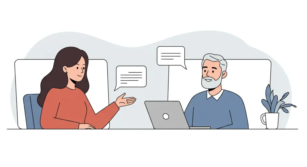
1.0 – Construct the Creative Design Brief
The biggest lie in the design industry is that creativity requires total freedom. It doesn’t. Creativity thrives on constraints. The creative design brief is where we build the box we are going to play in.
If a client comes to us and says, “I’ll know it when I see it,” we know we are in for a rough ride. That is not a brief; that is a guessing game. To deliver a logo design service that actually works, we need criteria.

1.1 – What is a Creative Design Brief?
Think of the brief as the architectural blueprint. You wouldn’t hire a builder and say, “Build me a house, surprise me.” You would specify the number of rooms, the style, and the budget.
In our workflow, the brief is a questionnaire comprising around 20 targeted questions. It usually takes a client an hour to complete. That hour saves weeks of wasted revisions later. The quality of the output is directly correlated to the quality of the input.
1.2 – The Interrogation (What We Ask)
We don’t just ask, “What colours do you like?” We dig deeper. Our questionnaire is segmented into three critical areas:
- The Commercial Reality: What is the product? What specific problem does it solve? If you sell coffee, are you selling caffeine (speed) or community (comfort)? The design solution for those two value propositions looks very different.
- The Audience Profile: Who Is the Ideal Client? Not “everyone.” “Everyone” is no one. We need to know if we are talking to 18-year-old skaters or 60-year-old pension fund managers.
- The Visual Audit: We ask for three links to brands you envy and three you despise. Visual language is subjective; seeing what you hate is often more useful than hearing what you love.
Pro-Tip: If you are commissioning a logo, do not use adjectives like “innovative” or “modern” without defining them. “Modern” to a lawyer means something very different from “modern” to a tech founder. Use visual examples.
2.0 – Research & Discovery Phase
Once the brief is signed off, we stop talking and start researching. This is the “Discovery Phase.” It is where we fact-check the brief against the reality of the market.
2.1 – Client Discovery
We audit the existing business. If it’s a rebrand, we examine where the current identity is falling short. Is it a legibility issue? Does it look like a clip-art template from 1999? Sometimes the client thinks they have a logo problem, but they actually have a business model problem. We need to identify if the design can fix the issue.
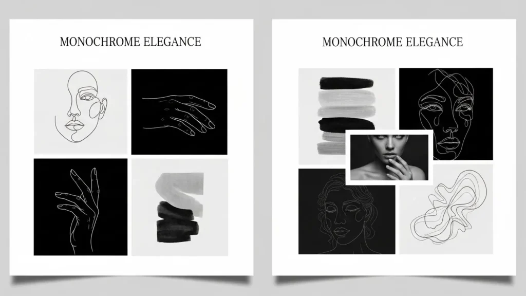
2.2 – Mood Boards: The Visual Filter
This is where mood boards separate the pros from the amateurs. A mood board isn’t just a collage of pretty pictures; it is a strategic filter.
We create distinct mood boards to explore different visual territories. One mood board might focus on “Heritage and Trust,” utilising serif fonts and muted colours. Another mood board might focus on “Disruption and Tech,” featuring neon palettes and abstract shapes.
We present these boards to the client before we design a single logo. This exercise aligns our visual language. If the client hates the “Disruption” mood, we know not to waste time sketching in that direction. It establishes the design criteria early, ensuring we are all pulling in the same direction.
2.3 – Competitive Auditing
We look at your competitors. If every law firm in your city uses a blue serif font and a pillar icon, we have two choices:
- Blend in: Use similar codes to look “safe.”
- Disrupt: Use a different colour palette to own a new visual space.
According to research by the Ehrenberg-Bass Institute, distinctiveness is the primary driver of brand growth. Being “different” makes you easier to remember. We analyse the industry landscape to find the “white space” where your brand can dominate.
3.0 – Logo Sketches & Brainstorming
This is the only part of the process that resembles the “artist” stereotype. But let me be clear: no computers are allowed yet.
3.1 – The Pencil is Mightier than the Mouse
We start with a pencil and a sketchbook. Why? Because software tools like Illustrator are restrictive. They force you into geometric perfection too early. A pencil allows for rapid, fluid iteration.
We might draw 50, 100, or 200 rough scamps. Ninety per cent of them will be terrible. That is the point. You have to eliminate the bad ideas from your system to find the gold. This sketching exercise is crucial. We look for:
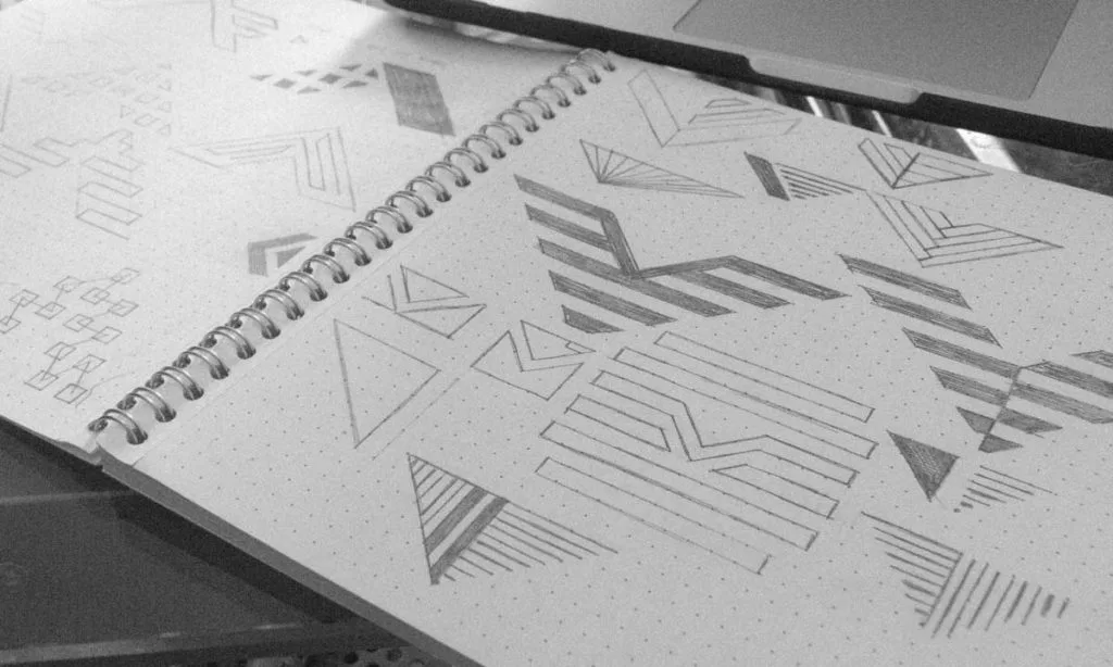
- Visual Puns: Clever combinations of concepts.
- Negative Space: Hidden shapes between the lines (like the FedEx arrow).
- Reductive Geometry: How simple can we make this shape while keeping the meaning?
As the legendary designer Sagi Haviv often argues, a logo must be simple enough to be drawn by a child in the sand. If it relies on complex effects, it fails the memorability test. We apply this principle ruthlessly.
3.2 – Grid Systems and Rationalisation
Once we have a strong idea on paper, we refine it. We look at the balance. Is it top-heavy? Will it topple over visually? We use grid paper to check the underlying structure. Even organic shapes need a skeleton to feel “right” to the human eye.
4.0 – Conceptualisation (The Digital Phase)
Now, we move to the screen. We take the best 3-5 sketches and vectorise them.
4.1 – Vectorisation
We use Adobe Illustrator to create vector paths. Unlike a photo (raster), which is made of pixels, a vector is made of math. This means you can scale it from the size of a postage stamp to the side of an aircraft carrier, and it will never lose quality.
If a “designer” delivers your logo in Photoshop, fire them. A professional logo must be vector-based.
4.2 – The Black and White Rule
This is a hill I will die on: If the logo does not work in black and white, it does not work.
We design exclusively in monotone first. No colour. No gradients. No drop shadows.
Why? Because a logo needs to survive in the worst possible conditions. It needs to work on a fax machine, a black-and-white receipt, or be engraved into metal. If the design concept relies on colour to be understood, it is a bad design. Colour is a luxury; form is a necessity.
4.3 – Typography and Wordmarks
The symbol (logomark) is only half the battle. The text (wordmark) carries the name. We browse our extensive foundry libraries to find a typeface that complements the mark.
For many brands, a wordmark is the logo (think Google or FedEx). In this exercise, we look at:
- Serif: Traditional, trustworthy, editorial.
- Sans-Serif: Modern, clean, tech-focused.
- Script: Human, creative, informal.
We often customise the font—shaving off a serif here, adjusting a ligature there—to ensure the wordmark is unique to your brand identity.
5.0 – Refinement & Client Presentation
We do not just email a JPG and say, “Here you go.” That is how ideas die. We present the work in context.
5.1 – Contextual Mockups
A logo sitting on a white background tells you nothing. You need to see how it lives in the real-life environment. We create “mockups”—digital renders of the logo on:
- Business cards.
- Shop signage.
- Uniform embroidery.
- App icons.
This helps the client visualise the brand identity as a system, not just a sticker.

5.2 – The Presentation Document
We collate the strongest design concepts (usually 3) into a PDF presentation. We explain the rationale behind every curve and corner. We link the design decisions back to the initial brief and the criteria we set.
- “We chose this blue because you wanted to signal ‘trust’ to the banking industry.”
- “We used a bold font because you need to stand out on a crowded supermarket shelf.”
6.0 – Feedback & The “Make It Pop” Problem

Feedback is essential, but it can be dangerous.
We advise clients to take their time. Sit with the designs for a few days. Print them out. Stick them on the fridge. Look at them when you are tired, when you are busy, when you are distracted. That is how your customers will see them.
6.1 – Valid vs. Invalid Feedback
Valid: “This symbol looks too much like our competitor’s icon.”
Invalid: “My wife hates green.”
Design is subjective, but branding is objective. We defend our work not because we are arrogant, but because we have done the strategic thinking. If we chose green, it’s likely because your competitors all use blue, and green offers a strategic advantage.
We guide the client through the selection process, ensuring personal bias doesn’t derail commercial strategy.
7.0 – Concept Development & Tuning
Once a route is chosen, we refine it. This is the “polish” phase.
- Kerning: Adjusting the space between letters to ensure optical balance.
- Colour Calibration: Tweaking the exact shade of red to ensure it prints correctly.
- Optical Corrections: Making horizontal lines slightly thinner than vertical lines so they look the same weight to the human eye.
8.0 – The Delivery: Final Files & Guidelines
The project isn’t finished until the files are delivered correctly. This is where many amateurs fail. They send a single PNG and disappear.
8.1 – The Asset Library
We provide a comprehensive suite of files. You are paying for a toolkit, not a single image.
- AI / EPS (Vector): The master files. For professional printing, signage, and editing.
- JPG (Raster): For internal documents and Microsoft Word.
- PNG (Raster): Transparent background for websites and email signatures.
- SVG (Web Vector): For crisp display on mobile devices and 4K screens.
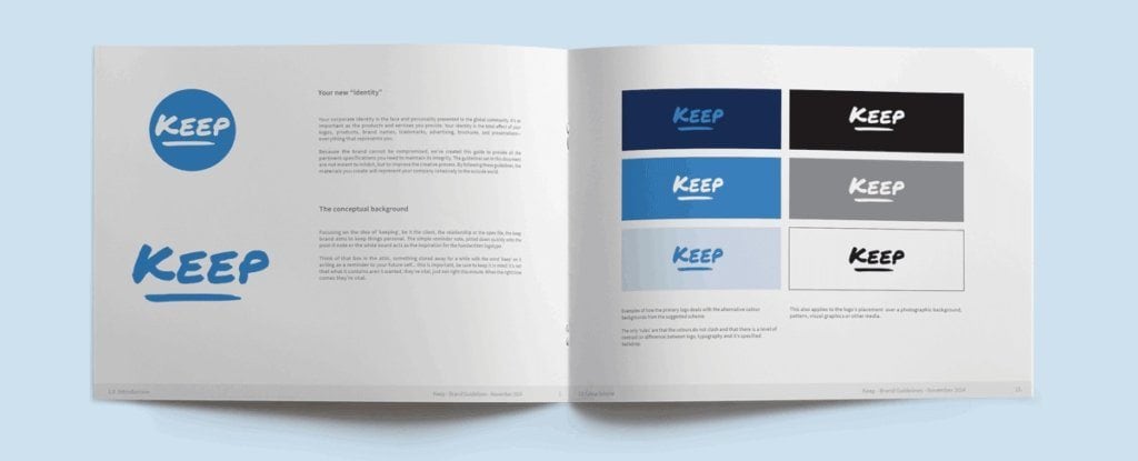
8.2 – Brand Guidelines (The Brand Book)
We create a Brand Guidelines document, often referred to as a Brand Book. This manual tells your staff and future vendors how to use the logo.
- Do: Use the logo with clear space around it.
- Don’t: Stretch, squash, or recolour the logo.
This document ensures consistency. Consistency builds trust. Trust builds revenue.
The Role of Colour, Typography, and Shape
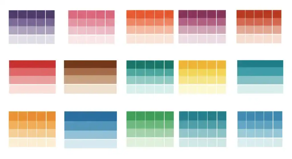
Choosing the Right Colour Palette
Colour is the most emotional signal a brand possesses. According to Colorcom, colour increases brand recognition by up to 80%.
- Red: Urgency, appetite, excitement (Coca-Cola, Netflix).
- Blue: Trust, security, logic (Chase, Facebook, IBM).
- Yellow: Optimism, clarity, caution (McDonald’s, Best Buy).
We select palettes based on colour psychology and the ability to reproduce them on all media. There is no point picking a neon green if it cannot be printed on a standard CMYK brochure.
Selecting Appropriate Typography
Typography is the voice of your brand.
- Geometric Sans: Says “We are objective, modern, and efficient.” (Google).
- Old Style Serif: Says “We have heritage and authority.” (The New York Times).
- Humanist Sans: Says “We are friendly and approachable.” (Airbnb).
Legibility is the priority. If people cannot read your wordmark in 3 seconds, you have lost them.
Creating Meaningful Shapes
Our brains are hardwired to instantly decode shapes.
- Circles: Unity, community, femininity.
- Squares: Stability, balance, masculinity.
- Triangles: Power, direction, conflict.
We use these primitive forms to subliminally communicate your brand values before the customer even reads the text.
Technical Deep Dive: Vector vs. Raster
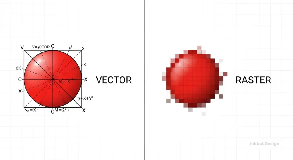
I cannot stress this enough: You must own vector files.
| Feature | Vector (AI, EPS, SVG) | Raster (JPG, PNG, GIF) |
| Composition | Mathematical formulas (paths/curves). | Pixels (coloured squares). |
| Scalability | Infinite. Pen tip to billboard. | Finite. Gets blurry/pixelated when enlarged. |
| File Size | Generally small and efficient. | It can be heavy at high resolutions. |
| Editability | Fully editable shapes and colours. | Difficult to edit individual elements. |
| Primary Use | Master logos, printing, and embroidery. | Web photos, social media posts. |
| The Verdict | Required for Logos. | Forbidden for Master Logos. |
If your designer only gives you a JPG, they have not sold you a logo; they have sold you a sticker.
The State of Logo Design in 2026
The landscape has shifted. In the last 18 months, we have seen a massive rise in Generative AI tools claiming to “design logos in seconds.”
AI can make pictures, but it cannot build brands.
AI tools scrape existing imagery, meaning they are derivative by definition. They cannot interview your CEO, understand the nuances of your market, or conduct a visual audit of your local competitors.
Furthermore, copyright law regarding AI-generated art is a complex and nuanced area of law. The US Copyright Office and other global bodies have indicated that purely AI-generated works may not be copyrightable. Do you want to build your business empire on a logo you cannot legally protect?
Professional human design is no longer just about aesthetics; it is about legal ownership and strategic understanding.
Why “Cheap” Logos Are Expensive

We often get requests to “fix” logos bought from budget contest sites. The issues are always the same:
- Stolen Art: The designer copied a stock icon, meaning 50 other companies have your logo. You cannot trademark it.
- Poor Technical Execution: The nodes are messy, meaning the vinyl cutter at the sign shop will tear the material.
- Zero Strategy: It looks “cool” but appeals to the wrong audience.
If you pay £50 for a logo, you will likely spend £5,000 fixing the problems it causes down the line. As the saying goes: “If you think good design is expensive, you should look at the cost of bad design.”
Ready to Build a Serious Brand?
Your logo is the anchor of your business identity. Do not leave it to chance. At Inkbot Design, we combine creative flair with commercial strategy to build brands that work.
Request a Quote today, or explore our services to see how we can help you dominate your market.
Frequently Asked Questions (FAQ)
How long does the professional logo design process take?
A typical professional logo design project takes between 2 to 4 weeks. This includes the briefing, research, conceptualisation, and refinement phases. Rushing the process often leads to generic results that fail to differentiate the brand.
Why do I need vector files for my logo?
Vector files (AI, EPS, SVG) use mathematical paths rather than pixels. This allows your logo to be scaled to any size—from a business card to a billboard—without becoming blurry or pixelated. Raster files (JPG, PNG) will lose quality when enlarged.
How much should a small business budget for a logo?
Prices vary widely, but a professional freelance designer or small agency typically charges between £1,000 and £ 5,000 or more. This fee covers not only the drawing but also market research, strategy, and the transfer of licensing rights, which are essential for commercial use.
What is the difference between a logo and a brand?
A logo is a graphic symbol (the “flag”). A brand is the perception of your company in the customer’s mind (the “country”). Your brand encompasses not only your logo, but also your voice, customer service, reputation, and principles.
Can you use AI to design my logo?
We do not use AI to generate final logo assets. AI tools often create derivative work that cannot be copyright-protected. We use human creativity and strategic thinking to ensure your logo is original, ownable, and legally defensible.
What happens if I don’t like the initial concepts?
This is rare due to our thorough briefing phase, but if it happens, we revisit the brief. We analyse why the design concepts missed the mark and iterate. Professional design is a collaborative process, not a “take it or leave it” transaction.
Do I own the copyright to my logo?
Yes. Upon final payment, Inkbot Design transfers all economic rights of the final chosen design to you. You are free to trademark the logo and use it commercially without recurring royalties.
Why does my logo need to work in black and white?
A logo must be versatile. It needs to be legible in single-colour formats, such as receipts, fax headers, or embroidery. If a design relies solely on colour to be understood, it will fail in these restrictive environments.
How many logo concepts will I receive?
We typically present 3 distinct strategic routes. Providing too many variations (e.g., 20) can cause “decision paralysis” and typically results in a weaker choice. We curate the best solutions based on your business goals.
What are Brand Guidelines?
Brand Guidelines (or a Style Guide) are a manual that explains how to use your logo. The Style Guide defines clear space, minimum sizes, colour codes (CMYK/RGB/Hex), and font usage to ensure your brand looks consistent across all marketing materials.
Can I just update my old logo instead of getting a new one?
Yes, this is referred to as a “brand refresh.” It is often a better strategy for established businesses that want to modernise without losing existing brand equity. We refine the shapes and typography while maintaining the core recognition.
What file formats do you deliver?
We deliver a comprehensive asset library, including AI and EPS (Master Vector), PDF (Print), JPG (High-Resolution Raster), PNG (Transparent Background), and SVG (Web Vector). This covers every possible use case from web to print.


