Monogram Mastery: 30 Letter Logos That Define Their Brands
A letter logo is not the easy option.
Too many entrepreneurs, seduced by minimalism, think they can pick a cool font, type their company’s initials, and call it a day. That’s not a logo. That’s a typing exercise.
The result is a sea of forgettable, generic marks that do nothing to build a brand. They are the visual equivalent of hold music. Present, but ignored.
The truth is, the simplest-looking logos are often the hardest to design. They rely on Intentional Simplicity.
It’s the art of distilling a brand’s story into a memorable gesture. There’s nowhere to hide weak ideas or poor execution.
We will look at 30 examples of letter logos that get it right. From single-letter giants to clever three-letter combinations, these designs prove simplicity is the ultimate sophistication.
Pay attention to the thinking behind them.
- Letter logos require intentional simplicity, distilling brand stories into memorable designs.
- Successful logos use unique, custom designs, ensuring they are scalable and recognisable.
- Simplicity is not simplistic; clever concepts create lasting impressions and distinct identities.
- A logo is a strategic asset, not just initials; invest in a unique visual identity.
What Actually is a Letter Logo? (And Why You Should Care)
In the simplest terms, a letter logo uses one or more letters—typically a company’s initials—as the core of its visual identity. They are clean, efficient, and great for businesses with long or difficult-to-pronounce names.
You’ll hear designers throw around a couple of specific terms.
Lettermarks vs. Monograms: The Quick Version
A Lettermark is a logo made of initials that are spoken as an acronym. Think IBM (International Business Machines), HBO (Home Box Office), or NASA (National Aeronautics and Space Administration).
A Monogram is a purely visual design of interwoven or combined initials. Think of the Chanel ‘CC’ or the Louis Vuitton ‘LV’. You see the symbol, you don’t say the letters.
For you, the business owner, the distinction is academic. The goal is identical: create a powerful, recognisable symbol from your initials.
The Single-Letter Champions: Making One Initial Unforgettable
Owning a single letter of the alphabet is the ultimate branding power move. It’s challenging. To succeed, the letter can’t just be typed.
It has to be drawn, customised, and infused with an idea. It has to become more than a letter; it must become a symbol.
1. McDonald’s ‘M’
This is the benchmark. It’s not just an ‘M’; it’s the “Golden Arches.” The design originates from the architecture of their early restaurants. Those warm, inviting curves represent a physical place, a feeling of comfort, and fast, reliable food. It’s a concept embedded in a letterform.
2. Netflix ‘N’
The modern Netflix ‘N’ is a masterclass in subtle storytelling. It’s drawn to look like a folded ribbon, giving it a depth and cinematic quality that a flat letter wouldn’t have. The curve at the base even suggests a slight smile, hinting at entertainment.
3. Pinterest ‘P’
This is concept-driven design at its finest. The letter ‘P’ has been customised, so its primary stroke is a map pin. The brand’s core function—pinning things you’re interested in—is baked directly into its initial. It’s clever, memorable, and impossible to separate from the brand’s purpose.
4. Unilever ‘U’
At first glance, it’s a ‘U’. Look closer; it comprises 25 smaller icons, each representing a different aspect of their massive product portfolio (a heart for health, a swirl for ice cream, etc.). It’s a complex story told within a simple, elegant shape.
5. Beats by Dre ‘b’
This logo does double duty with brilliant simplicity. It’s a lowercase ‘b’ but also a perfect representation of a human head wearing headphones. The concept is so strong and clear that you can’t unsee it.
6. WordPress ‘W’
The clean, sans-serif ‘W’ is professional and modern. The interlocking, layered strokes give it a sense of connection and community, reflecting the platform’s open-source nature. It’s in a circle, making it a versatile and button-like mark.
7. Yahoo! ‘Y’
The Pentagram-designed Yahoo! logo uses a bold, italic ‘Y’ with an exclamation point carved into the end. The dramatic 30-degree angle gives it a sense of forward momentum and excitement, perfectly capturing the brand’s energetic (and slightly goofy) personality.
8. Adobe ‘A’
The abstract, brushstroke-style ‘A’ is instantly recognisable. Designed by Marva Warnock (wife of co-founder John Warnock), it feels creative and expressive, perfectly aligning with the company’s software for artists and designers.
9. The Economist ‘E’
It’s just a capital ‘E’ in a red box. But the specific, bold serif font conveys authority, heritage, and intellect. The stark red colour grabs attention and signifies importance. It’s a testament to how colour and typography communicate a brand’s ethos.
10. Suzuki’s ‘S’
The Suzuki’s S’ is sharp, dynamic, and has a blade-like quality. The pointed edges give it a feeling of precision, speed, and engineering, perfect for a company that makes motorcycles and cars. It’s aggressive in a clean, controlled way.
The Power of Two: Creating Chemistry with Letter Pairs
Combining two letters opens up a new world of creative possibilities. The goal isn’t just to place them side-by-side. It’s to find a clever way for them to interact. This is where designers use negative space, ligatures, and interlocking shapes to create something greater than the sum of its parts.
11. Chanel ‘CC’
The interlocking ‘CC’ is the gold standard of fashion monograms. It’s perfectly symmetrical, elegant, and timeless. The reflection of one ‘C’ onto the other creates a beautiful, balanced shape that is the very definition of luxury. It was reportedly designed by Coco Chanel herself in 1925.
12. Volkswagen ‘VW’
A triumph of German engineering in logo form. The ‘V’ sits perfectly on top of the ‘W’, enclosed in a circle that gives it the feel of a quality seal or an emblem on a car. The geometry is flawless, communicating reliability and precision.
13. Roger Federer ‘RF’
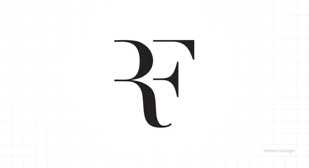
This is an absolute masterclass in creating an elegant, personal monogram. The ‘R’ and ‘F’ are not simply placed together; they flow into a single, fluid form. It has the grace of a tennis stroke and the classic feel of a luxury brand.
Designs like this require a deep understanding of typography and balance. It’s the nuanced detail we focus on in our logo design services.
14. Louis Vuitton ‘LV’
Like Chanel, the ‘LV’ monogram is synonymous with luxury. The italic, serif font with its overlapping letters creates a classic, powerful statement. It’s often used in a pattern, turning a simple monogram into a desirable and globally recognised texture.
15. General Electric ‘GE’
Created in the 1890s, the script ‘GE’ monogram has a sense of history and invention. The flourishes and swirls within the circle suggest motion and flow, like electricity in a turbine. It has remained unchanged for over a century, a testament to its enduring design.
16. Hewlett-Packard ‘HP’
The simplicity of the ‘hp’ in a circle is its strength. The lowercase letters feel accessible and human. The ascender of the ‘h’ and descender of the ‘p’ extend to touch the circle, creating a sense of completeness and containment. It’s friendly, techy, and solid.
17. Warner Bros. ‘WB’
The ‘WB’ shield is an institution. It feels grand, meaningful, and quintessentially Hollywood. The letters are custom-drawn to fit perfectly within the shield shape, giving it a powerful, unified presence that works perfectly at the start of a film.
18. Procter & Gamble ‘P&G’
After retiring their complex 19th-century moon-and-stars logo, P&G opted for this clean, corporate monogram. How the ‘P’ and ‘G’ are linked by a single, fluid line is simple and effective. It’s a modern, trustworthy mark for a consumer goods giant.
19. Under Armour ‘UA’
The interlocking ‘U’ and ‘A’ is aggressive and dynamic. The shapes are thick, strong, and almost weapon-like, perfectly capturing the brand’s focus on high-performance athletic gear. The logo looks fast and powerful, even when standing still.
20. Electronic Arts ‘EA’
The EA logo is geometric and modern. By breaking the letters down into simple shapes—a circle for the ‘e’ and a triangle for the ‘a—they created a logo that felt futuristic and digital, perfect for a video game company in its infancy. It has since evolved, but the core geometric concept remains.
Triple-Threats: When Three Letters Become an Institution
Three-letter logos are almost always lettermarks for companies with long names that the public naturally shortens.
The design challenge here is creating rhythm, balance, and visual interest across three characters. These logos often become so iconic that they are more recognisable than the company’s full name.
21. IBM
Designed by the legendary Paul Rand, the 8-bar IBM logo is a cornerstone of corporate identity. The horizontal stripes (or scanlines) unify the three blocky letters, suggesting speed, technology, and dynamism. It transformed a set of simple initials into a symbol for the entire digital age.
22. BBC
The British Broadcasting Corporation’s logo is a masterclass in conveying authority and trust through sheer simplicity. The three letters in square blocks are clean, balanced, and versatile. Placing each letter in its container makes the design feel structured, impartial, and solid—perfect for a global news organisation. It is instantly recognisable and works flawlessly across mediums, from a TV screen to a news app icon.
23. Yves Saint Laurent ‘YSL’
This vertical monogram, designed by A.M. Cassandre in 1961, is a stunning piece of typographic art. It breaks all the conventional rules by stacking and interlocking the letters in a complex and perfectly balanced way. It’s a high-fashion statement that is as elegant and daring as the brand.
24. ABC
Another Paul Rand design from 1962. The lowercase ‘abc’ in a solid black circle is brilliantly simple. Lowercase makes it feel accessible and friendly, while the stark, perfect geometry of the letters and circle makes it authoritative and modern. It has barely changed in over 60 years.
25. CNN
The CNN logo is designed to suggest urgency and connection. The central line that runs through all three letters resembles a cable, nodding to “Cable News Network.” The bold and tightly kerned letters give the logo a compact, immediate feel that suits a 24-hour news cycle.
26. UPS
Paul Rand’s 1961 redesign encapsulated the entire UPS business in a simple shield. The shield implies security and reliability, while the simple, strong letters above it are clear and direct. It’s a mark that says “your package is safe with us.”
27. HBO
The genius of the HBO logo is its simplicity. The ‘O’ with an overlapping circle inside is a subtle nod to a lens or a target, fitting for a television network. It created a premium feel by keeping the typography stark and bold, setting the stage for its famous tagline: “It’s not TV. It’s HBO.”
28. CVS
In 2014 CVS added the geometric “CVS Heart” to their logotype. This simple addition transformed a generic set of letters into a symbol of health and care. It visually communicates their shift from a simple pharmacy to a broader healthcare company. It’s a great example of how a simple graphic element can redefine a lettermark.
29. DHL
The DHL logo is all about communicating one thing: speed. The bold, italicised letters lean forward, creating a powerful sense of motion and urgency. The bright red typography on a yellow background is high-contrast and attention-grabbing, ensuring it stands out on delivery trucks and packages. It’s a simple, aggressive design that perfectly matches the fast-paced nature of the global logistics industry.
30. GMC
The modern GMC logo is all about being bold and strong. The thick, underlined letters have a clean, industrial feel. The silver chrome finish often used in advertising reinforces their trucks’ metallic, tough nature. It’s a no-nonsense logo for a no-nonsense brand.
The Common Thread: What Do All These Great Logos Share?
Looking back at these 30 examples, a few clear patterns emerge. These aren’t just pretty letters; they are strategic business assets built on a foundation of solid design principles.
They Are Simple, Not Simplistic
This is the core idea of Intentional Simplicity. The Chanel logo isn’t just two ‘C’s; it’s a perfectly symmetrical representation of elegance. The Beats logo isn’t just a ‘b’; it’s a person listening to music. Every great letter logo has a core concept distilled into its simplest possible form.
They Are Scalable
This is a non-negotiable, technical requirement that many amateurs forget. Every logo on this list looks as good on a massive billboard as a tiny 16×16 pixel favicon in a browser tab. The lines are clean, the shapes are distinct, and there are no fine details to get lost when shrunk.
They Are Unique
None of these logos could be recreated by typing on a keyboard. They are custom-drawn pieces of art. The spacing, the curves, the thickness of the lines—every element has been meticulously crafted to create a unique and legally defensible asset. This is why they are memorable and stand out from the competition.
Feeling Inspired? Don’t Just Copy, Create.
The biggest takeaway from this list should be that your company’s initials are a fantastic starting point for a logo, not the final product.
The real work lies in the creative process: Can those letters be combined? What idea can they represent? How can they be drawn uniquely to your brand’s personality?
A great logo is an investment. It’s the face of your company and your hardest-working employee, making an impression 24/7. If you settle for a generic template, you’re signalling that your business might be generic, too.
We build logos designed for the real world—simple, memorable, and unique marks. If you’re ready to create a visual identity that lasts, look at our logo design approach or request a quote when you’re ready to talk specifics.
Frequently Asked Questions About Letter Logos
What is a letter logo?
A letter logo is a type of logo that consists primarily of one or more letters, typically the initials of a company’s name. They are also known as lettermarks or monogram logos.
What is the difference between a lettermark and a monogram?
A lettermark is an initial-based logo that is spoken as an acronym (e.g., IBM, CNN). A monogram is a visual design of initials recognised as symbols, not spoken letter by letter (e.g., the Louis Vuitton ‘LV’).
Are letter logos a good choice for a new business?
Yes, they can be excellent. If your company has a long name, a letter logo can be a simple, memorable representation. The key is to ensure the design is professional and unique, not just a typed font.
How many letters should a logo have?
There’s no hard rule, but 1 to 3 letters is the most common and effective range. Any more than that, and it starts to become a wordmark rather than a lettermark.
What makes a good monogram logo?
A good monogram is simple, memorable, scalable, and unique. The letters should interact cleverly or elegantly, creating a balanced and harmonious shape.
Can I just use a font for my letter logo?
You shouldn’t. While you can start with a font for inspiration, a professional logo should be a custom-drawn vector graphic. This ensures it is unique, defensible, and can be modified for perfect balance and scalability.
How much does a professional letter logo cost?
Costs can vary widely, from a few hundred to thousands of pounds or dollars, depending on the designer’s experience and the project’s scope. It’s an investment in a core business asset.
What is negative space in a logo?
Negative space is the space around and between the elements of a design. Skilled designers use negative space to create hidden shapes or improve the balance and readability of a logo.
Why is scalability important for a logo?
Scalability means the logo looks good and remains legible at any size—from a giant billboard to a tiny social media icon. Logos with overly complex details fail this test.
How do I trademark a letter logo?
To trademark a logo, you must apply to the intellectual property office in your country (e.g., the IPO in the UK or the USPTO in the US). The logo must be distinctive and not confusingly similar to existing trademarks.
Who designed the IBM logo?
The iconic 8-bar IBM logo was created by the legendary American graphic designer Paul Rand in 1972.
Is the new minimalist trend suitable for letter logos?
Letter logos are naturally minimalist. The current trend towards simplification can be very effective, but also raises the bar. When a design is straightforward, every detail must be perfect.


