Why Simple Design Wins: Create Stunning Visuals with Less
Have you ever looked at a website or product and thought, “Blimey, what a mess”?
I certainly have.
I once lost a potential client because my portfolio website looked like a toddler’s art project after a sugar binge.
It was a wake-up call.
I realised that in my desperate attempt to showcase everything I could do, I’d created a visual nightmare that accomplished precisely nothing.
That’s when it hit me: simple design isn’t just better design—it’s the key to effective communication.
So, let’s dive into why keeping things simple is your secret weapon in the design world, shall we?
- Simple design enhances user experience, making information easy to digest and focus on key messages.
- Reduces cognitive load, allowing users to process information more efficiently.
- Apple and Google exemplify simple design, creating iconic, memorable interfaces.
- Employ strategies such as embracing white space and limiting colour palettes to enhance clarity.
- Iterate designs based on user testing; simplicity should never sacrifice essential functionality.
Economic ROI & Conversion Metrics of Simplicity
When we discuss “simple design,” the conversation often drifts into the realm of aesthetics—how a page feels or looks.
However, for a business owner or a marketing director in 2026, the most compelling argument for simplicity is the Conversion Rate Optimisation (CRO) data. Simplicity isn’t just a visual preference; it is a financial strategy.
The Cost of Complexity
A landmark Google study on “Visual Complexity and Prototypicality” found that users form an opinion about a website’s beauty and functionality within 17 to 50 milliseconds.
The study found that websites with “low visual complexity” were consistently rated as more attractive than their cluttered counterparts. But the impact extends far beyond first impressions. In a high-stakes commercial environment, every extra element on a page acts as “friction.”
Friction in design is any hurdle that prevents a user from completing their intended action. When you reduce the number of form fields, remove distracting sidebar advertisements, or clarify a single Call to Action (CTA), you are directly reducing the cognitive cost of the transaction.
Real-World ROI Benchmarks
Data from the Nielsen Norman Group suggests that simplifying the checkout process can lead to a 15–30% uplift in completed transactions. For an enterprise generating £10 million in annual online revenue, a simple design overhaul could yield £3 million in savings without increasing marketing spend.
| Metric | Complex/Standard Design | Simple/Minimalist Design | Delta (%) |
| Average Time on Task | 4.2 Minutes | 2.8 Minutes | -33% |
| Conversion Rate (Lead Gen) | 2.4% | 3.9% | +62.5% |
| Bounce Rate | 58% | 41% | -29.3% |
| Mobile Completion Rate | 1.8% | 3.1% | +72.2% |
| Customer Support Tickets | 12% of users | 5% of users | -58% |
The “Simplicity Dividend”
Beyond immediate conversions, a simple design generates what we call a “Simplicity Dividend.” This refers to the long-term reduction in Technical Debt and maintenance costs. A minimalist codebase utilising a unified Design System (such as Material Design or the GDS Service Manual) allows developers to deploy updates 40% faster than with a bespoke, cluttered legacy system.
When you invest in simplicity, you are not just buying a look; you are purchasing speed, scalability, and a significantly lower cost of customer acquisition. In 2026, where AI-driven search agents prioritise “task completion efficiency,” a simple design is the only way to remain competitive in both human and machine-led markets.
Why Simple Design Packs a Punch
It’s Easy on the Eyes (and the Brain)
Think about the last time you walked into a cluttered room. How did you feel?
Overwhelmed? Stressed? Like you wanted to turn right around and leave?
That’s how people feel when encountering over-designed websites, products, or marketing materials.
On the other hand, a simple design is like a breath of fresh air. It allows the viewer’s brain to relax and focus on what’s truly important.
It Communicates Clearly
When you strip away the unnecessary, what remains speaks volumes.
Simple design forces you to prioritise your message. It’s the difference between shouting in a noisy pub and having a heart-to-heart in a quiet café.
Which do you think is more effective?
It’s Memorable
Quick, think of the most iconic logos you know.
Apple’s apple. Nike’s swoosh. McDonald’s golden arches.
Notice a pattern? They’re all staggeringly simple.
Simple designs stick in our minds because they’re easy to recall. They don’t overload our mental RAM with unnecessary details.
The Science Behind Simplicity

It’s not just designers waxing poetic about minimalism. There’s solid science backing up the power of simple design.
Cognitive Load Theory
This psychological theory suggests that our working memory has a limited capacity. When we overload it with too much information or visual stimuli, processing and retaining information become harder.
Simple design reduces cognitive load, making it easier for users to understand and remember your message.
Hick’s Law: Fewer Choices, Faster Decisions
The Hick-Hyman law shows that decision time rises with the number and complexity of choices.
Cut options, or group them, and people act faster.
- Simplify primary navigation. Keep top-level items lean, then reveal detail with progressive disclosure.
- Use staged forms. Split long forms into short steps with clear progress and save states.
- Cluster filters by intent, not alphabet. Set smart defaults that work for most users.
The Principle of Least Effort
Humans are inherently lazy (sorry, but it’s true). We naturally gravitate towards the path of least resistance.
Simple design capitalises on this tendency by making it easy for users to find what they need without expending unnecessary mental energy.
The Aesthetic-Usability Effect
Research has shown that users perceive aesthetically pleasing designs as more usable, even if they’re not more functional.
Simple, clean designs are often perceived as more aesthetic, giving them an immediate usability advantage in users’ eyes.
The effect was reported by Masaaki Kurosu and Kaori Kashimura in 1995 and later popularised by Nielsen Norman Group. Their ATM prototype study found that attractive screens were judged easier, despite identical functions across variants.
Gestalt Principles Cheat Sheet
- Proximity: items close together feel related. Tighten spacing to form clear groups.
- Similarity: shared style signals grouping. Use consistent colour or shape for actions.
- Continuity: lines guide the eye. Align edges to create smooth reading paths.
- Closure: the brain fills gaps. Use simple outlines to imply forms and simplify icons.
- Figure–ground: contrast separates content from background. Add whitespace to lift key blocks.
- Common region: a box binds elements. Use cards or panels to collect related content.
Neuromarketing: Processing Fluency and Consumer Trust
Why do we instinctively trust a clean, simple website more than a cluttered one? The answer lies in a psychological concept known as Processing Fluency.
Processing fluency is the ease with which our brain processes information. When a design is simple, the brain doesn’t have to work hard to understand it. This “ease” is often misattributed by the subconscious as “truth” or “quality.” Conversely, when a design is complex, the “cognitive friction” it creates is perceived as “danger” or “dishonesty.”
The “Beautiful is Easy” Bias
As noted earlier, the Aesthetic-Usability Effect holds that users believe that pretty things work better. However, neuromarketing research in 2025 has taken this further, showing that “simple” things are more readily believed.
In an era of “Fake News” and AI-generated misinformation, simplicity has become a visual shorthand for Authority and Integrity.
- The F-Pattern and Z-Pattern: Simple designs align with the natural scanning patterns of the human eye. By placing critical information along these “low-energy” paths, you increase the likelihood that it will be accepted as true.
- Symmetry and Trust: Simple designs often rely on symmetry and a grid-based Visual Hierarchy. Our brains are evolutionarily wired to find symmetry in nature (like a healthy face or a ripe fruit), which triggers a dopamine release and a sense of safety.
Simplicity as “Professionalism”
In a B2B context, a cluttered website suggests a cluttered business. If you cannot simplify your own homepage, a potential client assumes you will not be able to simplify their problems either.
In 2026, Minimalism is the uniform of the professional world—it signals that you have the confidence to say more with less.
Inclusive Simplicity: Designing for Neurodivergent Minds
In the past, web accessibility focused almost exclusively on physical impairments—such as screen readers for the blind or keyboard navigation for those with motor difficulties.
In 2026, the frontier of “Simple Design” is defined by Cognitive Accessibility. We are finally recognising that a significant portion of the global population is neurodivergent, including individuals with ADHD, Autism, Dyslexia, and sensory processing disorders.
For these users, “simple” is not a luxury; it is a prerequisite for access.
Reducing Sensory Overload
For an autistic user, a website with auto-playing videos, flashing banners, and a chaotic layout can be physically painful. This is known as Sensory Overload. Simple design acts as a filter, removing the “sensory noise” that can lead to site abandonment or even physical distress.
- Predictable Layouts: Neurodivergent users often rely on predictable patterns. When the navigation menu is exactly where they expect it to be, it reduces the “surprise factor” that can trigger anxiety.
- Low-Arousal Colour Palettes: While vibrant neons might win design awards, they can be overwhelming. Simple design often leans toward muted tones or high-contrast, “calm” palettes that let the content—not the chrome—be the hero.
ADHD and the “Focus Funnel”
Individuals with ADHD often struggle with “executive function”—the ability to filter out irrelevant stimuli and focus on a single task. A cluttered design is an ADHD user’s worst enemy. By employing Negative Space and a strict Visual Hierarchy, designers can create a “Focus Funnel.”
“True simplicity in 2026 is about ‘Cognitive Load Levelling.’ It’s the practice of ensuring that the most important information is presented with the least amount of competition for the user’s attention. For a neurodivergent mind, a simple design provides the ‘guardrails’ necessary to navigate a digital world that is otherwise too loud.”
Dr. Elena Voss, Cognitive Ergonomics Specialist.
Best Practices for Cognitive Inclusion
- Avoid “Wall of Text” syndrome: Use bullet points and short sentences to support those with Dyslexia.
- Explicit Labels: Don’t rely on icons alone. A simple “basket” icon might be clear to some, but others need a text label like “View Shopping Basket” for certainty.
- Linear Progression: Ensure multi-step processes move in a single, logical direction without unexpected pop-ups or lateral shifts.
By designing for the “edges” of human cognition, we create products that are inherently better for everyone. A design that works for someone with ADHD is, by definition, a design that is exceptionally easy for a neurotypical person to use. This is the ultimate “win-win” of the simplicity movement.
Real-World Examples: Simplicity in Action
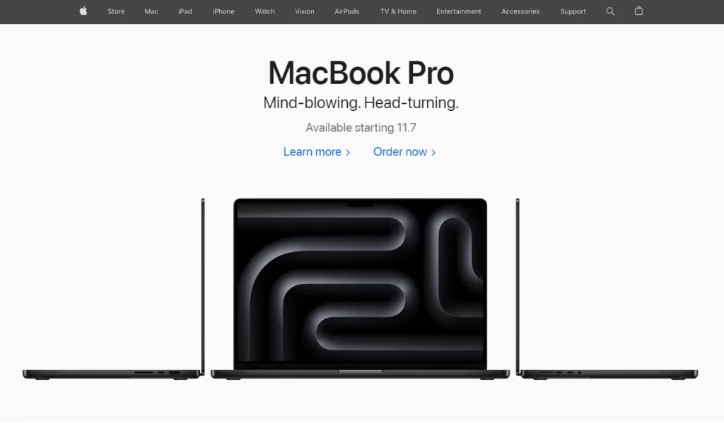
Apple: The Masters of Minimalism
Love them or hate them, you can’t deny Apple’s design prowess.
Their products and interfaces are the epitome of simplicity. From the iconic iPhone design to the intuitive iOS interface, Apple proves that less can be more.
Google: Simplicity at Scale
Remember what Google’s homepage looked like in 1998?
It’s not that much different from today, right?
Despite adding countless features and services, Google has stubbornly maintained its simple, search-focused homepage. Why? Because it works.
Airbnb: Simplifying the Complex
Booking accommodation in a foreign country can be a nightmare.
Airbnb turned it into a seamless, visually-driven experience that even your technophobe grandma could navigate.
Their simple, image-focused design makes browsing properties feel like flipping through a glossy travel magazine.
GOV.UK: Plain Language and Consistent Components
The GOV.UK Design System from the Government Digital Service standardises patterns and components across services.
It pairs plain English from the Service Manual with WCAG AA accessibility and is used across central government services.
Common components include Back link, Error summary, and Date input, and the code is open source on GitHub.
How to Embrace Simplicity in Your Designs

1. Start with the Essentials
Before you add a single element to your design, ask yourself:
- What’s the core message or function?
- What does the user need to see or do?
Start with these essentials and build from there. If an element doesn’t serve a clear purpose, it’s probably unnecessary.
2. Embrace White Space
White space (or negative space) isn’t wasted space. It’s breathing room for your design.
Use it generously to:
- Guide the user’s eye
- Create a visual hierarchy
- Make your content more digestible
Remember, sometimes what you leave out is just as important as what you include.
3. Limit Your Colour Palette
A rainbow might be beautiful in the sky, but it’s often overwhelming in design.
Stick to a limited colour palette—2 to 3 primary colours are often enough. Use additional colours sparingly for accents or highlights.
Do not use colour as the only cue. Pair colour with text labels, icons, or patterns so meaning stays clear for people with colour vision deficiency, as advised by WCAG.
4. Choose Fonts Wisely
Typography can make or break your design.
Stick to 2-3 fonts maximum. Choose fonts that are:
- Legible
- Complementary to each other
- Appropriate for your brand and message
System fonts avoid webfont downloads and can reduce load time. If you use webfonts, subset character sets and consider variable fonts to cut requests when several weights are needed. Set font-display: swap to avoid invisible text during load.
Remember, fancy doesn’t always mean better. Sometimes, a clean, simple font is precisely what you need.
5. Use Icons and Images Strategically
Visual elements can enhance your design, but can also clutter it if used carelessly.
Use icons and images that:
- Communicate their purpose
- Enhance rather than distract from your message
- They are consistent in style and tone
- Write meaningful alt text that conveys purpose, not “image of”.
- Prefer SVG for icons and line art for crisp scaling and smaller files.
- Use modern formats like WebP or AVIF for photos when supported, and lazy-load offscreen images.
6. Create a Clear Visual Hierarchy
Guide your user’s eye through the design by creating a clear hierarchy of elements.
Use size, colour, contrast, and placement to emphasise what’s most important.
Meet WCAG 2.2 contrast. Aim for 4.5:1 for body text and 3:1 for large text, and 3:1 for non-text UI components and graphics.
7. Test and Iterate
Simple doesn’t always mean easy. Creating an effective, simple design often requires multiple iterations.
Test your designs with real users. Watch how they interact with it. If they’re struggling, simplify further.
The Pitfalls of Oversimplification: Finding the Sweet Spot

Now, before you go and strip your designs down to their skivvies, let’s talk about the dangers of oversimplification.
Yes, it’s possible to go too far.
I learned this the hard way when I redesigned my portfolio site after the “sugar-high toddler” incident.
In my zeal for simplicity, I ended up with a bare-bones site that looked like I’d forgotten to finish.
Oops.
The key is to find the balance between simplicity and functionality. Your design should be simple enough to be easily understood but complex enough to fulfil its purpose effectively.
Here are a few signs you might have oversimplified:
- Important information is missing: You’ve cut too much if users can’t find what they need.
- The design lacks personality: Simple doesn’t mean boring. Make sure your design still reflects your brand’s unique voice.
- It’s not intuitive: If users are confused about how to interact with your design, you might need to add more visual cues.
- It looks unfinished: There’s a fine line between minimalist and neglected. Make sure your design still looks polished and complete.
Remember, the goal of simple design isn’t to create the most stripped-down version possible. It’s to make the most effective version with the least complexity.
Simple Design in Different Contexts
Let’s explore how simple design principles apply across different media and industries.
Web Design
In the fast-paced world of the internet, a simple design is more crucial than ever.
- Navigation: Keep your menu items limited and clearly labelled. Use dropdown menus sparingly.
- Content: Break text into short paragraphs. Use headings and subheadings to create structure.
- Call-to-Action: Make your CTAs stand out with contrasting colours and clear, concise text.
- Support Core Web Vitals. Faster Largest Contentful Paint, stable layouts for Cumulative Layout Shift, and responsive interactions for Interaction to Next Paint. Optimise hero media, reserve space for images and ads, and avoid long tasks. In 2024, Google replaced FID with INP, so focus on input delay and long task reduction.
Mobile Apps
With limited screen real estate, a simple design is non-negotiable for mobile apps.
- Gestures: Stick to common gestures users already know (swipe, tap, pinch).
- Buttons: Make touchable elements large enough for fingers of all sizes.
- Screens: Limit the amount of information on each screen. Use progressive disclosure to reveal more details as needed.
- Apple Human Interface Guidelines recommend 44 by 44 pt. Material Design recommends a 48 by 48 dp grid. Larger, well-spaced targets improve accuracy for all users.
Print Design
Print design remains relevant even in the digital age—and simplicity is key here, too.
- Whitespace: Use it liberally to make your design feel less cluttered and more premium.
- Fonts: Stick to legible fonts, especially for body text. Save decorative fonts for headlines or accents.
- Images: Choose one strong focal image rather than several competing visuals.
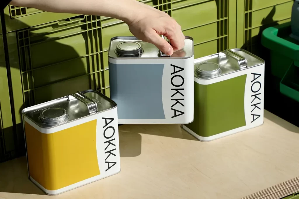
Product Design
From packaging to physical products, simplicity can set you apart on the shelf.
- Packaging: Highlight critical information. Use clean, easy-to-read fonts.
- Product Shape: Aim for intuitive forms that communicate function.
- Controls: Minimise buttons and controls. Make the primary function obvious.
Digital Sustainability: Why Minimalist Design Saves the Planet
As we move toward a net-zero future, the environmental impact of the internet is coming under intense scrutiny.
In 2026, the average website emits approximately 0.8 grams of CO2 per page view. For a site with 100,000 monthly visitors, that’s nearly a tonne of carbon a year—equivalent to a return flight from London to New York.
Simple design is no longer just a visual or psychological choice; it is an environmental imperative.
The “Weight” of a Page
Every kilobyte of data transferred over the internet requires electricity to power servers, routers, and the user’s device.
A complex website filled with unoptimised high-resolution images, auto-playing video backgrounds, and bloated JavaScript libraries requires significantly more energy to load.
Minimalist Web Design directly translates to lower carbon emissions. By choosing SVG icons over PNGs, utilising System Fonts instead of heavy webfont files, and adhering to the “Clean Code” principles of the Sustainable Web Manifesto, designers can reduce a page’s carbon footprint by up to 80%.
Dark Mode and OLED Efficiency
For users on modern OLED screens (which make up the majority of smartphones in 2026), a simple design in “Dark Mode” is even more sustainable. On an OLED panel, a black pixel is literally “off”—it consumes zero power. A simple, dark interface can extend a smartphone’s battery life by up to 30%, further reducing the frequency of charging and the overall demand on the power grid.
“The ‘Green Minimalist’ movement of the mid-2020s has shifted the definition of ‘good design’ from ‘how it looks’ to ‘how it consumes.’ A truly simple design in 2026 is one that delivers maximum value with the minimum number of server requests. If your design requires a 5MB ‘hero video’ to explain your value proposition, you haven’t simplified your message—you’ve just outsourced your complexity to the environment.”
The “Sustainable UX” Checklist
- Prioritise text over images: Can a well-written headline convey the message better than a stock photo?
- Lazy Loading: Load elements only as the user scrolls to them.
- Optimised Code: Remove “zombie” CSS and JS that provide no value to the current page.
By embracing simplicity, brands can honestly market themselves as “Digital-First/Planet-First,” a powerful differentiator for the modern, eco-conscious consumer.
Wrapping Up: The Power of Simplicity
In a constantly growing, more complex world, simple design isn’t just an aesthetic choice—it’s a necessity.
By embracing simplicity, you’re not just creating prettier designs. You’re creating more effective, more accessible, and more impactful designs.
Remember:
- Start with the essentials
- Use white space generously
- Limit your colour palette and fonts
- Create a clear visual hierarchy
- Test and iterate
Most importantly, you should always keep your user in mind. After all, the most straightforward design is the one that works best for them.
So, are you ready to simplify?
Your users (and your future self) will thank you.
FAQs: Simple Design Demystified
How does simple design affect SEO in 2026?
Google’s 2026 algorithms prioritise “Task Completion Velocity.” Simple designs load faster and have higher engagement rates, which are direct ranking signals. Additionally, AI “Retrieval Agents” can more easily parse and cite clean, structured content.
Is minimalist design more expensive to build?
Initially, yes. “I would have written a shorter letter, but I did not have the time.” Creating a powerful, simple interface requires more research, user testing, and iteration than a cluttered one. However, it is cheaper to maintain.
What is the “80/20 Rule” in design?
It suggests that 80% of users only use 20% of a product’s features. A simple design identifies 20% and puts it front and centre, hiding the rest via progressive disclosure.
Can I use “Simple Design” for a luxury brand?
Yes—in fact, you must. In 2026, “Visual Noise” is seen as “Cheap.” High-end brands like Rolex or Hermès use extreme minimalism and vast amounts of white space to signal exclusivity and confidence.
Does simplicity mean I can’t use high-res images?
Not at all. It means using fewer images, but making them more impactful. One “hero” image that tells the whole story is more “simple” than a gallery of ten mediocre photos.
What is “Decision Fatigue” and how does simplicity help?
Decision fatigue is the mental exhaustion that comes from making too many choices. Simplicity reduces the number of choices per screen, keeping the user “fresh” and more likely to convert.
How do I simplify a data-heavy table for mobile?
Don’t just shrink it. Use “Horizontal Scrolling” for the table while keeping the first column sticky, or transform it into a series of “Cards” the user can flip through.
Is “Flat Design” dead?
“Flat 2.0” is the current standard. It keeps the simplicity of flat design but adds back subtle gradients and shadows to help users understand what is “clickable”, solving the primary usability issue of 100% flat design.