The Evolution of the Shell Logo Design: Illustration to Icon
You can see that red and yellow scallop shell on a motorway sign from a mile away, obscured by rain, and you know exactly what it is. You don’t even need to see the word “Shell.”
That, right there, is the end goal. That’s the billion-dollar prize every entrepreneur is chasing when they commission a logo. It’s not “art.” It’s not a “vibe.” It’s instantaneous, unambiguous, global recognition.
As a design consultant, I have a few pet peeves. One is the obsession with “timelessness,” as if a logo is a magic spell you cast once and it works forever. Another is the startup’s desire to cram its entire business plan into one complex, clever-mark.
The Shell logo disproves both of these ideas.
The Pecten (the proper name for the scallop shell) isn’t great because it was “timeless.” It’s great because it was relentlessly adapted and simplified over the course of more than 100 years. Its strength is its evolution, not its static perfection.
It’s one of the most valuable case studies in logo design and branding, and for a small business owner, it’s a masterclass in what actually matters.
- Shell’s strength lies in relentless evolution and simplification over a century, not a single “timeless” idea.
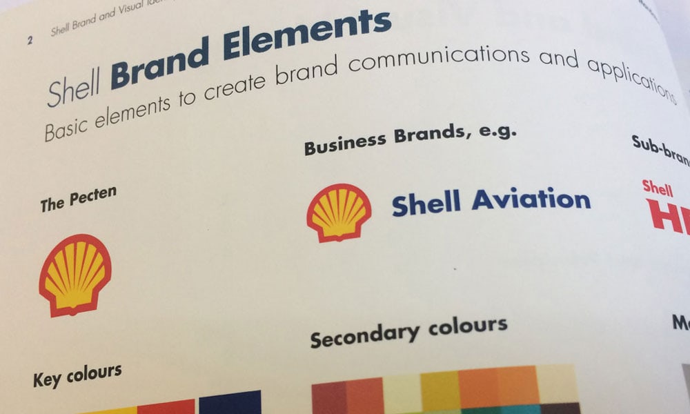
- The 1971 Raymond Loewy redesign distilled the Pecten into a geometric, scalable icon for all media.
- Red and yellow were chosen for high visibility and regional roots, becoming core, owned brand colours.
- Strong symbols can replace wordmarks—but they also carry reputation, good and bad, as brand containers.
The Surprising Origin: Why a Shell?
Most founders I meet want a logo that’s a deep metaphor for “synergy,” “disruption,” or “innovation.” It’s all very abstract.
The Shell logo? It’s a shell because the company was… a shell company.
It’s shockingly literal. In 1891, Marcus Samuel and Company began transporting kerosene. However, his father, Marcus Samuel Sr., had established a business importing antiques, curiosities, and, crucially, Oriental seashells to London.
When Samuel needed a name for his new transport and trading company, he chose “Shell.” It was a simple, tangible family connection.
The first logos, dating back to around 1900, weren’t logos in the traditional sense. They were illustrations.
- 1900: A basic, illustrative, black-and-white mussel shell.
- 1904: The first switch to a Pecten, or scallop shell. Why? It was visually simpler, more symmetrical, and reproduced better in print.
Even a century ago, they understood the first rule: practicality beats cleverness. A scallop shell was just a “tidier” drawing than a mussel.
A Century of Change: The Pecten’s Evolution
This is where the real lesson begins. The Shell logo we know today was not the result of a single stroke of genius. It was the result of seven decades of incremental change.
I’ve watched countless businesses with 20 years of history try to “rebrand” by detonating their own identity and starting from scratch. It’s almost always a mistake. Shell shows us the right way: evolve, don’t detonate.
Here is a quick breakdown of that journey.
Shell Logo Evolution: 1900–Present
| Year | Visual Description | Key Strategic Change |
| 1900 | A black & white, realistic mussel shell (lying flat). | Literal Illustration. Just a picture of a product. Not a “brand.” |
| 1904 | A black & white, upright scallop shell (Pecten). | The Pivot. The company chose a more symmetrical, distinct, and “logo-friendly” shape. |
| 1930 | A 3D-shaded, more realistic Pecten. | Adding “Quality.” The trend was to add perspective and shadow to make logos look more “premium” and substantial. |
| 1948 | The Pecten now has the “SHELL” wordmark across it. Red and yellow colours are introduced. | Codifying the Brand. This is the first true logo. The name and symbol are locked together. The colours appear. |
| 1955 | Cleaner lines. The “SHELL” font is bolder, and contours are simplified. | First Simplification. Removing fussy details. The logo is still “sitting” on a white block in many applications. |
| 1961 | Further refinement. The wordmark is stronger, and the shell’s lines are cleaner. | Adaptation. A minor tweak to improve legibility and reproduction, especially on new, illuminated station signage. |
| 1971 | The Big One. Complete geometric redesign by Raymond Loewy. Bold, simple lines. Wordmark moved below the shell. | Strategic Simplification. Designed for a modern, global, multi-media world (faxes, TV, print). This is the Pecten we know today. |
| 1995 | The colours are brightened (Shell Red, Shell Yellow). | Digital Optimisation. Adjusting the palette for better on-screen vibrancy and consistency. |
| 1999 | The wordmark “SHELL” is dropped in most applications. | The Ascension. The brand equity is so strong that the symbol alone is enough. The Pecten becomes a “Symbol.” |
The Game Changer: 1971 and Raymond Loewy
Let’s talk about 1971. This is the single most important event in the logo’s history.
By the 1970s, the world was moving fast. Globalisation, television, fax machines, and mass-market advertising were the new reality. Shell’s 1961 logo, while fine, was still a bit fussy. It had shadowing, fine lines, and a wordmark that was trapped inside the symbol.
Shell hired the “father of industrial design,” Raymond Loewy. This is the man who designed the Coca-Cola bottle, the Exxon logo, and the Studebaker Avanti. He was a master of commercial identity.
Loewy’s team didn’t reinvent the logo. They perfected it.
- They Simplified It to its Core: All shading and fussy illustrative lines were stripped away. It was reduced to its absolute essential, geometric form.
- They Built it on a Grid: The 1971 Pecten is a masterpiece of technical design. It’s based on precise curves and parallel lines, making it incredibly robust and balanced.
- They Optimised for Scalability: This is the key. The 1971 logo looked good on a 100-foot petrol station sign and on a 1-inch business card. It could be faxed, photocopied, and embroidered without losing its integrity.
- They Freed the Wordmark: They moved the “SHELL” wordmark out from inside the Pecten and placed it underneath (in a custom font, Shell Sans). This was critical. It allowed the two elements to be used together or, for the first time, apart.
This redesign is the entire lesson. Loewy’s team provided Shell with high-performance commercial equipment. It was a tool built for one job: to be recognised, instantly, in any context.
Why Red and Yellow?
The colours are as iconic as the shape. They were first introduced in 1948.
The story goes that Shell, building its first service stations in California, wanted to stand out. California had strong Spanish ties, so Shell adopted the red and yellow of the Spanish flag.
It was a smart, regional choice that inadvertently had a universal psychological impact.
- Red: Energy, urgency, attention, power.
- Yellow: Optimism, warmth, warning, visibility.
Together, they are the most high-visibility combination in the spectrum. On a busy road, at 70 mph, a red and yellow sign cuts through the visual noise. It’s a beacon.
The Shell Logo’s Biggest Lesson: Dropping the Name
In the late 1990s, Shell made its final, boldest move. It started removing the word “Shell” from its logo on its marketing and station signage.
This is the final exam for a brand. It’s the moment you ask: “Is our symbol so powerful that it can do the job all by itself?”
For Shell, the answer was yes.
I still remember the first time I saw a new petrol station with just the Pecten on the main sign. No name. I realised that is what brand equity means. It’s not just recognition; it’s a substitution. The Pecten doesn’t represent Shell. The Pecten is a Shell.
This is the holy grail. The Nike Swoosh. The McDonald’s Arches. The Apple… apple.
This level of recognition isn’t something that’s designed; it’s something that’s earned. It’s the result of 100 years, billions of dollars in marketing, and relentless, “boring” consistency. The 1971 logo has been virtually untouched for over 50 years. That’s the discipline.
What Your Small Business Can Learn from the Shell Logo
Alright, so you’re not a $200 billion global energy giant. You don’t have 50 years to wait. What’s the practical, real-world lesson you can apply on Monday?
My clients often become obsessed with the wrong things. The Shell Pecten teaches us to focus on the right ones.
The Pecten Principles for Your Business
| Principle | The Shell Logo Lesson | How You Can Apply It |
| 1. Start with a Simple Truth | The logo is a “Shell” because the founder sold… shells. It’s literal. | Don’t invent a complex, abstract metaphor. What do you do? Who are you? A simple, authentic story is 10x more memorable. |
| 2. Evolve, Don’t Detonate | Shell spent 70 years refining its logo before the 1971 redesign. | Your 5-year-old logo probably isn’t “broken.” It might just be fussy. Look at simplifying it, not replacing it. Keep your equity. |
| 3. Design for a 16×16 World | The 1971 logo was built for faxes and TV. It was simple and scalable. | Your logo must work as a 16×16 pixel favicon in a browser tab. If it’s an unreadable smudge, it’s too complex. Simplify. |
| 4. Own Your Colours | Red and yellow is Shell. They own that combination in their industry. | Pick a simple, bold palette (two or three colours, max) and apply it relentlessly. On your site, your socials, your invoices. |
| 5. Aim for the Symbol | Shell’s final move was to drop the name. The Pecten was enough. | Your 5-year goal: Can your logo’s icon (the “mark”) be used next to your name? Your 20-year goal: Can the icon be used instead of your name? |
This kind of strategic simplification—knowing what to keep, what to refine, and what to discard—is the single most valuable aspect of a professional logo design. It’s not about adding “flair”; it’s about removing every single thing that doesn’t matter.
The Other Side of the Coin: When a Logo Carries Baggage
It’s not all positive. A logo this strong has a downside.
The Pecten is so recognisable that it becomes a container for everything the company does—good and bad. For Shell, a “Big Oil” company, the logo also serves as a symbol of fossil fuels, environmental controversy, and high prices.
When activists want to protest Shell, they don’t picket an anonymous office; they target the Pecten. They subvert it, recolour it, and use its recognition against the company.
This is the double-edged sword of brand equity. When your logo is this famous, you can’t hide from your reputation. Your brand identity becomes a lightning rod for your corporate behaviour.
The lesson? Your logo is a promise. It becomes a container for your customers’ experiences and your public reputation. Ensure that your business operations can support the visual identity you’re creating.
The Bottom Line: Your Logo is a Tool, Not a Trophy
The Shell logo is a quintessential example of practical, commercial design.
It began as a literal illustration.
It was simplified for better printing.
It was colourised to stand out on a busy street.
It was professionally redesigned for a global, multi-media age.
And finally, it became so famous that it no longer needed its own name.
Your logo isn’t a piece of art. It’s a piece of high-performance commercial equipment. It has a job: to identify your business, instantly and unambiguously, wherever your customers find you.
If your current branding feels fussy, complicated, or just isn’t working for you in our fast-paced, digital-first world, it might be time for a professional review. It might be time for your own “1971 moment.”
💡 Shell Logo Design FAQs
Who designed the 1971 Shell logo?
The 1971 Shell Pecten, which is still in use today, was designed by the team at Raymond Loewy’s design consultancy. Loewy is often referred to as “The Father of Industrial Design.”
Why is the Shell logo a scallop shell (Pecten)?
It’s a literal nod to the company’s origins. The founder’s father, Marcus Samuel Sr., was an importer of oriental seashells. When his sons founded “The Shell Transport and Trading Company,” they adopted the shell as their symbol.
Why are the Shell logo colours red and yellow?
When Shell first built service stations in California, they wanted to stand out. They chose red and yellow, the colours of the Spanish flag, to honour the state’s strong Spanish heritage. The high-visibility combination proved incredibly effective for roadside branding.
When did Shell remove the word “Shell” from its logo?
Shell began phasing out the wordmark in many applications around 1999. This was a strategic move, possible only because the Pecten symbol itself had achieved near-universal recognition.
What is the main lesson from the Shell logo’s history?
The main lesson is the power of evolutionary simplification. The logo wasn’t a single “perfect” idea. It was refined, simplified, and adapted over the course of 100 years to meet new commercial and technological needs.
How does the Shell logo work for scalability?
The 1971 redesign is a masterclass in scalability. Its simple, bold geometric lines and lack of fine detail mean it reproduces cleanly at all sizes—from a massive motorway sign down to a tiny app icon or favicon.
Why is the Shell logo considered a “symbol” and not just a “logo”?
It has reached a rare level of brand equity where the mark alone is enough to identify the company. Like the Nike Swoosh or Apple’s Apple, the Pecten has transcended its role as a logo and become a globally recognised symbol.
Is the Shell logo based on a real shell?
Yes, it’s based on the Pecten maximus, also known as the great scallop. The 1904 version was a more literal illustration, while the 1971 version is a highly stylised, geometric interpretation.
What is the “sound” of Shell?
Shell is one of the few brands to also have a “sonic logo” or sound mnemonic. This short musical piece, often played at the end of its commercials, reinforces the brand identity audibly, just as the Pecten does visually.
What’s the main takeaway for a small business?
Focus on simplicity, scalability, and consistency. A logo that is simple, works well at all sizes, and is used consistently with a cohesive colour palette will build brand equity far more effectively than a complex design that tries to convey too much.
What’s Your Next Move?
I’ve just walked you through 100 years of branding strategy from one of the world’s largest companies. The lessons are right there: simplify, be consistent, and think long-term.
That journey from a fussy illustration to an $8 billion symbol is the value of professional design. It’s not about making something “pretty”; it’s about building a valuable, hard-working asset for your business.
If you’re looking at your own logo and realising it’s working against you—too complex, too dated, or just plain invisible on a phone screen—it might be time to take a page from Shell’s 1971 playbook.
Explore the logo design services we offer at Inkbot Design. We specialise in creating clean, memorable, and scalable identities that work.


