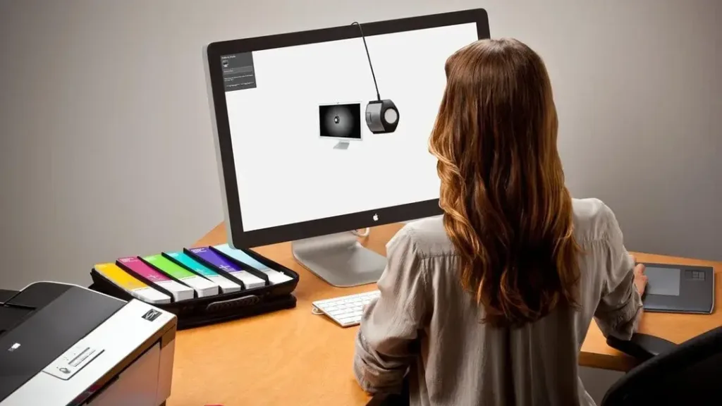
5 Best Monitor Calibration Tools for Designers
Have you ever stared at your screen, squinting and wondering if that shade of blue is really the one you picked?
Trust me, I’ve been there.
As a designer, I sent a client’s branding package to print without proper calibration. Let’s just say the “vibrant orange” logo returned looking more like a washed-out peach.
Embarrassing? Yes. Avoidable? Absolutely.
That’s why I’m here to guide you through the world of monitor calibration tools. Because let’s face it, in our line of work, colour accuracy isn’t just nice to have—it’s essential.
- High-luminance support: Use calibrators like Calibrite Display Plus HL for HDR/XDR displays to measure up to 10,000 nits and avoid clipping.
- Target accuracy: Aim for Delta E < 1.0 and use ICC v4 for HDR workflows when supported by your toolchain.
- Workflow basics: Calibrate then profile—hardware LUT for monitor, save an ICC profile, and keep system-level profiles active for apps.
- Practical routines: Warm up monitor, disable adaptive features (True Tone/Night Shift/Auto HDR), calibrate regularly, and match luminance across displays.
The 2026 Standard: Navigating HDR and High-Luminance Displays
Today, “standard” brightness is a thing of the past. If you are working on an Apple Pro Display XDR, a Liquid Retina XDR MacBook, or a high-end ASUS ProArt Mini-LED, your monitor likely peaks well above 1,000 nits.
Traditional calibrators often “clip” or provide inaccurate readings once they pass the 500-nit threshold.
To maintain colour accuracy in 2026, you must ensure your hardware supports High Luminance (HL). Tools like the Calibrite Display Plus HL are specifically engineered to measure up to 10,000 nits.
This is crucial not just for HDR video, but for designers creating “Gimme Gummy” or “Texture Check” aesthetics where specular highlights and deep contrast define the brand’s premium feel.
Critical HDR Calibration Checklist
- Disable Local Dimming: Before starting, turn off “Zone Dimming” or “Variable Backlight” in your monitor’s OSD. This ensures the colourimeter reads the panel’s raw response.
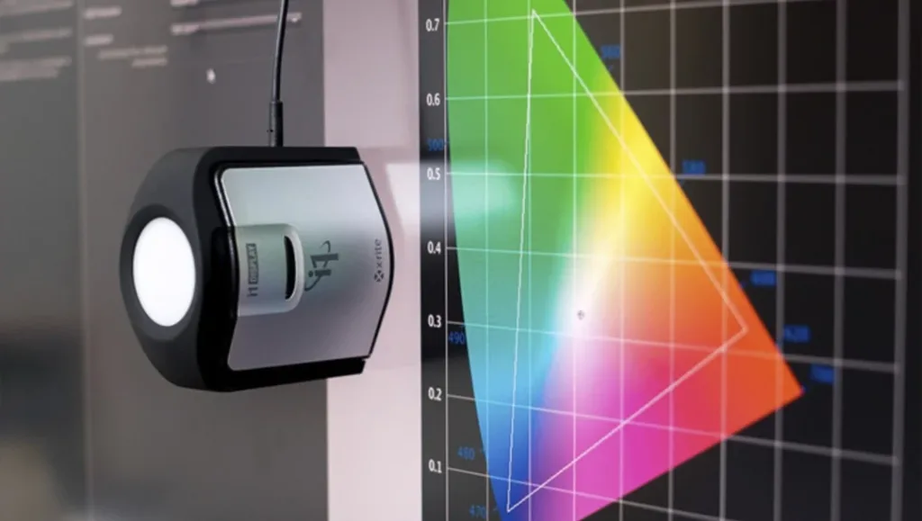
- Target Delta E: Aim for a Delta E of less than 1.0. In technical terms, the formula measures the distance between the “true” colour and the colour your screen displays. Anything under 1.0 is invisible to the human eye.
- Profile Version: Use ICC v4 for HDR workflows if your software chain supports it, as it handles complex tone-mapping better than legacy ICC v2.
Why Bother with Monitor Calibration?
Before diving into the tools, let’s discuss why this matters.
Have you ever bought a shirt online that looked navy blue on your screen, only to receive a purple monstrosity in the mail? That’s what we’re trying to avoid, but on a professional scale.
The Consequences of Poor Calibration
- Inconsistent branding
- Printing disasters
- Client disappointment
- Wasted time and resources
- Damaged professional reputation
Remember: Your monitor is your window to your digital creations. You’re not seeing the whole picture if that window is dirty or distorted.
Colour Management Basics: Calibration vs Profiling
Calibration changes how your display behaves. It adjusts backlight, white point, and tone response to hit known targets.
Profiling measures the calibrated display. It creates an ICC profile that colour-managed apps use to show colours correctly.
Hardware calibration writes changes to the monitor’s internal LUT. Profiling then describes the resulting colour output for colour-managed software.
GPU LUT calibration applies corrections to your graphics card instead. Keep the ICC profile active at the system level for accuracy.
Apps like Adobe Photoshop, Lightroom, and Affinity read the profile. They map colours to your screen so previews look right.
Now, let’s get to the good stuff. Here are the five best monitor calibration tools that’ll save your designs (and your sanity):
1. Calibrite Display Plus HL: The Professional’s Choice
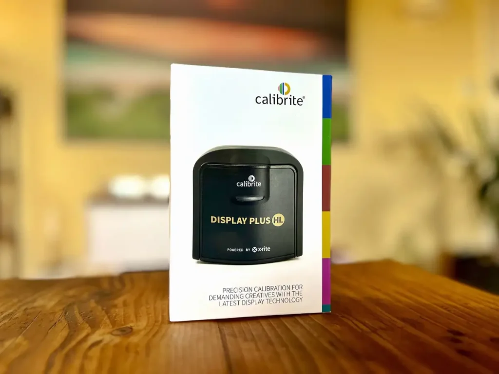
Price: £269.99
Listen up because this is the cream of the crop. The Display Plus HL isn’t just a calibrator; it’s like having a colour scientist in your pocket.
Why It’s a Game-Changer:
- Unparalleled Accuracy: It measures up to a whopping 10,000 nits. That’s like counting grains of sand on a beach, but for colour.
- Versatility: Works with all modern display technologies. OLED, LED, you name it.
- Advanced Features: Ambient light measurement? Check. Multiple monitor support? Double-check.
It works with Calibrite Profiler on macOS and Windows. It supports OLED, mini-LED, and wide gamut panels.
You can create ICC v2 or v4 profiles. Matrix or LUT profiling is available.
The Downside:
It’s not cheap. But neither is reprinting an entire marketing campaign because the colours were off.
Pro Tip: The ambient light feature adjusts your display based on your work environment. Your eyes will thank you during those late-night design sessions.
2. Datacolor SpyderX Pro: The All-Rounder
Price: £200
If the Calibrite is too rich for your blood, the Datacolor SpyderX Pro is your next best bet. It’s like the Swiss Army knife of calibrators.
What Makes It Special:
- Speed: Calibrates in under two minutes. Perfect for the impatient designer (aren’t we all?).
- User-Friendly: Even if you’re new to calibration, the software walks you through every step.
- Room Light Monitoring: Adjust your display based on ambient light changes.
The Not-So-Great:
The software interface could use a facelift. We’re calibrating monitors, not dating them.
Datacolor’s newer Spyder X2 Elite and Ultra feature updated hardware and USB-C connectivity. They add better HDR support for OLED and mini LED panels.
If you are buying today, shortlist an X2 with the Pro.
Insider Tip: Use the “StudioMatch” feature to ensure all your monitors display colours consistently. It’s a lifesaver for multi-monitor setups.
3. Display 123: The Budget-Friendly Option
Price: £75
Don’t let the cute name fool you. The Display 123 is serious about colour, not emptying your wallet.
Why It’s Worth Considering:
- Affordable: Get professional-grade calibration without breaking the bank.
- Simple Interface: Perfect for beginners or those who break out in hives at the sight of complex software.
- Compact Design: Easily portable for on-the-go calibration.
The Trade-off:
Limited advanced features. But if you’re just starting, do you need to measure ambient light in 50 different ways?
Colour Me Impressed: Even at this price point, it supports monitor profiling for smooth colour transitions—crucial for gradient work.
4. BenQ Palette Master Element
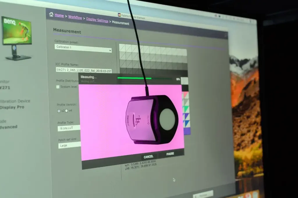
Now, we’re getting into the big leagues. The BenQ Palette Master Element is like the James Bond of calibration tools – smooth, sophisticated, and packing some serious tech.
Pros:
- Explicitly designed for BenQ monitors
- Incredible accuracy for wide gamut displays
- Supports HDR calibration
Cons:
- It only works with specific BenQ monitors
- Steep learning curve
Palette Master Element performs true hardware calibration on supported BenQ models. It writes to the monitor’s internal LUT.
It works with common Calibrite and Datacolor meters, and it bypasses GPU LUT limits.
Insider tip: This is your golden ticket if you’re working with high-end photography or video. It’s overkill for most graphic design work, but if you need that extra level of precision, it’s worth every penny.
5. Datacolor SpyderX Elite
The SpyderX Elite is the crown jewel of Datacolor’s lineup. It’s what you get when you take the Pro version and inject it with superhero serum.
Pros:
- Supports multiple monitor calibration
- Extensive customisation options
- Ideal for both print and digital work
Cons:
- Pricey
- It can be overwhelming for beginners
I splurged on this when we landed a major client in the fashion industry. The ability to calibrate multiple monitors simultaneously was a game-changer for our team workflow. It paid for itself within the first project.
Choosing Your Weapon: 2026 Calibrator Comparison
Selecting a tool in 2026 requires looking beyond the price tag. You must match the sensor technology to your specific panel type (OLED vs IPS vs Mini-LED).
| Feature | Calibrite Display 123 | Datacolor SpyderPro | Calibrite Plus HL | Spyder X2 Ultra |
| Max Luminance | 120 nits (SDR) | 1,200 nits | 10,000 nits | 2,000 nits |
| Panel Support | Standard IPS/LCD | IPS, OLED, Mini-LED | All (inc. HDR/XDR) | IPS, Bright HDR |
| Best For | Students / Hobbyists | Pro Designers | High-end Video/Photo | Outdoor/Bright Studios |
| Connection | USB-C Native | USB-C + A Adapter | USB-C Native | USB-C Native |
| Price (Approx) | £75 | £200 | £270 | £230 |
The Calibration Process: A Step-by-Step Guide
- Clean Your Screen: Use a microfiber cloth. Fingerprints are not a colour space.
- Warm Up Your Monitor: Let it run for at least 30 minutes before calibrating.
- Set Your Room Lighting: Consistent lighting is critical. Avoid direct sunlight.
- Adjust Monitor Settings: Set to factory defaults unless otherwise instructed.
- Run the Calibration Software: Follow the on-screen instructions carefully.
- Save Your Profile: Name it something memorable, like “Perfect_Colours_Do_Not_Touch.”
- Schedule Regular Recalibrations: Monitors drift over time, like my attention during long meetings.
Why Does My Screen Look “Wrong” After Calibration?
It is the most common complaint: “I finished the process, and now my screen looks warm/yellow/dim.” Before you reset everything in a panic, understand why this happens.
1. The “White Point” Shock
Most uncalibrated monitors are set to a “cool” factory default (often 7000K or higher), which looks bright and crisp but is blue-biased. When you calibrate to the industry-standard D65 (6500K), the screen will initially appear yellow.
- The Fix: Give your eyes 24 hours to adjust. This is “Chromatic Adaptation”. Once your brain recalibrates, you will notice that skin tones look natural rather than ghostly.
2. Ambient Light Interference
If your colourimeter isn’t flush against the glass, or if a desk lamp is hitting the sensor, the software will overcompensate.
- The Fix: Use the “Weighted Cable” correctly to ensure there is no gap. Calibrate in the lighting conditions you actually work in—ideally, dim, neutral light.
3. Conflicting System Features
In 2026, operating systems are “helpful” to a fault. On macOS, ensure True Tone and Night Shift are toggled off. On Windows 11/12, ensure Auto HDR is disabled during the profiling phase. These features dynamically shift the white point, rendering your static ICC Profile useless.
Recommended Target Settings for Designers
White point D65 (6500K) is the standard for web and general design. Print teams may pair D50 viewing booths with soft-proofing within apps.
Gamma: 2.2 is the default for macOS and Windows. Keep the tone response the same across every display you use.
Luminance: Aim for 80–120 cd/m² for print leaning work. Use 120–160 cd/m² for web or UI. Pick sRGB for web, and Adobe RGB or Display P3 when a wide gamut is needed.
The Dual-Monitor Challenge: Achieving Consistency
If you’re using a MacBook Pro alongside a BenQ PD series or a Dell UltraSharp, you’ve likely noticed they never quite match. This is due to different backlight technologies (W-LED vs GB-r LED).
To fix this, use the StudioMatch feature found in Datacolor SpyderPro or the Multi-Display tools in Calibrite PROFILER.
- Select a Lead Display: Usually your most expensive, wide-gamut monitor.
- Match the Luminance: Don’t just set both to “100%”. Use the calibrator to set both to exactly 120 cd/m².
- Visual Verification: Use a neutral grey background across both screens. If one still looks slightly “pinker”, use the software’s manual “White Point Adjustment” to nudge them into alignment.
Beyond the Tools: Best Practices for Colour Accuracy
Calibration tools are fantastic, but they’re not a silver bullet. Here are some additional tips to ensure your colours stay true:
- Use a Monitor Hood: It’s like sunglasses for your screen, blocking out ambient light.
- Invest in a Quality Monitor: You can’t calibrate your way from a poor-quality display.
- Understand Colour Spaces: Know the difference between sRGB, Adobe RGB, and CMYK.
- Regular Maintenance: Clean your screen and check for dead pixels regularly.
- Coordinate with Clients and Printers: Ensure everyone’s on the same calibrated page.
- Disable display tweaks: Turn off macOS True Tone and Night Shift, Windows HDR or Auto HDR, and any adaptive brightness. These features shift the white point and brightness mid-profile.
- Pick the right ICC version: Use ICC v2 for the widest app compatibility on Windows and mixed workflows. Choose ICC v4 only if your entire toolchain supports it.
The Colourful Conclusion
Choosing and using a monitor calibration tool might seem daunting at first. But trust me, once you see the difference it makes in your work, you’ll wonder how you ever lived without it.
Remember that embarrassing orange logo incident I mentioned earlier? Well, after investing in proper calibration, not only did I fix that client’s branding, but I also landed three new high-profile contracts thanks to the improved quality of my work.
Colour accuracy isn’t just about making things look pretty—professionalism, attention to detail, and delivering the best possible work to your clients.
So, whether you opt for the top-of-the-line X-Rite i1Display Pro Plus or decide to dive into the open-source world of DisplayCAL, know that you’re taking a crucial step towards elevating your design game.
So, whether you opt for the top-of-the-line Calibrite ColorChecker Display Plus HL or decide to explore the open-source world of DisplayCAL, you are on the right path. DisplayCAL uses ArgyllCMS under the hood and can generate ICC profiles, plus 3D LUTs for video pipelines.
And if you’re still feeling overwhelmed by all this colour talk, remember that at Inkbot Design, we live and breathe this stuff. We’re always here to help fellow designers navigate the technicoloured waters of professional design.
Now go forth and calibrate! Your perfectly colour-accurate future awaits. 🌈
FAQ: Your Burning Questions Answered
How often should I calibrate an OLED monitor in 2026?
OLED panels are prone to “drift” as organic compounds age. For colour-critical design, calibrate every 200 hours of use or once a month. This also helps you monitor any subtle shifts that might indicate the early stages of burn-in.
Is the Calibrite Display 123 enough for professional branding work?
It is a fantastic entry point for sRGB web work. However, if your branding projects require Adobe RGB for print or Display P3 for mobile apps, you’ll find the 123’s inability to measure high-gamut targets limiting. Upgrade to the Pro HL if you charge professional rates.
Can I calibrate my iPad or iPhone for design previews?
You cannot hardware-calibrate a mobile device the same way you can on a PC. However, you can use the Calibrite ColorTRUE app or similar tools to create a “profiled” viewing environment within specific gallery apps. For the most part, rely on your calibrated desktop for final sign-offs.
Why is my print darker than my screen, even after calibration?
This is usually a “Luminance” mismatch. Most designers keep their monitors too bright (160+ nits). For print, you should target 80–120 cd/m². If your screen is a lighthouse, your prints will always look like caves.
What is the best free software for monitor calibration?
DisplayCAL (based on ArgyllCMS) remains the gold standard for open-source power. While the original project has seen forks in recent years, it offers deeper “LUT” control than many paid manufacturer suites. It is highly recommended for users who own a SpyderX but want pro-level “Elite” features.


