Designing a Logo That Sells: The 3 Things You Need to Win
In the business world, your logo isn’t just a pretty picture—it’s the face of your brand. It’s what customers remember, what sticks in their minds, and ultimately, what helps convert browsing into buying. But what separates the logos that merely exist from those that honestly sell?
After working with hundreds of brands, I’ve found three critical elements determining whether your logo will be a silent bystander or a powerful sales tool. Let’s explain what you need to know about designing a logo that drives business results.
- Your logo is the face of your brand, crucial for customer recognition and conversions.
- Strategic typography communicates your brand's personality before words are read.
- Colour psychology influences purchasing behaviour and must align with your brand's message.
- Distinctive shapes help your logo stand out, occupying unique mental space in customers' minds.
- Effective logo design requires collaboration and a focus on strategic objectives over personal preferences.
The Psychology Behind Logo Design That Converts
Before diving into the practical aspects of designing a logo, we must understand what makes certain visual elements trigger buying behaviours.
When someone encounters your logo, their brain processes it in milliseconds. This isn’t just about recognition—it’s about the immediate emotional response that can push them closer to a purchase decision or make them scroll past.
A study by the University of Amsterdam found that simple logos were 13% more likely to grab attention and create positive brand impressions. But simplicity alone isn’t enough—your logo must communicate your brand’s unique value proposition in that split-second impression.
Think about the logos that instantly make you feel something: Apple’s minimalist fruit that somehow conveys innovation or Nike’s swoosh that embodies movement and determination without a single word. These aren’t accidents—they’re deliberately crafted psychological triggers.
Your Logo as a Trust Signal
Trust is the invisible currency of business. Without it, even the best products struggle to sell. Your logo serves as a visual shorthand for all the trust factors in your industry.
When crafting your logo, ask: Does this design communicate reliability? Does it feel professional enough that someone would confidently enter their credit card details on a website bearing this symbol?
For service-based businesses, a professionally designed logo can justify higher pricing tiers. One client of mine—a consultant who hadn’t updated his visual identity in years—saw a 27% increase in his acceptance rate for premium packages after refreshing his logo. Nothing about his service changed—just the visual presentation of his brand.
Element #1: Strategic Typography That Speaks Before You Do
Typography isn’t just about picking a nice font. It’s about choosing letterforms that communicate your brand’s personality before a word is read.
Selecting Fonts That Align With Your Brand Position
The typography you choose instantly communicates whether your brand is:
- Traditional or innovative
- Luxury or accessible
- Playful or serious
- Corporate or creative
A financial services company using Comic Sans (please don’t) sends an immediate message about their professionalism—and not a good one. Conversely, a children’s entertainment business using rigid, corporate typography creates a disconnect that makes selling harder.
When selecting typography for your logo, don’t just ask, “Do I like this font?” Instead, ask: “Does this font communicate the qualities that would make someone want to buy from my business?”
Adobe Illustrator remains the industry standard for working with typography in logo design, allowing you to manipulate letterforms with precision. Vector graphics ensure your type remains crisp across all applications—essential for building professional brand recognition.
Typographic Hierarchy in Action
A clear hierarchy is essential if your logo includes a wordmark and tagline. Your primary name should command attention, while secondary elements support rather than compete.
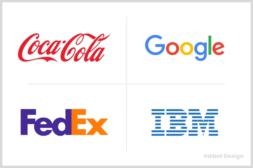
Consider the FedEx logo—while most people eventually notice the hidden arrow in the negative space between the E and X, the primary focus remains on the company name. This creates layers of discovery that reward viewers and create memorable brand interactions.
Element #2: Colour Psychology That Triggers Buying Decisions
Colour isn’t subjective when it comes to selling. Different colour palettes trigger different psychological responses, directly impacting purchasing behaviour.
The Conversion Impact of Strategic Colour Selection
Research from the Institute for Color Research found that people make subconscious judgments about products within 90 seconds of viewing—and up to 90% of that assessment is based on colour alone.
- Red creates urgency and passion (perfect for clearance sales or impulse purchases)
- Blue builds trust and security (ideal for financial services or healthcare)
- Green signals growth and health (effective for wellness brands or sustainable products)
- Black communicates luxury and sophistication (premium product positioning)
- Yellow captures attention and optimism (good for brands wanting to appear approachable)
The colours in your logo don’t just need to look good—they need to strategically align with what motivates your ideal customers to purchase.
Colour Consistency Across Brand Touchpoints
Your logo colours establish the foundation for your entire visual identity. These colours should carry through to your website, packaging, social media, and advertising materials.
This consistency creates what marketers call “mental availability”—the ease customers can notice, recognise, and recall your brand in buying situations. The more consistent your colour application, the more likely customers will remember your business when they’re ready to purchase.
When developing colour palettes for your brand identity, consider creating:
- Primary brand colours (used in your logo)
- Secondary palette (complementary colours for supporting elements)
- Functional colours (for CTAS, warnings, success messages, etc.)
This creates a comprehensive system that maintains brand recognition while providing flexibility across different marketing contexts.
Element #3: Distinctive Shapes That Own Mental Real Estate
In marketing, differentiation is everything. Your logo needs to claim unique visual territory in your customer’s mind.
The Memory Science Behind Logo Shapes
Human brains process and remember shapes before they process words or complex images. This is why the most effective logos often have distinctive silhouettes that can be recognised even when shrunk to a tiny favicon or viewed from a distance.
Think about how you can instantly identify McDonald’s golden arches or the Twitter bird from just their shapes. This “shape ownership” is invaluable in marketing real estate—it means your brand occupies a unique space in the customer’s mind that competitors can’t easily replicate.
When designing your logo, consider the following:
- Could this shape be recognised at a glance?
- Does it remain distinctive when simplified to its basic outline?
- Is it unique enough to stand apart from competitors?
- Does it work well across different sizes and contexts?
Balancing Trendy vs. Timeless Design Elements
While current design trends might make your brand feel contemporary, building a logo that sells over the long term requires careful balance. Chasing trends can lead to frequent redesigns—each one resetting the brand recognition you’ve built.
Inkbot Design’s branding portfolio showcases excellent logos incorporating modern elements while maintaining timeless appeal. These designs feel current without being so trendy that they’ll look dated within a year.
A practical approach is to use trendy elements in your extended brand materials while keeping your core logo more timeless. This allows you to constantly evolve your visual language without changing your primary brand mark.
From Concept to Completion: The Logo Design Process
Creating a logo that sells isn’t just about knowing the principles—it’s about following a strategic process that ensures all elements work together cohesively.
The Design Brief: Setting the Foundation for Success
Every successful logo starts with a comprehensive design brief. This document clarifies:
- Your brand positioning and unique selling propositions
- Target audience demographics and psychographics
- Competitor analysis and differentiation strategy
- Brand personality and tone of voice
- Application contexts (where and how the logo will be used)
A thorough brief prevents the most common logo design mistake: creating something visually attractive but strategically ineffective. When completing your brief, focus less on aesthetic preferences (“I like blue”) and more on strategic objectives (“We need to establish trust in a competitive market”).
For guidance on creating an effective design brief, Inkbot Design’s guide to working with logo designers offers valuable insights into the information professionals need to develop strategic visual assets.
Iterative Refinement: From Concepts to Final Design
The refinement process transforms promising concepts into powerful selling tools. This typically involves:
- Initial concept development (exploring multiple directions)
- Preliminary client feedback and direction selection
- Refinement of selected concept(s)
- Detailed adjustments to typography, colour, and shapes
- Finalisation of the primary logo version
- Development of logo variations for different applications
Throughout this process, continually revisit the strategic objectives. Does each refinement strengthen the logo’s ability to differentiate, communicate value, and trigger positive purchasing associations?
Logo Variations: Maximising Versatility and Recognition
A complete logo system includes variations that maintain brand recognition across different contexts.
Creating a Flexible Logo System
Most businesses need several logo versions:
- Primary logo (complete version with all elements)
- Secondary/simplified versions (for space-constrained applications)
- Monochrome versions (for single-colour applications)
- Favicon/icon versions (for digital platforms)
- Responsive logos (that adapt to different screen sizes)
Each variation should maintain core recognition elements while adapting to specific use cases. Digital illustration techniques allow designers to create these variations while preserving the essential visual DNA that makes your brand identifiable.
Responsive Logo Design for Digital Environments
With over 60% of web traffic now coming from mobile devices, your logo needs to function effectively across numerous screen sizes. Responsive logo design—where elements adapt or simplify at different sizes—ensures your brand remains recognisable whether viewed on a large desktop monitor or tiny mobile screen.
Consider how companies like Google implement this principle. Their full-colour wordmark appears on their homepage, while a simplified “G” icon represents them in space-constrained environments like browser tabs or app icons.
Implementation: Bringing Your Logo to Market
Even the best logo design is only effective when properly implemented across all brand touchpoints.
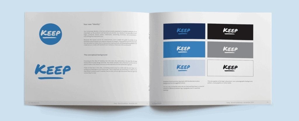
Developing Comprehensive Brand Guidelines
Brand guidelines ensure that your logo is used consistently across all applications. These typically include:
- Logo specifications (sizing, placement, exclusion zones)
- Colour specifications (including RGB, CMYK, HEX, and Pantone values)
- Typography usage rules
- Do’s and don’ts for logo application
- Examples of the logo in different contexts
These guidelines maintain the integrity of your visual identity, ensuring that each customer touchpoint reinforces rather than dilutes your brand recognition.
Creating Mockups for Key Applications
Before finalising your logo, test it in realistic application scenarios. This might include:
- Website headers and favicons
- Social media profiles
- Business cards and stationery
- Signage and environmental applications
- Product packaging
- Promotional materials
Scalable graphics ensure your logo maintains clarity and impact across these diverse applications. Vector formats like EPS or AI files allow unlimited scaling without losing quality, which is essential for everything from building signage to business cards.
Measuring Logo Effectiveness: Beyond Aesthetics
How do you know if your logo is helping sell your products or services? While aesthetics matter, business results are the ultimate measure of success.
Recognition Testing and Feedback
Several methods can help assess logo effectiveness:
- A/B testing different logo variations in digital ads
- Heat mapping to track eye movement and attention on websites
- Recognition testing to measure recall after brief exposure
- Customer surveys about brand attributes and perceptions
One client of mine tested two logo concepts in digital ads without changing any other elements. The version better aligned with their target audience’s expectations generated 32% higher click-through rates, translating directly to more sales opportunities.
Tracking Changes in Brand Perception
After implementing a new or refreshed logo, track changes in:
- Brand recall and recognition rates
- Perception alignment with target positioning
- Website conversion rates
- Social media engagement metrics
- Customer acquisition costs
These metrics provide tangible evidence of how your visual identity impacts business performance.
Client Collaboration: Navigating the Feedback Process
Creating a logo that sells requires effective collaboration between the designer and the client. This partnership balances creative expertise with business objectives.
Providing Constructive Design Feedback
When reviewing logo concepts, focus feedback on strategic effectiveness rather than subjective preferences:
- Does this design communicate our core value proposition?
- Will it resonate with our target audience?
- Does it differentiate us from competitors?
- Will it work effectively across all required applications?
This approach focuses on creating an effective selling tool rather than just an appealing design.
Making Objective Design Decisions
It’s easy to fall into the trap of personal preference when evaluating logo designs. Remember that you are not your target audience. What appeals to you personally may not be what best sells to your customers.
Instead, evaluate options based on:
- Alignment with strategic objectives
- Distinctiveness in the competitive landscape
- Versatility across applications
- Long-term sustainability of the design
This objective approach typically yields logos with longer effective lifespans and stronger market performance.
Evolving Your Logo Over Time: When and How to Refresh
Even the most effective logos eventually need updating to remain relevant and competitive.
Signs It’s Time for a Logo Refresh
Consider updating your logo when:
- Your business has evolved beyond its original positioning
- Your logo looks dated compared to competitors
- You’re entering new markets with different expectations
- Your current logo has technical limitations in digital environments
- Brand recognition or perception metrics are declining
However, approach evolution carefully—maintain recognition elements that customers associate with your brand while modernising outdated aspects.
Case Studies: Successful Logo Evolutions
Many leading brands subtly evolve their logos over time. Starbucks has gradually simplified their siren logo, removing the outer ring and text while maintaining the core visual element. This evolution preserved brand equity while creating a more versatile, modern mark.
Inkbot Design’s logo redesign case studies demonstrate how strategic updates can maintain brand recognition while solving business challenges. These examples show how minor refinements can significantly impact market perception and performance.
Common Logo Design Mistakes That Kill Sales
Understanding what undermines logo effectiveness is just as important as knowing what works.
Prioritising Trends Over Strategy
Design trends come and go, but your brand needs to sell consistently over time. Logos that chase trends often:
- They date quickly, requiring frequent updates
- Looks similar to competitors following the same trends
- Fail to communicate unique brand attributes
- Create disconnects with established brand perceptions
Instead of following trends unquestioningly, incorporate contemporary elements selectively while keeping core identification elements consistent and strategic.
Using Stock Graphics or Templates
Pre-made logo templates or stock graphics might save money initially, but they undermine sales effectiveness by:
- Looking generic and forgettable
- Being potentially used by other businesses
- Lacking strategic alignment with your specific positioning
- Offering limited customisation and differentiation
Original vector graphics developed specifically for your brand ensure you own unique visual territory in your market.
Technology Considerations for Modern Logo Design
Today’s logos must function across an unprecedented range of environments and technologies.
Digital-First Design Principles
Modern logos must consider the following:
- Responsiveness across device sizes
- Animation potential for digital applications
- Social media profile requirements and constraints
- App icon functionality and recognition
- Dark/light mode adaptability
- Loading speed implications for web assets
These considerations ensure your logo performs effectively in the environments where most customers will encounter it.
Future-Proofing Your Logo
Technology continues evolving, bringing new logo application contexts. To create lasting value, consider:
- Scalable graphics that maintain quality at any size
- Simplified versions for emerging small-screen devices
- Animation possibilities for interactive environments
- 3d adaptations for augmented/virtual reality
- Flexible colour systems that work across media
These forward-looking considerations extend the effective lifespan of your investment in logo design.
FAQ: Logo Design That Sells
How much should a professional logo design cost?
Professional logo design typically ranges from £500 for independent designers to £5,000+ for agencies. However, price alone doesn’t determine value—the strategic thinking behind the design has far more impact on its selling effectiveness than the cost of creation.
How long should the logo design process take?
A thorough logo design process typically takes 2-6 weeks, depending on the complexity and number of stakeholders. While faster timelines are possible, rushing strategic development often leads to logos that look good but fail to generate business results.
Should I design my logo to save money?
Without professional design training and marketing strategy experience, DIY logos typically lack the strategic elements that make logos practical selling tools. The opportunity cost of a weak logo (lost sales, reduced conversion rates, lower perceived value) usually far exceeds the investment in professional design.
How do I know if my current logo is hurting my sales?
Signs your logo may be undermining sales include difficulty charging premium prices, high bounce rates on your website, customer feedback about your brand seeming “unprofessional” or “outdated,” and conversion rates below industry averages.
Can a great logo fix a struggling business?
A logo alone cannot save a business with fundamental product or service issues. However, a strategic logo redesign can significantly improve conversion rates, perceived value, and customer acquisition for companies with solid offerings but poor visual presentation.
How often should I update my logo?
Most successful brands evolve their logos subtly every 7-10 years, with major overhauls only when significant business strategy changes occur. Frequent dramatic changes can erode brand recognition and trust.
What file formats should I receive with my logo package?
A complete logo package should include vector formats (AI, EPS, SVG) for unlimited scaling, raster formats (PNG, JPG) for digital use, and variations for different applications (full colour, monochrome, simplified versions).
How important is client collaboration in the logo design process?
Client input is crucial for strategic alignment, but is most effective when focused on business objectives rather than personal design preferences. The best collaborations balance client industry expertise with designer visual communication expertise.
Should my logo follow current design trends?
Incorporate contemporary design elements selectively while ensuring core recognition features remain timeless. This balances current relevance with long-term effectiveness.
How does logo design differ across industries?
While design principles remain consistent, industry contexts create different expectations. For example, financial services typically require more conservative approaches than creative industries. However, strategic differentiation sometimes means intentionally breaking industry visual conventions.
Would a minimalist logo design work for any business?
Minimalist design can be effective across industries, but it must still communicate your specific brand attributes. Luxury brands, technical services, and complex offerings often benefit from minimalism that communicates sophistication rather than simplicity.
How do I protect my logo from being copied?
Register your logo as a trademark for legal protection. Custom typography and distinctive visual elements make your logo harder to imitate effectively.
Your logo isn’t just a checkbox in your business setup—it’s an active sales tool that helps or hinders every customer interaction. By focusing on strategic typography, psychology-based colour selection, and distinctive shape ownership, you create more than just a pretty symbol—you build a visual asset that genuinely contributes to your bottom line.
Ready to transform your brand identity into a powerful sales machine? Request a quote from Inkbot Design to start crafting a logo that sells.
Remember: in the visual economy, your logo isn’t just making an impression—it’s making a sale. Design accordingly.


