Getty’s New Visual Order: A Brutalist Framing of the Future?
The J. Paul Getty Trust is finally shedding its institutional weight, dropping the ‘Trust’ and embracing a ‘G’ that acts like a window. It’s a move toward clarity in a world where everyone confuses a world-class museum with a stock photo site—but is it actually art?
The Getty rebrand isn’t just a facelift; it’s a strategic divorce.
For decades, the public has struggled to distinguish between the J. Paul Getty Trust—a powerhouse of conservation and research—and Getty Images, the commercial stock giant.
In 2025, as the latter fought high-profile legal battles with Stability AI over watermarked training data, the museum’s need for a distinct, unshakeable identity became a matter of institutional survival.
Fred & Farid New York’s solution?
A punchy, geometric ‘G’ that attempts to bridge the gap between Roman mosaics and Los Angeles modernism.

- The Getty drops “Trust” for a punchy, geometric G, clarifying identity and separating museum from Getty Images.
- The four-part G references travertine, mosaics and the Getty’s pillars, framing art as the brand’s primary storyteller.
- The rebrand balances modular digital needs with architectural weight, though the “All for Art” tagline feels safe and undercooked.
Why This Matters: The Death of the ‘Trust’
‘The J. Paul Getty Trust’ sounds like something a lawyer whispers in a mahogany-row office. It’s stiff. It’s academic. It’s a mouthful.
By rebranding simply as ‘Getty’, the institution is following the path of the V&A or the Met—moving from a formal entity to a cultural destination.
This matters because, in 2026, the battle for attention is brutal.
If your brand sounds like a tax shelter, you’re losing.
The new identity, anchored by the ‘All for Art’ tagline, is a deliberate attempt to humanise one of the wealthiest art institutions on the planet.
But there’s a deeper tension here. As museums race to become ‘outward-looking’ and ‘accessible’, they often strip away the gravity that made them prestigious in the first place.
The challenge for Getty was to look modern without looking like a tech startup that’s about to go bust.
Deep Dive: Travertine, Mosaics, and Saul Bass’s Ghost
I’ve only been once, around 10 years ago, but when you walk through the Getty Center in Los Angeles, you’re surrounded by 1.2 million square feet of travertine.
It’s the stone of the Colosseum, chosen by architect Richard Meier to signify permanence.
The new ‘G’ icon is a direct nod to these blocks—a square, modular unit that feels heavy, intentional, and architectural.
The Anatomy of the ‘G’
The icon isn’t just a letter; it’s a four-part mosaic. These pieces represent the Getty’s four pillars:
- The Museum
- The Foundation
- The Conservation Institute
- The Research Institute
It’s a clever bit of storytelling. By drawing inspiration from the mosaics at the Getty Villa, the design team has linked the ancient world with a digital-first framing device.
We’ve seen the ‘logo as a window’ trend before—think Hillary Clinton’s ‘H’ or the Whitney’s responsive ‘W’—but here, the ‘G’ feels more like a physical structure.
Typography and the Custom Touch
You can’t talk about Getty without mentioning Saul Bass.
His 1997 mark, set in Optima, was the gold standard for institutional elegance.

While the new rebrand leans into a more modern geometric aesthetic, it hasn’t entirely abandoned its humanist roots.
The system utilises custom typography—specifically the ‘Getty Humanist’ face—to maintain a sense of approachability.
It’s a delicate balance. If you go too geometric, you look like a bank. If you go too humanist, you look like a 90s textbook.
The Friction of Digital Flexibility
Yasmine Vatere, Getty’s assistant director of brand management, mentioned they ‘iterated relentlessly’ to ensure the system could scale.
This is the designer-vs-business tension: a logo that looks great on a 40-foot banner at the Getty Center must also work as a 16px favicon or a TikTok profile picture.
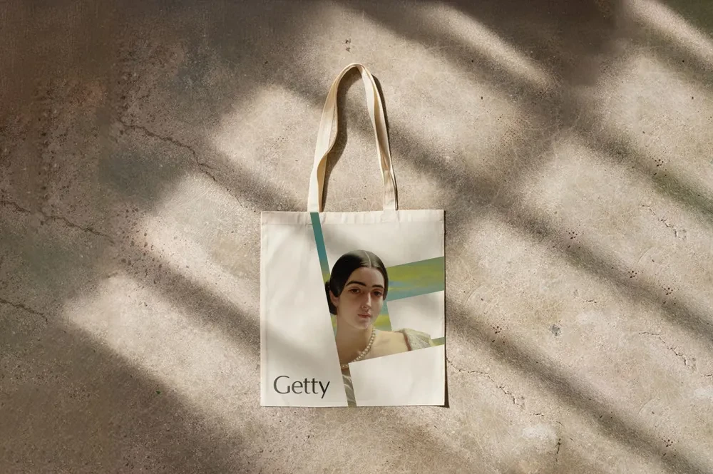
The ‘G’ works because it’s a framing device. It allows the art to do the heavy lifting.
You can drop a 17th-century Dutch master painting into one of the ‘G’ quadrants, and it suddenly feels contemporary.
It’s a trick that turns the brand into a curator rather than just a nameplate.
The Creative Verdict: Is it Too Punchy?
To be fair, some critics have called the new mark ‘brutal and unforgiving’.
I get it. It’s a heavy, dominant shape.
If you’re used to the airy, serif-led elegance of old-world museums, this feels like a punch to the jaw.
But I’d argue that’s exactly what Getty needed.
In a world where AI is flattening design—making everything look like a rounded-corner SaaS template—Getty has gone for something with corners.
It has weight. It feels like it was carved out of the very stone that sits on those LA hills.
My professional grumble? The ‘All for Art’ tagline feels a bit like a marketing committee’s first draft. It’s fine, I guess. It’s safe.
But for an institution that supports ‘visionary work’, it lacks the poetic bite of the visual system. It’s the kind of line you’d see on a gym membership ad.
That said, the execution of the visual system is a masterclass in modularity. By using the ‘G’ as a container for motion and imagery, Fred & Farid have given Getty a toolkit, not just a logo.
That’s how you design for 2026. You don’t build a monument; you build a framework.
Strategic Takeaways
- Graphic Designers: When rebranding an institution with massive physical heritage (like travertine buildings), look to the architecture first—modernity is more convincing when it’s anchored in stone.
- Business Owners: If your name is being confused with a competitor or a related industry (like Getty Images), a visual ‘divorce’ through radical simplification is often the only way to reclaim your story.
FAQs
Is the new Getty logo better than the Saul Bass one?
It’s different. Bass’s work was about the opening of a physical centre; the new mark is about expanding a digital global presence. One was a seal of quality; this is a window for engagement.
Why did they drop ‘Trust’ from the name?
Because nobody goes to a ‘Trust’ to see a Van Gogh. They go to the Getty. Simplification isn’t just a trend; it’s about reducing friction in users’ minds.
Is this rebrand related to the Getty Images AI lawsuits?
Not officially, but the timing is suspicious. Separating the museum’s ‘pure’ art mission from the stock site’s legal and commercial chaos is a smart move for the brand’s long-term reputation.
What’s with the ‘G’ being a square?
It’s a direct reference to the travertine blocks used by Richard Meier at the Getty Center. It’s a way of making the logo feel like part of the building.
Is ‘All for Art’ too simple?
Yes. It’s functional, but it doesn’t quite capture the intellectual depth of a research institute.
Can I use the ‘G’ framing device for my own brand?
You could, but the ‘logo as a container’ is becoming crowded. Unless you have the architectural or collection-based ‘why’ that Getty has, it might just look like you’re following a trend.
What font does the Getty use now?
They use a custom-refined version of ‘Getty Humanist’, which was originally developed with Roger Taylor and Studio Scott. It’s designed to be legible across both academic publications and digital signage.
How does this rebrand work with the Getty Villa?
The four pieces of the ‘G’ are actually inspired by mosaics at the Villa. It’s the first time the two locations (Center and Villa) have felt like they truly share the same DNA.


