5 Website Design Trends in 2026 to Keep an Eye On
The annual parade of “website design trends” articles is mostly nonsense.
They are echo chambers of aesthetic fads, recycled jargon, and visual fluff that will have zero meaningful impact on your business.
They talk about “glassmorphism” or “retro-futurism” as if changing the texture of your buttons is a revolutionary business strategy. It isn’t.
As a business owner, you don’t have the time or money to waste on fleeting styles that designers on Dribbble think are cool.
You need a website that works. A website that attracts customers, communicates clearly, and makes you money.
This isn’t another list of fads. This is a breakdown of the fundamental technological shifts and user behaviour defining successful websites in 2026.
These are the trends that have teeth, backed by real-world needs, not just artistic whims.
- Focus on pragmatic AI integration to enhance user experience and streamline website functionality.
- Emphasise radical accessibility as a fundamental requirement for all users, expanding market reach and reducing legal risks.
- Adopt a modular design system for speed, consistency, and scalability, allowing for easier updates and maintenance.
Most “Website Design Trends” Are a Waste of Your Time and Money
Every year, the same thing happens. A few designers create something visually interesting, give it a fancy name like “claymorphism,” and suddenly it’s a “trend.” A year later, it’s gone, replaced by the next shiny object.
These are not trends. They are styles. And styles are subjective.
Real trends are not subjective. They are powerful currents pulling the entire digital world in a specific direction. Three unstoppable forces drive them:
- Changing User Behaviour: How people use devices and what they expect from a digital experience.
- Advancing Technology: The new tools and capabilities that make different experiences possible.
- Business Imperatives: The relentless need for websites to produce a measurable return on investment.
If a “trend” doesn’t align with at least two of these forces, it’s not a trend. It’s noise. Now, let’s talk about the signal.
Trend 1: Pragmatic AI Integration (Not Robot Designers)
The initial hype around generative AI was creating wild images and writing passable-at-best copy. The real revolution, which will define 2026, is far more practical and happens mostly behind the scenes.
What It Is
Pragmatic AI integration uses artificial intelligence to make your website smarter, faster, and more helpful for the user. It’s not about replacing your designer; it’s about augmenting the user’s experience.
Think less “AI creating a logo” and more:
- AI-powered internal search that understands natural language and delivers shockingly accurate results.
- Automatic content summarisation that gives users the gist of a 2,000-word article in three bullet points.
- Truly personalised product recommendations based on complex behaviour patterns, not just “people who bought this also bought…”
- Automated analysis of A/B tests that can spot conversion patterns a human would miss.
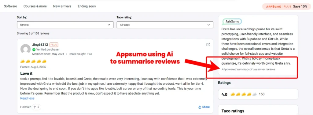
Why It Matters for Your Business
Efficiency. Relevance. Conversion.
A user who finds exactly what they need in two seconds is a user who trusts you. A customer who sees product recommendations that feel uniquely curated for them is a customer who buys.
This isn’t about flashy tech; it’s about using that tech to shorten the distance between a user’s intent and their goal.
Real-World Example
Look at the video messaging service Loom. After you record a video, its AI suite automatically suggests a title, writes a concise summary, breaks the video into chapters, and even removes filler words like “um” and “ah.”
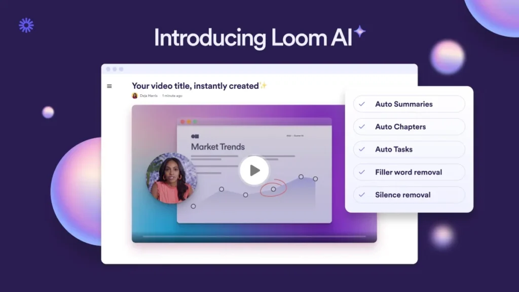
This saves the creator and the viewer an enormous amount of time. The AI isn’t doing the creative work, but the laborious administrative work, making the core product infinitely more valuable.
The Pitfall to Avoid
The biggest mistake is thinking AI is a substitute for strategy. Don’t fire your designer, expecting Midjourney to spit out a brand-aligned, conversion-optimised website.
Generative AI is a brilliant brainstorming partner and a powerful assistant. It is not, and will not be in 2026, the strategic mind behind your business’s digital presence. Treat it as a tool, not the artisan.
Trend 2: Radical Accessibility Becomes Non-Negotiable
For years, web accessibility was treated as a niche concern, a “nice-to-have” or a box-ticking exercise to avoid getting sued.
By 2026, this mindset will be a business liability. Radical accessibility will be the default for any serious online enterprise.
Why It Is
Radical accessibility is designing and building a website so everyone can use it, regardless of physical or cognitive abilities. This goes far beyond adding alt-text to images. It’s about deep, structural integrity.
It means high-contrast text, logical navigation that works with a keyboard alone, clearly labelled forms, and avoiding content that could trigger seizures. It’s about clarity over cleverness.
Why It Matters for Your Business
The business case is overwhelming.
- You expand your market. Roughly 16% of the global population lives with a significant disability. Ignoring them is like closing your shop one day a week.
- You improve your SEO. Search engines, especially Google, prefer websites with clean, semantic code and good accessibility markers. They see it as a sign of quality.
- You reduce legal risk. Accessibility-related lawsuits against companies with unusable websites are increasing dramatically. Compliance with standards like WCAG is your best defence.
- You improve the experience for everyone. A website that’s easy for someone with a visual impairment to use is also easier for someone using their phone in bright sunlight. High contrast and clear hierarchy benefit all users.
Real-World Example
The benchmark for this is, and continues to be, the Gov.uk website. It has no flashy animations or trendy fonts. It is, by some measures, “boring.”

It is also among the most effective, usable, and respected websites. It is a masterclass in putting the user’s need for information above the designer’s desire for expression.
The Pitfall to Avoid
Do not treat accessibility as a final check before launch. It’s not a plugin you can install or a coat of paint you can apply at the end.
From the first wireframe, it must be a foundational part of your strategy. If your designer isn’t discussing accessibility in your first meeting, you might have the wrong designer.
Trend 3: Component-Driven Modularity (Build with LEGOs, Not Concrete)
The days of designing websites page by painful page are over. The future is modular. Innovative businesses are not commissioning a “website design” but a “design system.”
What It Is
A modular or component-driven approach means designing and building a website as a flexible system of reusable parts.
Think of it like a set of digital LEGO bricks: buttons, form fields, navigation bars, product cards, testimonials.
Each component is designed and coded once, and can then be assembled in near-infinite combinations to create new pages.
Why It Matters for Your Business
Speed, consistency, and scalability.
- Speed: Need to launch a new promotional landing page? Your team can assemble it in hours using pre-approved components, not weeks starting from scratch.
- Consistency: When your “call to action” button is a single, centrally-controlled component, it looks and functions identically everywhere. This strengthens your brand and reduces user confusion.
- Scalability: As your business grows, your website can grow with it without becoming a chaotic mess. You add new components to the system, rather than creating one-off, disconnected pages.
Real-World Example
Stripe is a prime example. Their website and developer documentation are vast and complex, yet they feel impeccably consistent and intuitive. This is only possible because they are built on a rock-solid design system.
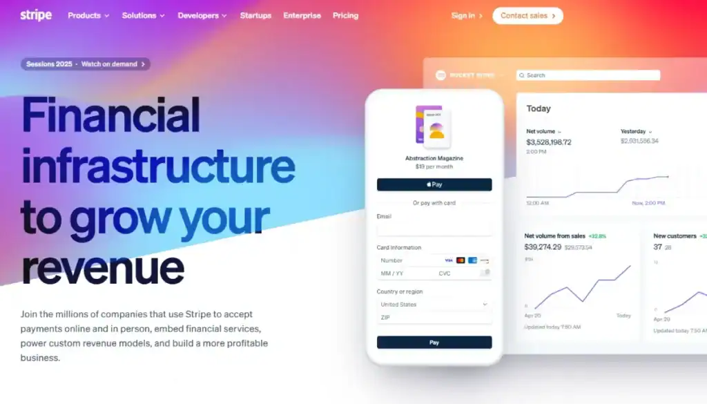
Tools like Figma and platforms like Webflow have championed this component-first philosophy, making it accessible to businesses of all sizes.
Building a modular site from scratch is a strategic task. It’s something we focus on heavily in our web design services to give clients long-term flexibility.
The Pitfall to Avoid
Avoid the “special snowflake” page.
This happens when a marketing team demands a unique design for a single campaign. It breaks the system, introduces inconsistencies, and creates long-term maintenance debt.
The discipline of modularity requires you to solve problems within the system first, only creating new components when a genuine need is identified.
Trend 4: Purposeful Motion & Microinteractions
Animation on the web is finally growing up. The era of gratuitous, “look-at-me” animations that slow down your page is being replaced by a more mature understanding of motion as a tool for communication.
What It Is
Purposeful motion uses animation to guide the user, provide feedback, and add clarity to an interface. It’s not about significant, distracting movements. It’s about the small things: microinteractions.
- A button that subtly changes shape or colour on hover, confirming it’s clickable.
- An item that smoothly animates into a shopping cart, providing a visual confirmation of the action.
- Form fields highlighting green for correct input and red for errors give instant feedback.
- Page transitions that slide horizontally, reinforcing the user’s mental model of moving through a sequence.
Why It Matters for Your Business
These small feedback moments make a website feel responsive, alive, and intuitive. They reduce cognitive load because the user sees the result of their actions. This builds confidence and trust.
It makes your interface feel less like a static document and more like a well-oiled machine, which increases perceived quality and user engagement.
Real-World Example
Think of any modern mobile banking app. When you transfer money, subtle animations confirm that the transaction is processing and then complete.

Contrast this with the jarring, pointless “fly-in” animations you see on tired corporate websites, where every block of text slides in from the side for no reason other than the developer could make it happen.
The Pitfall to Avoid
My pet peeve: scroll-jacking. This is when a website hijacks the user’s natural scrolling behaviour to force them through a cinematic presentation. It’s arrogant and frustrating.
The rule for 2026 is simple: if the animation takes control away from the user or doesn’t provide helpful feedback, it’s a liability. Cut it.
Trend 5: The Rise of Tangible Digital Experiences (AR & Beyond)
For years, augmented reality (AR) felt like a tech demo looking for a problem to solve. For e-commerce, it has finally found its killer application: bridging the confidence gap between browsing online and buying in person.
What It Is
This trend is about using technology, primarily AR on smartphones, to make digital products feel more tangible. It allows customers to “try before they buy” in their context, overlaying a digital product onto their real-world environment.
Why It Matters for Your Business
For any business selling physical goods, this is a revolution. It addresses the most considerable hesitation in online shopping: “How will this look on me/in my home?”
By solving this, AR drastically increases buyer confidence, which leads to higher conversion rates and, crucially, lower return rates.
According to Shopify, interactions with products with 3D/AR content showed a 94% higher conversion rate than those without.
Real-World Example
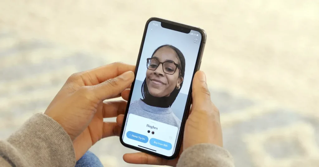
The gold standard is Warby Parker’s virtual glasses try-on feature within their app. It uses the phone’s camera to map your face and realistically show you how different frames will look.
Similarly, the IKEA Place app lets you see a true-to-scale 3D model of a sofa in your actual living room. This isn’t a gimmick; it’s a powerful sales tool.
The Pitfall to Avoid
Do not implement a clunky, slow, or inaccurate AR feature. A bad AR experience is worse than no AR, as it erodes trust.
The technology must be seamless, fast, and realistic to be effective. This is a trend to invest in properly or not at all.
So, What Should a Business Owner Actually Do?
Based on this article, you don’t need to panic or earmark £50,000 for a complete redesign. The takeaway is about shifting your mindset. Stop asking “What’s trendy?” and start asking “What’s effective?”
When you review your website or plan your next one, filter every decision through this lens:
- Focus on Speed & Clarity: This embraces radical accessibility and respects the user’s time. A fast, simple site almost consistently outperforms a slow, complex one.
- Build for the Long Term: This embraces modularity. Invest in a flexible system that can adapt and grow with your business, saving you money.
- Use Tech as a Tool, Not a Toy: This embraces pragmatic AI and purposeful motion. Use technology to solve real user problems, not just to decorate your pages.
- Answer The One Question: For every single feature, button, or animation, ask: “Does this help my customer achieve their goal faster and with more confidence?” If the answer is no, get rid of it.
A successful website in 2026 won’t be defined by its aesthetic. Its respect for the user will explain it.
Ready to Build a Website That Lasts?
Building a website that balances these future-proof principles requires a strategic partner, not just a coder or a trend-chaser. It’s about making deliberate choices that serve your business for years.
If you’re ready to build a site that works as hard as you do, you can see our approach to web design or request a no-nonsense quote to discuss your project.
Frequently Asked Questions (FAQs)
What is the most significant web design trend for 2026?
The biggest trend isn’t a visual style, but a strategic shift: pragmatic AI integration. This means using AI to enhance user experience through hyper-personalised content, intelligent search, and data analysis, rather than just generating images.
Should I use AI to design my website?
No. You should use AI as a tool to assist the design process. It’s excellent for brainstorming, creating mood boards, or generating draft copy. However, a human professional who understands your brand and customers should make the final strategic and creative decisions.
Is dark mode still a popular design trend?
Dark mode is better understood as a user preference or feature, not a trend. Offering a dark mode option is a great accessibility feature, but designing a website only in dark mode can alienate users who find light text on a dark background difficult to read.
How important is accessibility in web design?
It is critically essential and no longer optional. Good accessibility expands your potential market, improves SEO, protects you from legal action, and generally results in a better, more user-friendly site for everyone.
What is a modular design system?
It’s a collection of reusable components (like buttons, forms, and headers) that can be combined to build any number of web pages. This approach ensures brand consistency, speeds up development, and makes the website easier to maintain and scale.
Will AR be necessary for my small business website?
If you sell physical products online, AR is becoming increasingly important. It helps customers visualise items in their own space or on themselves, significantly boosting conversion rates and reducing returns. For service-based businesses, it’s less relevant.
Is brutalism a good style for a business website?
Almost certainly not. True brutalism is a niche artistic movement. Most so-called “brutalist” websites are simply ugly, unusable, and inaccessible. Prioritise clarity and ease of use over edgy aesthetics.
How can I make my website faster?
Standard methods include optimising image sizes, using a content delivery network (CDN), minimising code (CSS and JavaScript), leveraging browser caching, and choosing a high-quality hosting provider. A fast site is crucial for user experience and SEO.
What’s more important: UI or UX?
UX (User Experience) is more important. A beautiful website (UI) that is confusing and difficult to use (bad UX) will fail. A simple, even “boring,” website with excellent UX will succeed. Good UX is the foundation of a successful site.
How often should I redesign my website to keep up with trends?
You shouldn’t. Instead of periodic, expensive redesigns to chase trends, you should adopt a model of continuous improvement based on data and user feedback. If your site is built on a modular system, you can evolve it piece by piece without needing a complete overhaul.
What is kinetic typography?
Kinetic typography is animated text. It can guide a user’s attention, add emphasis, and make storytelling more engaging when used purposefully. When used gratuitously, it can be distracting and annoying.
Is sustainable web design a real trend?
Yes, it’s an emerging but essential trend. It involves practices aimed at reducing the energy consumption of websites, such as optimising code and media, using efficient web hosting (especially “green hosting”), and designing for faster load times. It’s good for the planet and often overlaps with good performance practices.


