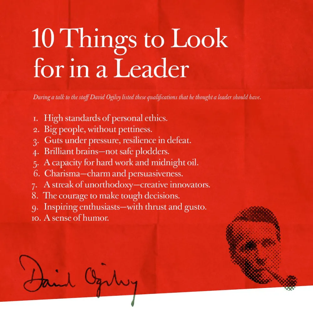
David Ogilvy: The Scientific Framework for Advertising
It’s a common story: a business owner has paid a “creative” agency five figures for a campaign that looks like a fever dream but says absolutely nothing. They focus on “brand awareness” and “storytelling” without ever asking for the sale.
David Ogilvy would have hated your modern marketing.
He was the man who famously stated:
“In the modern world of business, it is useless to be a creative, original thinker unless you can also sell what you create.”
If your advertising isn’t shifting units, it’s not art; it’s a vanity project funded by your bottom line.
Most SMB owners are currently lighting money on fire because they’ve been told that “content is king” without being taught how to make that content perform. We need to go back to the source.
- Advertising must sell products; creativity without measurable sales is vanity and wastes the client's money.
- Do exhaustive research first: know the product and customer better than they know themselves.
- Headlines drive results; a strong headline captures most readers and commands 80% of your budget's impact.
- Use a clear visual hierarchy: hook, promise, evidence, then a direct call to action.
- Long, factual copy builds trust for serious purchases; avoid vague jargon and prioritise measurable ROI.
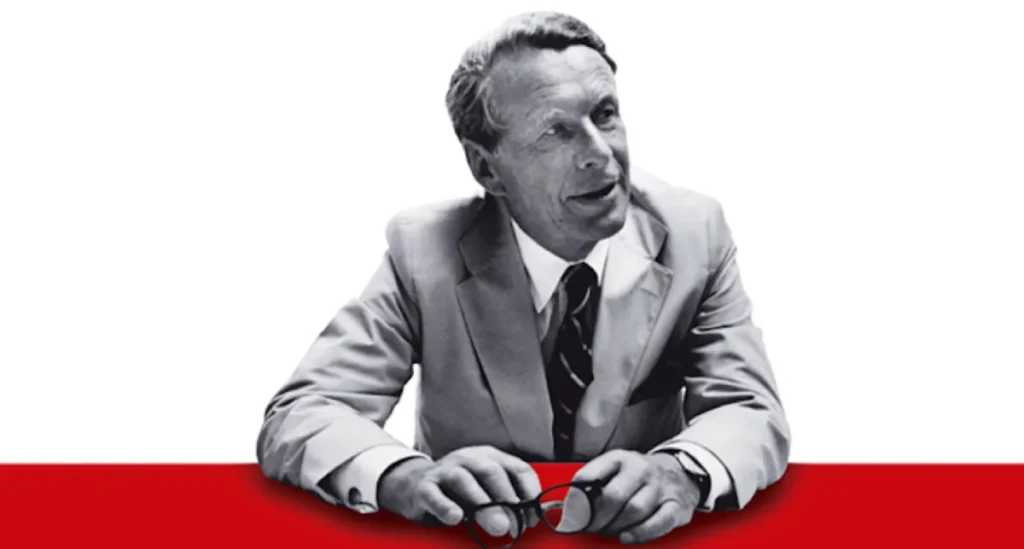
Who is David Ogilvy?
David Ogilvy (1911–1999) was a British advertising executive, often referred to as the “Father of Advertising.” He founded Ogilvy & Mather and revolutionised the industry by replacing guesswork with “Scientific Advertising”—a methodology rooted in meticulous research, direct-response principles, and a relentless focus on the consumer’s needs.
The three core elements of his philosophy are:
- Research-Driven Strategy: Never write a word of copy until you know the product and the consumer better than they know themselves.
- The Big Idea: A central, compelling concept that grabs attention and makes the product indispensable.
- Direct Response Discipline: The belief that advertising exists solely to sell, and its success must be measured by sales figures, not creative awards.
The “Scientific” Foundation of the Big Idea
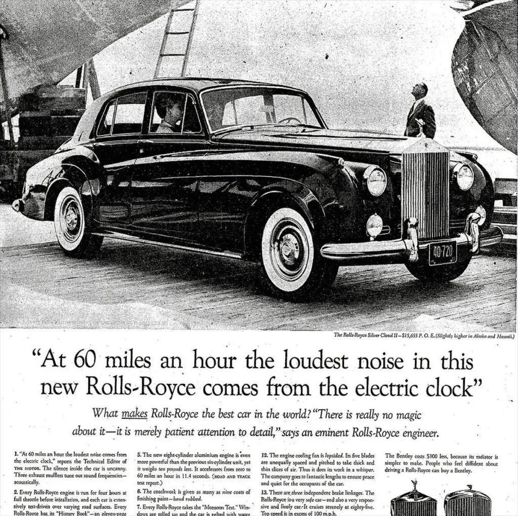
Ogilvy didn’t just wake up with brilliant ideas. He hunted them. Before he wrote the famous Rolls-Royce ad, he spent three weeks reading every technical report the engineers had written. That is where he found the line: “At 60 miles an hour, the loudest noise in this new Rolls-Royce comes from the electric clock.”
Modern designers and marketers are often too lazy for this level of depth. They want the “vibe” without the variables. But as we see in the work of famous graphic designers, the greats always anchor their visual flair in a concrete message.
The 80% Rule: Why Your Headline is Your Business
Ogilvy famously noted that five times as many people read the headline as read the body copy. When you have written your headline, you have spent 80 pence out of your pound. If the headline doesn’t sell the product, you have wasted 80% of your money.
In a digital context, your headline is your H1 tag, your email subject line, or the first three words of your Facebook ad. If you’re being “clever” instead of clear, you’re losing money. Nielsen Norman Group’s research on scanning patterns confirms this: users decide whether to stay on a page in seconds. If the value proposition isn’t immediate, they bounce.
The Architecture of Persuasion
An Ogilvy-style layout follows a logical, psychological flow. He favoured the “Editorial” look, making an ad look like a news story because people read news, but they ignore ads.
- Visual (The Hook): A high-quality image with “story appeal.”
- Headline (The Promise): A bold claim or a specific benefit.
- Body Copy (The Evidence): Long-form, factual prose that treats the reader like an intelligent person.
- Call to Action (The Close): A clear instruction on what to do next.
If you look at our display advertising strategies, you’ll see this same hierarchy. We don’t clutter the space; we direct the eye.
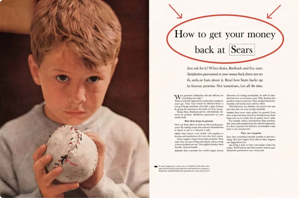
Debunking the Myth: “Nobody Reads Long Copy”
One of the most damaging lies told to SMB owners is that “attention spans are shorter than a goldfish’s” and therefore, all copy must be short. This is utter nonsense, typically promoted by individuals who struggle with writing.
The Reality: People read what interests them. If you are selling a £50,000 piece of industrial machinery or a complex B2B consulting service, a “snappy” three-word slogan isn’t going to cut it.
A 2024 study by Backlinko analysed 11.8 million Google search results and found that the average word count of a first-page result is roughly 1,447 words.
In advertising, Ogilvy demonstrated that long copy conveys more information and fosters greater trust. For his client, the Puerto Rico Economic Development Administration, he wrote a 961-word ad that generated over 14,000 leads.
Amateur vs. Professional Advertising Standards
| Feature | The Amateur Way (Vibe-Based) | The Ogilvy Way (Result-Based) |
| Headline | Vague puns or “clever” wordplay. | Specific benefits or news-oriented facts. |
| Imagery | Generic stock photos of “happy people.” | Images with “story appeal” that provoke curiosity. |
| Copy Length | As short as possible (fear of boring the user). | As long as necessary to provide all facts. |
| Typography | Reverse type (white text on black) for “style.” | Serif fonts on white backgrounds for legibility. |
| Research | Skimming a competitor’s website for 10 minutes. | Weeks of deep-diving into product specs and data. |
| Goal | To win a design award or “get likes.” | To make the cash register ring. |
The Visual Hierarchy: Design for Sales, Not Ego
Ogilvy was a stickler for typography. He hated reverse type (white text on a dark background) because it is physically harder to read.
He also loathed the use of all-caps in headlines. Why? Because the human eye recognises the shapes of lowercase letters faster.
When you use all-caps, you destroy the “word-shape,” slowing down the reader and increasing the cognitive load.
In modern UX design and A/B testing, we see these “old” rules validated on a daily basis. If a user has to squint to read your pricing table or your call to action design, they won’t struggle through it—they’ll just leave.
The Eye Patch Factor: Creating “Story Appeal”
One of Ogilvy’s most famous campaigns was for Hathaway Shirts. He didn’t just show a man in a shirt. He put an eye patch on him.
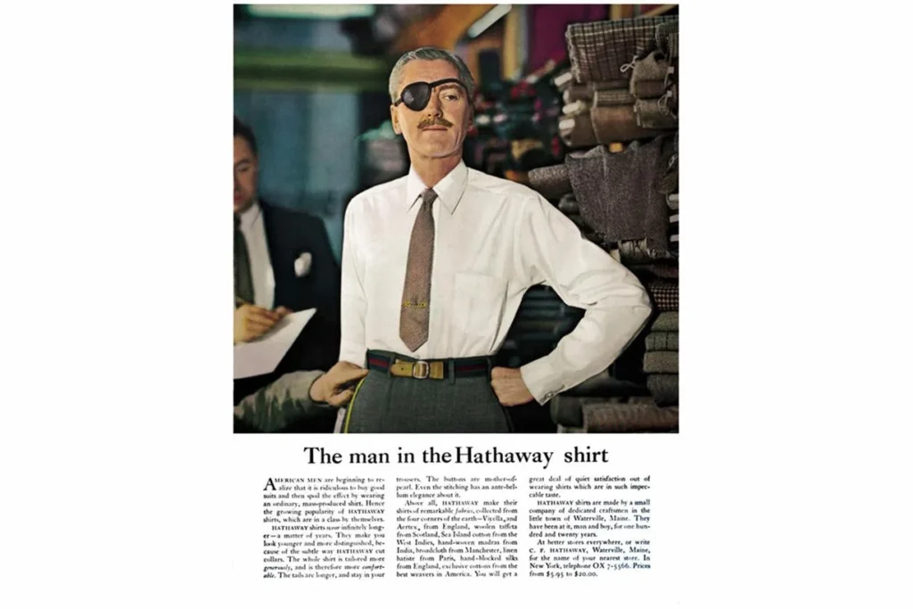
The eye patch added an element of mystery. Why does he have it? Is he a spy? A sailor? This “story appeal” forced the reader to look longer and eventually read the copy to find out more. This wasn’t just “being creative”; it was a calculated move to increase dwell time. Today, we refer to this as a “pattern interrupt.”
Whether you are designing out-of-home advertising or a social media carousel, you need a visual hook that isn’t just “pretty”—it must be provocative.
The State of Advertising Design in 2026
As we move deeper into 2026, the advertising world is being flooded with AI-generated content. Most of it is mediocre. It lacks the “Human Truth” that Ogilvy obsessed over.
While AI can churn out 1,000 headlines in ten seconds, it cannot (yet) conduct the primary research required to find the “electric clock” detail that defines a brand.
The recent shift in the last 18 months has been a move away from “hyper-polished” corporate aesthetics toward “Lo-Fi” but high-authority content. According to Deloitte Insights, consumers are increasingly sceptical of “over-produced” ads. They want raw data and transparent proofs.
This is a return to Ogilvy’s principles. He advocated for “The Corporate Image,” where every ad is a long-term investment in the brand’s reputation.
In 2026, your pay-per-click advertising isn’t just a way to get a click; it’s a way to build a narrative of authority in an era of digital noise.
I Once Audited a Client…
I once audited a client in the high-end architectural hardware space. They were spending £8,000 a month on Instagram ads. The ads were stunning—slow-motion shots of door handles accompanied by ambient, lo-fi beats. They were getting thousands of likes.
The problem? They weren’t getting any sales.
I asked the CEO who their target customer was. “High-end interior designers and developers,” he said. I looked at the ads again. There was no mention of the materials, no mention of the 25-year warranty, no technical specs, and—crucially—no price or “how to buy” instructions.
They had ignored the importance of advertising design in achieving success and instead focused on being a “lifestyle brand.”
We pivoted. We used Ogilvy’s “editorial” approach. We created ads that looked like spec sheets. We used long-form copy explaining the cold-forging process of the brass. We added a direct request a quote button.
Likes went down. Sales went up by 312% in three months. That is the difference between “Design” and “Strategic Design.”
The Ogilvy Research Protocol: How to Fix Your Marketing
To apply these principles today, follow the checklist below. Don’t skip steps.
1. The Fact-Finding Mission
Before you touch a design tool, gather every piece of data you have.
- What are the top three objections your sales team hears?
- What is the “boring” technical detail that actually makes the product work?
- What do the competitor’s best print ads look like, and how can you provide more value?
2. The Headline Sprint
Write 100 headlines. Not ten. Not twenty. A hundred. By the time you get to 70, you’ll have exhausted the clichés. The real gold is usually found between 85 and 100. Focus on “News” (Introducing…), “How-To” (How to save…), and “Command” (Stop wasting…).
3. The Visual Hierarchy Test
Squint at your design. If you can’t tell what the most important element is, your visual hierarchy is broken. The eye should move from the Visual to the Headline to the Body to the CTA.
4. The Jargon Purge
Ogilvy hated “ad-speak.” Phrases like “best-in-class,” “synergy,” or “innovative solutions” are context-less fluff. Replace them with specific nouns and active verbs. Instead of “innovative cooling,” use “Reduces engine temperature by 15% in under 3 minutes.”
Ogilvy on Advertising
You’re treating advertising like an art form, and that’s why you’re failing to sell. This is the fix. David Ogilvy, the “Father of Advertising,” proved that the only metric that matters is the cash register. He didn’t just build a global empire; he built a scientific system for persuasion.
As an Amazon Partner, when you buy through our links, we may earn a commission.
The Verdict
David Ogilvy was not a magician; he was a disciplined researcher who understood human psychology. He knew that people don’t buy “products”; they buy solutions to their problems and shortcuts to their desires. Most modern marketing fails because it is too busy trying to be clever to bother being helpful.
If your current design services are focused on “vibes” rather than “value,” you are leaving money on the table. In a world of AI-driven mediocrity, the “Scientific Advertising” approach is your greatest competitive advantage.
Stop guessing. Start measuring. Sell something.
Ready to stop the fluff and start selling? Request a quote from Inkbot Design today, or explore more of our insights on our blog.
FAQ
Who was David Ogilvy?
David Ogilvy was a British advertising executive and the founder of Ogilvy & Mather. Known as the “Father of Advertising,” he pioneered “Scientific Advertising,” which prioritises consumer research, factual copy, and measurable ROI over purely aesthetic or “creative” choices.
What are David Ogilvy’s 7 rules of advertising?
While he wrote many, his core rules include: 1. Do your homework (research). 2. Develop a Big Idea. 3. Make the product the star. 4. Avoid “clown” advertising (humour that distracts). 5. Be ambitious. 6. Use headlines to sell. 7. Don’t be a bore.
Why did Ogilvy prefer long copy?
Ogilvy believed that the more you tell, the more you sell. He argued that serious prospects for high-ticket items want as much information as possible before making a decision. Data consistently shows that long-form content builds more trust and authority.
What is “The Big Idea” in advertising?
The Big Idea is a central concept that makes a campaign instantly recognisable and emotionally resonant. It must be simple, unique, and capable of being executed across multiple platforms while staying focused on the primary selling point.
Did David Ogilvy believe in brand image?
Yes. He believed that every advertisement should be treated as a long-term contribution to the complex symbol, which is the brand image. He pioneered the idea that consistent personality builds long-term equity.
What was Ogilvy’s view on creative awards?
He was famously dismissive of them. He believed that the only award that mattered was a sales report. If an ad was “creative” but failed to move the product, he considered it a failure.
Why did Ogilvy dislike reverse type?
Research into legibility shows that black text on a white background is significantly easier to read than white text on a dark background. Ogilvy prioritised the reader’s ease over the designer’s aesthetic preference.
How do Ogilvy’s principles apply to modern SEO?
His focus on headlines is directly applicable to H1 tags and Meta Titles. His insistence on research-driven long-form content aligns perfectly with Google’s E-E-A-T (Experience, Expertise, Authoritativeness, and Trustworthiness) guidelines for high-quality content.
What is story appeal in advertising?
Story appeal is a visual or textual element that makes the viewer wonder, “What is happening here?” It provokes curiosity, leading the consumer to engage more deeply with the advertisement to find the “answer” to the visual puzzle.
Is Ogilvy’s “Scientific Advertising” still relevant in 2026?
Absolutely. While the media have evolved (from newspapers to TikTok), human psychology remains largely unchanged. The need for clear value propositions, trust-building evidence, and a strong call to action remains the foundation of effective marketing.
How can I apply Ogilvy’s rules to my small business?
Start by spending more time researching your customers’ pain points than you do on your logo. Write headlines that offer a specific benefit, and ensure your website is easy to read and navigate.
What is the most famous David Ogilvy ad?
The 1958 Rolls-Royce ad (“At 60 miles an hour the loudest noise… comes from the electric clock”) is widely considered his masterpiece of research-led copywriting and technical precision.


