The Nike Logo Design: Why the $35 Story is a Dangerous Lie
Everyone loves the story of the $35 Nike logo. It’s a fantastic bit of trivia for a pub quiz. It’s also a dangerous lie for your business.
That story, repeated in countless blog posts and business books, has done more damage to the client-designer relationship than almost any other piece of corporate mythology. It teaches entrepreneurs and small business owners the exact wrong lessons about branding.
This isn’t just a history lesson about the Swoosh. This is a deconstruction of a myth. We will uncover the brutal, practical truth of the Nike logo design and extract the strategic lessons you can use to build your brand.
- The $35 story of the Nike logo misrepresents the true value of strategic design in branding.
- A successful logo like the Swoosh is rooted in meaning, simplicity, and versatility, not just cost.
- Building a strong brand requires long-term relationships, consistent application, and a focus on product quality over logo alone.
The Origin Story You Think You Know
The basics of the story are mostly true. In 1971, Phil Knight, the co-founder of what was then called Blue Ribbon Sports, needed a logo for a new line of running shoes. He was teaching accounting at Portland State University to make ends meet and approached a graphic design student named Carolyn Davidson.
He gave her a simple brief: create a “stripe” – the term for a shoe logo at the time – that conveyed a sense of movement.
Davidson spent over 17 hours sketching ideas, eventually presenting several options. Knight and his partners gathered around a table, looked them over, and settled on the one we now know as the Swoosh.
And here is the most crucial, often-ignored detail of the entire story. Knight’s immediate reaction was not one of ecstatic discovery. His famous words were:
“Well, I don’t love it, but maybe it will grow on me.”
Let that sink in. One of the most valuable, recognisable marks in human history was met with a shrug. It wasn’t love at first sight. It was a pragmatic choice.
Let’s Talk About the $35 (And the Real Payday)
Yes, Carolyn Davidson submitted an invoice for $35, calculated at her student rate of $2 per hour. And for years, that’s where the story ended, creating a dangerously misleading benchmark for the value of design.
But it’s not the whole truth.
Nike didn’t just pay the invoice and forget about her. As the company grew into a titan, they recognised her foundational contribution. In 1983, they invited her to a special reception. There, they presented her with a diamond ring shaped like a Swoosh and, more importantly, an envelope containing 500 shares of Nike stock.
Those shares have split multiple times over the years. That “real payday” is now worth well over a million dollars.
The real lesson here isn’t that a great logo costs $35. An innovative business builds long-term relationships with its creative partners and understands that the initial investment in a brand identity can pay dividends for decades.
Shoe Dog: A Memoir by the Creator of NIKE
You’ve only heard the sanitised startup stories. This is the brutally honest truth about what it actually takes to win. It’s the unfiltered, gut-wrenching account of how Nike was built—from a $50 loan and the boot of a car through years of daunting setbacks. This is the real playbook.
As an Amazon Partner, when you buy through our links, we may earn a commission.
Deconstructing the Swoosh: The Principles That Actually Matter
So, Knight didn’t love it, and the price tag is misleading. Why, then, did it become so iconic? It’s not magic. It’s solid design theory and strategic application.
Lesson 1: It’s Grounded in Meaning, Not Just a Random Shape
The Swoosh isn’t an arbitrary tick mark. It’s a brilliantly simplified abstraction. Davidson has stated that the core shape is meant to represent the wing of Nike, the Greek Goddess of Victory.
This subtle link infuses the mark with a mythological backstory of triumph, speed, and winning.
The takeaway for your business is simple: the best logos have a story. They are rooted in a core idea, a mission, or a piece of history. They aren’t just pretty shapes chosen from a catalogue. They are symbols of something real.
Lesson 2: It Weaponises Dynamic Simplicity
The shape itself is a masterclass in minimalism. It is pure motion. It feels fast even when it’s static. It visually represents acceleration and forward momentum.
More importantly, it passes the “memory test” with flying colours. A child can draw it accurately in the sand with a stick. This effortless recall is the holy grail of logo design. Complex, fussy logos are forgettable. The Swoosh is not.
Lesson 3: It Was Built for Ultimate Versatility
Think about where you see the Nike logo. It’s embroidered on a hat, stitched onto the side of a £200 trainer, printed massively on a billboard in Times Square, and shrunk down to a 16×16 pixel favicon on a browser tab.
It works every single time. In one colour. In any colour. Reversed out on any background.
This is not an accident. This is versatility by design. When developing a logo, you must stress-test it against every possible application. Will it work on a pen? On the side of a van? As a social media profile picture? If the answer is no, you don’t have a strong logo.
The Real Engine: How a Simple Mark Became an Icon
A hard truth: for the first few years of its life, the Swoosh was just a decent logo on a decent running shoe. It had no cultural power. Nike built that power and poured it into the logo.
The Billion-Dollar Context Machine
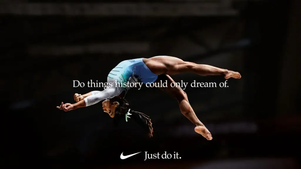
The Swoosh is not iconic on its own merits. It is iconic because it has been attached to Michael Jordan dunking from the free-throw line. It’s iconic because it was on Tiger Woods’ polo shirt when he dominated Augusta. It’s iconic because it became the visual anchor for one of the greatest slogans of all time: “Just Do It.”

A logo is an empty vessel. You fill it with meaning through your products, service, marketing, and actions. Nike spent billions of dollars over decades to make you associate their simple checkmark with athletic excellence and human achievement.
The Masterclass in Brand Evolution
Look at the evolution of the logo’s application.
- 1971: The Swoosh with the word “Nike” in a cursive, lowercase script over it.
- 1978: The logo is updated. The Swoosh is cleaner and now sits below the word “NIKE” in a bold, uppercase Futura font. This added strength and authority.
- 1995: The final, most confident step. They dropped the wordmark entirely.
It was just the Swoosh.
This was a power move. Nike had spent 24 years building so much equity that the symbol alone was enough. They earned the right to be that minimalist. Your new startup has not earned that right. Trying to launch with a symbol-only logo is often brand suicide; nobody knows who you are.
The 3 Dangerous Lies the Nike Story Teaches Entrepreneurs
If you only remember the $35 part of the story, you’re setting yourself up to make these three critical mistakes.
Lie #1: “A world-class logo should be cheap.”
Let’s be blunt. Believing the $35 myth will cripple your branding efforts before you even start. That was the student rate in 1971. Adjusted for inflation, it’s still only around $250. The reality is that professional brand identity design is a strategic investment.
You are not Phil Knight in 1971. You are competing in a visually saturated world against millions of other businesses. Expecting to build a robust brand foundation for the price of a takeaway dinner is delusional. You absolutely get what you pay for. Investing in a proper logo design process involves buying expertise and strategy, not just a graphic file.
Lie #2: “You’ll know ‘the one’ the second you see it.”
This is the “love at first sight” fallacy. Entrepreneurs often expect a quasi-religious moment of revelation when their perfect logo is presented. As we saw with Phil Knight, that’s nonsense. He was unsure but trusted the process and the rationale behind the design.
A logo isn’t a piece of art you hang on your wall. It’s a functional tool for your business. The right question isn’t “Do I love it?” The right questions are “Is it strategically sound? Is it versatile? Is it memorable? Does it communicate our core idea?”
Lie #3: “The logo will make the brand famous.”
This is the most dangerous lie of all. Too many founders believe that customers will magically appear if they just get the logo right.
It’s the other way around.
A brilliant logo on a terrible product, with awful customer service and non-existent marketing, is worthless. It’s just lipstick on a pig. Your business—the quality of what you do and how you do it—makes the logo powerful. The logo doesn’t do the heavy lifting; the signature goes on the work once it’s done.
What Your Business Actually Needs to Learn from Nike
Forget the $35 myth. Here are the fundamental, actionable principles you should steal from the Nike playbook.
Invest in Strategy, Not Just a Symbol
The first step in any credible design process isn’t sketching. It’s thinking. Who is your audience? What is your unique position in the market? What feeling do you want to evoke? A detailed design brief, born from a clear brand strategy, is 90% of the work.
Prioritise Clarity and Versatility Above All Else
Ask the hard questions before you fall in love with a complex or trendy design. Will this work in black and white? Can it be embroidered? Will it look dated in five years? The most enduring logos—Apple, McDonald’s, Nike—are brutally simple for this very reason.
Commit to Incredibly, Boringly Consistent Application
The power of the Swoosh comes from seeing the same mark, used consistently, billions of times. Once you have your logo and brand guidelines, stick to them religiously. Don’t use ten different colours. Don’t stretch the logo. Don’t let your marketing intern “get creative” with it. Consistency builds recognition. Recognition builds trust.
Build a Business That Deserves an Iconic Logo
Focus obsessively on your product, your service, and your customer experience. Create a business that people want to talk about. A great logo is the signature on a masterpiece, not the masterpiece itself. Earn the right to have a symbol that stands for excellence.
Your Logo Isn’t the Next Swoosh (And That’s Okay)
Chasing the next Swoosh is a fool’s errand. You cannot replicate the unique combination of timing, talent, and billion-dollar marketing spend that created it.
But you can learn from its real story.
The true lesson of the Nike logo design is that icons aren’t found in a flash of inspiration for a few quid. They are built. They are forged over years with strategic thinking, a commitment to quality, and relentless, painstaking consistency.
Stop looking for your $35 miracle. Start the real work of building a brand worthy of its own powerful mark.
The difference between a cheap graphic and a strategic brand asset is the process. If you’re ready to build the latter, it’s worth exploring what a professional design journey looks like. At Inkbot Design, we focus on that strategy first. Feel free to request a quote or check out more of our thoughts on the Inkbot Design blog.
Frequently Asked Questions About the Nike Logo Design
Who designed the Nike logo?
The Nike logo, known as the Swoosh, was created by Carolyn Davidson, a graphic design student at Portland State University in 1971.
How much did the Nike logo initially cost?
The original invoice for the logo design was for $35. However, Nike later compensated Carolyn Davidson with 500 shares of company stock in 1983, which is now worth over a million dollars.
What does the Nike Swoosh symbolise?
The Swoosh represents the wing of Nike, the ancient Greek Goddess of Victory. It is designed to convey motion, speed, and triumph.
Why is the Nike logo so successful?
Its success is due to three factors: its simple, memorable, and versatile design; its deep-rooted meaning in the concept of victory; and decades of multi-billion-dollar marketing that has associated the logo with top athletes and the “Just Do It” ethos.
Did Phil Knight like the logo at first?
No. His initial, now-famous reaction was, “I don’t love it, but maybe it will grow on me.” This demonstrates that a logo’s effectiveness isn’t always apparent at first glance.
What font is used for the NIKE wordmark?
The bold, uppercase “NIKE” wordmark, often paired with the Swoosh from 1978 onwards, is set in a modified version of the Futura Bold Condensed Oblique typeface.
When did Nike stop using the name with the logo?
Nike began phasing out the “NIKE” wordmark and using the Swoosh as a standalone logo 1995. This move signified that the brand had achieved global recognition, where the symbol alone was sufficient.
What’s the biggest lesson for a small business from the Nike logo story?
The biggest lesson is that a logo’s value comes from the brand, not vice versa. Focus on building a great business and use your logo consistently as a symbol of that quality, rather than expecting the logo to do the work for you.
Is the Swoosh a perfect logo?
From a technical and strategic standpoint, it’s very close. It is simple, memorable, timeless, versatile, and appropriate for the brand’s industry. Its global recognition and brand equity make it one of the most successful logos ever.
Why is it a mistake to seek a “$35 logo” today?
Relying on the $35 price tag ignores 50+ years of inflation, the context of it being a student project, and the fact that it was a one-in-a-billion outcome. Professional design is a strategic investment in your business’s future, and you get the quality of strategy and execution you pay for.


