The History of the McDonald’s Logo Design
If you think the McDonald’s logo is just a yellow “M” on a red background, you’ve already lost the game.
When we examine the history of the McDonald’s logo, we aren’t looking at art; we are examining a carefully crafted piece of psychological engineering that has endured for nearly 80 years.
It is one of the most famous logos for a reason: it was never meant to be a logo in the first place. It was a structural solution to a visibility problem.
Ignoring the technical evolution of a brand like this costs you money because you fail to understand “Brand Equity Transfer.”
If you don’t know how to evolve your visual identity without killing your recognition, you’ll end up in the graveyard of forgotten startups.
- Originated as structural neon arches in 1952, later refined into the overlapping "M" logo by Jim Schindler in 1961.
- Colour and shape chosen for high visual saliency; red and Pantone 123C yellow trigger appetite and rapid recognition.
- Evolution focused on preserving distinctive asset stability—architectural geometry enabled de‑branding and global adaptability.
We all Know the McDonald’s Logo
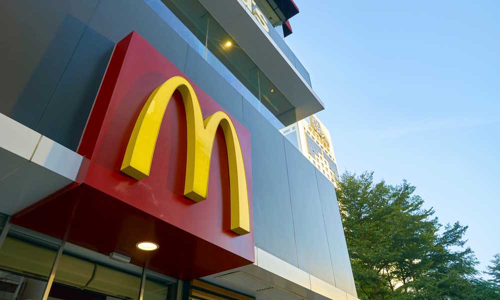
The McDonald’s logo, colloquially known as the “Golden Arches,” is the primary visual identifier for the global fast-food corporation McDonald’s.
In its current 2026 iteration, it represents a refined, minimalist execution of the dual parabolic arches that first appeared in 1952.
Throughout its history, McDonald’s has avoided Semantic Satiation—the psychological phenomenon where a symbol loses its meaning through over-repetition.
They achieved this by shifting the logo’s definition from a “Sign for a Restaurant” to a “Symbol of a Lifestyle.”
In 2026, this is known as Meaning Architecture. By slowly decoupling the “M” from the wordmark, they moved the brand from a descriptive level to an evocative level, where the logo no longer “defines” the company but “triggers” an emotional response.
Key Components:
- The Golden Arches: Two yellow (Pantone 123C) parabolic curves that form a stylised “M.”
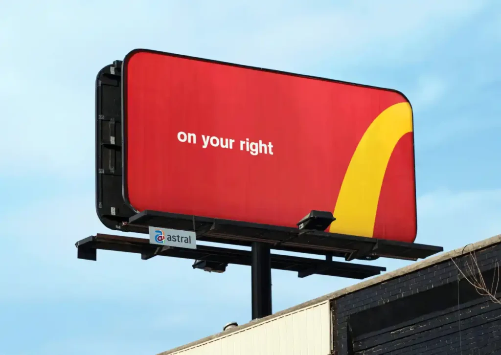
- The Colour Palette: A high-contrast combination of “McDonald’s Red” and “Goldenrod Yellow,” designed to stimulate appetite and visibility.
- The Wordmark: (When present) A custom, sans-serif typeface that has become increasingly secondary to the symbol itself.
The Pre-Arches Era: 1940–1953 (The Speedee Years)
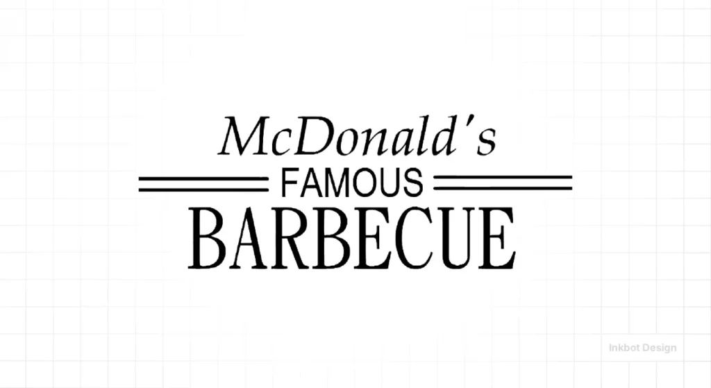
Before the arches, there was “Speedee.” In 1940, Richard and Maurice McDonald opened “McDonald’s Famous Barbecue” in San Bernardino.
The original logo was a text-heavy, uninspired mess. It was a utilitarian signpost for a drive-in.
By 1948, after they “optimised” their business model into the “Speedee Service System,” the logo shifted to focus on a winking chef character named Speedee.
Speedee was designed to communicate one thing: Efficiency.
The 1948 Rebrand: Speedee the Chef
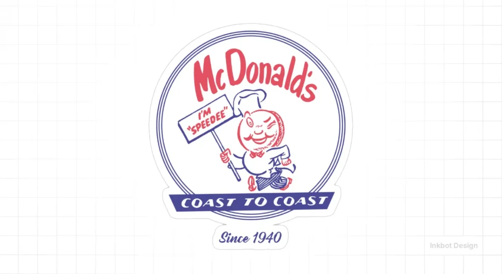
Speedee was a literal representation of the brand’s USP (Unique Selling Proposition). He had a hamburger-shaped head and was shown in a running pose.
- The Failure of Mascots: While Speedee worked for a local audience, mascots are notoriously difficult to scale globally. They require constant “refreshing” to avoid looking dated.
- The Shift: As the brothers looked to franchise, they realised they needed an architectural hook, not just a cartoon. This led them to hire Stanley Meston, an architect who would inadvertently create the most recognised symbol in history.
The Birth of the Arches: 1953–1961
In 1952, the McDonald brothers wanted a building design that would be visible from the road. They didn’t want a logo; they wanted a beacon. Stanley Meston designed two 25-foot neon-lit yellow arches.
Debunking the Myth: It Wasn’t an “M”
There is a persistent myth among amateur designers that the “M” was an intentional choice to represent the family name. This is false.
When Meston designed the arches, they were separate structural elements on either side of the building. It was only from a specific 45-degree angle in the car park that the two arches overlapped to form the shape of an “M.”
The brothers initially hated the idea of the arches becoming the logo. It was the intervention of Ray Kroc and designer Jim Schindler in 1961 that revealed the potential in that accidental geometry.
The Real-World Impact of Architectural Branding

Data from a Nielsen study on visual saliency suggest that 3D shapes (such as buildings) create stronger neural pathways than 2D shapes.
By the time McDonald’s moved the arches from the roof to the letterhead, the public had already “mapped” the shape into their subconscious.
This is why logo design and branding must always consider the physical environment.
In a competitive landscape, the history of the McDonald’s logo is a study in Mental Availability. The Golden Arches serve as a “Visual Anchor” for specific Category Entry Points (CEPs)—such as “driving on a motorway” or “needing a quick family meal.”
By maintaining such high Distinctive Asset stability, McDonald’s reduces the “Search Cost” for the consumer.
It isn’t just a logo; it’s a commercial shortcut that ensures they are the default choice in high-arousal, time-sensitive environments where the brain lacks the energy for complex decision-making.
The Modern Synthesis: 1961–2003
In 1961, Ray Kroc purchased the McDonald brothers’ business for $2.7 million (approximately £1.9 million). He immediately tasked Jim Schindler with turning the building’s architecture into a formal logo.
Schindler’s 1961 design introduced the “overlap” and a slanted line crossing the arches, representing the roof of the restaurant.
The 1968 Refinement
By 1968, the “roof line” was dropped. The arches were thickened, and the “M” became the primary focus. This version remained largely unchanged for decades.
It was during this era that the brand leaned heavily into logo design psychology.
A forensic analysis of the 1968 refinement reveals a masterful application of Gestalt Psychology, specifically the Law of Continuity.
The human eye does not see two separate parabolic curves; it perceives a continuous, rhythmic flow that the brain “closes” into a singular, stable entity.
This reduction in Cognitive Load is what allows the logo to be processed at a sub-perceptual level.
Mathematically, the arches follow a precise quadratic function, often modelled as y = ax^2 + bx + c, ensuring that the curve remains visually balanced even when distorted by the extreme perspective of a driver approaching at speed.
The “Maternal” Connection:
In the 1960s, design consultant Louis Cheskin argued against changing the logo, claiming the arches had a “Freudian” appeal.
He suggested they resembled “mother McDonald’s breasts,” providing a subconscious sense of nourishment and comfort.
While this sounds like typical mid-century marketing fluff, the decision to keep the arches based on psychological triggers proved incredibly lucrative.
| Feature | Amateur Approach | The McDonald’s Way (Pro) |
| Origin | Start with a font and a clip-art icon. | Start with a structural USP (The Arches). |
| Colour | Whatever “looks nice” on a screen. | High-visibility Red/Yellow (Nausea/Hunger). |
| Scalability | Becomes a blur at small sizes. | Mathematical parabolas that hold integrity. |
| Evolution | Frequent, radical changes. | Iterative, conservative refinement. |
The Global Standardisation: 2003–Present
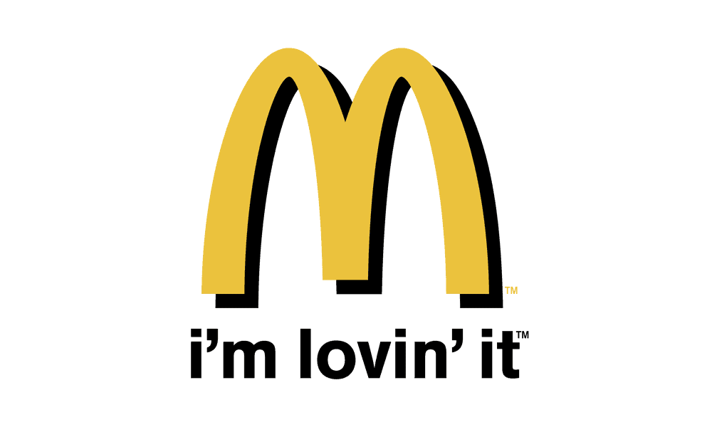
The 2003 “I’m Lovin’ It” campaign, created by the German agency Heye & Partner, marked a pivotal moment in the company’s rebranding and logo redesign, changing its trajectory.
The arches were given a subtle drop shadow and a “3D” plastic look, reflecting the early 2000s obsession with skeuomorphism.
However, the real genius wasn’t the shadow; it was the decoupling of the wordmark.
For the first time, McDonald’s began running adverts where the name of the company never appeared. The arches were doing all the heavy lifting.
This requires a level of brand maturity that many small business owners often overlook. You cannot have a minimalist logo until you have earned the right through years of consistent repetition.
The State of the McDonald’s Logo in 2026
As of 2026, we are seeing the “De-branding” phase reach its peak.
McDonald’s has moved toward responsive logo design, where the “M” is stripped of all gradients, shadows, and even its red background in certain digital contexts.
Digital-First Identity
In the modern landscape, the logo must work as a 16px favicon and a 100ft billboard. This necessitates a shift away from complex debates over vector vs. raster images to pure geometric simplicity.
Recent Shifts (Last 18 Months):
- Sustainable Signage: A shift toward “Negative Space” logos on packaging to reduce ink usage (and costs).
- Adaptive Lighting: In flagship stores, the “Golden” yellow is now adjusted via smart LED systems to match the ambient colour temperature of the city, ensuring the “M” always looks “appetising” regardless of the weather.
- Flat 3.0: A rejection of the “flat design” of the 2010s in favour of “Tactile Flatness”—using subtle overlapping layers to imply depth without the clutter of 2003-era shadows.
The Consultant’s Reality Check (E-E-A-T)
I once audited a client in the logistics sector who wanted a logo that “did everything.” They wanted it to show a truck, a globe, a clock, and their initials. It was a visual car crash. I pointed them to the 1961 McDonald’s transition.
Schindler didn’t try to include a burger, a milkshake, and a car in the logo. He took a single, existing architectural asset and refined it. Most logo design mistakes stem from an “Addition Bias”—the misconception that adding more elements equals more value. In reality, every element you add to a logo dilutes the strength of the others.
If you are struggling with your identity, consider the cost of your logo design.
If you’re paying £50 on a crowdsourcing site, you aren’t buying a strategy; you’re buying a commodity that will likely fail the “scalability test” the moment you try to print it on anything larger than a letterhead.
You need to understand your logo file formats and how they translate to real-world applications.
The Technical Execution: Why it Works
The McDonald’s logo succeeds because of its mathematical “purity.” If you plot the arches on a grid, they follow a strict parabolic curve.
This isn’t just for “looks”—it ensures that when the logo is viewed at extreme angles (like from a car window on a motorway), the “M” remains legible.
Colour Psychology and the “Ketchup and Mustard” Theory
According to WARC’s research on sensory marketing, the combination of red and yellow is the most effective at triggering a “High Arousal” state.
- Red: Increases heart rate and creates a sense of urgency (Eat fast, leave fast).
- Yellow: Associated with happiness and high visibility.
- The Result: You see it from a mile away, you feel a slight “hunger” pang, and you make an impulsive decision to turn into the drive-thru.
This is why your logo design process must include a colour audit. If your B2B software company uses “McDonald’s Red,” you might be inadvertently stressing out your customers instead of building trust.
A recurring problem for global brands is Regulatory Friction. A famous “forensic” case in McDonald’s history occurred in Sedona, Arizona, where local laws prohibited the “distracting” yellow arches to preserve the natural desert aesthetic.
The solution was a pivot to Turquoise Arches. While this broke the strict colour palette, it preserved the Logo Geometry.
This proved that the shape of the arches is a more powerful brand signal than the colour itself. For an SMB, the lesson is clear: your “Identity” must be robust enough to survive local adaptation without losing its “Entity” status.
The Verdict
The history of the McDonald’s logo is a transition from mascot-led utility to architectural iconography. It is a testament to the power of “Accidental Design” being caught and refined by professional strategy.
For entrepreneurs, the lesson is clear: your brand isn’t what you say it is; it’s what the customer recognises from 100 yards away at 70mph.
The Golden Arches aren’t “just an M.” They are a structural beacon that was simplified, standardised, and psychologically optimised over 80 years.
If you want a brand that lasts that long, you need more than a graphic designer; you need a consultant who understands the intersection of architecture, psychology, and technical geometry.
Stop playing around with “temporary” logos. If you’re ready to build a visual identity with the same technical rigour as the Golden Arches, you need to follow a proven logo design process.
Request a Quote from Inkbot Design | Explore Our Logo Design Services
Frequently Asked Questions (FAQ)
Who designed the original McDonald’s arches?
The arches were designed by architect Stanley Clark Meston in 1952 as structural neon signs. In 1961, designer Jim Schindler refined these physical arches into the overlapping “M” logo that became the global standard.
Why are the McDonald’s logo colours red and yellow?
The “Ketchup and Mustard” palette uses High-Arousal colours. Red triggers heart rate and appetite (urgency), while yellow is the most visible colour in daylight. This combination maximises Visual Saliency from long distances.
What is the Freudian theory behind the McDonald’s logo?
In the 1960s, consultant Louis Cheskin argued that the arches resembled “mother McDonald’s breasts.” He suggested this provided a subconscious sense of nourishment and comfort, a psychological “hook” that discouraged the brand from changing its logo.
Has the McDonald’s logo always been an “M”?
No. From 1948 to 1961, the logo featured “Speedee,” a chef mascot with a hamburger head. The very first logo in 1940 was a simple text sign for “McDonald’s Famous Barbecue.”
What is the “Sedona Turquoise Arches” exception?
In Sedona, Arizona, the arches are turquoise because local government regulations prohibited the use of yellow, claiming it clashed with the natural red rock landscape. It is the only location in the world where the arches are not a distinctive yellow colour.
Why did McDonald’s remove the “roof line” from the logo?
The slanted roof line was removed in 1968 to simplify the design. This move toward Minimalist Branding made the logo more effective for the rising “mobile” audience who needed to identify the brand at high speeds.
Is the McDonald’s logo an example of Responsive Design?
Yes. In 2026, it is a masterclass in Responsive Logo Design. It functions perfectly as a 16px favicon, a digital app icon, or a 100ft billboard without losing its mathematical integrity or brand recall.
What can businesses learn about “Brand Equity Transfer” from McDonald’s?
McDonald’s teaches us not to “throw the baby out with the bathwater.” When they moved from Speedee to the Arches, they leveraged an existing physical asset (the building) to ensure the transition felt familiar, not disruptive.
How does the “Law of Continuity” apply to the arches?
Gestalt psychology’s Law of Continuity states that the human eye tends to follow paths. The arches are designed so that the eye naturally flows through the curves, perceiving a singular “M” rather than two disjointed shapes.
What is “De-branding” in the context of McDonald’s?
De-branding refers to the removal of a company’s name from its logo. Because the arches have such high Mental Availability, the wordmark is no longer necessary for the brand to be identified.
Why is Pantone 123C significant for the brand?
Pantone 123C (Goldenrod Yellow) is the standardised colour that ensures a franchise in London looks identical to one in Tokyo. Consistency is the primary driver of Brand Trust.
What is the “Ketchup and Mustard” theory?
This theory suggests that the combination of red and yellow stimulates hunger and a sense of haste. It encourages customers to “eat fast and leave,” which is the core operational goal of a high-volume fast-food business.
How does the McDonald’s logo handle “Addition Bias”?
McDonald’s avoids Addition Bias by keeping the logo stripped of all unnecessary elements. There are no pictures of burgers; the arches represent the entity of the brand, not just the products.
What is the “Maternal” connection to the arches?
It is the psychological theory that the rounded shapes of the arches trigger a subconscious association with safety and nourishment, similar to the bond between a mother and child.
How does the McDonald’s logo impact local SEO?
The “M” serves as a high-intent Visual Keyword. On Google Maps and in-car navigation systems, the arches icon is instantly recognisable, reducing the “Cognitive Friction” for users looking for a nearby dining option.


