Marriott Logo Design: Secrets of Hospitality Branding
I used to think the Marriott logo was “just a wordmark.”
I was wrong.
The history of the Marriott logo design isn’t about aesthetics; it’s a masterclass in building brand consistency and market authority across a global empire.
This isn’t just a design review.
It’s a strategic breakdown of how Marriott uses a deceptively simple logo to communicate trust and justify a premium, no matter where you are in the world.
| Company Name | Marriott International, Inc. |
| Founded | 1927 |
| Founder | J.W. Marriott |
| Headquarters Location | Bethesda, Maryland, USA |
| Estimated Value | Approximately $45 billion (as of 2024) |
| CEO | Anthony Capuano |
| Industry | Lodging |
| Number of Employees | Approximately 411,000 |
| Ticker Symbol | MAR |
| Exchange | NASDAQ |
| Website | marriott.com |
- The Marriott logo's evolution illustrates the company's growth from a root beer stand to a global hospitality powerhouse.
- Iconic "M" symbolizes simplicity and strength, serving as a powerful visual identity for the brand.
- Each logo iteration balances tradition and innovation, maintaining its connection to Marriott's heritage.
- Consistent application across various touchpoints enhances brand recognition and reliability.
- Flexibility in design updates ensures the logo remains relevant in a changing hospitality landscape.
The Evolution of the Marriott Logo: A Story of Refinement and Relevance
The Marriott logo has undergone a fascinating transformation over the years, mirroring the company’s growth and adaptation to changing market demands. Let’s take a closer look at the key milestones:
1927: The Humble Beginnings
The original Marriott logo was far from the sleek, modern design we know today.
1927, when the company was founded as a humble root beer stand, the logo featured a simple text-based design with the word “Marriott” in a basic serif font.
This no-frills approach reflected the company’s modest roots and hinted at the potential for growth and expansion.
1957: A Bolder, More Recognisable Mark
The logo underwent a significant transformation as Marriott transitioned from a root beer stand to a motel chain. The iconic “M” symbol was introduced, adding a distinct visual identity that was easy to recognise and remember.
This bold, geometric “M” became the foundation for Marriott’s branding, setting the stage for the company’s rise to prominence in the hospitality industry.
1976: A New Visual Identity
Fast forward to 1976, when the Marriott visual identity was redesigned to embrace an iconic style that has remained essentially unchanged. This redesign marked a pivotal moment for the brand, crafting a unique and recognisable image that would stand the test of time.
The 1976 logo introduced a more sophisticated and polished look, aligning with Marriott’s evolution from its humble beginnings to becoming a global hospitality leader. This new identity enhanced brand recognition and solidified its presence in the competitive landscape.
1993: Refining the Classic Look
In the early 1990s, Marriott again refined its logo, introducing a more polished and sophisticated design. The “M” symbol remained, but the whole “Marriott” wordmark now accompanied it in a sleek, modern font.
This updated logo conveyed a sense of professionalism and reliability, perfectly aligning with Marriott’s growing reputation as a trusted name in the hospitality sector.
2013: A Contemporary Refresh
Fast forward to 2013, and Marriott underwent another logo transformation. The classic “M” symbol was retained, but the wordmark was given a contemporary makeover with a bolder, more geometric font that exuded a sense of modernity and innovation.
This latest iteration of the Marriott logo reflects the company’s continuous evolution and commitment to staying relevant in an ever-changing hospitality landscape. The Marriott chain currently operates over 8,000 hotels worldwide.
Deconstructing the Marriott Logo: Unlocking the Design Secrets
Now that we’ve explored the rich history of the Marriott logo, let’s dive deeper into the design elements that have made it so iconic and enduring.
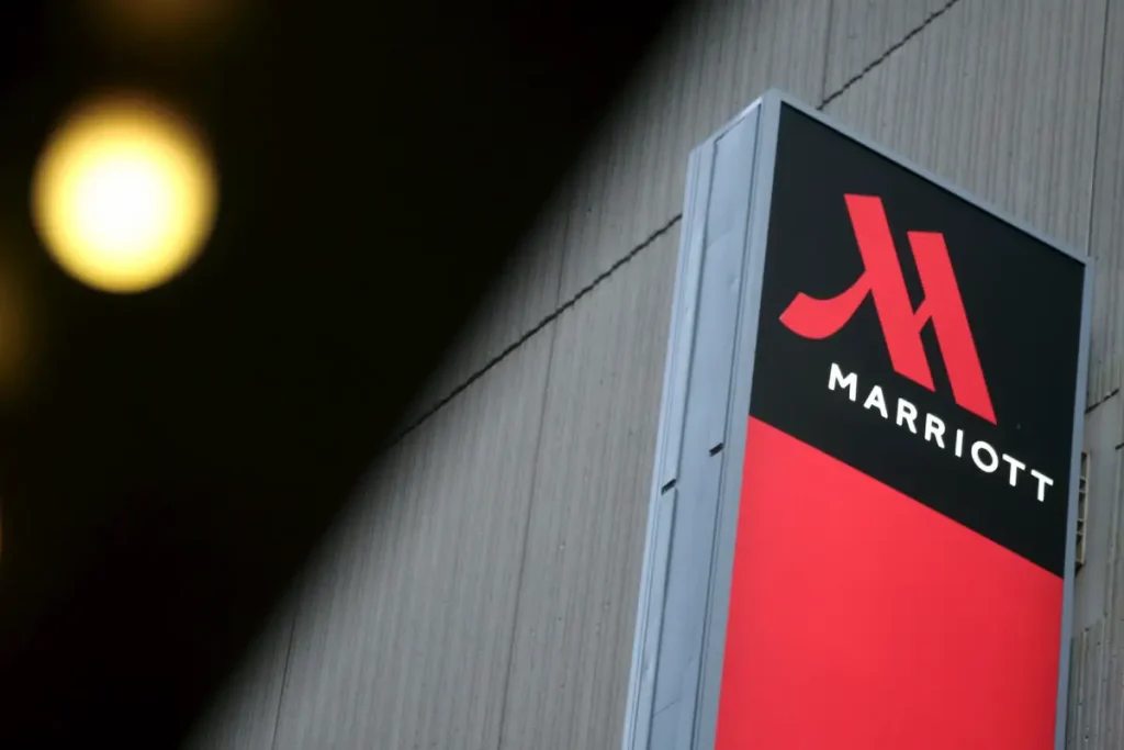
The Iconic “M” Symbol
The Marriott “M” is undoubtedly the star of the show. This geometric, abstract symbol has become synonymous with the brand, serving as a powerful visual shorthand instantly recognisable to travellers worldwide.
But what makes this “M” so effective? It’s all about the power of simplicity and symmetry. The clean, bold lines and perfectly balanced proportions create a sense of stability and strength. At the same time, the minimal design ensures that the symbol remains versatile and adaptable across a wide range of applications.
Typographic Refinement
The Marriott wordmark has evolved but has always maintained a sense of sophistication and elegance. With its geometric shapes and well-defined serifs, the current typeface exudes a timeless quality that complements the modern “M” symbol.
By carefully balancing the weight and spacing of the letters, the Marriott wordmark achieves perfect harmony with the logo mark, creating a cohesive and visually striking identity.
The current Marriott logo uses a modern Sans-serif typeface with generous spacing between the letters. This design choice gives the logo a clean and contemporary look.
Colour Palette: Striking the Right Balance
The Marriott logo is primarily associated with navy blue and gold. This colour combination is not only visually appealing, but it also carries significant symbolic meaning.
The navy blue represents the reliability, trustworthiness, and professionalism that are hallmarks of the Marriott brand. Meanwhile, the warm gold hue adds a touch of luxury and opulence, conveying the high-end hospitality experience that Marriott strives to provide.
Striking a Perfect Balance
What truly sets the Marriott logo apart is its ability to strike a delicate balance between various design elements.
The expertise of a skilled logo designer is evident in the iconic “M” symbol, the refined typography, and the carefully chosen colour palette, all of which work together to create a logo that is simultaneously bold and elegant, modern and timeless.
This harmonious blend of design principles has allowed the Marriott logo to remain relevant and recognisable for decades, adapting to the changing needs and preferences of the hospitality industry.
Lessons from the Marriott Logo: Insights for Your Own Brand Identity
As we’ve seen, the Marriott logo is a shining example of effective branding and design. But what can we learn from this hospitality giant’s success that can be applied to our brand identities?
1. Embrace Simplicity and Memorability
The Marriott logo’s enduring success is mainly due to its simplicity and memorability. By distilling the brand essence into a single, iconic symbol, Marriott has created a visual shorthand that is instantly recognisable and easy to remember.
When designing your logo, strive for a similar level of simplicity and memorability. Avoid cluttering the design with unnecessary elements and focus on creating a mark that is both visually striking and easy to recall.
2. Balance Tradition and Innovation
The Marriott logo has evolved over the years, but has maintained a solid connection to the brand’s heritage. By carefully balancing tradition and innovation, Marriott has stayed relevant while preserving its core identity.
As you develop your brand identity, consider how you can blend timeless design principles with contemporary touches. This will help you create a logo that feels familiar and fresh, resonating with your audience on a deeper level.
3. Invest in Brand Consistency
One of the keys to the Marriott logo’s success is its consistent application across the brand’s vast empire. Whether staying at a Marriott-branded hotel or interacting with the company’s digital presence, the logo remains a constant and recognisable element.
Prioritise brand consistency in your identity development. Ensure that your logo, typography, colour palette, and other branding elements are applied consistently across all touchpoints, from your website to your business cards.
4. Adaptation and Flexibility
While consistency is crucial, the Marriott logo has also demonstrated the importance of adaptation and flexibility. The brand has updated its logo over the years, ensuring it remains relevant and aligned with evolving market trends and customer expectations.
As you develop your brand identity, be prepared to revisit and refine your design elements as your business grows and evolves. Embrace change and be open to making strategic adjustments that keep your brand fresh and engaging.
FAQs: Navigating the Marriott Logo Design Journey
How can I ensure my Marriott-inspired logo stands out?
The key is to balance paying homage to the Marriott brand and infusing your unique personality. Leverage the design principles that have made the Marriott logo successful, such as simplicity, symmetry, and a refined colour palette, but add your creative twist. Experiment with subtle variations in the “M” symbol or the typeface to make it your own.
What are some common pitfalls to avoid when designing a Marriott-style logo?
One common pitfall is trying to copy the Marriott logo too closely. While drawing inspiration from their design is essential, you must avoid creating a blatant replica. Avoid using the same font, colours, or symbol proportions, as this could be considered trademark infringement.
Another pitfall is failing to consider the practical applications of your logo. Make sure the design is versatile enough to work across a wide range of digital and physical media without losing its impact.
How can I ensure my Marriott-inspired logo conveys a sense of luxury and sophistication?
Incorporate design elements that evoke a sense of prestige and elegance. Consider using a serif typeface with clean, geometric lines, and pair it with a colour palette with rich, jewel-tone hues. Experiment with subtle metallic accents, such as gold or silver, to add a touch of luxury.
Additionally, pay close attention to the balance and proportions of your design elements. Ensure the overall composition feels harmonious and visually pleasing, conveying a sense of refinement and attention to detail.
What are some tips for making my Marriott-inspired logo stand the test of time?
Timeless design is all about striking the right balance between tradition and innovation. Start with a solid foundation of classic design principles, such as symmetry, minimalism, and legibility. Then, infuse your logo with subtle contemporary touches that keep it fresh and relevant.
Avoid trendy design elements or gimmicks that may quickly become dated. Instead, focus on creating a logo that feels familiar and modern, with a sense of permanence that will resonate with your audience for years.
How can I ensure my Marriott-inspired logo is versatile enough for various applications?
Versatility is critical when designing a logo that needs to work across a wide range of media, from print to digital. Consider creating a primary logo mark that can be used independently and a version that includes the wordmark for more formal or text-heavy applications.
Experiment with different size ratios and proportions to ensure the logo remains legible and impactful at large and small scales. Additionally, choose a colour palette that is flexible enough to work well in both full-colour and monochrome versions of the logo.
Conclusion: Elevating Your Brand with a Marriott-Inspired Logo
The Marriott logo stands as a masterclass in brand identity design. Its success lies not in complexity, but in:
- Unwavering consistency
- Thoughtful simplicity
- Strategic implementation
Ready to develop your own iconic brand identity? At Inkbot Design, we specialise in creating timeless logos that stand the test of time. Let’s craft your brand’s legacy together.
Contact us today to discuss your brand identity needs.


