Popping the Secrets of the Iconic Pringles Logo Design
As the founder of a branding and design agency, I’ve seen my fair share of logo redesigns.
A logo often determines a company’s success, from iconic brands like Coca-Cola to scrappy startups.
In logo design, a few examples are as recognisable and enduring as the Pringles logo.
With its distinctive profile and bold red-and-yellow colour scheme, the Pringles logo is seared into the collective consciousness of snack lovers worldwide.
But have you ever wondered about the story behind this iconic design? How did the Pringles logo come to be, and what can we learn from its evolution over the years?
In this in-depth brand study, we’ll dive into the rich history of the Pringles logo, unpack the design choices that have made it so memorable, and explore how you can apply these principles to craft a logo that resonates with your audience.
Whether you’re a seasoned designer, a budding entrepreneur, or simply a curious snack enthusiast, this post will reveal the secret sauce behind the Pringles logo’s enduring success.
So, grab a can of Pringles (the original flavour, of course), and let’s get started!
| Attribute | Details |
| Brand Name | Pringles |
| Founding Year | 1968 |
| Founder(s) | Procter & Gamble (P&G) |
| Current Owner | Kellanova |
| Headquarters Location | Battle Creek, Michigan, United States |
| Estimated Value | Approximately $2.695 billion (acquisition price by Kellogg’s in 2012) |
| Product Type | Stackable potato chips |
| Market Presence | Sold in over 140 countries worldwide |
| Previous Owners | Procter & Gamble (1968–2012) |
| Website | pringles.com |
- Pringles Logo is an iconic representation of snack culture, created by Procter & Gamble in 1968 and designed to ensure recognisability.
- The logo's evolution began with a quirky inspiration: a man’s profile seen on a tennis ball can, credited to Arch Drummond.
- Mr. Julius Pringles embodies warmth and friendliness, establishing an emotional connection and making the brand approachable to consumers.
- In 2009, a minimalist approach was adopted, simplifying the logo while retaining its memorable elements, showcasing adaptability in design.
- Key design principles include recognisability, simplicity, personality infusion, evolution, and larger brand identity alignment for lasting impact.
The Origins of the Pringles Logo: From Modest Beginnings to Icon Status
The story of the Pringles logo begins, fittingly, with the invention of the iconic Pringles potato chip itself. In the late 1960s, Procter & Gamble was on a mission to create a consistent, uniform potato chip that could be packaged and shipped without getting crushed.
Enter Fredric Baur, a Procter & Gamble employee with a background in packaging design. Baur’s breakthrough came from the now-famous Pringles can, designed to perfectly contain and protect the delicate, saddle-shaped potato crisps.
The Inspiration Behind the Pringles Brand Name
The story of Pringles’ brand name is as intriguing as unconventional. The inspiration reportedly came from a somewhat unexpected source: a phone book.
According to popular lore, the marketing team went through a phone directory and stumbled upon “Pringle Drive” in Ohio. Captivated by the name’s catchy and unique ring, they decided it was the perfect fit for their innovative product.
This lucky find led to the iconic brand name, “Pringles,” which has since become synonymous with stackable potato crisps across the globe.
With the name and packaging sorted, the next step was to create a logo that would capture the essence of this revolutionary snack. And that’s where the story takes an unexpected turn.
A Curious (and Slightly Bizarre) Origin Story
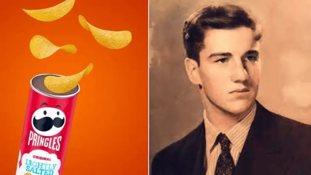
According to Pringle’s lore, the original logo design was the brainchild of Arch Drummond, a Procter & Gamble executive tasked with developing the brand’s visual identity. Drummond was a man of eclectic tastes and unorthodox inspirations.
One day, as the story goes, Drummond was enjoying a family picnic when he stumbled upon a rather unusual muse: the profile of a man’s head, as seen from the side, peeking out from the lid of a tennis ball can.
“Eureka!” Drummond must have exclaimed (or something to that effect). “That’s it! That’s the perfect representation of our Pringles crisps!”
With this bizarre stroke of genius, the iconic Pringles logo was born. Drummond’s design, which featured a profile of a man’s head with a distinct nose and chin, was instantly recognisable and became a staple of the brand’s marketing and packaging.
😄 I can imagine Drummond sitting at his desk, staring intently at that tennis ball can lid and muttering, “Yes, this is it! This is the face of Pringles!” The kind of quirky, left-field inspiration makes for an excellent brand origin story.
The Evolving Face of the Pringles Brand
Of course, the Pringles logo hasn’t remained static over the years. Like any successful brand, Pringles has periodically refreshed and refined its visual identity to keep pace with changing consumer tastes and trends.
Let’s take a closer look at the critical milestones in the Pringles logo’s evolution:
The Original Pringles Man (1968-1991)
The original Pringles logo, as conceived by Arch Drummond, featured a distinct profile of a man’s head with a prominent nose and chin. This instantly recognisable design was used on the brand’s packaging and marketing materials from the late 1960s through the early 1990s.
The Story Behind Mr. Julius Pringles
When you glance at the Pringles can’s cheerful face, you see more than just a logo. This iconic mascot, Mr. Julius Pringles, has a backstory that adds charm to the brand’s identity.
Mr. Pringles was conceived as a good-natured baker. His cheerful demeanour reflects the joy and satisfaction of enjoying a delicious stack of crisps. With his signature moustache and welcoming eyes, he stands as a symbol of warmth and hospitality, subtly hinting at the care put into every can of Pringles.
This character has remained a staple of the brand, embodying the playful and inviting nature that drew consumers in from the first iterations of the logo. Each redesign retains its essence, keeping Mr. Pringles at the heart of the brand’s visual identity.
As he came to be known, the Pringles Man had a warm, friendly expression and a slightly exaggerated, cartoonish appearance that helped convey the brand’s playful, approachable personality.
In the 1980s, a pivotal marketing campaign was launched featuring the catchy slogan “Fever for the Flavor of Pringles.” Accompanied by a television commercial starring a young Brad Pitt, this campaign significantly boosted the brand’s visibility. The impact was substantial: sales began to soar as the brand captured the public’s attention like never before. This strategic push transformed the product into a household name, marking a turning point in its commercial success.
The Modernised Pringles Man (1991-2009)
In 1991, Pringles underwent a subtle logo refresh, modernising the Pringles Man with a sleeker, more refined design. The profile was still recognisable, but the features were slightly smoothed out, giving the character a more sophisticated and contemporary look.
This updated logo was used for nearly two decades, helping solidify the Pringles brand’s position as a beloved snack staple in households worldwide.
The Significance of “Once You Pop, You Can’t Stop”
Instant Recognition and Appeal:
The slogan “Once You Pop, You Can’t Stop” captures the essence of Pringles in a way that creates instant brand recognition. It’s more than just a catchy phrase; it promises an irresistible snacking experience. The moment you pop open a tube, you’re met with the expectation of flavour and satisfaction that keeps you reaching for more.
Unique Product Experience:
Unlike other snacks, the shape of Pringles chips is unique and easily recognisable, contributing to the allure behind the slogan. It suggests a continuous cycle of enjoyment, highlighting that these crisps deliver a taste and texture combination that’s hard to resist. This is a nod to the idea that once you start enjoying Pringles, the enjoyment becomes a seamless, relentless experience.
Emotional Connection:
“Once You Pop, You Can’t Stop” also taps into consumers’ emotional response to the brand. The excitement and anticipation of popping open a can create a ritualistic, joyful moment associated with indulgence. This emotional connection drives brand loyalty and makes Mr. Pringles’ face on the package a symbol of consistent delight.
This slogan embodies more than just a marketing message—it’s an iconic cue for the delightful experience that awaits inside every can.
The Simplified Pringles Icon (2009-Present)
The most recent iteration of the Pringles logo, introduced in 2009, takes a decidedly minimalist approach. Gone is the detailed profile of the Pringles Man, replaced by a simple, stylised icon that captures the brand’s essence.
This simplified logo features a bold, yellow-and-red colour scheme, with the distinctive Pringles “smile” taking centre stage. The result is an instantly recognisable design that feels fresh and modern.
The decision to move away from the Pringles Man was bold, but it has paid off handsomely for the brand. By distilling the logo to its most iconic elements, Pringles has maintained its visual identity while keeping pace with the ever-evolving design trends of the 21st century.
🤔 It’s interesting to see how the Pringles logo has evolved from the quirky, cartoonish Pringles Man to the sleek, minimalist icon we know today. Each iteration has its charm, reflecting consumers’ changing tastes and preferences.
2012, a significant shift occurred when Kellogg’s acquired Pringles for $2.695 billion. This strategic move was a cornerstone of Kellogg’s plan to broaden its international presence. With the acquisition, Kellogg’s catapulted to the second-largest snack brand worldwide, marking a transformative moment in the company’s history.
This purchase significantly enhanced Pringles’ global footprint. The brand operates five major worldwide factories—in the United States, Belgium, Malaysia, Poland, and China. These facilities are pivotal in cementing Pringles’ status as a prominent player in the global snack market, underscoring both Kellogg’s and Pringles’ expanded international reach.
The Psychology of the Pringles Logo Design
Now that we’ve explored the history of the Pringles logo, let’s dive deeper into the psychology and design principles that have made it successful.
Recognisability and Consistency
One key factor contributing to the Pringles logo’s enduring popularity is its exceptional recognizability. Whether you’re strolling through the snack aisle or scrolling through social media, the distinctive Pringles profile is instantly identifiable.
This recognition level results from Pringles’ steadfast commitment to consistency in its branding. Throughout the logo’s various iterations, the core elements – the profile shape, the bold colour scheme, and the iconic “smile” – have remained largely intact.
This consistency has helped to cement the Pringles brand in the minds of consumers, creating a sense of familiarity and trust. No matter how the logo may have changed over the years, it has always retained a clear, cohesive visual identity.
Simplicity and Memorability
Another critical factor in the Pringles logo’s success is its simplicity. The brand has created a visually striking and memorable logo by distilling the design to its most essential elements.
The simplified Pringles icon, with its clean lines and bold colours, is the perfect example of this principle in action. It’s a design that is easy to recognise, remember, and reproduce – a trifecta of logo design that has helped cement the brand’s place in the pantheon of iconic snack logos.
💡 Simplicity is often the secret sauce of excellent logo design. By stripping away unnecessary details and focusing on the core elements, designers can create instantly recognisable and easily recalled logos. The Pringles logo is a prime example of this principle in action.
Emotion and Personality
But the Pringles logo isn’t just about recognizability and simplicity – it also has a strong emotional resonance with consumers.
With his friendly expression and slightly exaggerated features, the original Pringles Man conveyed a sense of warmth and approachability that helped endear the brand to snack lovers of all ages. Even the more refined, modernised logo versions have maintained a playfulness and personality that sets Pringles apart from its more serious competitors.
This emotional connection is a crucial element of the Pringles brand identity. By cultivating a sense of fun and personality, the logo helps to create a robust and positive association in the minds of consumers. It’s not just a logo – it’s a visual representation of the Pringles brand’s unique identity and values.
😊 I love how the Pringles logo manages to be both simple and emotive. The original Pringles Man’s friendly, almost cartoonish expression creates an immediate sense of warmth and approachability. At the same time, the sleek, minimalist design of the modern icon conveys a sense of sophistication and modernity. It’s a perfect balance of form and function.
Lessons for Your Logo Design
So, what can we learn from the Pringles logo’s enduring success? Here are a few key takeaways that you can apply to your logo design:
- Focus on Recognisability: Strive to create an instantly recognisable logo, even from a distance or at a small size. Consistent use of core design elements is critical.
- Keep it Simple: Distill your logo down to its most essential elements. Avoid clutter and extraneous details – iconic logos are often the most minimalist.
- Infuse it with Personality: Give your logo a sense of character and emotion. Whether it’s a friendly expression, a playful colour scheme, or a touch of whimsy, adding personality can help your logo resonate with your audience.
- Embrace Evolution: Be bold and periodically refresh and update your logo to keep pace with changing trends and preferences. But maintain a strong, consistent visual identity throughout the process.
- Consider the Bigger Picture: Remember that your logo is just one piece of a more significant brand identity. Ensure it aligns with and amplifies your business’s overall personality and values.
🚀 By applying these principles to your logo design, you can create a visual identity that is as memorable and enduring as the iconic Pringles logo. And who knows – maybe your brand will be as ubiquitous and beloved as a classic can of Pringles!
FAQs: Pringles Logo Design
Why did Pringles choose a profile of a man’s head for their logo?
According to the brand’s origin story, the Pringles logo was inspired by the profile of a man’s head peeking out from the lid of a tennis ball can. This unique and slightly quirky design helped the Pringles logo stand out from the crowd and become instantly recognisable.
How has the Pringles logo evolved over the years?
The Pringles logo has undergone critical changes since its inception in the late 1960s. The original Pringles Man featured a detailed profile with a prominent nose and chin. This was later updated to a more refined, modern version of the Pringles Man in the 1990s. Finally, in 2009, Pringles simplified the logo even further, removing the complete profile and focusing on a sleek, minimalist icon.
What design principles make the Pringles logo so successful?
Recognisability and consistency: The core elements of the logo have remained largely intact, even as the design has evolved.
Simplicity and memorability: The minimalist, iconic design is easy to recognise and recall.
Emotion and personality: The Pringles Man’s friendly, approachable expression (and the modern icon’s playful spirit) creates a solid emotional connection with consumers.
How can I apply the lessons from the Pringles logo to my brand’s visual identity?
Focus on creating a highly recognisable, consistent visual identity
Strive for simplicity and minimalism in your logo design
Infuse your logo with personality and emotion to connect with your audience
Be open to evolving and refreshing your logo over time to stay relevant
Does the Pringles logo have any deeper symbolic or cultural significance?
While the Pringles logo doesn’t necessarily have any deep, symbolic meaning, it has become a cultural icon in its own right. The friendly, approachable face of the Pringles Man (or the modern, minimalist icon) has become synonymous with the brand’s playful, indulgent personality. The logo has become so ingrained in the collective consciousness of snack lovers that it has taken on a life of its own, transcending its original purpose as a simple brand identifier.


