GoFundMe Rebrand: Koto and the Art of the Progress Bar
UI elements aren’t just for buttons anymore. GoFundMe is moving from a collection of individual stories to a global giving infrastructure.
- Koto repositions GoFundMe from individual fundraisers to a global, systemic giving ecosystem with integrated tools like Giving Funds.
- Progress Circle becomes a modular visual system: segmented fills, framing photography, and scalable motion to express collective action.
- GoFundMe Sans replaces Circular to improve legibility, control licensing costs, and unify consumer and Pro identities.
- Giving Funds democratises Donor-Advised Funds with low minimums, tax receipts, investment growth, and institutional partners.
Modern brand architecture requires a shift from singular transactions to systemic ecosystems.
In late 2025, we saw a shift. Brands stopped trying to be ‘everything to everyone’ and started trying to be ‘the system that connects everyone’.
GoFundMe’s recent rebrand by Koto is the textbook example of this.
They’ve moved beyond peer-to-peer fundraising into a broader, more complex giving ecosystem. By integrating GoFundMe Pro (formerly Classy) and new tools like ‘Giving Funds’, the platform had to grow up. (Cowan, 2026).
The goal? Expressing growth without losing that raw, emotional ‘someone-needs-help’ immediacy. It’s a delicate balance. Get it wrong, and you look like a cold, heartless bank.
In 2026, the most radical part of the GoFundMe rebrand isn’t a logo—it’s the launch of Giving Funds. Historically, Donor-Advised Funds (DAFs) were the playground of high-net-worth individuals, with massive minimums and complex management requirements.
By partnering with Vanguard and BlackRock, GoFundMe has democratised the DAF.

The brand identity had to signal this shift from “one-off help” to “strategic philanthropy.” Giving Funds allows users to contribute as little as $5, receive an immediate tax receipt under 501(c)(3) regulations, and invest those funds to grow tax-free until they are ready to recommend a grant.
Visually, this is represented by the “Pulse” motion in the UI—a rhythmic reminder that your capital is active even before it is deployed.
The Progress Circle is the most significant visual asset in the new system.
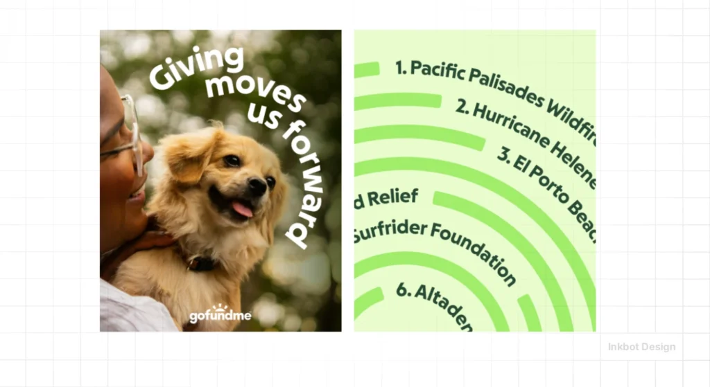
The Progress Circle is no longer a static UI bar; it is a modular framing device. Developed by Koto, the circle is divided into segments that represent the community’s collective action.
In marketing materials, these segments are used to frame photography, highlighting individual faces within a larger circular border to signify that every person is a part of the whole.
| Feature | Description | Strategic Benefit |
| Segmented Momentum | The circle fills in distinct blocks rather than a smooth gradient. | Shows that “Help Adds Up” through individual contributions. |
| Modular Framing | Used to crop and isolate subject matter in photography. | Focuses on the “Humanity” principle of the new art direction. |
| Dynamic Scale | The circle expands into a full-bleed graphic or shrinks to a favicon. | Ensures brand consistency from billboards to mobile buttons. |
| The “Reveal” | The logo’s hidden circle in the rays is now the primary hero. | Leverages 15 years of brand equity while modernising the form. |
How does the typography support the system?
For years, the platform used Circular, a beloved but wide typeface that struggled on small mobile screens where fundraising happens most.
GoFundMe Sans, designed in collaboration with the Koto type team, was built for density and warmth.
It takes the geometric foundations of the Progress Circle—specifically the rounded terminals—and applies them to a high-x-height sans serif that remains legible at 10px.
Crucially, this move was also a business decision. For a platform facilitating $40 billion in giving, the licensing fees for third-party fonts were a significant “shambles” for the budget.
GoFundMe Sans is a proprietary asset that works across both the “Helpful Guide” (B2C) and the “Helpful Partner” (GoFundMe Pro) identities, ensuring a unified voice without recurring overhead.
Is the colour palette a total reset?
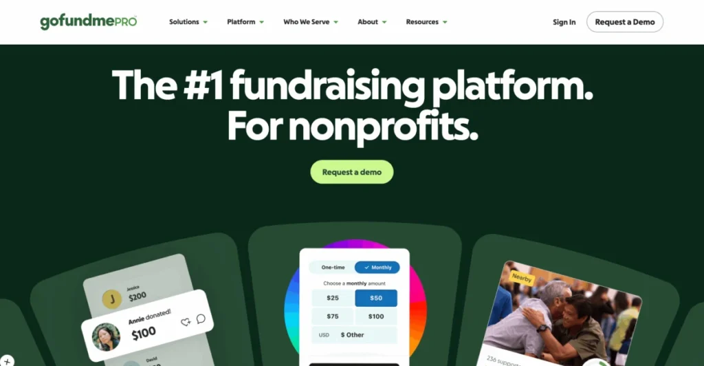
The rebrand introduced a clear architectural split. While the consumer platform retains its signature vibrant green, GoFundMe Pro (the successor to Classy) adopts a “Premium Dark” palette.
This isn’t just a “dark mode” aesthetic; it uses a deep forest green that anchors the brand in professionalism for enterprise non-profits.
To ensure these colours met 2026 accessibility standards, the team used Leonardo, an open-source tool for creating adaptive colour systems.
By pairing light, vibrant greens with high-contrast darker shades, the team bypassed the “muddy green” problem that plagued brands in 2024.
The result is a duotone system that allows for white text on green backgrounds without sacrificing WCAG compliance.
Koto has managed to make a massive platform feel like a local neighbour.
I remember a client meeting in 2018 where we discussed ‘scaling empathy’. It’s a bloody nightmare. You start with one person helping another, and suddenly you’re a multi-national corporation handling billions.
Most agencies try to hide the scale. They use ‘soul-less vector art’ or generic photos of people smiling. Koto didn’t.
They leaned into the ‘Progress Circle’ as a representation of collective action. It’s a bit of a contradiction—using a geometric shape to show ‘humanity’—but it works. It avoids the ‘over-designed’ trap that killed so many 2025 rebrands.
At Inkbot Design, we often see junior designers trying to ‘reinvent the wheel’. Koto did the opposite. They took the wheel GoFundMe already had, polished it, and made it the engine.
Provenance.
The new motion identity brings a much-needed rhythm to the brand. In 2026, if your brand doesn’t move, it’s dead. The segments of the circle shifting and filling feel like a pulse.
Intelligent Ask – AI as a Brand Persona
A brand is how a product behaves, and in 2026, GoFundMe behaves more intelligently. The introduction of Intelligent Ask Amounts uses machine learning to suggest donation values based on a user’s history and the specific urgency of the cause.
This feature is the practical application of the “Helpful Partner” verbal identity. It removes the “donor’s block”—that moment of hesitation when someone doesn’t know how much to give.
By grounding these suggestions in real-time data, the platform moves from a passive tool to an active participant in the giving ecosystem.
Strategic Takeaways
Graphic Designers: Study how Koto extracted a ‘UI truth’ to build a brand. Don’t just make a logo; find the one thing the user already recognises and elevate it.
Business Owners: Consistency is your best friend when you’re expanding. If you’re launching a ‘Pro’ version of your service, ensure the brand architecture links back to your consumer roots.
FAQs
Is the new logo actually different?
Hardly. They just ‘revealed’ the circle inside the existing ray. It’s a smart move—evolution over revolution. Keep the equity, ditch the clutter.
Why custom typefaces?
Licensing fonts for a platform this big is an absolute shambles for the budget. Plus, ‘GoFundMe Sans’ lets the brand own every pixel of the conversation.
Does ‘Help Adds Up’ sound a bit too simple?
Good. If you can’t explain the strategy to a five-year-old, you haven’t got one. Simple is hard.
Is the green too ‘old school’?
Green is the colour of money and growth. In this context, changing it would be suicidal. They just made it look better in Dark Mode.
What’s the ‘Inkbot Method’ for this?
Look for the ‘scar tissue’. What’s the one thing users love or hate about the current product? For GoFundMe, it was the anxiety/excitement of the progress bar. We build from there.
Is ‘GoFundMe Pro’ a good name?
It’s functional. It’s not poetic, but when you’re dealing with non-profits and tax receipts, you want clear, not clever.
Does motion really matter in branding?
In 2026? Yes. Static brand guidelines are just expensive paperweights. If it doesn’t animate, it doesn’t exist.


