Massimo Vignelli: The Discipline of Timeless Brand Logic
If you are like many entrepreneurs or small business owners, you likely view design as an expense—the coat of paint you apply at the end of a project.
You are wrong. Design is the project.
Massimo Vignelli, one of the most famous graphic designers to ever pick up a pencil, understood this better than anyone.
“If you can design one thing, you can design everything.”
He didn’t make “pretty pictures.” He built systems that lasted half a century. In an era where the average brand rebrands every three years to “stay relevant,” Vignelli’s work stands as a poignant indictment of our modern obsession with the new over the functional.
Ignoring Massimo Vignelli’s principles isn’t just an aesthetic choice; it’s an expensive operational leak.
Every time a customer has to “guess” if a piece of content belongs to your brand, you lose money.
- Design is a disciplined, unified system; clarity, logic and function trump decoration in every medium.
- Use strict rules: grids, limited typefaces and palettes to ensure legibility, scalability and cost efficiency.
- Balance Modernist discipline with emotional hooks; systems sustain brands long term while moments create attachment.
Who is Massimo Vignelli?
Massimo Vignelli (1931–2014) was an Italian designer who championed Modernism, a philosophy that prioritises clarity, logic, and functionality over decoration.
He believed that “Design is One,” meaning the discipline of design is the same whether you are creating a spoon, a chair, a book, or a corporate identity for a multi-billion-pound airline.
Core Elements of the Vignelli Method
- Intellectual Elegance: The rejection of anything that doesn’t serve a specific communicative purpose.
- The Grid System: A mathematical framework that ensures every element on a page or screen has a logical relationship to every other element.
- Limited Palettes: A strict adherence to a handful of typefaces (usually Helvetica, Bodoni, and Garamond) and primary colours.
The “Design is One” Philosophy
“Design is One” is the title of a documentary and a book about the Vignellis, but it is also a rigorous professional methodology. It posits that the Discipline of Design is independent of the Subject of Design.
If you understand the relationship between a line and a space, you can design a book. If you understand the relationship between a body and a space, you can design a chair. For an entrepreneur, this is the ultimate “Efficiency Hack.”
The “Design is One” Workflow for Founders:
- Semantic Research: What is the core “truth” of this project? (Whether it’s a new app or a new office).
- Syntactic Construction: What are the rules? (The grid, the palette, the “voice”).
- Pragmatic Execution: Does it work? Is it legible? Is it durable?
By following this universal workflow, you stop treating design as a series of “creative” emergencies and start treating it as a single, unified business process.
Lella Vignelli: The Architect of the Vignelli Method
To understand the “Vignelli Style,” one must first dismantle the myth of the lone male genius.
While Massimo Vignelli was the public face and the charismatic evangelist of Modernism, Lella Vignelli (née Valle) was the structural rigour that made their eponymous firm, Vignelli Associates, a global powerhouse.
A trained architect from the University of Venice, Lella brought a sense of three-dimensional space and “architectural weight” to what could have otherwise been purely two-dimensional graphic exercises.
The partnership was a masterclass in Collaborative Modernism. Massimo often described himself as the “dreamer” and Lella as the “realist,” but this oversimplifies her contribution.
Lella was the filter through which Massimo’s maximalist-minimalism had to pass.
She managed the office, steered the industrial design projects—such as the Saratoga Sofa for Poltronova—and ensured that their designs weren’t just “conceptually sound” but “materially possible.”
For a modern business owner, the Lella-Massimo dynamic serves as a vital blueprint. It suggests that high-level branding requires two distinct forces: the Syntactic (the rules and logic) and the Pragmatic (the execution and materiality).
Without Lella’s architectural discipline, the Vignelli brand would have lacked the physical longevity that allowed their work for Knoll and IBM to survive decades of market shifts.
In the 1960s, during their tenure at Unimark International, Lella was often the invisible hand behind the complex interior systems that supported corporate identities.
She understood that a brand is not a logo on a page; it is a physical environment that a customer inhabits.
This “Total Design” approach—from the spoon to the city—was as much Lella’s vision as it was Massimo’s. When you view their work today, look for the structural integrity of the objects; that is Lella’s signature.
Unimark International: The Dream of a Universal Design Language
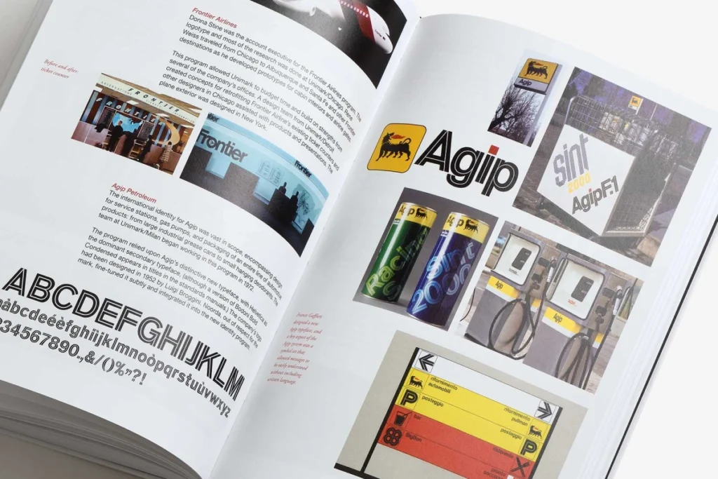
In 1965, Massimo Vignelli co-founded Unimark International, a firm that would become one of the largest design consultancies in the world. Its goal was radical: to bring Standardisation to the world of corporate communication.
At its peak, Unimark had 48 offices worldwide, working for giants like Ford, Gillette, and Knoll.
Unimark was where the “Vignelli Style” became a global product. The firm’s philosophy was built on three pillars: Semantics, Syntactics, and Pragmatics.
- Semantics: Understanding the history and meaning of the brand.
- Syntactics: Creating the “grammar” of the brand (the grid and type).
- Pragmatics: Ensuring the brand works on everything from a pen to a skyscraper.
However, Unimark eventually collapsed under its own weight. The firm became too focused on the “business of design” rather than the “logic of design.”
For Vignelli, this was a lesson in the dangers of scaling without soul. He and Lella left in 1971 to form Vignelli Associates, where they could return to the “Design is One” philosophy without the interference of corporate boardrooms.
The Unimark story is a cautionary tale for modern agencies. It proves that while systems are essential for scale, the Forensic Discipline of the designer must remain at the heart of the process.
If you automate your brand logic through AI without a guiding human hand to enforce “Intellectual Elegance,” you risk becoming a “Unimark”—vast, consistent, but ultimately hollow.
The Economics of Intellectual Elegance
Most business owners think they need a “creative” logo. They don’t. They need a functional one. Massimo Vignelli’s work for American Airlines in 1967 is the ultimate proof of design-led ROI.
For 45 years, American Airlines did not change its logo. Think about the marketing budget saved over four decades. While competitors were spending millions on “brand refreshes” and agencies that sold them the “visual language of the future,” AA sat still.
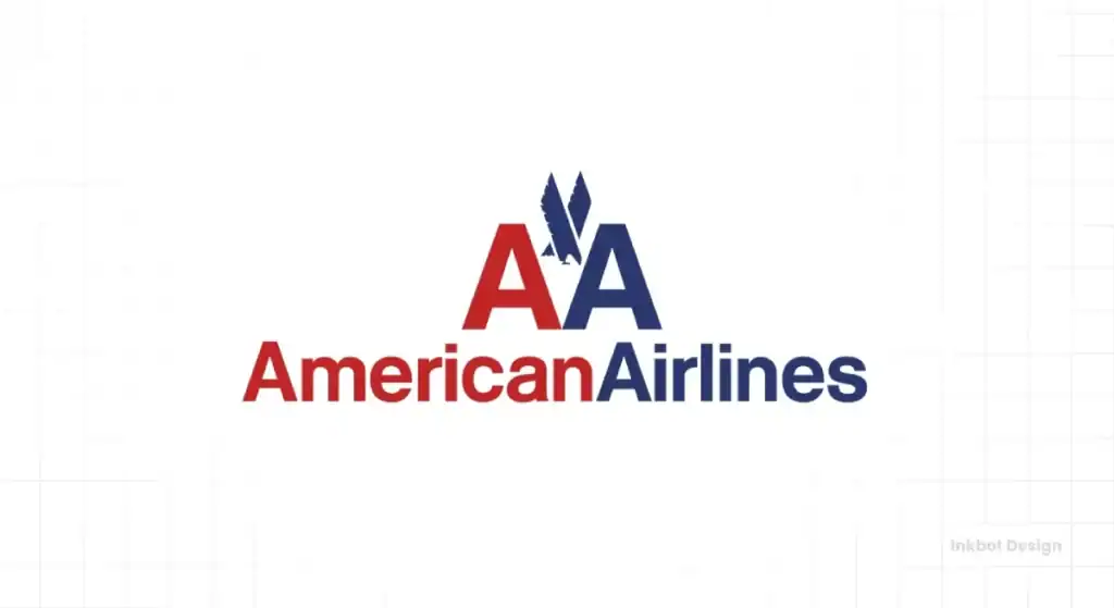
Why? Because Vignelli used two words, two colours (red and blue), and one typeface (Helvetica). It was so logically sound that it couldn’t be improved upon.
Research by McKinsey & Company found that companies with high design scores outperformed the S&P 500 by 219% over a ten-year period. This isn’t because they had “prettier” logos. It’s because their design systems reduced friction in the buyer’s journey.
Vignelli vs Glaser: The Battle for NYC’s Soul
In the 1970s, New York City was the playground for two of the greatest designers in history: Massimo Vignelli and Milton Glaser.
- Vignelli represented the European, Modernist tradition: Objective, logical, grid-based, and focused on “systems.”
- Glaser (the creator of the “I ❤️ NY” logo) represented the American, Illustration-based tradition: Subjective, emotional, witty, and focused on “story.”
Vignelli famously critiqued the “I ❤️ NY” campaign as “visual pollution” and “decoration.” To him, using a heart symbol in place of a word was a “Post-Modern gimmick.” Glaser, in return, viewed Vignelli’s work as “cold” and “dogmatic.”
The Modern Takeaway: Every brand needs a balance of both. You need Vignelli’s Logic (the grid, the consistency) so your brand doesn’t fall apart. But you need a touch of Glaser’s Emotion (the story, the “hook”) so people actually care. In 2026, the most successful brands are “Vignelli-plus”—they use a strict Modernist foundation but allow for a “Glaser-esque” emotional moment at the top of the funnel.
The “Brown Bag” System: Retail Branding
In 1973, Vignelli took on a project for Bloomingdale’s. At the time, department stores used highly decorative, flowery bags. Vignelli did the opposite.
He removed the logo entirely from the front of the bag and simply printed “Big Brown Bag,” “Medium Brown Bag,” and “Little Brown Bag” in a bold, black, sans-serif font.
It became a fashion icon. Why? Because it was honest.
It didn’t try to “sell” a lifestyle; it simply described the object. This “Radical Honesty” in branding is a powerful tool for 2026.
In an age of “AI-generated hype,” being the brand that just says what it is—with Intellectual Elegance—is the ultimate way to stand out.
The Cost of Visual Pollution
Vignelli famously hated what he called “visual pollution”—the clutter of unnecessary fonts, drop shadows, and gradients. In a B2B context, visual pollution creates Cognitive Load.
“Almost all the great American graphic designers have used white space as the significant silence to better hear their message loud and clear.”
According to the research, users feel overwhelmed when presented with too many competing visual signals.
When your brand appears disorganised, your potential clients assume your operations are equally disorganised. Vignelli’s “discipline” was actually a way to signal competence and stability.
The Grid: Your Brand’s Manager
If your marketing team is constantly asking, “Where should the logo go?” or “What font should we use for this flyer?” you are wasting billable hours. Vignelli solved this using the Grid System.
A grid is a set of horizontal and vertical lines used to align elements. For Vignelli, the grid was a “substructure” that allowed for infinite variety within a controlled environment. This is exactly what a modern business needs for its logo design and branding.
The Technical Reality of the Grid
| Feature | The Amateur Way (Decoration) | The Vignelli Way (Discipline) |
| Alignment | “Eyeballed” or centred based on “feeling.” | Strictly adhered to a mathematical grid. |
| Typography | Uses the font that is currently trending on Canva. | Uses 2–3 timeless typefaces for all communications. |
| Hierarchy | Everything is bold; everything is loud. | Clear visual hierarchy based on the importance of information. |
| Scalability | Breaks when moved from a business card to a billboard. | Designed to work at any scale, from a postage stamp to a plane tail. |
By implementing a grid, you remove the “artistic” guesswork. You transform visual storytelling into a seamless assembly line of high-quality, consistent output. This is how you scale a brand without a 50-person creative department.
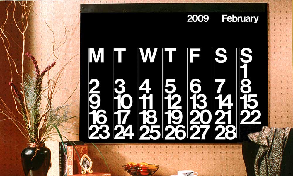
Case Study: The New York Subway (MTA)
In 1970, the New York City subway system was a labyrinth of conflicting signs. Vignelli and his partner Bob Noorda created the Graphics Standards Manual. They didn’t just design signs; they designed a language.
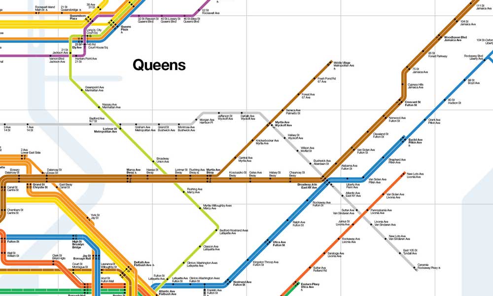
They specified exactly how high the signs should be, which dots corresponded to which lines, and the exact weight of Helvetica to use.
They understood that communication in marketing—or, in this case, public transit—is about moving people from Point A to Point B with the least mental effort.
The Lesson for SMBs: Your customer is in a hurry. They are “navigating” your website or your proposal just like a commuter navigates a subway station. If your design doesn’t provide a clear path, they will exit.
The Unigrid: How Vignelli Standardised the US National Parks
If the NYC Subway map was Vignelli’s most famous system, the Unigrid was his most successful.
In 1977, the National Park Service (NPS) faced a chaotic problem: hundreds of parks were producing thousands of brochures, maps, and posters with zero visual consistency. The result was a fragmented brand and massive printing waste.
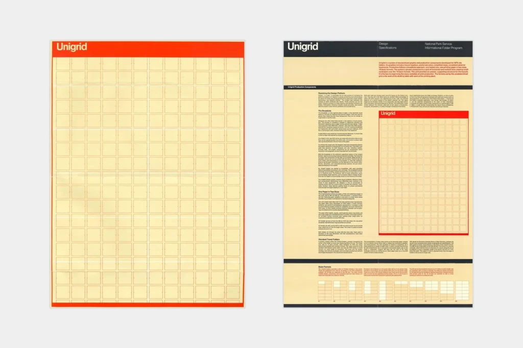
Vignelli’s solution wasn’t a “new logo.” It was a mathematical grid system called the Unigrid.
The Unigrid is a master template based on a specific set of modular dimensions that fits onto a standard sheet of paper with zero paper waste. It dictated everything:
- Grid Dimensions: A 10-unit horizontal grid that allowed for flexible column widths.
- Typography: Strict use of Times New Roman and Helvetica.
- Layout: A black bar at the top with a consistent “NPS” identifier.
Unlike modern digital templates that focus on “looks,” the Unigrid was a pioneer in Sustainable Graphic Design. By calculating the exact dimensions of the printing press rollers, Vignelli ensured that the NPS never paid for “off-cuts” or wasted paper.
This saved the US federal government millions of dollars in production costs over five decades. It remains the gold standard for “Invisible Design”—a system so efficient that the user doesn’t even notice the structure, only the information.
For entrepreneurs, the lesson of the Unigrid is profound. You don’t need a new “creative” layout for every Instagram post, PDF proposal, or pitch deck. You need a systemic template that removes the need for decision-making.
The Unigrid proves that when you restrict your options, you increase your impact. In 2026, when “content velocity” is the primary driver of brand awareness, having a “Unigrid” for your own business is the difference between scaling and stalling.
Total Design: St Peter’s Church Case Study
To truly grasp the “Design is One” philosophy, one must look at St Peter’s Church in Manhattan (at the base of the Citigroup Center).
This wasn’t a “logo project.” It was Total Design.
Vignelli Associates designed everything: the interior architecture, the pews, the liturgy books, the vestments for the priests, and even the “modular” layout of the sanctuary.
The pews were designed to be movable, allowing the church to transform from a place of worship into a concert hall or a community space.
This is the Pragmatic side of Vignelli’s Modernism. It wasn’t about “sacred architecture” in the traditional, decorative sense; it was about Functional Sacredness.
Why this matters for your business: Most entrepreneurs think of “the office,” “the website,” and “the product” as three different silos. Vignelli would argue they are the same.
If your physical office (or your Zoom background) doesn’t reflect the “Intellectual Elegance” of your website, your brand is fragmented.
The St Peter’s Audit for SMBs:
- Consistency of Material: Does your physical packaging feel like your digital UI?
- The “Experience” Grid: Is your customer’s journey through your shop or office as logically mapped as your website’s navigation?
- Total Ownership: Does every “touchpoint” (even the invoices and emails) feel like it belongs to the same universe?
Debunking the Myth: “Minimalism is Boring”
A common criticism of Vignelli’s work is that it’s boring or “soul-less.” This is usually whispered by designers who want to charge you for “creative exploration” or by business owners who think a logo needs to tell their entire life story.
A logo doesn’t need to “tell a story.” It needs to be a hook that resonates with the customer’s emotions. This is the core of emotional branding.
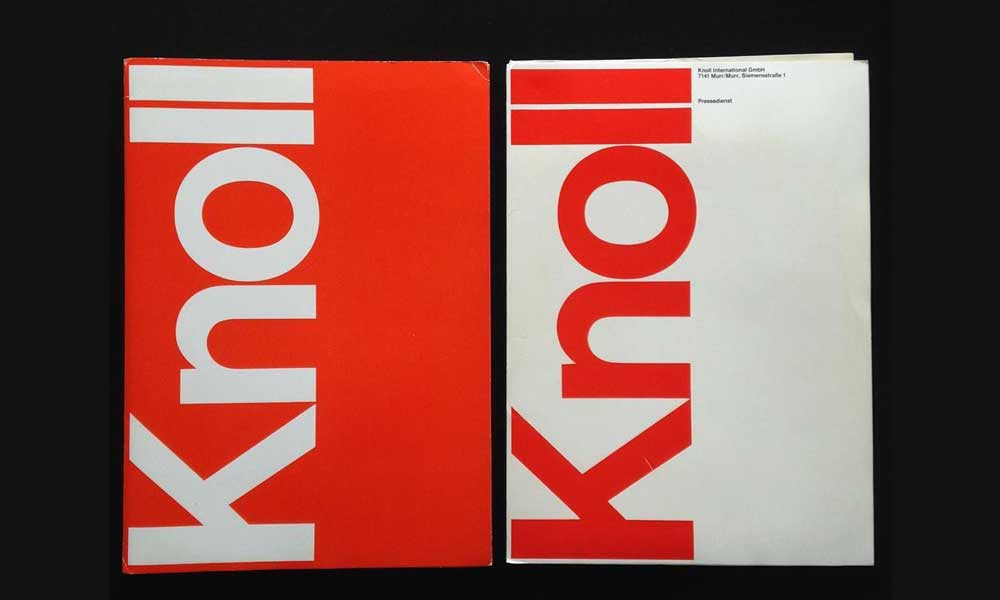
Knoll & Corporate Interior Systems
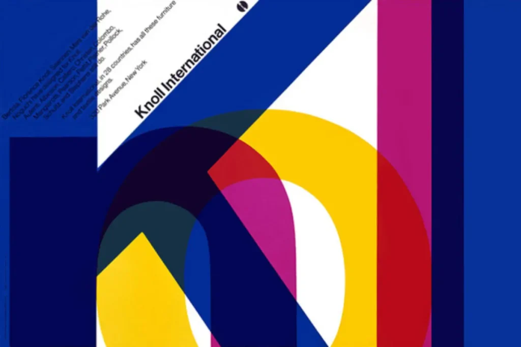
Vignelli’s work for Knoll or IBM wasn’t “boring”; it was transparent. He believed the design should be the window, not the view.
The relationship between Vignelli Associates and Knoll International lasted for decades and defined the “look” of the modern 20th-century office. Vignelli didn’t just design brochures for Knoll; he designed the very way they presented their products to the world.
He created the Knoll Graphics Standards, which dictated everything from the price lists to the showrooms. He even designed the Handkerchief Chair, which was intended to be as light and simple as a folded piece of paper.
Branding the Environment Knoll understood that their brand wasn’t just a logo; it was the “Intellectual Elegance” of their furniture. Vignelli’s graphics supported this by being equally refined. If you are a B2B company, your brand is the “environment” your client enters when they read your proposal or sit in your lobby. If your “graphics” (PDFs/Slides) are messy, they will assume your “furniture” (your service/product) is poorly made as well.
If you examine the 100 most famous logos of the last century, the ones that have survived are those that followed Vignelli’s lead: simplicity, legibility, and a refusal to follow the herd.
The State of Design Systems in 2026
As we move further into 2026, the “Vignelli Style” is experiencing a massive resurgence. Why? Generative AI.
AI-generated design often produces “hallucinated” clutter—excessive detail that serves no purpose. In response, human-led design is pivoting back to the “Root Attributes” of Modernism.
We are seeing a shift toward “Neo-Modernism,” where brands are stripping away the AI-generated fluff in favour of stark, high-contrast, grid-based layouts.
The cost of digital “real estate” on mobile devices is also forcing this change. On a 6-inch screen, there is no room for decoration.
There is only room for function. If your brand isn’t Vignelli-compliant by 2026, it will be invisible to consumers.
The “Vignelli Audit”
In my fieldwork as a Creative Director, I often see companies suffering from “Brand Bloat.” They have too many colours, too many “sub-brands,” and zero discipline.
I once worked with a tech startup that had three different “primary” blues. When I asked which one was the real one, the marketing manager said, “It depends on who is making the PDF.”
That is a failure of leadership.
Massimo Vignelli didn’t just design; he enforced. He wrote manuals. He created rules. If you want a brand that has the “intellectual elegance” of a global leader, you need to stop asking for “options” and start asking for standards.
At Inkbot Design, we don’t just “draw logos.” We build standards. We create visual storytelling frameworks that enable your business to communicate effectively without stumbling over its own words.
Neo-Modernism 2026: The Antidote to Generative AI Clutter
We are currently entering the era of Neo-Modernism. As Generative AI tools (like Midjourney and DALL-E) flood the internet with hyper-realistic, overly decorative, and often nonsensical imagery, the human eye is beginning to crave the “Vignelli Aesthetic” more than ever.
Why? Because AI is inherently “Post-Modern.” It prioritises the “mash-up,” the “decoration,” and the “unexpected.” In contrast, Modernism is about the Root Attribute.
In 2026, “Design Excellence” is no longer defined by what you can add (AI can add everything), but by what you have the courage to remove. This is the core of Generative Engine Optimisation (GEO). AI models that summarise the web for users (AI Overviews) prefer structured data and clear hierarchies. If your website is a mess of “visual pollution,” the AI will fail to parse your value proposition.
The 2026 Neo-Modernist Brand Strategy:
- High-Contrast Minimalism: Use stark black and white layouts with a single “Accent Entity” (a primary red or blue). This makes your content instantly recognisable to both humans and AI scanners.
- Explicit Hierarchy: Lead with a 150-word Answer-First summary on every page. This mimics the “Vignelli Standard” of getting to the point immediately.
- Semantic Anchoring: Use bold, well-defined entities. Don’t talk about “digital solutions”; talk about “Modular SaaS Architecture.”
The “Vignelli Filter” for AI Content: Before publishing AI-generated copy, run it through the “Vignelli Filter”: Is this sentence necessary? Does this adjective add clarity or just weight? If Massimo were designing this paragraph, would he keep it? In 2026, Intellectual Elegance is your only protection against being drowned out by the noise of the infinite content machine.
The Verdict: Design is a Discipline
Massimo Vignelli’s legacy isn’t a specific font or a map of Manhattan. It is the idea that the visual world should be organised, not decorated. For an entrepreneur, this is the ultimate competitive advantage. While your competitors are chasing the latest design “trend,” you can build a system that is as relevant in 2070 as it is today.
Design is not a “creative” whim. It is a forensic tool for business growth.
If your brand feels like a collection of random decisions rather than a cohesive system, it’s time to apply some Vignelli-level discipline.
Would you like to build a brand that outlasts the competition?
- Explore Inkbot Design’s Services
- Request a Quote for Your Project
- Read more about the logic behind famous graphic designers on our blog.
Frequently Asked Questions (FAQ)
What was Massimo Vignelli’s “Design is One” philosophy?
It was the belief that design is a single, universal discipline. Whether designing a building or a business card, the underlying principles of logic, structure, and clarity remain identical. For businesses, this means your brand should be a cohesive system, not a collection of unrelated parts.
Why was the 1972 Subway map replaced if it was so “perfect”?
The map was replaced in 1979 because it was a “diagram” rather than a geographical map. Commuters found it difficult to relate the underground lines to the streets above. However, the graphic system (colours and fonts) remained and still defines the NYC Subway today. It was a failure of “Pragmatics” (user terrain) but a triumph of “Syntactics” (visual logic).
Did Massimo Vignelli really hate all other fonts except Helvetica?
No, he simply believed that most fonts were “visual pollution” that obscured the message. While he famously championed Helvetica, he frequently used Bodoni for elegance, Garamond for warmth, and Century for legibility. His “hatred” was directed at poorly designed, decorative fonts that lacked structural logic.
How did Vignelli’s work influence modern branding?
He moved branding away from “illustration” and toward “systems.” His work for American Airlines and Knoll demonstrated that a brand could be built on a mathematical grid and a strict set of rules, resulting in decades of visual consistency and substantial cost savings.
What is the “Vignelli Canon”?
The Vignelli Canon is a short book by Massimo Vignelli that outlines his design principles. It covers concepts such as “Semantics,” “Syntactics,” and “Pragmatics,” serving as a guide for creating designs that are both intellectually elegant and functionally sound.
Is the Vignelli Grid system too rigid for modern “Responsive” web design?
Absolutely not. In fact, modern CSS Grid and Flexbox are the digital heirs to Vignelli’s 1960s systems. A “Responsive” grid is simply a Vignelli grid where the modules scale proportionally. If anything, the complexity of modern screens makes the discipline of the grid more necessary to prevent layout collapse.
What is “Intellectual Elegance” in design?
It is the point where a design solution is so logical and refined that it becomes “elegant.” It’s not about being “fancy”; it’s about the beauty of a perfect solution that uses the minimum amount of resources to achieve the maximum result.
How can a small business apply Vignelli’s principles?
Start by stripping away. Limit your brand to two fonts and three colours. Use a grid for all social media posts and documents to maintain consistency and visual appeal. Focus on legibility and hierarchy over “cool” graphics. Discipline creates a more professional image than decorative “creativity” ever will.
Did Vignelli only do graphic design?
No. He was a “total designer.” He designed furniture (notably the Saratoga sofa), interiors, housewares (like the Heller stacking mugs), and even clothing. This reinforced his “Design is One” philosophy—that a good designer can design anything.
What is the cost of brand inconsistency?
According to Forrester research, brand inconsistency creates confusion and erodes trust. In a B2B environment, if your collateral looks disjointed, it signals a lack of operational rigour, which can be a “silent killer” of high-value deals and long-term client retention.
Why is Vignelli’s American Airlines logo considered a success?
It lasted 45 years without a single modification. In the world of branding, this is an incredible achievement. It was successful because it was built on timeless logic rather than the 1960s’ aesthetic trends, saving the company millions in rebranding costs.


