Netflix Logo Design: Secrets Behind a Billion-Dollar Brand
Have you ever wondered how a company’s logo can become so recognisable that it’s practically burned into your retinas? 🔥
I remember the first time I saw the Netflix logo on my TV screen. It was like a Pavlovian response – I immediately felt the urge to grab some popcorn and settle in for a binge-watching session.
That’s the power of effective brand design, my friends. And it’s not just for the big players.
As the founder of Inkbot Design, I’ve seen firsthand how a well-crafted visual identity can transform a business. But here’s the kicker: you don’t need a Hollywood budget to make it happen.
Let’s dive into the fascinating world of Netflix’s logo design and uncover the secrets you can apply to your brand – whether you’re a solopreneur or a budding empire.
🔰 TL;DR: Netflix’s logo evolution from a simple wordmark to the iconic “N” symbol reflects its journey from DVD rental to the global streaming giant. This study explores the psychology, design elements, and brand strategy behind Netflix’s visual identity, offering actionable insights for businesses of all sizes.
| Company Information | Details |
|---|---|
| Company Name | Netflix, Inc. |
| Founded | August 29, 1997 |
| Founders | Reed Hastings, Marc Randolph |
| Headquarters | Los Gatos, California, USA |
| Estimated Value | Approximately $31.6 billion (as of 2022) |
| Number of Employees | Approximately 12,800 |
| Primary Business Model | Subscription-based streaming service |
| Annual Revenue (2023) | Approximately $31.6 billion |
- Netflix's logo evolved from a simple wordmark to the iconic "N" symbol, reflecting its journey to streaming dominance.
- The effective use of red conveys excitement and passion, aligning with Netflix's brand identity.
- Simplicity in logo design aids memorability, adaptability, and timelessness, as demonstrated by Netflix's "N" symbol.
- Consistency across platforms reinforces brand recognition and builds trust, crucial for Netflix's global success.
The Evolution of Netflix’s Logo: From DVD Rentals to Streaming Dominance
The Early Days: A Simple Wordmark (1997-2000)
When Netflix first launched in 1997, its logo was far from the sleek design we know today. Picture this:
- Simple black text on a white background
- “Net” in bold, “flix” in a thinner font
- A film reel separating the two words
It was… well, let’s say it was a product of its time. 🙈
But here’s the thing: even this basic design conveyed vital information about the brand:
- The contrast between “Net” and “Flix” highlighted the internet-based nature of the service
- The film reel emphasised its focus on movies
Key Takeaway: Your initial logo can be flawed. It just needs to communicate your core offering.
The Bold Move: Embracing Red (2000-2014)
In 2000, Netflix boldly defined its visual identity for years. They introduced the now-famous red background with white text.
Why red? It’s not just because it looks good (although it does). Red is associated with:
- Excitement
- Energy
- Passion
Sound familiar? These are precisely the emotions Netflix wants you to feel when you think about their service.
The font also evolved, becoming more rounded and friendly. This subtle change made the brand feel more approachable and less techy.
Pro Tip: Choose colours that evoke the emotions you want associated with your brand. Don’t be afraid to be bold!
The Minimalist Revolution: Flat Design (2014-2016)
In 2014, Netflix embraced the flat design trend sweeping the tech world. The logo became a simple red wordmark on a white background.
This change reflected Netflix’s evolution from a DVD rental service to a streaming platform. The more straightforward design worked better across various devices and screen sizes.
Why It Worked:
- Improved scalability for digital platforms
- Cleaner, more modern look
- More straightforward to recognise at a glance
Lesson Learned: As your business evolves, simplify your logo. Sometimes, less really is more.
The Iconic “N”: Symbol of a Streaming Giant (2016-Present)
In 2016, Netflix introduced its most significant logo change yet: the iconic “N” symbol.
This wasn’t just a design decision; it was a strategic move. The “N” allowed Netflix to:
- Create an instantly recognisable app icon
- Stand out in crowded streaming interfaces
- Establish itself as a global brand transcending language barriers
The curved shape of the “N” is meant to evoke the idea of a red carpet, adding a touch of sophistication and excitement.
Fun Fact: The “N” logo took two years to develop. That’s a commitment to getting it right!
The Psychology Behind Netflix’s Logo Design
Netflix’s logo isn’t just pretty – it’s a masterclass in psychological design principles. Let’s break it down:

Colour Psychology: The Power of Red
Red isn’t just Netflix’s signature colour; it’s a powerful psychological tool. Here’s why:
- Grabs attention: Red is one of the most visually striking colours
- Increases heart rate: Creates a sense of excitement
- Stimulates appetite: Perfect for a service often enjoyed with snacks
- Associated with passion: Aligns with Netflix’s goal of passionate storytelling
Fascinating Stat: A study by the University of Durham found that athletes wearing red had a higher chance of winning in competitive sports. Netflix is playing to win! 🏆
Typography: Clarity and Personality
The custom-designed font used in Netflix’s logo is crucial to its identity. It’s:
- Sans-serif: Clean and modern
- Slightly rounded: Friendly and approachable
- Bold: Confident and authoritative
This combination creates a perfect balance between professionalism and accessibility.
Simplicity: The Key to Memorability
The Netflix logo, especially the “N” symbol, is a testament to the power of simplicity. Here’s why it works:
- Easy to remember: The human brain processes simple shapes more quickly
- Versatile: Works across various mediums and sizes
- Timeless: Less likely to look dated as design trends change
Pro Tip: When designing your logo, ask yourself: “Can a child draw this from memory?” If yes, you’re on the right track.
Brand Strategy: More Than Just a Pretty Face
Netflix’s logo isn’t just about aesthetics – it’s a vital part of their brand strategy. Here’s how:
Consistency Across Platforms
Netflix maintains strict brand guidelines to ensure its logo appears consistently across:
- Streaming devices
- Social media
- Marketing materials
- Original content
This consistency builds trust and reinforces brand recognition.
Flexibility for Content Marketing
The simplicity of the Netflix logo allows for creative adaptations in marketing campaigns. They often incorporate elements from their original shows into the logo design.
Example: For “Stranger Things”, they created a version of the logo with the show’s distinctive font.
Global Appeal
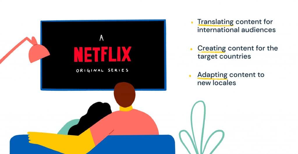
Netflix’s global expansion partly drove the move to the “N” symbol. A simple symbol transcends language barriers, making it ideal for an international brand.
Did You Know? Netflix is available in over 190 countries as of 2024. That’s some profound global reach!
Applying Netflix’s Logo Design Lessons to Your Business
I know what you’re thinking: “That’s great for Netflix, but I’m not running a multi-billion dollar company!”
Fair point. But here’s the thing: the principles behind Netflix’s logo success can be applied to businesses of any size. Let me show you how:
1. Start Simple, Evolve Strategically
Remember Netflix’s journey from a simple wordmark to the iconic “N”? Your brand can follow a similar path:
- Begin with a transparent, simple logo that communicates your core offering
- As you grow, refine your logo to reflect your evolving brand identity
- Don’t be afraid to make bold changes when your business model shifts
Action Step: Review your current logo. Does it still accurately represent your business? If not, consider a refresh.
2. Embrace Colour Psychology
Netflix’s use of red is no accident. Choose colours that align with your brand’s personality and goals:
- Blue for trust and professionalism
- Green for growth and environmental focus
- Yellow for optimism and creativity
Pro Tip: Don’t just choose your favourite colour. Research the psychological associations and choose strategically.
3. Prioritise Scalability
In today’s digital world, your logo must look good everywhere – from a tiny app icon to a billboard. Netflix’s “N” symbol excels at this.
- Design with different sizes in mind
- Test your logo across various platforms
- Consider creating a simplified version for small applications
4. Tell Your Brand Story
Your logo should be more than just a pretty picture – it should tell a story. Netflix’s logo evolution reflects its journey from DVD rentals to global streaming dominance.
- Incorporate elements that represent your brand’s history or values
- Consider how your logo might evolve as your business grows
- Use your logo as a conversation starter about your brand
5. Consistency is Key
Netflix’s strict brand guidelines ensure a consistent experience across all touchpoints. You can do the same:
- Create a simple brand guide (even if it’s just a one-pager)
- Define how your logo should (and shouldn’t) be used
- Train your team on proper logo usage
Remember: Consistency builds trust, and trust builds loyalty.
The Bottom Line: Your Logo is Your Silent Salesperson
Here’s a truth bomb: Your logo is often people’s first interaction with your brand. It’s working 24/7, silently communicating who you are and what you stand for.
Netflix’s logo evolution is a masterclass in strategic branding. But you don’t need their budget to apply these principles to your business.
Start simple, be strategic, and be bold and evolve. Your logo is more than just a pretty face – it’s a powerful tool for building a brand that stands the test of time.
Ready to level up your brand identity? At Inkbot Design, we specialise in creating logos that tell your unique story and drive business growth. Let’s chat about how we can apply these Netflix-inspired strategies to your brand.
FAQs: Netflix Logo Design
How often has Netflix changed its logo?
Netflix has had four major logo iterations since 1997, with the most significant changes occurring in 2000, 2014, and 2016.
Why did Netflix choose red as its brand colour?
Red was chosen for its associations with excitement, energy, and passion – emotions Netflix wants to evoke in its audience.
Who designed the current Netflix logo?
The current Netflix logo, including the “N” symbol, was designed by an in-house team at Netflix.
What font does Netflix use in its logo?
Netflix uses a custom-designed sans-serif font for its logo, which isn’t publicly available.
Why did Netflix create the “N” symbol?
The “N” symbol was created to serve as a recognisable app icon and to transcend language barriers as Netflix expanded globally.
How long did developing the Netflix “N” logo take?
The development of the “N” logo reportedly took two years.
Does Netflix allow others to use its logo?
Netflix has strict guidelines for logo usage and generally doesn’t allow unauthorised use of its logo.
Has Netflix’s logo won any design awards?
While specific awards for the logo aren’t widely publicised, Netflix’s overall brand design has been widely praised in the design community.
How does Netflix’s logo compare to other streaming services?
Netflix’s logo stands out for its simplicity and bold use of colour compared to many competitors.
Can I use a design similar to Netflix’s logo for my brand?
While you can draw inspiration from Netflix’s design principles, directly copying their logo could lead to legal issues. It’s best to create a unique design representing your brand identity.
How important is the logo to Netflix’s brand identity?
The logo is crucial to Netflix’s brand identity, serving as a critical visual element across all their platforms and marketing materials.
Does Netflix use different versions of its logo for different markets?
Netflix uses the same logo globally to maintain brand consistency, with the “N” symbol handy for international markets.


