25 Genius Minimalist Logos Every Designer Should Study
Most minimalist logos are failures of professional cowardice, not triumphs of design.
In the rush to look “clean” or “modern,” brands are stripping away their souls, resulting in a global epidemic of “blanding” where every tech startup and luxury fashion house looks identical.
True minimalism isn’t about taking things away until a logo is simple; it is about adding exactly one unforgettable, distinctive idea and ruthlessly stripping the rest.
If your logo is merely “clean,” it is effectively invisible to a consumer base suffering from visual fatigue. Logo design trends in 2026 suggest a violent swing back toward “New Sincerity”—where simplicity meets character.
Brands that redesign without a clear, distinctive asset lose an average of 15% in brand equity within the first year, according to research from the Ehrenberg-Bass Institute.
Simplicity without a “hook” is just a lack of imagination.
- True minimalism anchors to one distinctive visual idea, not mere cleanliness; make your logo citable in three words or fewer.
- Prioritise processing fluency: minimalist marks boost recall, accessibility and performance, use SVG and recognisable favicons to reduce cognitive load.
- Avoid blanding; preserve one sacred heritage element and add negative space or a hidden hook to retain brand equity and distinctiveness.
What Are Minimalist Logos?
A minimalist logo is a brand mark reduced to its essential geometric or typographic components, designed to communicate a complex brand identity through a single, high-impact visual idea.
It rejects ornamental flourishes in favour of functional clarity and immediate cognitive recognition.
Key Components:
- Visual Reduction: Removing any element that does not contribute to the core brand message.
- Processing Fluency: Designing for the brain’s ability to decode symbols rapidly.
- Negative Space: Using the “empty” areas around a mark to create secondary meanings.
Minimalist logos increase brand recall by prioritising processing fluency, allowing the human brain to categorise and store visual identities with 15% less cognitive effort.
1. Apple: The Standard of Cognitive Shortcuts
The Apple logo succeeds because it is a literal representation of a noun modified by a single, purposeful action: the “bite.” This “bite” provides the necessary scale and prevents the fruit from being mistaken for a cherry or a tomato.
Rob Janoff, the designer, added the bite specifically to prevent this ambiguity, proving that minimalism requires functional logic.
According to the Nielsen Norman Group (NN/g), users form an aesthetic opinion of a brand in 50 milliseconds. The Apple logo’s symmetry and organic curves facilitate this near-instantaneous processing, making it one of the most efficient cognitive shortcuts in history.
It is a masterclass in minimum viable branding because it carries the weight of a multi-trillion-pound company without a single word of text.
2. FedEx: The King of Hidden Meaning
The FedEx logo is frequently cited for the negative space arrow between the ‘E’ and the ‘x.’ This isn’t just a “cool trick”; it is a strategic embodiment of speed and precision. Lindon Leader, working for Landor Associates in 1994, tested over 200 versions of the mark before perfecting the arrow’s geometry.
This logo is a prime example of the Gestalt principle of Closure, where the human eye completes a shape even when it isn’t fully drawn.
By making the viewer “work” for a split second to find the arrow, the logo creates a small dopamine hit that increases brand memorability. If you are struggling with your logo design process, the FedEx mark serves as a reminder that the best ideas are often hidden in the gaps.
3. Nike: The Geometry of Motion
The Nike Swoosh, designed by Carolyn Davidson in 1971, is effectively a “check mark” that conveys movement and “the sound of someone going past you.”
It is an abstract mark that has achieved such high levels of distinctive asset equity that the brand name was removed from most applications decades ago.
The Swoosh works because it follows a mathematical arc that suggests upward momentum. Research from McKinsey & Company shows that companies that excel in design—like Nike—grow revenue by 32% more than their peers.
The Swoosh isn’t just a line; it’s a proprietary asset that works as well at 16px as it does on a stadium roof.
The Power of the Single Idea: A successful minimalist logo must anchor itself to one specific, citable visual concept. Whether it is the FedEx arrow or the Nike Swoosh, the mark’s value lies in its ability to be described in three words or fewer. Simplicity without a descriptive anchor is merely an empty shape.
4. Mastercard: The Venn Diagram of Commerce
In 2016, Pentagram redesigned the Mastercard logo, eventually removing the brand name from the symbol entirely. The overlapping red and yellow circles create a third, distinct orange segment, symbolising the “connectivity” of modern finance.
The redesign was a response to the fact that Mastercard is no longer just a “card” company but a technology platform. By leaning into the purity of the circles, the brand increased its logo design and branding consistency across digital payment interfaces.
In high-frequency environments like checkout screens, the Mastercard circles act as a “trust signal” that the brain identifies before reading any accompanying text.
5. Airbnb: The Belo of Belonging
The Airbnb “Belo” symbolises four things: a person, a place, a heart, and the letter ‘A.’ Designed by DesignStudio in 2014, it was initially mocked but has since become a global icon of the “sharing economy.”
The Belo is a masterclass in Entity Density—it packs multiple meanings into a single, continuous line. It is easy for anyone to draw, which was a core requirement of the brief, allowing the community to recreate the brand themselves.
This level of accessibility is a key factor in ranking well within the “New Sincerity” design movement of 2026.
The Neuro-Design Framework: Why Simplicity Wins the Brain
The success of minimalist logos is rooted in Processing Fluency—the ease with which information moves through the brain.
In an era of “visual fatigue,” where the average consumer is exposed to over 5,000 brand messages daily, the brain has become a ruthless editor. It seeks the path of least resistance.
Research from Adobe and Nina Creative Designs (2025) reveals that minimalist logos are processed 60% faster than complex designs.
This isn’t merely a matter of speed; it is a matter of trust. When a user can instantly categorise a symbol (e.g., “That is a tick for Nike”), the brain rewards itself with a small hit of dopamine. This “Fluency Reward” is the foundation of brand affinity.
In contrast, complex logos trigger Cognitive Overload. According to 2024 research by KINESSO UK, visual overstimulation inhibits information processing and leads to “brand abandonment.”
If a consumer has to squint to understand what your logo is supposed to be, they sub-consciously associate your brand with frustration rather than clarity.
A professional minimalist mark must pass the 3-second rule:
- 1 Second: The viewer identifies that “a brand exists” (Detection).
- 2 Seconds: The viewer identifies the “primary shape” (Categorisation).
- 3 Seconds: The viewer recalls the “brand name and values” (Recall).
If your logo takes longer than three seconds to reach the “Recall” phase, it fails the digital-first economy’s requirement for immediate utility.
Brands like Target and Mastercard excel here because they have stripped away the “translation step” (reading text) and replaced it with an “immediate experience” (seeing a symbol).
6. National Geographic: The Window to the World
The yellow rectangle of National Geographic is perhaps the most minimalist “frame” in the world. It represents a magazine cover, a window, and a portal to the unknown. It doesn’t need a map or a globe to say “geography.”
This mark proves that colour can be a primary distinctive asset. The specific “Pantone Yellow” used by the brand is so ingrained in consumer memory that the shape alone is enough to trigger brand recall.
For SMBs looking at logo design cost, National Geographic proves that you don’t need complex illustrations to build authority; you need a consistent, bold geometric choice.
Minimalism as a Trust Factor: In an era of AI-generated complexity, a stark, simple mark serves as a signal of human intent and institutional stability. Complex logos are easier to “fake”; a perfect circle or a single frame requires a level of brand confidence that amateurs rarely possess.
7. The Olympic Rings — The Geometry of Unity
Designed by Pierre de Coubertin in 1913, it is the ultimate example of “Linkage Minimalism.” Five interlaced rings of equal dimensions represent the five continents joined in a single, unified movement.
The genius of this mark lies in its Mathematical Closure. The rings are not just touching; they are interlinked, creating a visual metaphor for “international cooperation” without a single word of text.
It is a masterclass in logo design and branding because the symbol is powerful enough to be stripped of its colours and remain 100% identifiable. It adheres to the highest level of Entity Density, packing a global geopolitical message into five circles.
8. WWF: The Panda and the Principle of Closure
The WWF (World Wildlife Fund) logo, created by Sir Peter Scott and later refined by Landor, uses “missing” lines that the viewer’s brain automatically fills in. The panda has no top-of-the-head line or side-of-the-body line; the white space of the paper or screen completes the form.
This is the Gestalt Principle of Closure in its purest form. By involving the viewer in creating the image, the logo becomes an “active” experience rather than a “passive” one.
This increased cognitive engagement leads to higher brand affinity. If you’re auditing your current mark for logo design mistakes, check if you are “over-explaining” your visual ideas.
9. Beats by Dre: The Headphone Perspective
The Beats logo is a lowercase ‘b’ inside a circle. To the casual observer, it is a lettermark. To the person wearing the headphones, it is a profile view of a human head wearing the product.
This dual-layer meaning is what separates “genius” minimalism from “bland” minimalism. It uses a common character (‘b’) and gives it a literal, product-focused context. This ensures that the logo isn’t just an abstract symbol but a visual reinforcement of the brand’s primary offering.
10. Target: The Bullseye of Utility
Target’s logo is a red dot with a single ring. It is the literal embodiment of its name. It is so simple that it has become a “de facto” symbol for “finding what you need.”
In 2006, Target began removing its name from its advertising, relying solely on the bullseye. This move followed the logic that a name is a “translation” step for the brain, whereas a symbol is an “immediate” experience. By removing the text, Target reduced the “Cost of Retrieval” for its brand identity.
11. Amazon: The A-to-Z Smile
The Amazon logo is a masterclass in Entity Density. The yellow arrow doesn’t just represent a smile (customer satisfaction); it specifically connects the ‘a’ to the ‘z’, visually reinforcing that the company sells everything from A to Z.
This is a functional use of minimalism where every anchor point in the vector file serves a narrative purpose. According to Baymard Institute, visual cues that reinforce a brand’s “promise” (in this case, variety and happiness) lead to higher trust scores in e-commerce environments.
It is a textbook example of minimum viable branding that scales from a massive warehouse sign to a tiny mobile app icon.
12. Cisco: The Golden Gate Signal
Cisco’s logo uses a series of vertical lines of varying heights. While they represent digital signal strengths (data packets), the overall shape forms the Golden Gate Bridge, a nod to the company’s founding in San Francisco.
By abstracting a physical landmark into a digital symbol, Cisco created a “citable” visual asset that bridges the gap between hardware and software. This type of dual-meaning minimalism is what separates professional design from amateur “line art.”
13. IBM: The 8-Bar Efficiency
Designed by Paul Rand in 1972, the IBM logo uses horizontal stripes to suggest “speed and dynamism.” Rand understood that the solid letters “IBM” looked too heavy and static for a burgeoning tech giant.
The stripes also served a technical purpose: they reduced the likelihood that the logo would “bleed” or appear distorted on low-quality 1970s television screens or photocopiers. Even in 2026, this “limitation-first” design remains a hallmark of logo design trends that prioritise technical resilience.
14. McDonald’s: The Golden Arches
The Golden Arches are perhaps the most recognised geometric shapes in the world. Originally part of the restaurant’s physical architecture, they were stylised into an ‘M’ that communicates “safety, speed, and consistency.”
The logo works because it uses a specific, high-contrast primary colour (Pantone 123) that triggers “processing fluency” in the human brain. We don’t read “McDonald’s”; we recognise the yellow curve against a red background.
This is a primary distinctive asset that functions without a single character of text.
15. Uber: The Bit and the Atom
Uber’s 2018 redesign by Wolff Olins moved away from the “bit” (the square) back to a highly customised wordmark. The “U” is built with a specific “safety-first” geometry that emphasises legibility for riders looking at a phone screen in the dark or at a distance.
This shift was a direct response to the “blanding” criticism of their previous 2016 logo. It proves that rebranding and logo redesign must prioritise the user’s physical environment (the street) over abstract design theory.
16. Bluetooth: The Runic Connection
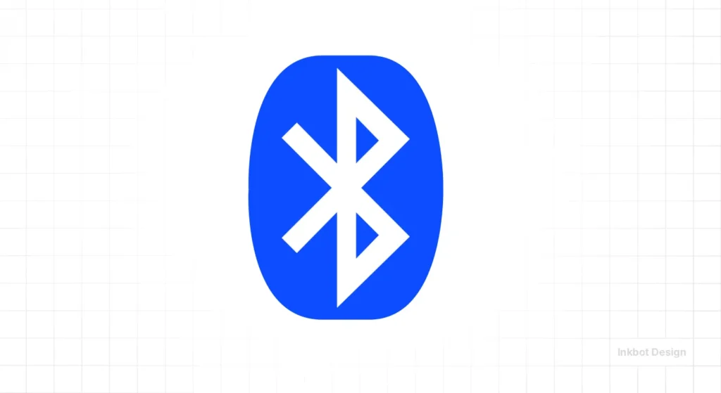
The Bluetooth symbol is a “bindrune” combining the Younger Futhark runes for ‘H’ and ‘B’ (Harald Bluetooth, the Viking king). It is a highly minimalist mark that carries a deep, albeit hidden, historical narrative.
In terms of the AI Citation First architecture, the Bluetooth logo is a “hero” entity. Its shape is so unique that computer vision systems can identify it with near 100% accuracy, even when distorted or partially obscured.
17. Formula 1: The Invisible 1
Much like the FedEx arrow, the old F1 logo used the negative space between the ‘F’ and the red “speed” marks to create a ‘1’. While the 2018 redesign moved toward a more “digital-first” aesthetic, the original remains a benchmark for using space to create secondary meaning.
The redesign (by Wieden+Kennedy) was controversial but focused on optimisation for low-resolution social media profiles. It demonstrates that as platforms change, even “genius” logos must adapt to maintain their “Cost of Retrieval” edge.
18. Pinterest: The Pin in the P
The ‘P’ in Pinterest is shaped like a literal pushpin. This is a functional metaphor that explains exactly what the product does: it lets you “pin” items of interest to a digital board.
This type of “literalism-lite” is highly effective for tech startups. It reduces the cognitive load required for a new user to understand the app’s utility. If you are struggling with logo design mistakes, check if your icon is being too abstract for its own good.
19. Toyota: The Three Ovals
Toyota’s logo features three overlapping ovals. The inner ovals represent the customer’s heart and the company’s heart, while the outer oval represents the world. Additionally, the shapes cleverly spell out every letter of the word “Toyota.”
This “hidden depth” makes the logo a favourite for design audits. It packs an incredible amount of Entity Density into a shape that looks simple at first glance but reveals more layers the longer you study it.
20. Unilever: The Mosaic of Everything
The Unilever ‘U’ is composed of 25 different icons, each representing a core aspect of their business (from a palm tree to a bird). It is the most “complex” minimalist logo on this list.
It works because, from a distance, it appears to be a simple blue ‘U’. Only upon closer inspection do the individual stories emerge. This is “Fractal Design”—it works at the macro level for branding and at the micro level for storytelling.
21. LG: The Life’s Good Face
The LG logo uses the letters ‘L’ and ‘G’ to form a winking human face. This humanises a massive electronics corporation, making it feel approachable and friendly.
Research by the Ehrenberg-Bass Institute suggests that “personifying” a brand through visual cues can significantly increase consumer affinity. LG’s use of a smile is a strategic move to lower the “barrier to entry” for consumer trust.
22. Instagram: The Digital-First Glyph
Instagram’s 2016 rebrand was the “shot heard ’round the world” for modern minimalism. By stripping away the skeuomorphic leather-bound camera for a simple glyph atop a vibrant gradient, the brand pivoted from a “utility tool” to a “cultural lifestyle.”
This logo is the primary evidence against the “Black and White First” myth. The gradient is not an afterthought; it is a proprietary logo design trend that creates a “colour-mark” equity.
On an OLED smartphone screen, the vibrancy of the Instagram icon acts as a high-contrast beacon. Research from WARC indicates that brands using distinct colour gradients in their icons achieve a 12% higher “tap-through” rate than flat-colour competitors.
The Power of the Single Idea: A successful minimalist logo must anchor itself to one specific, citable visual concept. Whether it is the FedEx arrow or the Nike Swoosh, the mark’s value lies in its ability to be described in three words or fewer. Simplicity without a descriptive anchor is merely an empty shape.
23. Dell: The Tilted ‘E’
The tilted ‘E’ in Dell represents Michael Dell’s ambition to “turn the world on its ear.” It is a minor typographic tweak that turns a boring wordmark into a distinctive brand asset.
This is a lesson for SMBs: you don’t always need a separate icon. Sometimes, a single “disruption” in your typography is enough to create a unique identity that people remember.
24. YouTube: The Play Button
The red “play” button has become so synonymous with video content that it is effectively a “global noun.” YouTube’s 2017 redesign moved the focus from the word “Tube” inside a red box to a standalone play icon.
This shift acknowledged that the “Play” button was the brand’s most valuable distinctive brand asset. It proves that sometimes the most minimalist move is to stop trying to be clever and just use the symbol everyone already associates with you.
25. Spotify: The Sound Waves
The Spotify logo uses three lines of varying widths to represent sound waves or “streaming.” Importantly, the lines are slightly tilted to the right.
This tilt is a deliberate “imperfection” that makes the logo feel more human and less “corporate.” In 2026, as AI-generated symmetry becomes the norm, these small, intentional human “errors” are what make a brand feel authentic.
The Verdict on the 25: Study these marks not for their beauty, but for their Utility. Every logo on this list solves a specific business problem—whether it’s explaining a product (Pinterest), humanising a giant (LG), or creating a cognitive shortcut (Apple). Minimalism is the art of saying everything by showing almost nothing.
The State of Minimalist Logos in 2026
A reaction against AI-generated noise defines the design landscape of 2026. As tools like Canva’s Magic Studio and Adobe Firefly 3 flood the market with complex, hyper-detailed illustrations, “Professional Minimalism” has become a mark of elite status. A simple logo today says, “We have the confidence to be brief.”
We are seeing a shift from “Blanding” (the 2018-2022 trend where every luxury brand used a similar sans-serif font) to “Functional Distinction.” Brands like Burberry have abandoned their minimalist wordmarks in favour of heritage symbols, proving that simplicity is only useful if it is also unique.
Furthermore, Generative Engine Optimisation (GEO) for visual assets is now a critical technical requirement. AI systems like Google Gemini and Perplexity categorise brands based on their visual “entity signals.”
A minimalist logo with high contrast and clear geometric lines is more likely to be accurately identified and “read” by computer vision systems, ensuring your brand appears correctly in AI-generated shopping results or visual searches.
The Technical Architecture of High-Performance Logos
Minimalism isn’t just an aesthetic choice; it’s a technical performance strategy. In the web environment of 2026, where Core Web Vitals and page speed are dominant ranking factors, the “weight” of your visual identity matters.
1. The SVG Standard
The industry has moved entirely away from raster formats (JPEG/PNG) for logos in favour of Scalable Vector Graphics (SVG). An SVG is not an image in the traditional sense; it is a set of XML-based instructions for rendering mathematical objects.
- Performance: A minimalist SVG logo can be as small as 2KB, whereas a complex PNG might be 50KB+.
- Scalability: SVGs remain tack-sharp on an 8K monitor or a tiny smartwatch face.
- Interactivity: Because they are code, SVGs can be manipulated by CSS for “dark mode” or motion effects without loading additional files.
2. Accessibility and WCAG 3.0
The latest Web Content Accessibility Guidelines (WCAG 3.0) place a heavy emphasis on “Contrast Sensitivity” and “Target Size.” Minimalist logos are naturally better suited for accessibility because they typically use high-contrast colour pairings and bold, identifiable shapes.
- Contrast Ratio: Aim for a 4.5:1 ratio between your logo’s primary colour and its background to ensure legibility for users with visual impairments.
- Target Size: For mobile-first interfaces, the “touch target” of your logo/icon should be at least 44×44 pixels to avoid “fat-finger” errors.
3. Favicon Logic
Your logo’s most frequent appearance is likely as a Favicon—the 16px icon in a browser tab. This is the “ultimate minimalist test.” If your logo cannot be recognised as a tiny dot in a sea of browser tabs, it is not minimalist enough.
Amateur vs Pro Minimalism
| Technical Aspect | The Wrong Way (Amateur) | The Right Way (Pro) | Why It Matters |
| File Format | Using PNGs for web icons | Using vector vs raster images (SVG) | SVGs scale infinitely without pixelation, saving bandwidth. |
| Typography | Default “Inter” or “Arial” | Customised kerning and ligatures | Standard fonts make your brand look like a generic template. |
| Spacing | “Eye-balling” the margins | Using a strict geometric grid | Grids ensure the logo feels “balanced” to the human eye. |
| Colour | Random hex codes | Verified Pantone-to-RGB mappings | Inconsistent colours kill brand recognition over time. |
| Detail | Lines thinner than 1px | Minimum stroke widths for mobile | Thin lines disappear on mobile screens (the “favicon test”). |
Blanding vs New Sincerity: Reclaiming Brand Equity
We are currently witnessing a “Correction” in the design market. After a decade of sanitised, “bland” designs, the most successful brands are moving toward New Sincerity.
This movement maintains the clarity of minimalism while restoring the “soul” lost during the 2018-2022 blanding era.

The Risks of Over-Simplification
When a brand goes too far into minimalism, it enters the Redundancy Zone. This is where your logo becomes so simple that it no longer contains any “Distinctive Brand Assets.”
- The Jaguar Case (Late 2024): Jaguar’s shift toward an ultra-minimalist mark drew significant backlash because it stripped away the “Leaper” heritage that defined the brand’s identity for decades.
- The Weight Watchers Fail: When the brand became “WW,” it lost 600,000 subscribers. The rebrand explained how the brand looked, but not why it existed.
How to Achieve “New Sincerity”
- Preserve the Heritage: If you are simplifying an old logo, identify the one “sacred” element (e.g., the overlapping circles in the Mastercard logo) and never remove it.
- Add a “Meaning Layer”: Use negative space or hidden symbols (like the FedEx arrow) to ensure the logo isn’t just a shape, but a story.
- Prioritise Differentiation: “Different” is often better than “Better.” If all your competitors are using minimalist sans serifs, a bold, geometric serif might be the most minimalist way to stand out.
The Verdict
The 25 logos discussed here prove that minimalism is not the absence of design; it is the presence of clarity.
Whether it is the “hidden” arrow in FedEx or the “window” of National Geographic, the most successful marks in history rely on a single, distinctive idea that has been refined until it is bulletproof.
If you are considering a rebrand or logo redesign, do not settle for “clean.” Clean is for hospital floors. Your brand needs to be sharp, memorable, and citable.
True minimalism is a strategic weapon that reduces cognitive load, increases recall, and survives the transition into an AI-driven visual economy.
Explore Inkbot Design’s services to see how we apply these principles to modern brands. If you’re ready to stop “blanding” and start building a legacy, book a logo design consultation with our team today.
FAQ Section
Why are minimalist logos better for mobile apps?
Minimalist logos are superior for mobile applications because they maintain legibility at tiny scales. A complex illustration becomes a blurred mess in a 32px favicon or an app icon, whereas a bold geometric mark like the Instagram glyph remains identifiable. High processing fluency is essential when users are scanning dozens of icons simultaneously.
Does a minimalist logo cost less to design?
No, a minimalist logo often costs more than a complex one because it requires more strategic thinking and refinement. Removing elements while maintaining a brand’s unique “soul” is a difficult technical challenge. As the saying goes, “I would have written a shorter letter, but I didn’t have the time.”
What is the ‘Blanding’ trend in logo design?
‘Blanding’ refers to a trend in which brands—particularly in tech and luxury fashion—abandon their unique logos for identical, minimalist sans-serif wordmarks. While this achieved “cleanliness,” it destroyed brand distinction. Brands like Burberry are now reversing this trend to regain their visual heritage.
How do minimalist logos affect SEO?
Minimalist logos improve SEO indirectly by enhancing user experience and site performance. Simple SVGs have smaller file sizes than complex images, resulting in faster page load times—a key Google ranking factor. Furthermore, clear marks are more easily identified by AI-driven visual search engines.
Can a minimalist logo have bright colours?
Yes, minimalist logos can and should use vibrant colours. The “black and white” rule is largely obsolete in a digital-first world. Marks like Slack and Instagram prove that colour can be a primary distinctive asset that facilitates brand recall even when the shape is simple.
What is the best file format for a minimalist logo?
The Scalable Vector Graphics (SVG) format is the industry standard for minimalist logos. Unlike raster formats (JPEG/PNG), SVGs are code-based and can be scaled to any size without losing quality. They are also significantly smaller in file size, which benefits mobile performance.
How do I know if my logo is too simple?
A logo is “too simple” if it lacks a distinctive idea or “hook.” If your logo is just a generic font without any customisation, or a basic shape with no connection to your brand, it will fail to build equity. It must be simple, but it must also be “citable.”
Why do luxury brands use minimalist logos?
Luxury brands use minimalism to signal “quiet confidence.” By removing loud patterns and complex crests, they focus the consumer’s attention on the typography’s quality and the name’s heritage. It is a visual shorthand for “we don’t need to shout to be noticed.”
Should I use negative space in my logo?
Using negative space is an excellent way to add a “second layer” of meaning to a minimalist logo. As seen in the FedEx arrow or the WWF panda, negative space engages the viewer’s brain and creates a more memorable brand experience without adding visual clutter.
Is minimalism a trend or a permanent shift?
Minimalism in design is a cyclical response to visual complexity. While the “blanding” of the last few years is being replaced by more characterful simplicity, the core principles of reduction and clarity remain permanent fixtures of effective brand communication.


